SharePoint / PowerBI / Primavera P6 Integration – By Darrin Kinney

Which mix of applications will improve your construction progress reports? Understand simple steps, like adding comments to SharePoint and quickly publishing Primavera construction data through Excel, Access, and PowerBI.

I have dreamed about the ability to easily integrate many of my favorite applications. A few technological roadblocks had prevented me from pursuing this, but I am finally in a position to showcase what I view to be a quite seamless integration chain and management process.

Our key objective is to

  1. View our schedule activities
  2. Allow our area specific team to provide commentary on each activity (if we view the activity deviating from our plan or perhaps need to include notes about key interfaces)
  3. Allow our project wide team view our comments
  4. Provide a tool to present schedule and progress aspects of our area

Note that I still view JIRA as providing a tool that immediately makes this post redundant.  Although, in lieu of everyone jumping on JIRA, let’s dive right into an interesting use case of common applications.

Primavera
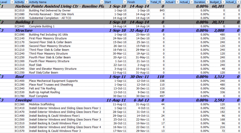
Primavera exported to Excel

For this example, I am using dummy schedule data. The ideas here are quite universal and can be used with any schedule. Care should be take to ensure proper filtering to avoid ever displaying too many activities.

The key objective here is to be able to export our activities to Excel and then upload the data into a SharePoint list. Tools, such as XER reader, provide the ability to quickly move activities into Excel.

SharePoint

Here, a lot of interesting hacks and strategy come into play.

Digital Strategy – Enter Data Once

SharePoint is a perfect tool for editing data in one location, and to source it in many different ways without having to reenter it.

The first thing we need to do is create a list.
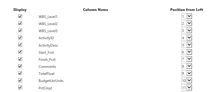
so02_sharepointlistsetup

You can insert a few more columns to pull in Plan Dates, or prior updated dates. However, we are only looking at a comments functionality with this list. We can live with a very stripped down data set (and leave PowerBI to capture everything at a later point).

SP03_sharepointList

The above view is what you would see in the edit view on your SharePoint website. This functionality is fast and allows a team to provide a much more concise internal list of comments specific to each activity (or perhaps only key interface activities).

Where the above doesn’t work? It doesn’t work in situations where we might have a chain of comments. SharePoint allows effectively free text fields. We can enter multiple lines of data for each comment and include dates inside the comment for when the comment was made. There are more sophisticated data models that would allow for multiple comments to be actioned on each activity. However, this example is a lightweight solution — using easily available, off-the-shelf technology. From this point, we dive into your standard PowerBI template.

An URL with predefined filter criteria applied to the SharePoint list is simple. However, we need to use this with caution, because we may end up with 1000s of activities in SharePoint and it will be hard to update this in the future.

Microsoft Access

It is possible to directly edit a SharePoint list using MS Access. In this example, we get constant updates from our contractors on dates. Keep in mind, the SharePoint list is not the management tool for the dates or progress (however — looking at the above, it can be!).

To allow for the list to be bulk updated with new dates and progress figures, we can utilize a query in MS Access. I am a firm believer in the ability for MS Access to facilitate moving data between different systems.

PowerBI

In this example, I will be using an existing template I have previously discussed (follow this link to the Construction Progress Reporting post).
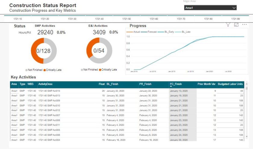
Construction02

Where reports in PowerBI fall over, is that users have a difficult time actually being engaged as managers of the data. We do not have an easy ability to provide context or comments to specific data elements.

Here, we can immediately see that we can interface this dashboard with our SharePoint list. In our PowerBI queries, we can link to the SharePoint list.
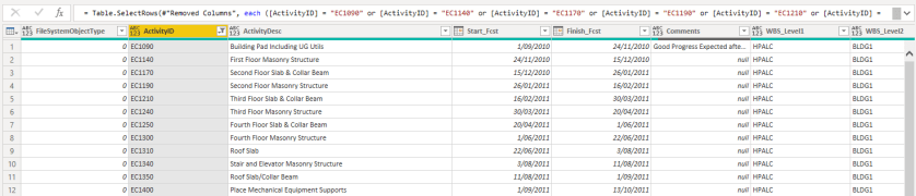
SP04_sharepointPBI

As our schedule data is unique per ScheduleID, and our SharePoint list is unique per ScheduleID, we can link these 2 tables together and pull the comments into our table.

SP05

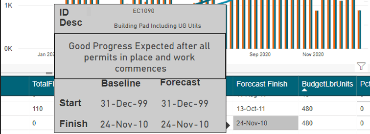
The resulting comment can the efficiently placed on a custom tooltip.

Extensions

As with any comment, it is important to include an indication of criticality. In the above picture, we don’t have an indication if a comment exists, and if a comment does exist we do now know if its important. Therefore, in our SharePoint list, we can use an extension to insert a traffic light in the cell. Then on the PowerBI visual, a traffic light is displayed using a small, colored circle. This would allow for quickly glancing at all the activities and being able to quickly drill into a critical comment.

This is different from looking at Total Float or Variations. Typically on-site, various activities have issues for various reasons that may not have anything to do with float or variances. These may be risk-related issues we are trying to prevent, or perhaps gets others to understand. This approach to comments is exactly what can lend value to a project.

Agile in Construction

Will Agile ideas and approaches fit the construction world – Definitely.

This does not mean I think that a lot of the tried and true practices we have developed need to change. Quite the contrary, the construction world have for decades been the pioneers for quality project management.

What has changed is the way in which people communicate and the culture we live in. Agile does have a lot of good properties in the personal communication. So I believe the construction world needs to embrace some aspects of Agile and the software tools that have been developed to support Agile management


Introduction to Agile in Construction

In this presentation, we can see that indeed many of the terms used in Agile have existed for a long time in the construction PM space. So, in many ways, we already are Agile. Thus, if you go down a path to embrace new management approaches, you first need to understand the current overlaps and also where opportunities exist.


Using JIRA to improve communication on construction projects

There are some great possibilities in using JIRA in the construction world. I do not believe a typical Agile approach fits into the project space; however, many of the ideas are sound and specifically the tools that have been built to facilitate Agile can be molded to fit the construction project space.

Specifically, this relates to the way we communicate and track the work we are performing or the work we are overseeing. Applications such as JIRA and DevOPS have capabilities that I feel are a perfect match for the construction world and we need to be looking how we can customize these new tools to really revolutionize the way construction projects are managed.
 

How to reduce data volume in PowerBI Maps by using WKT

In a previous blog, I showed how to load a raster tiles into PowerBI data model, in theory that should solved all my issues with doing a detailed maps in PowerBI.

unfortunately, no, even if R and Python visual support up to 150K points,  the reality is the implementation of R in the PoweBI service has a massive overhead and you can’t do anything about it, as it is literally a black box, all you can do is try to reduce the data passed to R visual and hope it works.

Actually, in my case, the visual did not even show up and I got an error message that resources are exceeded

I am in a situation where I can’t filter data because the whole point of the visual is to show all the data, at the same time, if the visual does not work in the service then there is no point in the whole exercise.

The trick is using wkt, I will simplify the geometry without losing any visual data, for example:

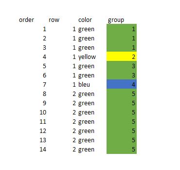
Instead of showing all the points, I will just group the points in the same order and colour as a line, as you can see from 14 rows of data, it is reduced to 5 rows, and the visual representation is the same, it is like sampling, but we keep the exact shape of the data.

Now in PowerBI, all we need to do is to automatically group those points together, turn out the solution was very easy using Rankx, keep in mind the wkt is dynamic for every update, I get a new geometry

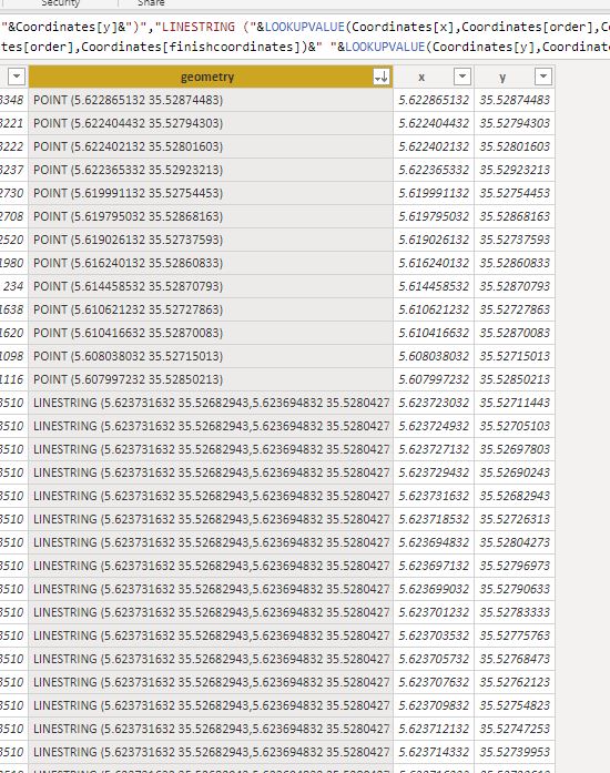
After that I just added some calculated columns to create the wkt format

For a point, POINT (X Y)

For a line, STRINLINE (start_X start_Y,finish_X finish_Y)

Keep in mind you can create polygons too, but the DAX become more complex (maybe for another blog)

you can create the wkt file in QGIS very easily but as my data change daily, it was not practical

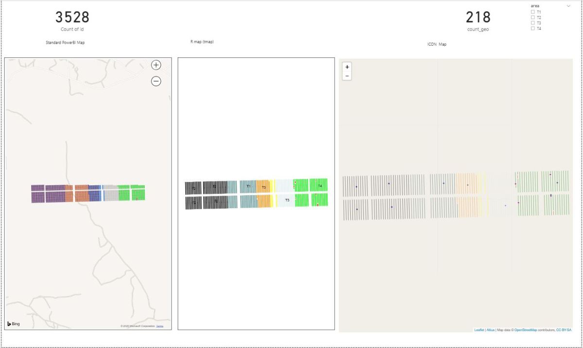
And here is the final result

The number or rows were reduced from 3528 to 218

That make a massive difference in PowerBI service, my real data is 58K rows and I can’t tell how much I was happy when finaly it worked in the service,not only that, but the total rows using wkt keep decreasing when I do more updates 🙂

There is a catch though, unfortunately as of Dec 2019, only R and Python script can render wkt geometry, there is a new custom visual by @james dales, but it is in a private beta and has some limitation on colors by category. ( icon map support color per category now)

You can download the pbix file here

I hope that in 2020, Microsoft invest more on improving the Maps offering in PowerBI , and optimize R and Python scripts on the service, I am very optimistic

with the new ICON map my use case is fully solved 🙂

Controls Accounts for Cost – Houston we have a (possible) problem

This article captures 2 issues that are related and perhaps not clearly discussed or understood (not even by me): Level of Detail, and Transactional vs Account based tracking

Many cost tools, for right or wrong, are now almost entirely Control Account based. This leads to some conceptual issues where people have been use to managing data in a more transaction way.

Additionally, when we begin to establish defined control accounts, picking the right level of detail, and how changes are managed between Controls Accounts, requires a lot of creative accounting (thoughtful process mapping through all your systems & Digital Strategy)

The below is just a primer for a potential discussion. This is a post on what it means to pick a correct level of detail and what it really means to how you manage your costs.

Transaction Management

This is my wheelhouse, the way my brain primarily works when dealing with projects. List Management. Everything is a new record.

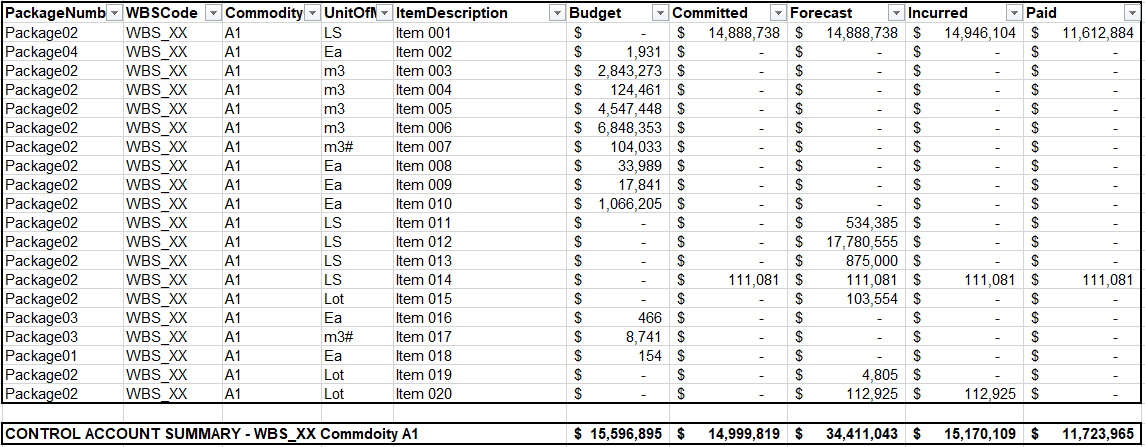
We have contracts with detailed line items, we want to retain our budget line items, each contract line item will have various columns for Committed, Forecasts, Incurred and Paid values. We manage these detail items in this way. Below is a example of how we really manage costs (and progress and deliverable). Excel (sharepoint, or a simple flexible database) provides an ideal solution for users to manage this detail.

C01

However, the new age of cost tools want us to view projects at a more “control account” level. In the above example, I have created a control account to a WBS and Commodity code level of detail.

In the above example, we have 4 contractors working on this scope in various capacities. Although, its way more subtle then that, we actually only have 1 contract and 3 expected contracts. We have parsed our budget into what we expect to be 4 different contracts. Thus only 1 contract has a commitment, but yet we have a forecast (and budget) for all 4. Each contract will have a full detailed list of detail items that we will manage. We will items for specified growth, perhaps contingency, maybe a few site instructions. A transactional list!

Quantity Growth – new line or modify existing?

Here again is one of the conundrums of how we manage (specifically related to progress measurement. Consider a project with some concrete and steel.

If we have a change in quantity for a foundation, where do we capture the change and what does it look like in our database. Too often, we look at this and manage it using a simple excel file – which can make the process easy. However, this is a very complex issue. If we add a line item and base our progress off committed quantities, we will have to update 2 line items with %’s. However, so many options exist to capture this.

And again, if instead this item is managed at the “control account” level, all we need is the total actual quantity, or simply the overall % for the control account. When you look at the above from a control account level, you capture all the detail, but yet for % management, you can disregard all the %’s to the details and only insert a % to the control account.

Which method is right, which method fits into your cost/progress system, which approach aligned to your specifications?

In the second method above, you loose the ability to calculate a specific % for variations. So again, we have taken just a simple issue, and created a complex nightmare.  Obviously, we all solve these problems day in and day out. The issue here is again just to bring this topic to light and how the new range of cost tools may not be flexible enough to really capture what we do – nor should they! The real answer is as we all do now, some detail is managed inside excel and some abstraction ends up in the system.

Control Account Management

In the above, we have seen the importance of picking the right control account level of detail, but, we perhaps haven’t conceptualized what a controls account is in the first place. For “control account” management, we want to manage “SCOPE”. For this package of scope, we sum up all the detail coded to the same codes.

C02

When we look at scope, it is much easier to compare against our estimate which was built to this level before we had to detail with specified growth, claims, site instruction and even contractor commitment. This is why we want control account management and why so many cost tools are forcing us down this path.

Whats the Problem?

In the above example, the “control account” is meaningless. We can not “manage” anything at the control account level. The control account is only a metric.

Instead we are going to manage our contracts in isolation. Each contract will have its own specifics and likely its own approvals when we modify a forecast or a commitment.

A solution to this conundrum is to split the above into 4 control accounts (or more). However, that creates a nightmare for everyone dealing with the new cost systems where creating cost accounts, loading budgets and costs is not straight forward. Doubly so as we haven’t even begun to discuss at what level we manage our time phased data.

All the new tools also allow us to manage “detail items”. Budget again, as soon as you start to push the level of detail of management into the detail items, you may as well make the detail item its own control account.

The Problem is – Whats the right Level of Detail?

You can run this problem down rabbit holes with how we manage engineering deliverables, how we manage progress items, manhours, quantity management, etc. Here I have just presented the problem related to strictly just a cost control level. But yet the dimensions for each of the items above is multiplied by each of the additional management datasets we also track.

Picking the right level of detail that goes into our cost tools, is more of an artform than it is a science.

My view is that we need easy flexible transactional capabilities from cost systems to ease the excel hell aspects. But yet at the same time, need to understand how the transactional records join up to perhaps a more formal CTR or Control Account level of detail.