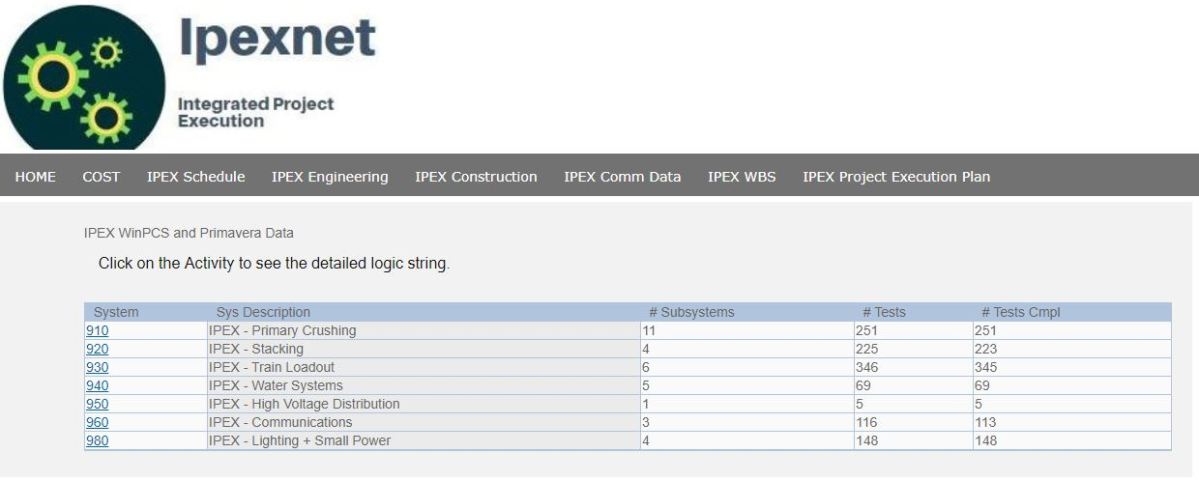
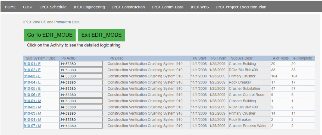
I am a firm believer in the use of a standard project website portal from which the project team at large can quickly access key data and metrics about the project. This is not meant to be confused with a project dashboard, or PowerBI visualization. This is simple html file linked to a database with key flat-file information. Using smart JavaScript code, it is also possible to EDIT some of the key information.
With everything, before we even begin, we want to focus on what core digital strategies we are trying to tackle. Again, the project website is just a tactical approach, underlying it are the more relevant strategic goals we want to operate under.
Digital Strategy – Make Information easy to access
Digital Strategy – Agile Construction Management
Digital Strategy – Allow people to EDIT key data
The features discussed in this blog can be seen showcased in the following video. This is not a pipe dream. This is a functional application.
The video can be viewed in a separate window at https://www.youtube.com/watch?v=0XNA9xJS2yY
The Data
The key data sources involved with engineering progress will be:
- Engineering Deliverable List
- Manhours per WBS
Your engineering deliverable list is a bit of a misnomer. A lot of engineering and design tasks are not specifically related to a “deliverable.” In my view of the world, while you will have specific deliverables and need to track them, your progress list should also include everything else you are doing too – up to a point where perhaps the level of detail is too small.
For analysis, productivity factors for engineering are critical. As such, this post would not be complete without a discussion and visibility into hours and productivity factors.
The Menu

Our menu follows many of the key functions of project controls. However this specific post will dive into the ENGINEERING section only.
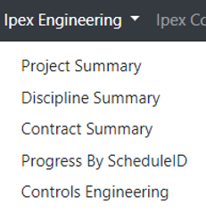
If we expand our menu, we see various views into our data: by project, discipline, contracts, schedule IDs and a unique view for controls engineering
Detail Views / EDIT MODE
Perhaps before we look at our summary and drill downs, the main control screen we would use on a day to day basis would be the Deliverables by WBS and Discipline
In the below screen, we can see all out progress items, our budget hours, progress% as well as the mapping to P6 ID (as all progress items should be mapped to into your schedule)

This view into deliverables by itself is not specifically unique. Where the magic happens is when we enter EDIT MODE.

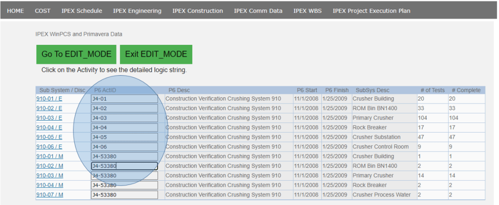
Inside our EDIT MODE, we can directly update the progress %, and update our mapping to schedule ID. These features in my mind are your killer features that distinguish this from any other app. The shear ease in updating items in this way is a breath of fresh air, not to mention the live feedback and visibility throughout your team.
JIRA
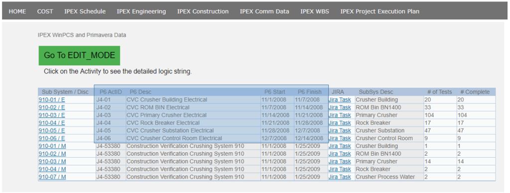
Each combination of WBS and Discipline can be mapped to a JIRA task. Obviously we know our WBS can be considered an EPIC. The power in using a tool such as JIRA is that we can now track more detailed L4/5 tasks using JIRA Subtasks. These are completely flexible to allow the user to manage their own tasks.
Additionally, the ability to embed commentary and status is a brilliant way to distribute and communicate key status and blockers if any.

Summary Pages
Now that we have seen how we will actually interact with a project website, we can now showcase the summary level reporting. Specifics of how you report can often times be better captured using an analytics platform like PowerBI; however, more often then not, simple summaries and metrics are what drive our business.

In the summary by project, we can easily see key metrics per project. Each project would have a link to allow us to drill into the details for each project
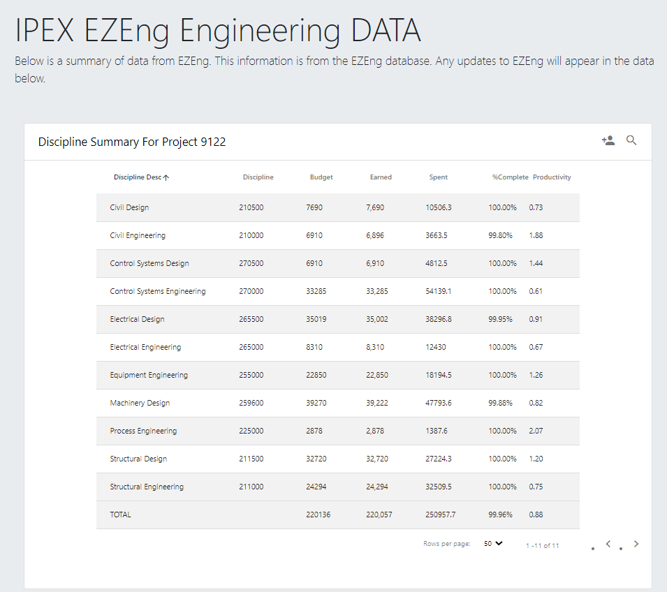
In the above, we are now looking at the individual functional delivery areas (disciplines) for our project. Again we can see key budgets, spent hours, progress and productivity measures too. By clicking each discipline, we further dive into our project by now looking into the detailed WBS elements for that Discipline
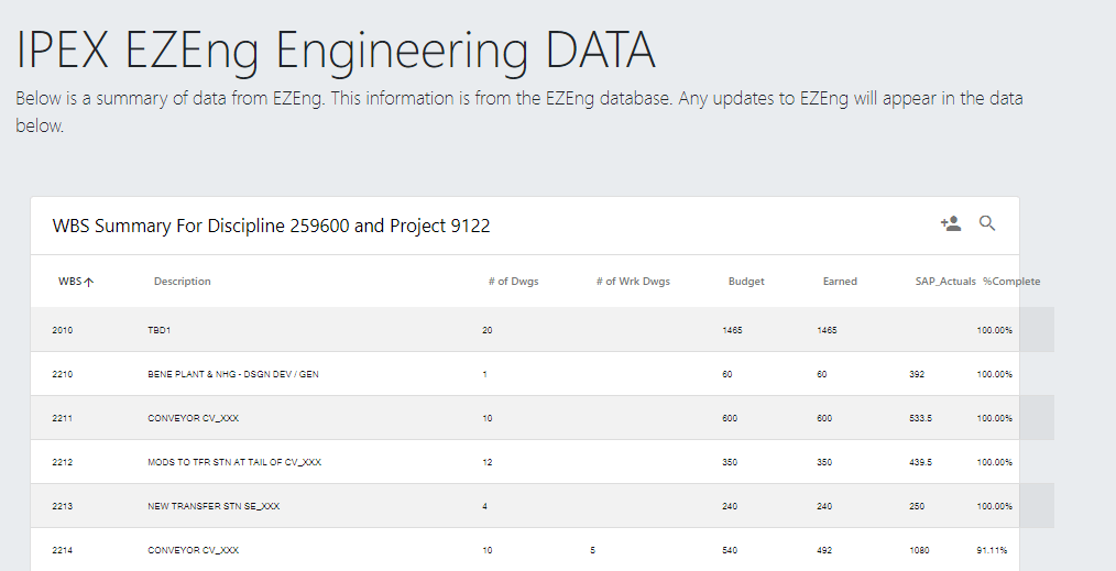
It is in this view that we can see detailed metrics per WBS/Discipline pair.
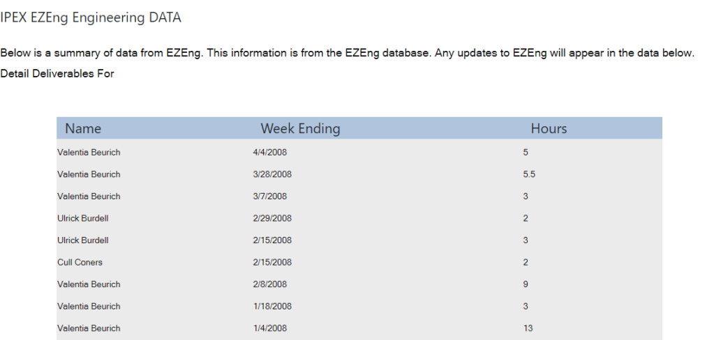
Understanding our Spent Hours from time sheets is a critical management function. As such, the SAP actuals here is a link that takes us to a screen where we can view the detailed weekly time sheet data to see who (and when) has book to this element.
Conclusion
In summary we started with some key strategic thinking and built out a tool that ticks a lot of boxes in the EPCM construction world.
More often then not, I am confronted with technology that “shows me” but doesn’t allow me to interact, edit, or collaborate. Everyone wants to solve the “one source of truth” however, information changes and is updated by people. That is the missing link in a lot of our data analytics. Look into the work processes that generate information in the first place. Look at what people need to better capture their raw information into a data format and platform that others can now use.
This approach to put management of engineering items to plain sight, with ease of access is just one approach. There are 100s of ways to approach this, but if you stick to core strategic ideals, you can’t go wrong.

