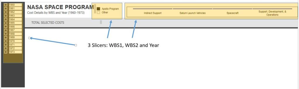
Slicers are not my specialty, actually, PowerBI is not my specialty. So it was with a little frustration in trying to add a slicer to a page to find the slicer altering all my data.
Set The Stage
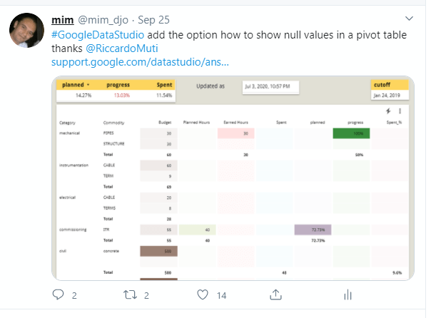
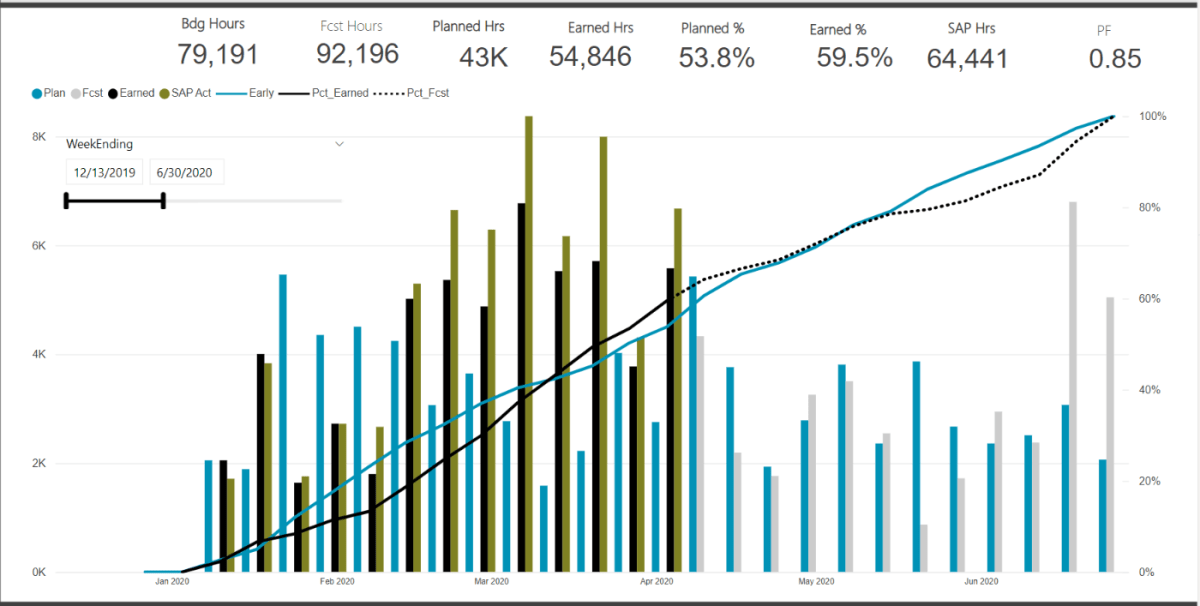
My go to progress dashboard calculates a lot of progress % metrics and graphs. However for larger projects, its often difficult to zoom into the graph. This is exactly why slicers exist. I am sure there are other nice graph tools that allow for custom date ranges, but again, this is so not my specialty.

What didn’t work
I simply added a slicer on my “weekending” field. However, in doing so, all my measures are now calculating based on the filtered date range. This is likely an issue with my measures, but alas, I wanted something to just adjust the graph axis and not effect anything else
Below we can see that my measure are calculating a progress set from 0-100%. Thus when the date ranges were adjusted, the entire dashboard is now just wrong. My budgets and %’s are also not correct on the cards (which are also based on all the slicers).

The Solution – Create a Duplicate DIM_Date Table
The problem was caused because the slicer was based on the live master dimension table that was linked to my data. Just like I want my graph to adjust based on the adjusted the WBS dimension tables, if I insert a slicer linked in anyway to my FACT table, I am in a world of hurt
Thus, just create a duplicate DIM_Date table. Here I created a new table: DIM_Date_GraphRangeSlicer
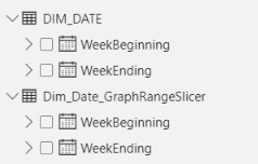
I insert a formula into the chart X-Axis range to select the min and max dates from this new GraphRange table. I then setup a slicer that filters the range for this new table, not the master DIM_Date.

With these new ranges, linked to the dummy date range, I can now much better refine just the X-Axis display of the graph without impacting any of the measures used to calculate the % progress.
The Result

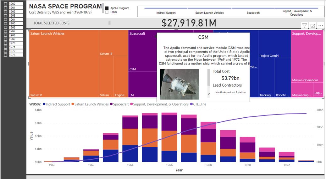
Putting it all together, we can now customize the X-Axis range without altering the measures or cards that are calculating key metrics off the full (or filtered based on the WBS slicers) data.