This one I took it from a Tableau Presentation, let’s say you want some element to have a particular color when they reach a value.
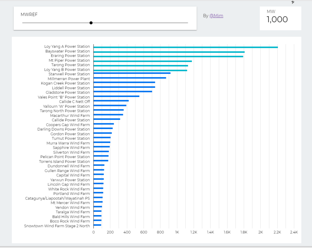
For example in this report, I want to make it clear which generators is producing more than 1000 MW.
Create a parameter MWREF

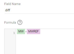
Data Studio formula engine you can not compare dimension to parameter, instead we create first a helper calculated field “diff”
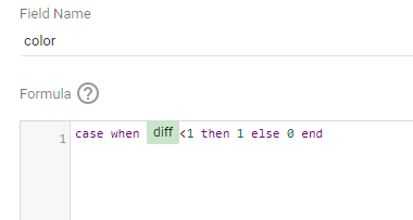
then we create a second calculated field “color”
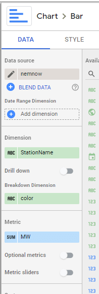
in the bar chart, I use “color” as as a breakdown Dimension
and here is the result


Hi, how did you create the ‘highlight a line chart’ please
LikeLike
I am using SQL parameter and vega custom viz, are you interested into this combination ?
LikeLike
I was hoping you managed this just using the new parameter function in data studio. I use data studio for work and currently don’t have access to big query. 😕 Thanks for letting me know.
LikeLiked by 1 person
actually I found a solution without BigQuery 🙂
https://datamonkeysite.com/2020/09/08/change-the-color-of-one-category-in-a-chart/
LikeLike
Lovely, thankyou
LikeLiked by 1 person
I try with the metric is record count. The formula in the “diff” is “AUT Record Count”.
The breakdown dimension shows error
“Metric expressions and aggregations are not allowed in this expression.”
Could you please give me some advice? I just would like to change the color if the bar shows the metric number of sum record count more than 10000, no parameter is needed.
LikeLike
This is not working.. Showing Invalid formula while creating field.
LikeLike