TL;DR : The report is here
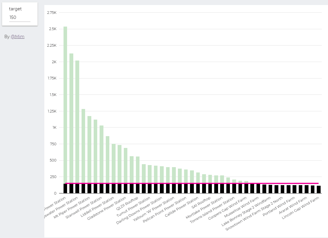
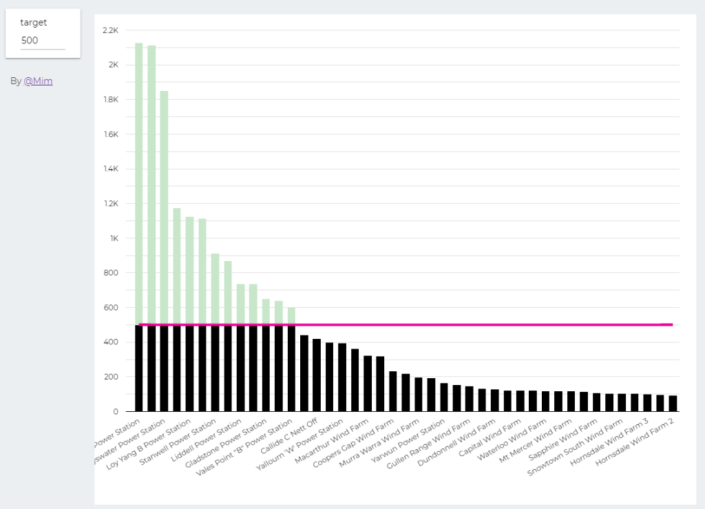
trying to reproduce a visual I saw before, Probably in a tableau forum, it is quite simple but give a very nice visual clue, the idea is the user input a target and the color will change based if it is higher or lower than the Target
Probably you can do it using Parameter in Google Data Studio, but using BigQuery was much easier. ( solution using only GDS , courtesy of Nimantha )
I built this Query, which generate two values, Firstsection of the bar and the secondsection
SELECT
*,
CASE
WHEN MW < @target THEN MW
ELSE
@target
END
AS firstsection,
CASE
WHEN MW < @target THEN null
ELSE
MW -@target
END
AS secondsection
FROM
datastudio.table
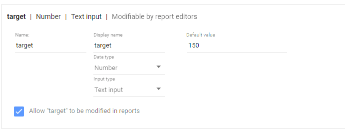
define parameter “Target” , currently BigQuery parameter does not accept range, instead you have to type a number
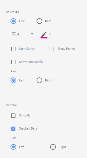
then Create Stacked Combo Chart
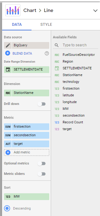
Make sure first section and second section are bars and target is a line and make sure bars are stacked
when you change the parameter values, the bars value change

