Getting different parties in the software industry to agree on a common standard is rare. Most of the time, a dominant player sets the rules. Occasionally, however, collaboration happens organically and multiple teams align on a shared approach. Geometry types in Parquet are a good example of that.
In short: there is now a defined way to store GIS data in Parquet. Both Delta Lake and Apache Iceberg have adopted the standard ( at least the spec). The challenge is that actual implementation across engines and libraries is uneven.
- Iceberg: no geometry support yet in Java nor Python, see spec
- Delta: it’s unclear if it’s supported in the open source implementation (I need to try sedona and report back), nothing in the spec though ?
- DuckDB: recently added support ( you need nightly build or wait for 1.4)
- PyArrow: has included support for a few months, just use the latest release
- Arrow rust : no support, it means, no delta python support 😦
The important point is that agreeing on a specification does not guarantee broad implementation. and even if there is a standard spec, that does not means the initial implementation will be open source, it is hard to believe we still have this situation in 2025 !!!
Let’s run it in Python Notebook
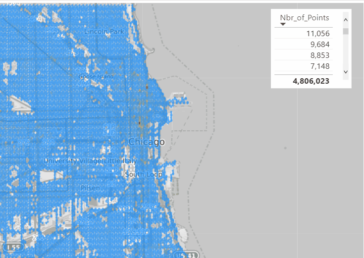
To test things out, I built a Python notebook that downloads public geospatial data, merges it with population data, writes it to Parquet, and renders a map using GeoPandas, male sure to install the latest version of duckdb, pyarrow and geopandas
!pip install -q duckdb  --pre --upgrade
!pip install -q pyarrow --upgrade
!pip install geopandas  --upgrade
import sys
sys.exit(0)
At first glance, that may not seem groundbreaking. After all, the same visualization could be done with GeoJSON. The real advantage comes from how geometry types in Parquet store bounding box coordinates. With this metadata, spatial filters can be applied directly during reads, avoiding the need to scan entire datasets.

That capability is what makes the feature truly valuable: efficient filtering and querying at scale, note that currently duckdb does not support pushing those filters, probably you need to wait to early 2026 ( it is hard to believe 2025 is nearly gone)
👉Workaround if your favorite Engine don’t support it .
A practical workaround is to read the Parquet file with DuckDB (or any library that supports geometry types) and export the geometry column back as WKT text. This allows Fabric to handle the data, albeit without the benefits of native geometry support, For example PowerBI can read WKT just fine
duckdb.sql("select geom, ST_AsText(geom) as wkt from '/lakehouse/default/Files/countries.parquet' ")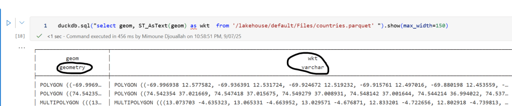
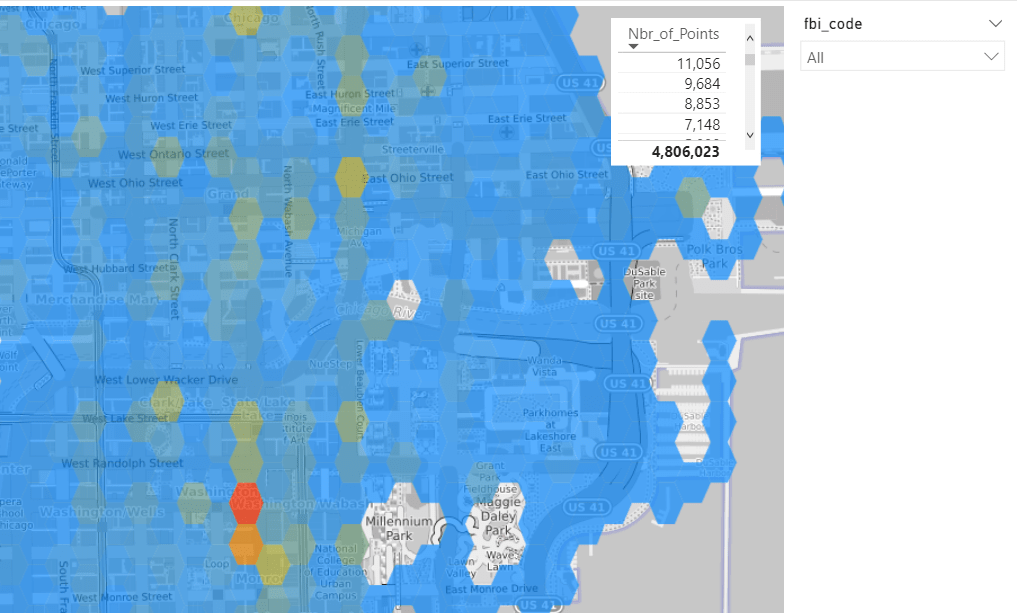
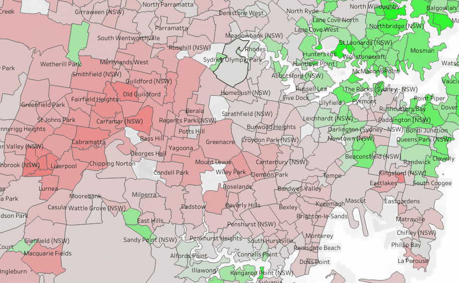
For PowerBI support to wkt, I have written some blogs before, some people may argue that you need a specialized tool for Spatial, Personally I think BI tools are the natural place to display maps data 🙂