Four years ago I wrote a blog about using DuckDB with Power BI in DirectQuery. It got a fair number of likes on LinkedIn 🙂 along with the one comment I didn’t want to hear: how does this work in production? (Craig, if you’re reading this, you were right.)
Back then I thought the technology was the hard part and the rest would sort itself out. It didn’t.
The ODBC driver never really worked in any non-trivial setup. Filters didn’t push down, decimal precision was buggy. It has gotten better since, but two show stoppers remained:
DuckDB is in-process, so the driver is the database. There’s no warm, long-running session. Every query starts from scratch.
I don’t think those drivers can realistically be certified (personal opinion). And Power BI Service, or any hosted BI service for that matter, is not going to host an in-process engine for free. An on-prem data gateway is not really a good option either.
In 2026 things are way better. MotherDuck (DuckDB’s SaaS) shipped a PostgreSQL endpoint. Problem solved: Power BI speaks Postgres, and it works out of the box.
Then last week DuckDB released Quack. For my own sanity I’ll just call it “DuckDB Server.” It is just an extension; a single function call and you have a server !!
My first reaction was annoyance. Four years of waiting, and they shipped a proprietary wire protocol. I was hoping for pg wire. I want my driver to work. I don’t really care about a 2x improvement if nothing interoperates.
Luckily I was partially wrong. Within two days there was an ADBC driver from gizmodata/adbc-driver-quack, and, to my surprise, a Power BI custom connector from Curt Hagenlocher (think of him as the Linus of Power Query). my understanding it is a side project, not official Microsoft.
And somehow, the whole thing worked. It was beautiful.
But lesson learned from last time: this is experimental, with no guarantee the connector will ever be certified.
The main change from the 2022 post is that instead of pointing at parquet files, I’m pointing at a catalog and getting tables back, like an actual database instead of a pile of files and duckdb got way better.
High level architecture
OneLake Iceberg Catalog — OneLake exposes data as tables. You need three things:
Path to the Lakehouse/Warehouse: workspace_name/Lakehouse_name.Lakehouse
DuckDB + iceberg extension — reads the catalog and the underlying parquet over HTTPS.
Entra ID — az account get-access-token --resource https://storage.azure.com/ mints a short-lived bearer token. No service principal, no app registration. I have a script that grabs the token, and I opened duckdb-azure#170 hoping to make this much simpler.
DuckDB Endpoint — turns the engine into a TCP server on 127.0.0.1:9494, speaking DuckDB’s native wire protocol (whatever that means).
The ADBC Driver — Python client and Power BI share the same DLL, you need to manually install it from curt github page
Let’s just share a video. Yes, 600M rows, warm run in my laptop
Python Notebook
TPC-H SF=10 (10 GB), 22 queries, run twice in the same session via client.ipynb. Numbers are seconds, copied straight from the notebook output.
Cold
Warm
Total
~5 min 29 s
~30 s
Cold time is dominated by parquet I/O over HTTPS from OneLake. Bandwidth and seek count, not CPU. Warm runs hit DuckDB’s in-process buffer cache, Onelake endpoint is in another continent and my internet provider is horrible 🙂
Optimization on this stack should target bytes read and seeks (codec, row-group size, predicate pushdown, range prefetch), not query plans.
This is exactly why server mode make sense, as the warm cache is shared by all client (notebook, Power BI, AI Agent)
Not production ready
The Entra token has a ~1h TTL. As far as I can tell, DuckDB has no way to auto-refresh tokens.
The driver is not certified, so it can’t be used in the service, if you want it added to PowerBI, create an idea in Fabric forum and vote
DuckDB Server is new. Don’t expect SQL Server maturity yet 🙂
DuckDB’s remote file cache is RAM only. When you restart DuckDB, you lose it and have to deal with the cold-run pain again and egress fees 😦
The DuckDB Azure extension is still pretty rough in places. To be fair, they’ve openly said they don’t have the bandwidth.
Hopefully it won’t take another four years to make this production ready.
Still, seeing DuckDB as a single binary serving a 600M row table to Power BI was genuinely fun. and The Iceberg catalog is awesome !!!
DuckLake supports multi-writer just fine — but only if your catalog is a real database, like Postgres (there’s some interest in SQL Server support too). But if all you have is object storage and a SQLite or DuckDB file as the catalog, you’re stuck with single-writer: object stores aren’t real filesystems, so the DB file can’t be locked. Nothing stops two processes from writing to it at the same time and corrupting it.
If single-writer is enough for you (one notebook, one pipeline, one user), you don’t need to stand up a database server. You just need accidental concurrent runs to fail fast.
The trick: take a blob lease
OneLake speaks the ADLS API, so you can take a lease on a blob — a mutex for free (it seems S3 needs DynamoDB and GCS needs a homemade lock object). Each run does:
Acquire a lease on metadata.db in abfss://.
Download it to local disk of the notebook.
Point DuckLake at the local copy and do the work.
Upload the modified file under the lease.
Release the lease.
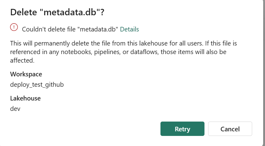
A second notebook that starts while the lease is held fails immediately on acquire_lease. It can’t even read a stale copy. and you can’t delete the file using the UI , I can see already some uses cases here:)
What about crashed runs?
ADLS leases are either 15–60 seconds fixed, or infinite. Fixed leases need a heartbeat — annoying inside a notebook. Infinite leases work until something crashes — then the file is stuck.
The fix: take an infinite lease, but stamp acquired_at = <utc iso> into the blob’s own metadata when you acquire. When the next run hits a lease conflict, read that timestamp. Older than 12 hours? Call break_lease and re-acquire. A crashed run self-heals within 12 hours. You can shorten that window, or break the lease manually with a one-line script if you can’t wait — there’s a snippet in the README.
Microsoft Fabric now has a proper CLI deploy, and it works. I built a fully automated CI/CD pipeline that deploys a Python notebook, Lakehouse, Semantic Model, and Data Pipeline to Fabric using nothing but the fab CLI and GitHub Actions. Here’s what I learned along the way , what works great, what to watch out for, and where a few small additions could make the experience even better.
The Blog and the code was written by AI, to be clear, Fabric had always excellent API. and I perosnally used adhoc pythion script to deploy, but this time, it feels more natural
maybe the main take away when working with Agent and writing python code, logs everything including API response specially at the begining, AI is very good at autocorrecting !!!
The Goal
Push to main or production, and everything deploys automatically:
A Lakehouse gets created (with schemas enabled)
A Python Notebook gets deployed and attached to the Lakehouse (dbt need local path)
The notebook’s supporting files get copied to OneLake
The notebook runs — transforming data and creating Delta tables
A Direct Lake Semantic Model gets deployed (pointing at those Delta tables)
A Data Pipeline gets deployed and scheduled on a cron
Each Fabric item lives in a folder named {displayName}.{ItemType} under fabric_items/. The deploy script discovers them dynamically — no hardcoded item names.
What Works Well
The fab deploy command is brand new — v1.5.0, March 12, 2026. For a tool that just shipped, two things stood out.
Native .ipynb Support for Notebooks
Fabric’s default Git format for notebooks is notebook-content.py — a custom FabricGitSource format that flattens your notebook into a single .py file with metadata comments. It’s fine for Git diffs, but you lose the cell structure, can’t preview outputs, and can’t use standard Jupyter tooling to edit it.
As of Fabric CLI v1.4.0 (February 2026), you can now deploy notebooks as standard .ipynb files. Before v1.4.0, the CLI only supported the .py format.
With .ipynb support, what you see in VS Code or Jupyter is exactly what gets deployed:
fabric_items/
run.Notebook/
.platform
notebook-content.ipynb # standard Jupyter format, deployed as-is
You can edit notebooks locally with proper cell boundaries, use Jupyter tooling, and the deploy just works. Notebooks are finally first-class citizens in the deployment story.
model.bim Is Beautifully Simple
Fabric supports two formats for Semantic Models: TMDL (a folder of .tmdl files, one per table — the default) and TMSL (a single model.bim JSON file). TMDL is better for Git diffs on large models. But for my use case, model.bim is perfect.
One file. Everything in it — tables, columns, measures, relationships, and the Direct Lake connection. The entire environment-specific configuration boils down to a single OneLake URL:
Two GUIDs. That’s it. Swapping environments is a two-line string replacement:
bim_path.write_text(
bim_text.replace(source_ws_id, WS_ID)
.replace(source_lh_id, target_lh_id)
)
Compare this to the pipeline, where you’re hunting through deeply nested JSON paths with fab set. The BIM format is refreshingly straightforward.
The deploy works perfectly with just Python string replacement — three lines of code and a git checkout to restore.
TMSL (model.bim) vs TMDL: Which Format for CI/CD?
Fabric supports two formats for Semantic Models, and this choice matters more than it might seem.
TMDL is the default. It splits your model into a folder of .tmdl files — one per table, plus separate files for relationships, the model definition, and the database config:
definition/
├── tables/
│ ├── dim_calendar.tmdl
│ ├── dim_duid.tmdl
│ └── fct_summary.tmdl
├── relationships.tmdl
├── model.tmdl
└── database.tmdl
TMSL is a single model.bim JSON file with everything in it.
For CI/CD pipelines, TMSL wins hands down. Here’s why:
One file to manage. Your deploy script reads one file, replaces two GUIDs, deploys, and runs git checkout to restore. With TMDL, you’d need to find which .tmdl file contains the OneLake URL and handle multiple files.
Two .replace() calls. The entire environment swap is two string replacements on one file. With TMDL, the connection expression lives in model.tmdl, but table definitions reference it indirectly — more files to reason about during deployment.
Easier to grep and debug. When something goes wrong with your Direct Lake connection, you open one file, search for the OneLake URL, and see everything. No jumping between files.
When TMDL makes more sense:
Large models with dozens of tables where multiple people edit measures and columns — per-file Git diffs are cleaner and merge conflicts are smaller
Teams using Tabular Editor who need reviewable PRs on individual table changes
Models that change frequently at the table level
But if your semantic model is authored once and deployed across environments — which is the typical CI/CD pattern — you’re not reviewing table-level diffs. You’re swapping two GUIDs and pushing. TMSL keeps it simple.
I chose model.bim and haven’t looked back.
Things to Know Before You Start
Lesson 1: Deploy Order Matters — A Lot
This was my biggest source of failed deployments. Fabric items have implicit dependencies, and deploying them out of order causes cryptic failures.
The correct sequence:
Lakehouse → Notebook → (run notebook) → Semantic Model → Data Pipeline
Why this specific order:
The Notebook needs a Lakehouse to attach to. If the Lakehouse doesn’t exist yet, the attachment step fails.
The Semantic Model uses Direct Lake mode, which validates that the Delta tables it references actually exist. If you deploy the model before running the notebook that creates those tables, validation fails.
The Data Pipeline references the Notebook by ID. You need the Notebook deployed first to get its target workspace ID.
# 5. Deploy Semantic Model (Delta tables now exist)
# 6. Refresh Semantic Model via Power BI API
# 7. Deploy + schedule Data Pipeline
Lesson 2: fab job run Does Nothing for Notebooks Without -i '{}'
This one cost me hours of debugging. Running a notebook via the CLI:
# Does NOTHING — silently succeeds but notebook never executes
fab job run prod.Workspace/run.Notebook
# Actually runs the notebook
fab job run prod.Workspace/run.Notebook -i '{}'
Notebooks require the -i '{}' flag (empty JSON input). Without it, the command returns success but the notebook never fires. There’s no error, no warning — it just silently does nothing.
Lesson 3: parameter.yml Token Replacement Is Surprisingly Limited
Fabric CLI has a parameter.yml mechanism for replacing GUIDs across environments. The idea is great — use tokens like $workspace.id and $items.Lakehouse.data.$id that get resolved at deploy time.
In practice, the rules are strict and poorly documented:
Tokens only resolve if the entire value starts with $
# WRONG — token is embedded in a URL, never resolves
The pattern: modify → deploy → git restore. No token resolution needed.
Lesson 4: item_types_in_scope Must Be Plural
The deploy config YAML key is item_types_in_scope (plural). Use the singular item_type_in_scope and Fabric CLI silently ignores it — deploying everything in your repository directory instead of just the types you specified.
# CORRECT
item_types_in_scope:
- Notebook
- Lakehouse
# WRONG — silently deploys ALL item types
item_type_in_scope:
- Notebook
This is the kind of bug that only shows up in production when your Semantic Model gets deployed before your Delta tables exist.
Lesson 5: New Lakehouses Need a Provisioning Wait
Creating a Lakehouse returns immediately, but the underlying infrastructure isn’t ready yet:
result = subprocess.run(["fab", "create", LAKEHOUSE, "-P", "enableSchemas=true"])
if result.returncode == 0:
# Brand new lakehouse — need to wait for provisioning
print("Waiting 60s for provisioning...")
time.sleep(60)
On first deploy to a new workspace, this 60-second wait is essential. Without it, subsequent operations (deploying items, copying files) fail with opaque errors.
Lesson 6: Attaching a Lakehouse to a Notebook Requires fab set
Deploying a notebook doesn’t automatically connect it to a Lakehouse. You need a separate fab set call:
The JSON path is deeply nested and not well documented. I had to inspect the API responses to find the correct path: definition.parts[0].payload.metadata.dependencies.lakehouse.
Lesson 7: Semantic Model Refresh Uses the Power BI API, Not the Fabric API
After deploying a Direct Lake semantic model, you need to trigger a refresh. But this isn’t a Fabric API call — it’s a Power BI API call:
# Note the -A powerbi flag — this targets the Power BI API endpoint
fab api -A powerbi -X post "groups/{workspace_id}/datasets/{model_id}/refreshes"
Without the -A powerbi flag, you’ll get 404s because the Fabric API doesn’t have a refresh endpoint for semantic models.
Lesson 8: Pipeline References Are Hardcoded GUIDs
A Data Pipeline that runs a notebook stores the notebook’s ID and workspace ID as hardcoded GUIDs in its definition:
fab auth login -t ${{ secrets.AZURE_TENANT_ID }} \
-u ${{ secrets.AZURE_CLIENT_ID }} \
--federated-token "$FED_TOKEN"
This means no client secrets to rotate — just configure the Azure AD app registration to trust your GitHub repo’s OIDC issuer. It works well, but you still need to set up an Azure AD app registration, configure federated credentials, and grant it Fabric permissions. It would be nice if Fabric supported direct service-to-service authentication — something like a Fabric API key or a native GitHub integration — without needing Azure as the intermediary.
Lesson 10: Use Variable Libraries for Runtime Config
Instead of baking config values into your notebook or using parameter.yml, Fabric has Variable Libraries:
This makes your notebook fully portable — the same code runs everywhere:
Local dev: swap to a local path or Azurite connection
Deployed to staging: notebookutils resolves to the staging workspace/lakehouse IDs
Deployed to production: same code, different IDs at runtime
The alternative — hardcoding workspace names or using /lakehouse/default/ mount paths — ties your notebook to a specific workspace. With abfss://, the notebook doesn’t care where it’s running. The IDs come from the runtime context, and the deploy script handles attaching the right Lakehouse. Zero code changes between environments.
Lesson 12: Copying Files to OneLake Is Parallel but Slow
The notebook needs supporting files (SQL models, configs) available in OneLake. The fab cp command handles this, but it’s one file at a time. I parallelized with 8 workers:
with ThreadPoolExecutor(max_workers=8) as executor:
executor.map(copy_file, files)
Before copying files, you need to create the directory structure with fab mkdir. OneLake doesn’t auto-create parent directories.
Lesson 13: Schedule Idempotently
Don’t recreate the pipeline schedule every deploy — check first:
result = subprocess.run(["fab", "job", "run-list", PIPELINE, "--schedule"],
capture_output=True, text=True)
if "True" not in result.stdout:
fab(["job", "run-sch", PIPELINE,
"--type", "cron",
"--interval", cfg["schedule_interval"],
"--start", cfg["schedule_start"],
"--end", cfg["schedule_end"],
"--enable"])
This prevents duplicate schedules stacking up across deploys.
The Big Picture
Here’s the overall architecture in one diagram:
GitHub Push
│
▼
GitHub Actions (OIDC → fab auth login)
│
▼
deploy.py
├── fab create → Lakehouse (with schemas)
├── fab deploy → Notebook
├── fab set → Attach Lakehouse to Notebook
├── fab cp → Copy data files to OneLake (8 parallel workers)
├── fab job run → Execute Notebook (creates Delta tables)
├── fab deploy → Semantic Model (with GUID replacement + git restore)
├── fab api → Refresh Semantic Model (Power BI API)
├── fab deploy → Data Pipeline
├── fab set → Update Pipeline notebook/workspace refs
└── fab job run-sch → Schedule Pipeline (if not already scheduled)
Everything is driven by a single deploy_config.yml that maps branch names to workspace IDs:
defaults:
schedule_interval: "30"
schedule_start: "2025-01-01T00:00:00"
schedule_end: "2030-12-31T23:59:59"
main:
ws_id: "e446a5e7-..."
schedule_interval: "720" # 12 hours (staging)
production:
ws_id: "be079b0f-..."
download_limit: "60" # full data
Push to main → deploy to staging workspace. Push to production → deploy to production workspace.
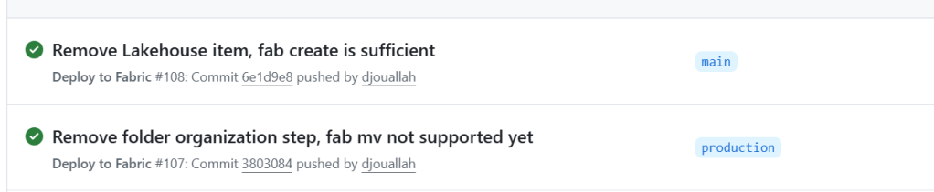
Lesson 14: Don’t Deploy the Lakehouse Item — Let the Data Define the Schema
I had a data.Lakehouse/ folder in fabric_items/ with a .platform file and a lakehouse.metadata.json that just set defaultSchema: dbo. I was running fab deploy for it. Then I realized: I was already creating the Lakehouse with fab create before the deploy step:
fab create "prod.Workspace/data.Lakehouse" -P enableSchemas=true
The fab create handles everything. The fab deploy of the Lakehouse item was redundant.
But there’s a deeper point here: the Lakehouse schema should be driven by your data, not by CI/CD. Your notebook creates the tables, your data transformation defines the schemas. The Lakehouse is just the container — it doesn’t need a deployment definition. Trying to manage Lakehouse schema through fab deploy is fighting the natural flow. Create the container, let the data populate it.
I deleted the entire data.Lakehouse/ folder from my repo. One less item to deploy, one less thing to break.
What I’d Tell My Past Self
Read every fab CLI error message carefully. Many failures are silent (wrong key name, missing -i flag). Add verbose logging.
Deploy in phases, not all at once. Item dependencies are real and the error messages when you get the order wrong are unhelpful.
Skip parameter.yml for anything non-trivial. Direct GUID replacement in Python with git restore is simpler and fully transparent.
fab set is the power tool. Most post-deploy configuration — attaching lakehouses, updating pipeline references — goes through deeply nested JSON paths in fab set.
Test in a separate workspace mapped to a non-production branch. The deploy_config.yml pattern of mapping branches to workspaces makes this trivial.
The Power BI API and Fabric API are different surfaces. Some operations (like semantic model refresh) only exist on the Power BI side. Use fab api -A powerbi.
Don’t deploy what you don’t need to. If fab create handles it, drop the item definition. Let your data drive the schema.
The Fabric CLI is new — fab deploy landed in v1.5.0 just this month — and it already handles a full end-to-end deployment pipeline. The foundation is solid. Everything you need is already there — it just takes knowing where to look. Hopefully this saves you some of that discovery time.
Acknowledgements
Special thanks to Kevin Chant — Data Platform MVP and Lead BI & Analytics Architect — whose blog has been an invaluable resource on Fabric CI/CD and DevOps practices for the data platform. If you’re working with Fabric deployments, his posts are well worth following.
I don’t know much about SQL Server. The closest I ever got to it was having read only access to a database. I remember 10 years ago we had a use case for a database, and IT decided for some reason that we were not allowed to install SQL Server Express. Even though it was free and a Microsoft product. To this day, it is still a mystery to me, anyway, at that time I was introduced to PowerPivot and PowerQuery, and the rest was history.
Although I knew very little about SQL Server, I knew that SQL Server users are in love with the product. I worked with a smart data engineer who had a very clear world view:
I used SQL Server for years. It is rock solid. I am not interested in any new tech.
At the time, I thought he lacked imagination. Now I think I see his point.
When SQL Server was added to Fabric, I was like, oh, that’s interesting. But I don’t really do operational workloads anyway, so I kind of ignored it.
Initially I tried to make it fit my workflow, which is basically developing Python notebooks using DuckDB or Polars (depending on my mood) inside VSCode with GitHub Copilot. and deploy it later into Fabric, of course you can insert a dataframe into SQL Server, but it did not really click for me at first. To be clear, I am not saying it is not possible. It just did not feel natural in my workflow( messing with pyodbc is not fun).
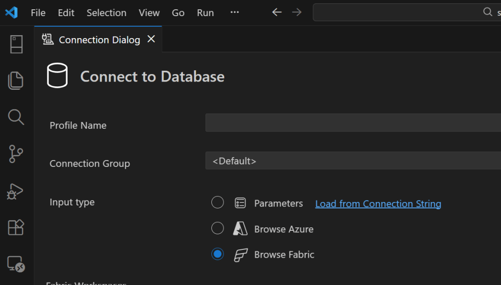
btw the SQL extension inside VSCode is awesome
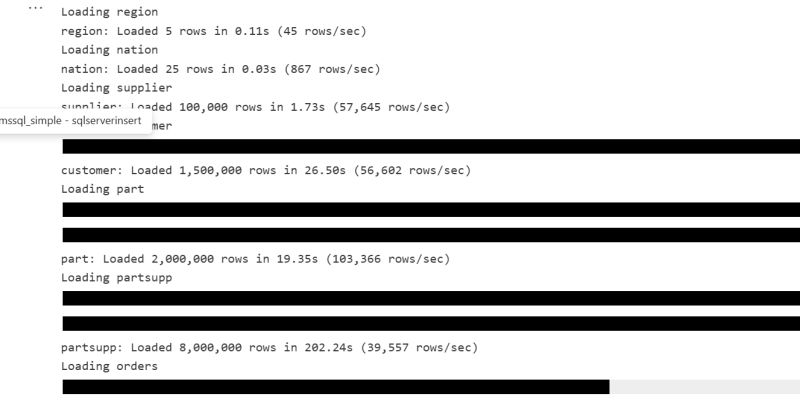
A week ago I was browsing the DuckDB community extensions and I came across the mssql extension. And boy !!! that was an emotional rollercoaster (The last time I had this experience was when I first used tabular editor a very long time ago).
You just attach a SQL Server database using either username and password or just a token. That’s it. The rest is managed by the extension, suddenly everything make sense to me!!!
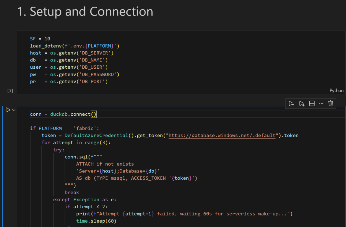
conn = duckdb.connect()

if PLATFORM == 'fabric':
    token = DefaultAzureCredential().get_token("https://database.windows.net/.default").token
# notebookutils.credentials.getToken("sql") inside Fabric notebook
    for attempt in range(3):
        try:
            conn.sql(f"""
                ATTACH IF NOT EXISTS
                'Server={host};Database={db}'
                AS db (TYPE mssql, ACCESS_TOKEN '{token}')
            """)
            break
        except Exception as e:
            if attempt < 2:
                print(f"Attempt {attempt+1} failed, waiting 60s for serverless wake-up...")
                time.sleep(60)
            else:
                raise e
else:
    conn.sql(f"""
        ATTACH OR REPLACE
        'Server={host},{pr};Database={db};User Id={user};Password={pw};Encrypt=yes'
        AS db (TYPE mssql)
    """)

conn.sql("SET mssql_query_timeout = 6000; SET mssql_ctas_drop_on_failure = true;")
print(f"Connected to SQL Server via {PLATFORM}")
again, I know there other ways to load data which are more efficiently, but if I have a small csv that I processed using python, nothing compare to the simplicity of a dataframe, in that week; here are some things I learned, I know it is obvious for someone who used it !!! but for me, it is like I was living under a rock all these years 🙂
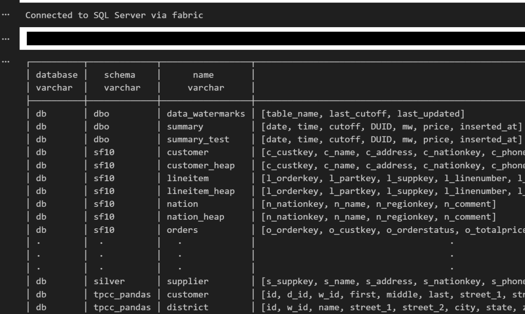
if you run show all tables in duckdb, you get something like this
TDS and bulk insertion
You don’t need ODBC. You can talk to SQL Server directly using TDS, which is the native protocol it understands. There is also something called BCP, which basically lets you batch load data efficiently instead of pushing rows one by one. Under the hood it streams the data in chunks, and the performance is actually quite decent. It is not some hacky workaround. It feels like you are speaking SQL Server’s own language, and that changes the whole experience.
SQL Server is not only for OLTP
Turns out people use SQL Server for analytics too, with columnar table format.
CREATE CLUSTERED COLUMNSTORE INDEX cci_{table}
ON {schema}.{table}
ORDER ({order_col});
I tested a typical analytical benchmark and more or less it performs like a modern single node data warehouse.
Accelerating Analytics for row store
Basically, there is a batch mode where the engine processes row-based tables in batches instead of strictly row by row. The engine can apply vectorized operations, better CPU cache usage, and smarter memory management even on traditional rowstore tables. It is something DuckDB added with great fanfare to accelerate PostgreSQL heap tables. I was a bit surprised that SQL Server already had it for years.
RLS/CLS for untrusted Engine
If you have a CLS or RLS Lakehouse table and you want to query it from an untrusted engine, let’s say DuckDB running on your laptop, today, you can’t for a good reason as the direct storage access is blocked, this extension solves it, as you query the SQL Endpoint itself.
Most of fancy things were already invented
Basically, many of the things’ people think are next generation technologies were already implemented decades ago. SQL control flow, temp tables, complex transactions, fine grained security, workload isolation, it was all already there.
I think the real takeaway for me; user experience is as important – if not more- than the SQL Engine itself, and when a group of very smart people like something then there is probably a very good reason for it.