I have recently been developing a series of videos that highlight the key features utilized in a progress and schedule dashboard. The videos showcase the capabilities of PowerBI dashboards in the Project Controls space. I have not seen dashboards effectively used in this way and want to share the valuable knowledge.
This series is not meant to be a step by step guide. There are subtleties about this demo that may cause difficulties in the production environment. I would simply recommend you share this with your development team and discuss the pros and cons of your approach. Oftentimes, a more straight forward approach is more valuable when compared to endless development polishing an inferior product.
Part 1: The Showcase
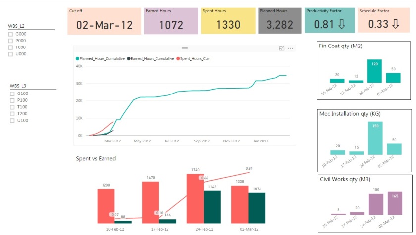
This video gives an insight into the key capabilities of the dashboard. Having the ability to seamlessly review schedule activities, and how these contribute to the overall progress and forecast, is invaluable.
The ability to quickly dive into your schedule, without having to deal with the confines and limitations of your actual scheduling tool are also key features.
Part 2: The Excel Feeder Sheets
This highlights a simple Excel feeder sheet. Too often the time phased data that our schedules produce are not easily accessible in a digital format. I have built an excel file around a typical structure that project controls deals with. This structure will lend itself nicely to the steps that follow in converting the into a database format.
Part 3: PowerBI PowerQuery
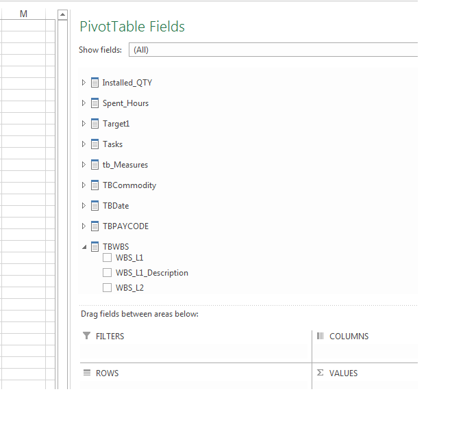
Here we import the data from the Excel feeder sheets into the PowerBI platform. The use of PowerQuery is so embedded with the way PowerBI works. The steps you need to follow here are the similar to the steps you would need to follow in inserting the progress and schedule data into any formal data structure. The way we think about data is sometimes not compatible with the format that databases need. This is specifically around the need to “unpivot” time phased data.
Part 4: PowerBI Measures and Dax
With all the data now structured and available to PowerBI, we need to now dive into the use of DAX to create Measures. A perfect example in the use of measures is in the generation of progress curves.
What might seem line a straight forward approach to drawing simple progress curves, is in fact (within the realms of PowerBI) not that simple. However, if you follow a logic approach and know what calculations are needed, the world is your oyster.
Part 5: Integration of JIRA and Agile Methods
In the (as of now) final installment of this series, I showcase a way in which we can integrate our PowerBI dashboard with a JIRA project. This approach is completely different from what you might expect. I don’t want to put a PowerBI dashboard ontop of my JIRA task list. I want to put a JIRA task list on top of my schedule.
The purpose of the dashboard is to extract the SCHEDULE data from the scheduling tool. When variations to prior forecasts occur, or where further detail is needed, we are often constrained because pictures, running commentary and discussion about each activity is not something that resides in our schedule. However, we can use JIRA to easily capture those elements and use our PowerBI dashboard and a linking tool to integrate everything together.
The Future: ???
There are still a lot of features and extensions that I have yet to formally discuss. The next steps are likely going to be a showcase of a SQL Server backend for this data. There is a lot of information that is missed in the way this dashboard imports data (specifically past budgets). Therefore visibility into changes is restricted.
Another interesting feature is the use of saw tooth graphs when budget changes occur. I have a clear vision for how this is possible, and in a professional capacity have implemented it. To achieve this, while you won’t achieve a discontinuous graph, it will calculate your % based on a variable budget. For this, you need to setup another tab on the excel feeder which instead of tracking the earned per week per activity, it will instead track the BUDGET for each activity at each cutoff. With this data element now in your data, you just change the denominator calculation.
In general, the way in which dashboards and data are embedded into our work processes, is a field ripe for growth. It is also an endeavor that can greatly increase the visibility into project controls data and can also bring teams together using integrated tools like JIRA. As such, the future is bright and where we should always have half an eye looking.