Google Data Studio is a new reporting service from google, it is still in beta, has rudimentary capabilities compared to established players ( PowerBI, Tableau and Qlik) and can be very slow, yet it has two killer features, it is free, with amazing sharing options.
Google business model for this product is very simple, the visualisation layer is free, but the preferred data source is BigQuery which is a paid product, but other source usage are free.
In the last two months, I have been experimenting with the product, I never managed to make it produces any meaningful charts, that was my mistake as I was thinking from a semantic model background, which is not valid here.
Data studio do not support multiple datasets, you can use multiple datasets in the same reports but not in the same chart, but you can filter multiple datasets using a common dimension, when solution is to create a master datasets that combine all the tables, if is the same concatenate table used in Qlik.
Now if you have a data workhouse you could simply write an SQL query to combined all the dimensions you want to report on, I don’t, so I will use what I have PowerBI desktop !! You can use R studio too, or any data management solution you are familiar with.
So the approach is build a data model in PowerBI desktop, Query the model using Dax and export the result to CSV, then load the CSV to Data Studio and share the report, Data Studio is only used as reporting service.
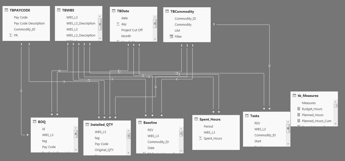
1- I will use this datamodel.
2- And use this query to extract the dimensions and measures I want to report on
EVALUATE

VAR Earned_Table =

FILTER (

ADDCOLUMNS (

SUMMARIZECOLUMNS (

TBPAYCODE[Commodity_ID],

TBCommodity[Commodity],

TBWBS[WBS_L3],

TBDate[Project Cut Off],

"Budget", tb_Measures[budget_hours],

"Period", tb_Measures[Earned_Hours_Period],

"Cumulative", tb_Measures[Earned_Hours_Cumulative]

),

"TYPE", "Earned"

),

MIN ( TBDate[date] ) <= [Cut off]             && MIN ( TBDate[date] ) >= DATE ( 2012, 1, 1 )

)

VAR Plan_Table =

FILTER (

ADDCOLUMNS (

SUMMARIZECOLUMNS (

TBPAYCODE[Commodity_ID],

TBCommodity[Commodity],

TBWBS[WBS_L3],

TBDate[Project Cut Off],

"Budget Hours", tb_Measures[budget_hours],

"Planned Hours", tb_Measures[planned_Hours],

"planned Hours Cumulative", tb_Measures[planned_Hours_Cum]

),

"TYPE", "Planned"

),

MIN ( TBDate[date] ) >= DATE ( 2012, 1, 1 )

)

VAR Spent_Table =

SELECTCOLUMNS (

FILTER (

SUMMARIZECOLUMNS (

//TBPAYCODE[Commodity_ID],

//TBCommodity[Commodity],

TBWBS[WBS_L3],

TBDate[Project Cut Off],

"Budget", tb_Measures[budget_hours],

"Period", tb_Measures[spent_Hours_Period],

"Cumulative", tb_Measures[spent_Hours_Cum]

),

MIN ( TBDate[date] ) <= [Cut off]                 && MIN ( TBDate[date] ) >= DATE ( 2012, 1, 1 )

),

"Commodity_ID", BLANK (),

"Commodity", BLANK (),

"wbs_l3", [WBS_L3],

"TBDate", [Project Cut Off],

"Budget Hours", [budget_hours],

"Planned Hours", [planned_Hours],

"planned Hours Cumulative", [planned_Hours_Cum],

"Table", "Spent"

)

RETURN

ADDCOLUMNS (

UNION ( Earned_Table, plan_table, spent_table ),

"Data_Date", IF ( [Project Cut Off] = [Cut off], 1, 0 )

)
Basically I am using union to concatenate the values for Earned Hours, Planned Hours and spent Hours, I added a column type to distinguish between the different tables and in the case of spent, I assign the value blank for Commodity_ID and Commodity as the measures don’t have the same granularity.
I added a column ‘Data_Date” so I can filter only the dates where it is equal to the cut off.
3-Load the CSV

If a field aggregation is none, then it is a dimension, otherwise it is a metric (measure), now, there are some functions to do calculations like sum, average but it is not DAX, it is really limited.
As an example for the measure Planned Hours = SUM(CASE WHEN REGEXP_MATCH(TYPE, ‘^Planned.*’) THEN Period ELSE 0 END)
4-build the report

You can view the report here , and the datasets here , (sorry does not support internet Explorer, Only Chrome, Firefox, and Safari, Internet Explorer works now, although not officially supported)
Personally the most interesting aspect of Data Studio is the integration with Google Drive, the reports you build will show in your Google drive and you can organize them in different folders, for example then you can group reports by departments, shop etc
I think it has potential, they got the sharing right, now they need to add some basic features ( pivot table, controlled cache ….) , and more options in the calculated field formula, ( hint return null for example is not supported, ok there is a workaround, Just create Metric*Metric/Metric, if it is 0 then it is an error, GDS return null in this case) and you will have data visualisation for the masses.
