In a previous blog, I showed how to use PowerBI to generate high quality print maps, with a caveat that the R script does not work in the Service unless all the packages are supported (the desktop use your local R install, so no limitation here)
I am a huge fan of ceramic, for me it shows the best of R philosophy, it does one thing and do it very well, you give it coordinated and it will give you back raster tiles.
I spent some time trying to figure out a workaround to make it works in the service and I found this trick.
- Generate raster using ceramic outside PowerBI ( using Rstudio for example).
- Save the raster object using saveRDS but using the option ASCII = TRUE, so it is a text file, notice you need to write version = 2, otherwise it will not work in the service.
- Load the file into PowerBI using PowerQuery
- The maximum data you can pass to R visual is 150K rows, which is not enough for my use case.

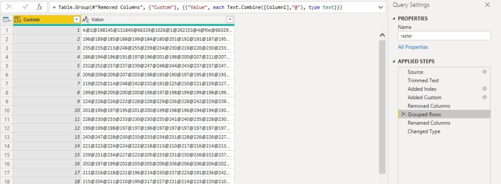
- The trick is to group the data using concatenation, the limit is the number of rows not the number of columns :), please note the maximum number of length of a text value is 32766
Merge the table for the raster with the table of data (coordinates, attribute etc), unfortunately, you can pass only one dataframe to R script, I changed to append so the visual can be sliced

- Now you have a dataframe with the coordinates and a raster data which you pass to R Visual script

- Unest the raster data into a dataframe, notice the dataframe holding the raster data is 1 Million rows

- Save the dataframe to a “raster.rds”
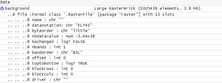
- Load the “raster.rds” and it is R Magic the raster is alive

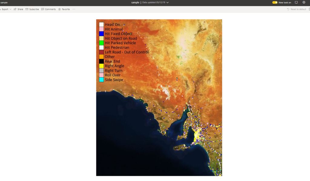
- Plot the map ( it is on the PowerBI service not the Desktop)


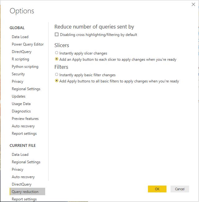
you can filter the status and hide the tiles if you want, as it is slow to render in the service, please use query reduction option in the filter

This workflow does works with any R object, not only Raster but any binary data can be passed to PowerBI data model.
All the codes are saved here.
I think the main take away is you can circumvent PowerBI limitation of 150,000 rows when you pass data to R or Python, but there is a trick, the resource available in the PowerBI Pro instanced are limited and not documentation, so your mileage may vary , but it is worth the try
now, you may ask, why bother with this tedious, slow visual, the answer is very easy, in some cases you want to control the exact look of a map, and R give you just that, you can show multiple layers, text, it support more than 30 K point in a map, it is worth the pain
edit : I just noticed that PowerBI cache the visual output , if you do the exact selection again, the visual show instantly !!!

I was able to reproduce this interesting approach. While it does work on the desktop, it is far too slow in the service ( > 1 min).
Anyway, my problem is, it is not sliceable (eg by crash type). Neither in the service nor on the desktop.
Error Message: An exception of type Microsoft.PowerBI.ExploreServiceCommon.ContainPIIException occurred.
I’m not familiar with R. Is that a PBI or an R problem?
LikeLike
check please the new pbix file, now you can filter and even hide the tiles if you want
LikeLike
Thanks! Online slicing now takes 30 sec with the background map, and only 15 sec without. If cached, it truly is instantly.
LikeLike
yeah, thanks, 30 seconds is still too long, I can’t understand why the PowerBI service is so slow,
LikeLike