
In this blog, I will present a workflow, I have been using for the last 2 years with a rather a good feedback.
Obviously, I like interactive Dashboard, I want everyone to login to the PowerBI service and start doing their own analysis, but to my dismay, not everyone is interested in doing that, a lot of users want only a report that they can print. A took me a while to understand that that there is nothing wrong with that, and in a lot of use cases, a printed report is the best medium to convey information.
in my case, we do a lot of maps, and users want print quality maps, and because the data change daily, you need automation.
In previous blog, I wrote how to integrate PowerQuery with R, in the current blog, I will show how to generate multiple pdf with a customized map, by using R custom visual.
The PowerBI team has done a fantastic job, all you have to do is add the R script visual, add the fields you need, which automatically create a dataframe and write your code, and with one click, you can edit your code in RStudio!!!
Rstudio Integration works by creating a temporary csv file that hold the dataframe data

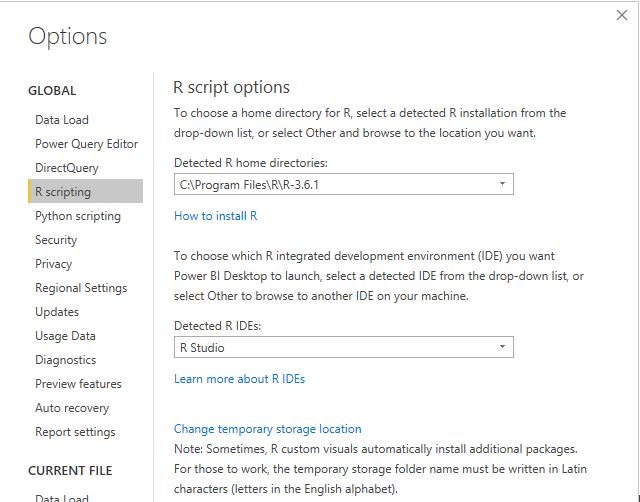
I personally prefer RStudio, but you can use any IDE
There are two caveats though
- The dataframe has a maximum of 150k rows.
- When you work in the desktop, it will use your R installation, all packages are supported, but when you publish to the service only the packages in this list are supported
(ceramic is not supported, I think packages that downloaded external data are not supported), I found a workaround
Let’s generate some maps.
I am using the excellent package tmap for the mapping, you can customize any aspects of the map, layout, Text Size, legend, titles, it is really an amazing product and show the power of R, for tiles I am using ceramic .
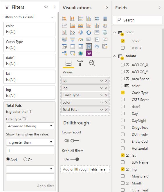
you need a Mapbox token (their free tier is very generous), I will use South Australia car crash data as an example.
- Fatalities >1
No code just adds a filter in the visual
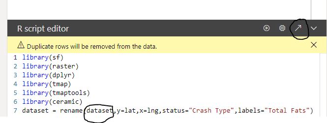
The code
library(sf)
library(raster)
library(dplyr)
library(tmap)
library(tmaptools)
library(ceramic)
dataset = rename(dataset,y=lat,x=lng,status="Crash Type",labels="Total Fats")
dataset$color <- as.character(dataset$color)
dataset$labels <- as.character(dataset$labels)
map <- st_as_sf(dataset, coords = c("x", "y"), crs = 4326)
Sys.setenv(MAPBOX_API_KEY =”get your own key")
background <- cc_location(map)
dataset[dataset==""] <- NA
new_DF<-filter(dataset, !is.na(labels))
map1 <- st_as_sf(new_DF, coords = c("x", "y"), crs = 4326)
chartlegend <- unique(dataset[c("status", "color")])
m2 <- tm_shape(background)+
tm_rgb() +
tm_shape(map) +
tm_symbols(col = "color", size = 0.04,shape=19)+
tm_shape(map1) +
tm_text(text="labels",col="white")+
tm_add_legend(type='fill',labels=chartlegend$status, col=chartlegend$color)
tmap_save(m2, "C:/Users/mimoune.djouallah/pdf/happyValey.pdf",width=3508, height=4961)
m2
- Copy the same custom visuals and just change the filters
Here we go
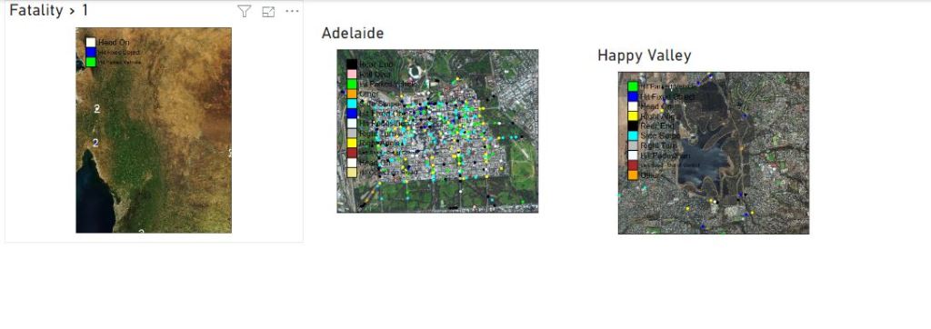
Best part the pdf files

Now you can share those files per email or save it in a shared folder. the map show only dots, but you can load polygon if you need to, see this blog for further details
You can download the pbix here, you need R to be installed, and your own Mapbox token.
