In a previous blog, I showed how to load a raster tiles into PowerBI data model, in theory that should solved all my issues with doing a detailed maps in PowerBI.
unfortunately, no, even if R and Python visual support up to 150K points, the reality is the implementation of R in the PoweBI service has a massive overhead and you can’t do anything about it, as it is literally a black box, all you can do is try to reduce the data passed to R visual and hope it works.
Actually, in my case, the visual did not even show up and I got an error message that resources are exceeded
I am in a situation where I can’t filter data because the whole point of the visual is to show all the data, at the same time, if the visual does not work in the service then there is no point in the whole exercise.
The trick is using wkt, I will simplify the geometry without losing any visual data, for example:

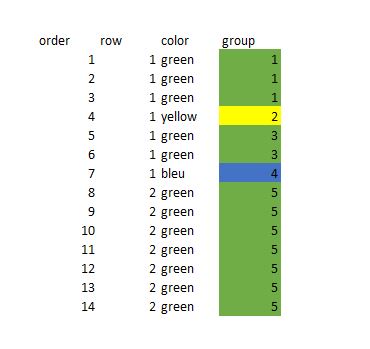
Instead of showing all the points, I will just group the points in the same order and colour as a line, as you can see from 14 rows of data, it is reduced to 5 rows, and the visual representation is the same, it is like sampling, but we keep the exact shape of the data.
Now in PowerBI, all we need to do is to automatically group those points together, turn out the solution was very easy using Rankx, keep in mind the wkt is dynamic for every update, I get a new geometry
After that I just added some calculated columns to create the wkt format
For a point, POINT (X Y)
For a line, STRINLINE (start_X start_Y,finish_X finish_Y)
Keep in mind you can create polygons too, but the DAX become more complex (maybe for another blog)
you can create the wkt file in QGIS very easily but as my data change daily, it was not practical
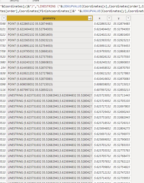
And here is the final result
The number or rows were reduced from 3528 to 218
That make a massive difference in PowerBI service, my real data is 58K rows and I can’t tell how much I was happy when finaly it worked in the service,not only that, but the total rows using wkt keep decreasing when I do more updates 🙂
There is a catch though, unfortunately as of Dec 2019, only R and Python script can render wkt geometry, there is a new custom visual by @james dales, but it is in a private beta and has some limitation on colors by category. ( icon map support color per category now)
You can download the pbix file here
I hope that in 2020, Microsoft invest more on improving the Maps offering in PowerBI , and optimize R and Python scripts on the service, I am very optimistic
with the new ICON map my use case is fully solved 🙂
