Digital Strategy is an enabler to allow you to tackle problems, however, unless you have a clear vision for the required data integration that follows, it doesn’t make a difference what your strategy is. What follows is a worked example that really dives into the heart of where your head needs to be in using the smart technologies that exist today
I’ve previously written some of my thoughts related to Data Integration and Digital Strategy, however, perhaps I haven’t made it absolutely clear what I mean.
Digital Strategy is an enabler to allow you to tackle problems, however, unless you have a clear vision for the required data integration that follows, it doesn’t make a difference what your strategy is. What follows is a worked example that really dives into the heart of where your head needs to be in using the smart technologies that exist today
I’ve created a companion video that allows you to see this in action. The focus to have a user managed data integration layer is just awesome in my mind and allows for a seamless integration experience for a major project.
Commissioning Test Sheets
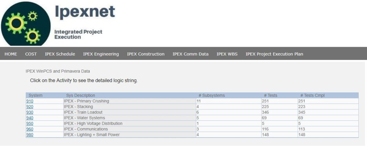
Commissioning Systems View
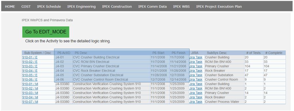
Here is a typical commissioning report. We are looking into the projects key systems. We see the number of subsystems, number of tests and total completed for each system.
We can follow the link on system to view what will will be subsystems
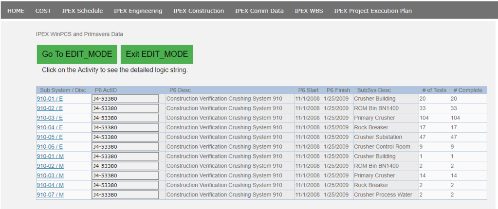
Commissioning SubSystem View
In our subsystem view we are obviously looking a bit in dept, and as we can see, this is our Integration Level. Each Subsystem/Disc pair is linked to a P6 Schedule ID. This is integration. However, we really need to dive into this and understand the process. We have 3 groups
Project Controls
Commissioning
Construction
The commissioning team will be updating our commissioning database, usually by close interfaces with engineering to define all the tests. They will be the hands on users of the commissioning system.
The project controls team will own the schedule, and will be responsible for updating and maintaining the schedule.
The construction team will know the detailed sequencing and duration that would be required.
Obviously each team will have discussions related to schedule and scope, however, your commissioning database is likely NOT updated with P6 IDs. Additionally, and here is the rub, when things change and perhaps more detail is added to the schedule, what is the mechanism for those changes to filter into the schedule. And when the magnitude and status of actual commissioning work changes, what is the mechanism for that information to be visible to the project controls team (in an smart way)
In the above example, all commissioning activities are assigned to 1 schedule ID. This is quite common when schedules are initially developed as projects enter execution. However, when additional detail is needed, it becomes hard to ensure systems STAY INTEGRATED.
Updated Data Integration
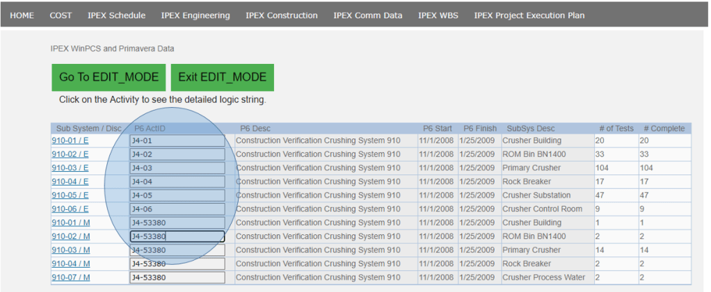
SubSystem EDIT MODE
The biggest weakness I see in many data integration efforts is they do not incorporate the step above. They do not allow edit capabilities into the data integration layers of the project.
In our worked example, we want to update the mapping between subsystems to schedule ID. We have added detailed activities into our schedule (I have left that step off, but imagine you have updated your schedule with additional commissioning activities), but do not yet have that new schedule information available in our commissioning system.
Enter Edit Mode and the world is your oyster. In the above screen we can now update the schedule ID mapping for each subsystem.
Updating the mapping to ScheduleID
Now that we have updated our mapping between our SubSystem / Discipline pairs, we can exit our edit mode and now see what we are left with
Now this is what proper Data Integration is all about. We have empowered our users to be able to flexibly manage their schedule, their commissioning system tree and update the mapping between the 2. Not to mention having everything at the fingertips of everyone involved in the process.
Extensions – JIRA
When we talk about Digital Strategy, we want users to be engaged and empowered to communicate. In the examples above, hopefully it was hard not to notice the “Jira Task” link that was available on the pages. Each of the subsystem discipline pairs is a critical discussion topic and as such deserves a Jira task page. This allows the team to openly discuss requirements and status. Indicate blocking tasks and interfaces (both preceeding and after completion of the task) is vital information.
Again, we want our users empowered to manage and communicate information on the project. This example really blows down barriers that I have seen. It is my passion to push the boundaries in the way we execute project. It is my passion to engage people and extract their knowledge as best as possible. Never before has technologies been so readily available to achieve these ends and I am really looking forward to seeing our business embrace some of my passion.
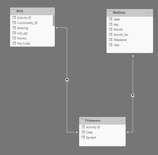
whenever I need to join Primavera Activity id to the quantity measurement system, I use this pattern, it did serve me well all those years, recently I started a new project where for the first time, I don’t get an extract using Excel but a proper live connection to SQL server 🙂
To get something quickly running, I started using the same approach, load Primavera export, unpivot the date and normalize it, every activity has a spread from 0 to 100 % then merge it to a Table from SQL server, all working as expected.
Although it works well, it is a bit clunky , specially that the export from Primavera does not change frequently, for the baseline maybe once a year and the forecast once a month, so instead of merging the data using Powerquery, I loaded the Primavera data as a separate table, here what the model looks like
As you have guessed the Activity id is duplicated in both tables
Now the Metric I am looking for is how to spread the budget hours from the table BOQ using the spread ( 0-100 %) from Primavera, let’s say I filter 1 row from the BOQ the result should be something like this
As it is multiple to multiple if you simply multiply the hours X spread you get duplicate values
I checked with the old model and all the results match, to be honest I am not a huge fan of multiple to multiple but in this case, it is worth it, less refresh time and got rid of two big tables.
I have recently been developing a series of videos that highlight the key features utilized in a progress and schedule dashboard. The videos showcase the capabilities of PowerBI dashboards in the Project Controls space. I have not seen dashboards effectively used in this way and want to share the valuable knowledge.
I have recently been developing a series of videos that highlight the key features utilized in a progress and schedule dashboard. The videos showcase the capabilities of PowerBI dashboards in the Project Controls space. I have not seen dashboards effectively used in this way and want to share the valuable knowledge.
This series is not meant to be a step by step guide. There are subtleties about this demo that may cause difficulties in the production environment. I would simply recommend you share this with your development team and discuss the pros and cons of your approach. Oftentimes, a more straight forward approach is more valuable when compared to endless development polishing an inferior product.
Part 1: The Showcase
This video gives an insight into the key capabilities of the dashboard. Having the ability to seamlessly review schedule activities, and how these contribute to the overall progress and forecast, is invaluable.
The ability to quickly dive into your schedule, without having to deal with the confines and limitations of your actual scheduling tool are also key features.
Part 2: The Excel Feeder Sheets
This highlights a simple Excel feeder sheet. Too often the time phased data that our schedules produce are not easily accessible in a digital format. I have built an excel file around a typical structure that project controls deals with. This structure will lend itself nicely to the steps that follow in converting the into a database format.
Part 3: PowerBI PowerQuery
Here we import the data from the Excel feeder sheets into the PowerBI platform. The use of PowerQuery is so embedded with the way PowerBI works. The steps you need to follow here are the similar to the steps you would need to follow in inserting the progress and schedule data into any formal data structure. The way we think about data is sometimes not compatible with the format that databases need. This is specifically around the need to “unpivot” time phased data.
Part 4: PowerBI Measures and Dax
With all the data now structured and available to PowerBI, we need to now dive into the use of DAX to create Measures. A perfect example in the use of measures is in the generation of progress curves.
What might seem line a straight forward approach to drawing simple progress curves, is in fact (within the realms of PowerBI) not that simple. However, if you follow a logic approach and know what calculations are needed, the world is your oyster.
Part 5: Integration of JIRA and Agile Methods
In the (as of now) final installment of this series, I showcase a way in which we can integrate our PowerBI dashboard with a JIRA project. This approach is completely different from what you might expect. I don’t want to put a PowerBI dashboard ontop of my JIRA task list. I want to put a JIRA task list on top of my schedule.
The purpose of the dashboard is to extract the SCHEDULE data from the scheduling tool. When variations to prior forecasts occur, or where further detail is needed, we are often constrained because pictures, running commentary and discussion about each activity is not something that resides in our schedule. However, we can use JIRA to easily capture those elements and use our PowerBI dashboard and a linking tool to integrate everything together.
The Future: ???
There are still a lot of features and extensions that I have yet to formally discuss. The next steps are likely going to be a showcase of a SQL Server backend for this data. There is a lot of information that is missed in the way this dashboard imports data (specifically past budgets). Therefore visibility into changes is restricted.
Another interesting feature is the use of saw tooth graphs when budget changes occur. I have a clear vision for how this is possible, and in a professional capacity have implemented it. To achieve this, while you won’t achieve a discontinuous graph, it will calculate your % based on a variable budget. For this, you need to setup another tab on the excel feeder which instead of tracking the earned per week per activity, it will instead track the BUDGET for each activity at each cutoff. With this data element now in your data, you just change the denominator calculation.
In general, the way in which dashboards and data are embedded into our work processes, is a field ripe for growth. It is also an endeavor that can greatly increase the visibility into project controls data and can also bring teams together using integrated tools like JIRA. As such, the future is bright and where we should always have half an eye looking.
A short commentary on my personal view of the 5 key digital practices promoted by McKinsey
For me, value is generated out of simple smart execution of our projects, but looking back into the feasibility studies and at the delivery of engineering HUGE gains can be had. I think McKinsey hits a lot of key issues, but perhaps missed the point of WHEN in the project lifecycle specific practices can be best employed
Understanding where value can be unlocked and realized, in the construction focused digital transformation space, is still elusive. Companies are making huge strides, mostly on backend support services such as HR and general employee services, such as online training, however, I personally do not believe these areas are where value is created. It is more an issue where cost has been eliminated as opposed to value creation.
For me, value is generated out of simple smart execution of our projects. When we can arrange for a pump to be installed right off a truck onto a foundation, have a mechanical crew available to commence work on it, and know that pump is on a critical path towards project completion: that is where we realize value. When we can realize that differing rates of installation (linear planning), will force certain commodities to be the pivotable drivers to our schedule, understanding that delaying the commencement of later activities is actually a value adder due to the efficiency gains (or re-arrange your area handover to complete some areas without having to wait for everything). These are obviously simplistic examples: but, we need to be grounded, and understand the problems we face, and be clear on where digital transformation can support solutions to these problems.
In the realm of lightweight digital strategy, my series on the subject hit some good points
In the realm of Project Management, I think the use of AGILE and the tools that have spawned from the Agile revolution will play a part in smart digital transforamtion
However, if we expand to a much broader topic, I think turning to companies like McKinsey is a good place to start. One of my favorite documents on this subject is
The 5 Key practices outlined by McKinsey to capture the full value of digital initiatives:
Focus on fixing pain points, not installing IT solutions.
Implement digital use cases that promote collaboration.
Reskill and restructure engineering teams.
Adjust project baselines to capture value.
Connect projects to unlock impact across the enterprise
In my world or project controls, we perhaps interact with these practices in different ways. What follows is my personal take on these topics and what they mean to me and how I believe we can embrace them to extract value from digital transformation
Understanding FEL and where value exists
Before I really begin to discuss each item, what I really want to bring to the table here is the concept of WHEN. Major construction projects all operate under some sort of front of loading process
Most value gained in project development is during the FEL Stages. As I primarily work on the execution project management side of things, my perspective on what is valuable to me in the exuection space is different. Therefore understand that way you embrace the 5 practices will be a function on where you are at in the FEL process for a specific project, and your overarching project development lifecycle for what may be a variety of projects
Some of the practices (my personal belief) are more geared towards early studies, while others are more geared towards Execution. Below is my quick take on what practices are relevant to consider in each stage of your project development. This is more a strawman for discussion, and exactly why I write these blogs – to try to stimulate discussion on these topics.
The first 2 topics are in my view, more applicable to the execution environment. As such I have some good perspectives and existing material on them. The remaining are more study focused.
FEL1
FEL2
FEL3
EXE
Focus on fixing pain points, not installing IT solutions.
0%
0%
20%
80%
Implement digital use cases that promote collaboration.
0%
0%
20%
80%
Reskill and restructure engineering teams.
80%
20%
0
0%
Adjust project baselines to capture value.
0%
50%
45%
5%
Connect projects to unlock impact across the enterprise
80%
20%
0%
0%
With that, lets now jump in and unwrap what each of the 5 key practices mean to me.
Focus on fixing pain points, not installing IT solutions
A few years ago, I was called in to a project to assist in the implementation of EcoSys. I have a good amount of experience with cost systems and it was nice to know someone could lean on me help them install their new “IT Solution”.
However, immediately, it was apparent the initiative was doomed to fail. The issue was exactly what McKinsey indicates – the company was not focused on the “pain points”. For this particular project, visibility into the build up of a specific contract final forecast cost (FFC) is the day in day out function of the cost team. However, that build up of data is not easily managed inside EcoSys. Creating “detail items” for each site instruction, when you have 100s of site instruction on each contract, and 10 major contracts – and that is only the cost need for site instruction – you quickly realize that information needed to be managed elsewhere.
Obviously the project already had an existing, more bespoke, system that allowed them to manage the build up of the contract FFCs. So, installing a new tool that just extracted the bottom line number from one system and consolidate it – was of no value to the project. Quite the contrary, extra work is required each period to now update Ecosys with summary level data. Now, as part of another key practice (Connecting Projects), having access to enterprise wide data is important; however, I would query where the value add is before pursuing that option.
My video on EXCEL Hell is a good primer on where you can look for understanding where PAIN POINTS exist
So, I can’t stress enough, before you begin pursuing a digital transformation, look at what you are doing and dive into the “PAIN POINTS”. More often then not, when you start looking into the weeds, you realize that a specific IT solution might not be the silver bullet.
Implement digital use cases that promote collaboration.
I am a huge proponent of collaboration. In the McKinsey position, they focus on interdisciplinary interfaces. In the project controls world, this is our bread and butter. We constantly need to get information from Engineering, Procurement, Contracts and all functions and merge this all into a manageable project management framework – either being the schedule, specific management plans, or our estimate and cost forecasts.
Anything that can positively influence collaboration as opposed to simply forwarding emails and excel files, is a huge win-win.
I have discussed my position of trying to implement a tool such as JIRA. I have a key quote
“how do we interact as a TEAM”
That concept is a core premise – dive into how your project interacts. Look at how information and data is shared. Who edits what- how – where does it go – what does someone do with it?
So when we look at collaboration and implementing a specific solution for a use case, ensure that use case touches many people in different functions. From that, if you are successful, that will immediately leverage you for future wins
Reskill and restructure engineering teams.
I can’t stress enough, real VALUE on construction projects is delivered by ENGINEERING. Although, value can be retained via efficient execution, truly innovative approaches and step changes in value have to be driven by ENGINEERING.
A clear example we have seen in the past few decades it the use of Modular construction, and focused Pre-Assembly. This is not specifically new, but is not perhaps as embedded into our culture to keep driving the limits for what is possible.
To achieve gains, your engineering team needs to be at the forefront of technology. You need to empower your engineering teams to constantly venture out into the real word and see what everyone else is doing and to not be afraid to mashup something they see elsewhere and try new things. The risk adversity of owners oftentimes restricts this. So, you need to be careful implementing new ideas, no question there.
All I can reference here, is perhaps the way TESLA has designed and engineered their cars. There application to smart control systems on cars is revolutionary and now makes every other car made look anachronistic. You only get that solution by engaging an engineering team willing to think outside the box.
A critical aspect of engineering teams, is the need that there is negative value into trying to implement restructuring of engineering teams during Execution. Or at least, if you do truly pursue that approach, you have de-facto moved your project OUT of Execution and back into a study phase. Again, always having a clear mindset in where you are in your project development cycle is critical in how you make decision and interact with digital solutions.
Adjust project baselines to capture value
One of the most important terminologies in the planning world is DRAG. DRAG is the opportunity that a project has in pulling back the critical path until a secondary sequence of work becomes critical.
When a change in execution caused by smart digital tools impacts the critical path, you are limited by your DRAG. Past that point, further gains are no possible (without also changing something else). Therefore, the balance between smart execution and reality need to be constantly played off each other.
Another aspect that is key in this practice, is that we need to perhaps understand where this adds value. In the FEL 2&3 phases, or perhaps better known simply as the feasibility studies, this is where baseline development occurs. Thus, this is exactly where you want to dive into how digital solutions can impact the execution of a project. In my initial example of seeing clearly the linear quantity limitations a project might have. Making decision that either increase a productivity rate, or split the project into more access points needs to be done duration a study phase to add value. Opportunity exists to extend this concept into execution, but careful management of changes in execution would be needed.
Connect projects to unlock impact across the enterprise
Executing a true program of work is the nirvana of every project. I have seen clients are limited in their abilities to run a program of works (outside the government sector). Often times instead, you have competing owners executing competing projects at the same time.
Personally, this practice might be better replaced with concepts or partnerships and teaming arrangements to perhaps unlock value among an industry, not just 1 company. McKinsey makes specific reference to:
consolidating cost and schedule data from multiple projects and business units to increase the accuracy of bids for future tenders, thereby increasing the margin
gaining an enterprise-wide view of resources to optimize resource loading and respond quickly when project demands change
creating central repositories for designs at the element, package, and project levels so those designs can be repurposed on future projects
Consolidating cost and schedule data: Reference Estimate data is a “great to have”; however you will be again limited. Good estimate data will likely reside OUTSIDE your company and a better practice is to have closer alignment with delivery partners.
Enterprise view of resourcing to adapt to changes: Again, project are delivered by a much wider matrix of differing companies. Aligning resources is something I always hear discussed, but have never seen in practice. Here to, a better practice is to have alignment with delivery partners. Only when you can act as an industry team, can this happen.
Central repositories for designs: This is something that I don’t feel is notable. Obviously it is important and is something every engineering company and client will keep. I don’t feel as as if this really belongs as a novel practice. This is more standard business as usual.
Bottom line is that I believe that a much better practice, as opposed to aligning projects from an enterprise wide view, is to instead ensure better contracting relationships with delivery partners and executing smart engagement to extract value from engineering delivery partners.
Closing Thoughts
Huge gains from smart implementation of digital strategies can be had. With a good framework of practices. I think all effective digital transformation is led by PEOPLE. While we have noted 5 key practices, never loose sight that digital transformation is a direct function of the people involved. Great ideas can fail if not implemented by great people. My view is that the common theme linking successful digital initiatives is people – and communication. In the end, nothing is substitute for plain ole good project management ideals.
When you look at your projects and begin to discuss how digital transformation can positively be implemented, pay close attention to WHEN in your project lifecycle you are. Some initiatives are more focused on what you can do during execution, while others provide value earlier on and are not effective during execution. Having a digital framework to ask key questions as certain points in your project lifecycle is a natural extension to implement these ideas.