Download the file Here, keep reading, if you want to see how it works
There is no industrial standard that define rigorously the levels of schedules, every company has it is own definition, but for the purpose of this post, the level 5 is at the tag level.
From working in different projects, I reach the conclusion that regardless of how much you details your schedule, you will have always some stakeholders that wants to see a more detailed schedule, or wants a different view, some examples:
- The commissioning guys wants to see the construction schedule by subsystem.
- The field supervisor, want his own scope by tag with physical quantity to install.
- PM wants a level 2 by SP and phase ( construction, Precom & Com )
a planning software can easily accommodate those requirement using activities code, you can always make new layout and groups by activity code, but some request are impossible to satisfy unless you start breaking down your activities to the lowest level possible, which I think is counterproductive and may lower the schedule quality if not done properly, and put a lot of pressure on the planners that need to maintain this level of details.
Goal
Taking the “pressure” from P6, but produce multiple Gantt chart report with different granularity to satisfy our customers 😦 Management, client, the guy in the field etc.)
Solution
the solution involve using Excel to mashup the data from Primavera P6 and Cobra and generate Gantt chart and S curve by any grouping possible, notice here how the conversation shifted from ” it will take a lot of work in P6″ to ” tell me how do you want your Gantt chart”.
P6 and Cobra are used as an example, it can be used with any other tools, the data transfer is using Excel files, so anything works as long the proper codes are used, as a matter of fact I don’t have access to cobra at all,all I need is an export.

How it works
Export Resource spread from P6
Export the remaining labor units from P6 per day, the reason to use days, so can group later using different calendar ( week, financial period, calendar month etc.).

Make the export database friendly
P6 spread the data horizontally by default, this format cannot be used as a source for a database, we need to make the date as list.

Now the date are “vertical”, next step generate Forecast_%
Forecast_% = (remaining labor units by day)/ (total remaining labor units)
Here we go

Notice here, the sum of all the forecast % per activity id is always 100%
(1.2 means the field’s data type is decimal)
Now we have a proper Table that we can load to the data model, I used to do a lot of crazy tricks to have the same results using the tradition Excel approach (VBA, formula) but now with powerquery it is one click J
Import the MTO from COBRA
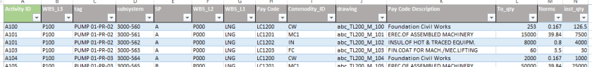
You need the detailed breakdown, no aggregation, with all the dimensions (tags, pay code, subsystems, separable portion, PCWBS L1,L2,L3, weight, etc.), the point is: the MTO will be always more details than P6 and that’s the way it should be. Don’t try to replicate the same level of details in P6, it does not work. (at least that was my experience),
Here is a sample format (dummy data for presentation only, in big project, it can be millions of lines)
Mapping between COBRA and P6
Ok that’s the hardest part, and will not be covered in this post, in Cobra for every line item you need to assign a P6 activity ID, no compromise here, it has to be 100 % done.
Link the MTO to P6 Spread
We use P6 activity ID as the lookup code between the two tables, and again with one click in PowerQuery it is done (try doing a vlookup with a 300 000 line item MTO)


We have now a table that have the level of details of the MTO and the spread from P6

Unfortunately many people still think it is Excel, they miss the fact we are talking about a real database working behind the scene, here an example from an actual project

Generate the dimensions tables
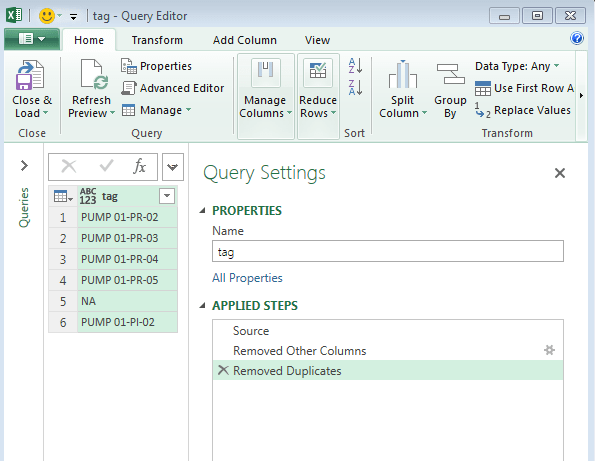
The dimension table is how you want to slice your pivot table (BI people will cry at this explanation), in our case we want a Gantt by tag, subsystem, wbs, drawing etc.
It is trivial to get a dimension table in Powerquery, select a column, remove the rest, and remove duplicate, the key should be unique
Here an example for tag, the rest is the same method.
Link the data in the PowerPivot Data model
Load everything into the data model, and link using the common keys
A simple straightforward star schema

Add measures
Let’s add two basic measures here, forecast qty and forecast hours

The beauty of the measure is that they automatically change, when you add new dimensions to the pivot table, in this case, the formula here is the same as using sum product in Excel (please google the difference between sum and sumx)
Generate the chart In Excel
The Gantt chart will be generated In Excel using Pivot Tables, with conditional formatting to simulate a Gantt chart, the end users can slice and dice as they wish, you can add many combination as you want, and trust me, people will ask for some combination that you never thought about before, the way a field supervisor want to see his Gantt, is not necessary the same as the planner expect a schedule to be organized,
A supervisor want to filter his Gantt by drawing number, go do that in P6?
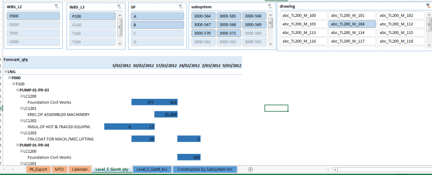
Just for fun, Construction Gantt chart by subsystem

Conclusion
Using PowerPivot as a reporting tool can offload a lot of pressure from P6, and keep the different stakeholders engaged with the schedule as they get customized views.
Keep P6 for what P6 is good at, critical path, date, spend that time on making the logic sounds, the duration that reflect reality and let reporting be done in a better suited tools.
Edit 27-04-2017 : if you don’t have the spread from P6 and all you have is activities start and finish, you can use this approach

One thought on “How to Build a Level 5 schedule using PowerPivot”