Another Short blog on my favorite topic, High Concurrency, Low latency Interactive BI Workload, I can’t test everything, but so far, I am impressed by BigQuery BI Engine and Snowflake on Azure, a reader may thinks, I have an anti-Microsoft bias which is nonsense, I think Microsoft has a different approach, Data warehouse is for storage and Transformation but as a serving layer, you load your reporting tables into a Tabular Model (PowerBI, Analysis Services)
PowerBI tabular model, at a very highly level consists of an analytical Database and a semantic Model, for the purpose of this blog , I am only interested in The Vertipaq database order of magnitude performance, it is not a benchmark, I am just asking a lot of questions, and hopefully start a conversation.
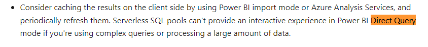
Just a note for readers not familiar with PowerBI, when PowerBI uses Direct Query Mode, it means The tabular Model using the existing semantic Model will send the Queries to the resource system directly and Vertipaq is not used.
What’s the difference between the Three Engines
Although all the three are Columnars Database, They use different tech and implement different assumption, it is a very technical subject and I am afraid there is not enough literature, but from my perspective as a user,I have notice the following.
- BigQuery BI Engine : The Data is loaded from BigQuery Storage to Memory, if the base tables changes, the data is reloaded nearly in near time, Only Column and partition needed for the Query are loaded, it does implement in-Memory compression , but , according to the dev, the engine may leave some columns without Compression for performance reason, I think it is a balance between compression overhead and loading data from the storage as soon as possible (This is my own speculation, I am sure it is much more complex), if the Query is not supported or the data scanned is too Big, it fall back to BigQuery, Mosha has a nice technical Video about the Engine
- Snowflake : I Notice the data can be cached in the local SSD drive, the performance became substantially faster, Although it is not an in-memory Database, I was genuinely Impressed by the performance. ( To honest I don’t know much about Snowflake)
Vertipaq : When the data is loaded from the Disk Storage to memory, all the Model is loaded, it means all the tables and columns, unlike the previous two engine, you can’t load only a subset of the data or only columns needed for the Queries, you have to manually make that selection either by importing only the columns you think you will need initially and the same by filtering a subset of the rows.
Basically, it is another independant copy of the data, and you need ETL process to make sure the data is synchronized between the source Data Storage and Vertipaq Storage, Marco Russo has a detailed Video about the Engine
Note regarding relationship
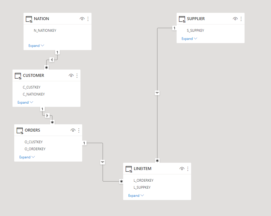
Since I start using PowerBI, I was always mystified by the performance of Vertipaq joins, it is well known, joins are expensive in all Databases, Vertipaq seems to be the exception, initially I started with this Model
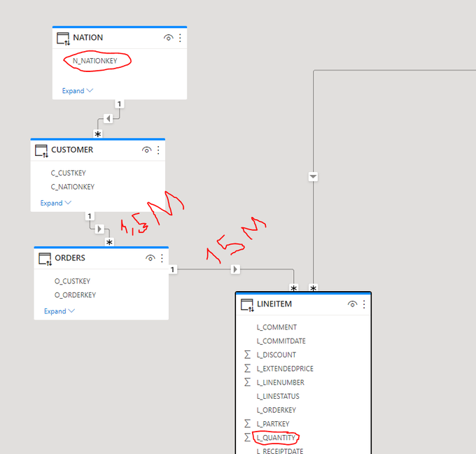
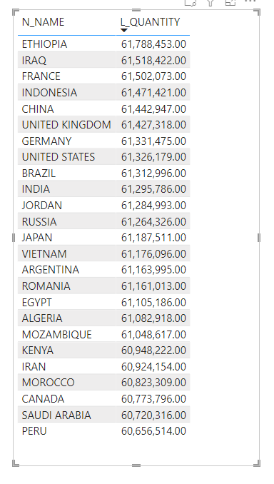
I asked a simple Question, what’s the total Quantity by Country, to get the answer the filter has to traverse some non trivial relationship ( Customer to order, 1.5 Millions distinct value, and then orders to Lineitem 15 Million distinct value)
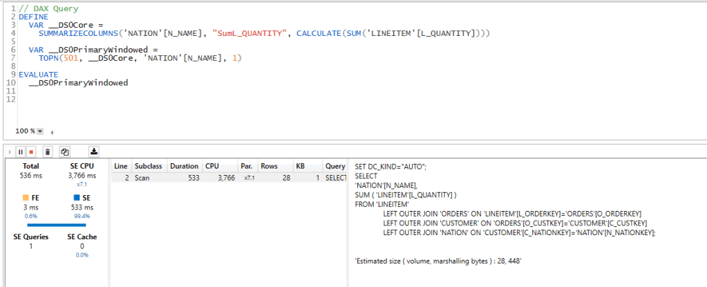
- Vertipaq gave the results in 536ms !!!!
- Snowflake 2.9 Second.
- BI Engine did fall back to BigQuery (4 second), BI engine has a limitation of 5 Million Dim Table
Vertipaq Materialized the joins, I don’t know how an analytical Database can compete with this implementation, but I read that firebolt has something called Join Index ( to be verified, I have not test it myself), anyway here the duration using DAX Studio, it is very fast
Star Schema Model
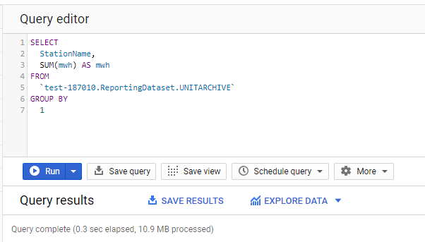
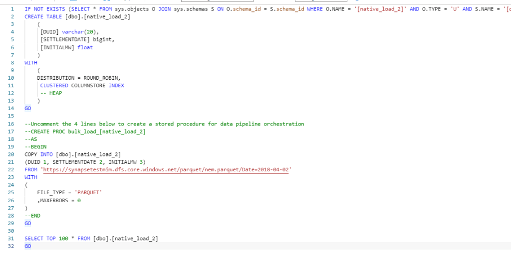
As BI Engine does not support yet a join with more than 5 millions rows, I changed the Semantic Model to a Star Schema, I did join the table order and Lineitem and create 1 wide fact Table, Notice I am using the sample Data provided by Snowflake TPC-H with a factor of 10, the main fact is 60 Millions rows. The supplier is 100K rows and Customer is 1.5 Millions rows.
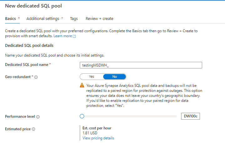
Snowflake is using the x-Small, cost $2.75 /Hour
BigQuery : 1 GB cost 5 cents/Hour
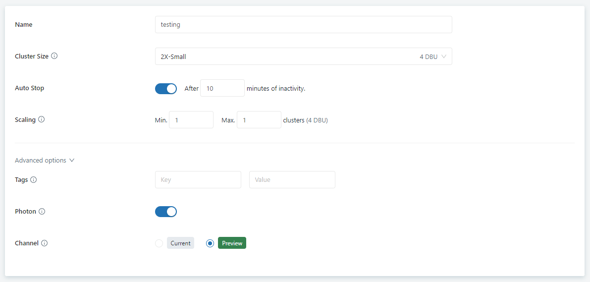
Vertipaq : Using my PowerBI Desktop.

Joins Performance
Using the Start Schema Model, and the same Question, total Quantity sold by country ( I know the metric is not very useful, but I am interested only in performance)
BI Engine : Around 1.8 Sec, I had to Cluster the Table by Custkey.

Snowflake : 1.6 S
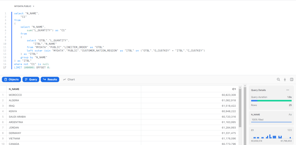
Vertipaq, using Materialized relationship average 52 ms

Vertipaq using runtime joins : Average 8 S
I used TREATAS to simulate a join without a physical relationship ( I hope my DAX is not wrong)
sum_Quantity_Virtual =
CALCULATE (
    SUM ( lineitem_orders[L_QUANTITY] ),
    TREATAS (
        VALUES ( customer_nation_region[C_CUSTKEY] ),
        lineitem_orders[O_CUSTKEY]
    )
)
and here is the results using DAX Studio

Group by using Same Table
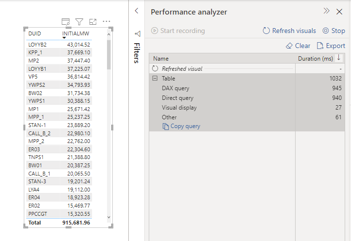
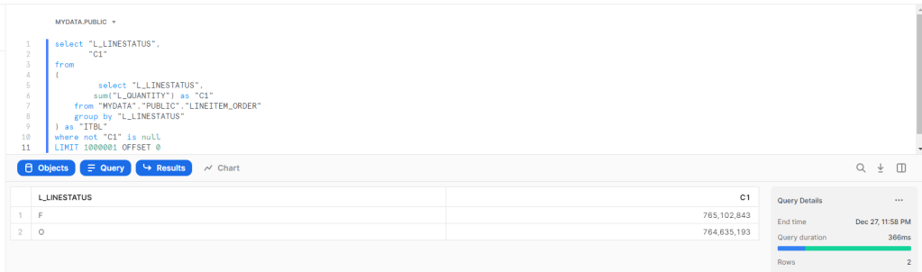
A simple Query, total Quantity by Line Status

BI Engine : 200 ms

Vertipaq : 6.8 ms , yeah, it is not a mistake, and it is not a result cache, honestly I have no idea how it is even possible to get this result.

Snowflake : 366 ms
Takeway
- It is a no surprise, Vertipaq is extremely fast, at least for a small dataset, Analytical Database can’t really compete, Materialized relationship are awesome, but you need to make a copy of your data, usually it is not an issue, until your data is too big or too volatile, Microsoft is aware of this and added feature like Hybrid Table will help
- Another interesting Question, at what Data Size Analytical DWH become faster than PowerBI Vertipaq ?
- This one is my own speculation, Maybe Analytical DWH don’t need to be as fast as Vertipaq, maybe not having to copy data is a bigger advantage than having a response time in less than 100 ms.
- Not all DWH are equal, most of them are designed only for Storage and running transformation which is fine, but there is a new category emerging, and it will compete with Workload traditionally served by OLAP Cubes
- I write only about Tech that I have used personally, but it seems, Firebolt and SingleStore serve the same workload too, my experience with Databricks SQL was a mixed feeling, I don’t think it is fast enough for this workload.
For the kind of work I do, Vertipaq is a Godsend, it is very fast, it tolerate wrong design choices, and for the majority of my workload it is the best solution in the market, and it was battle tested for 10 years, with a lot of real life optimization.
Having said that, it is just a Database competing indirectly with other technology for the same Workload, and some competitors are getting dangerously good.