BigQuery recently introduced two new GIS functions, ST_CONVEXHULL and ST_DUMP
Read the announcement here , when I saw the announcement I already thought about this use case.
The Problem
Although showing map in BI software has improved dramatically in the last couple of years, still unless you use Tableau, there is always a hard limit how much data you can show in a map, even if you can show more, it is better to reduce the volume of data just for performance sake, users are so spoiled those day that they complain when their report does not show up in less than 2 second.
Although the example used here is very specified, I am sure it can be extended to other uses cases.
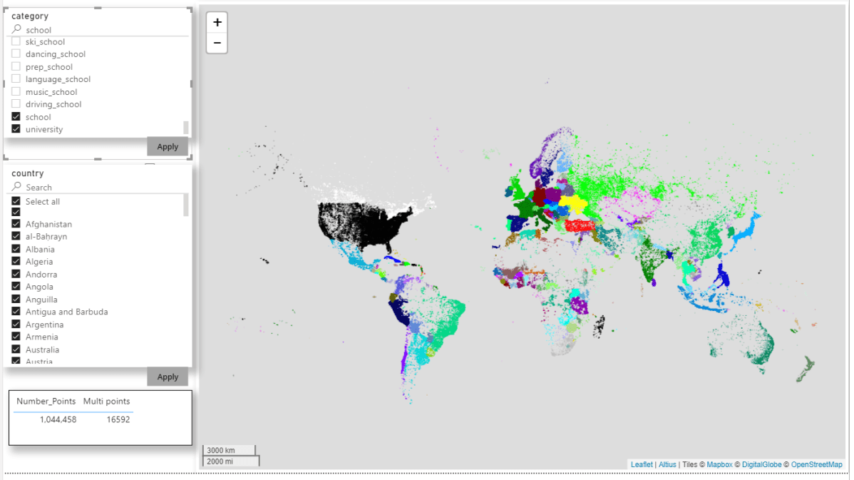
Let’s say you want to show a lot of points with one colour coded attribute, in a lot of cases, the end user wants only to see the distribution of the attribute not the individual points, see here

That’s a lot of points ( my real case is 58 Thousand)
Convexhull to the rescue
Convexhull is very handy the input will be group of points and the output will be a closed polygons, I use it a lot in QGIS, but the killer feature here, because it is SQL and the attribute are dynamic, (in my use case they changed daily), you can write a Query that dynamically generate new geometries, either polygons or linestring or even keep the original points if they can’t be grouped.
Now the trick is we group by status and existing grouping, for example in this dataset.
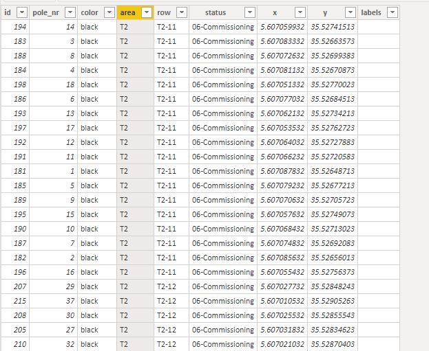
- Check if in one area all the status is the same using count distinct, if in one area it is the same attribute, it will generate a polygons.
- if one area has multiple status and hence multiple colours then fine, we jump to the row level and generate line strings.
- If one line string has multiple colors then we jump to points.
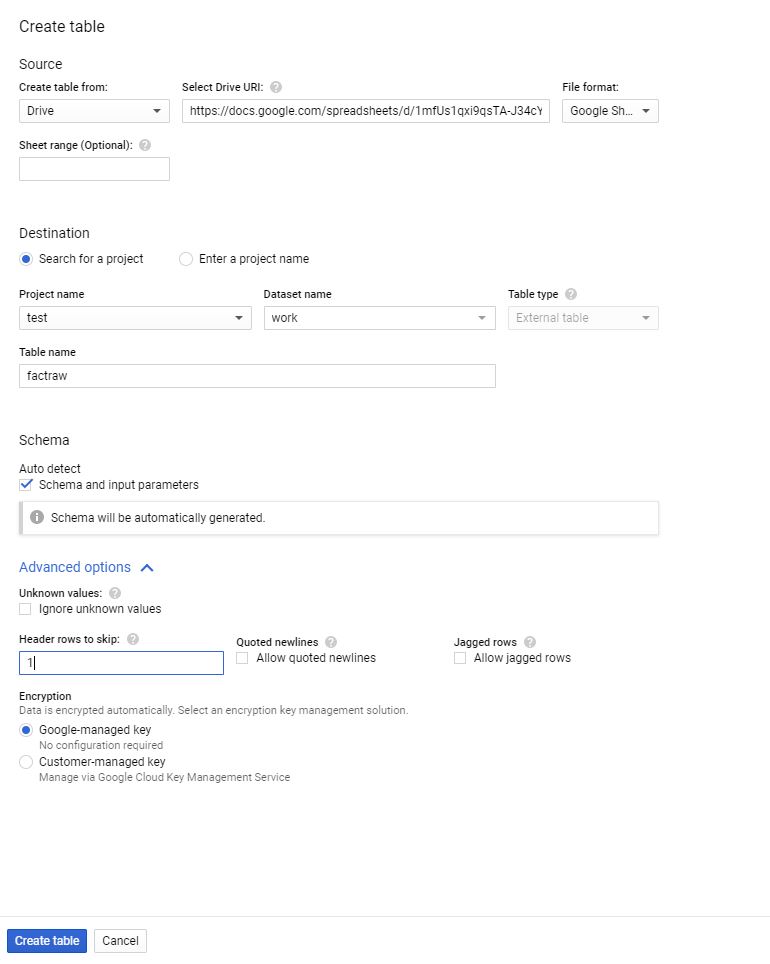
I built this SQL View with the help of Mikhail Berlyant, the source data is here, replace “xxxxx.SolarFarm ” with your table.
WITH
  source AS (
  SELECT
    *,
    ST_GEOGFROMTEXT(CONCAT( "POINT (",x," ", y,")")) AS POINT,
    COUNT(DISTINCT status) OVER (PARTITION BY ROW) AS multiple_status,
    COUNT(DISTINCT status) OVER (PARTITION BY area) AS multiple_status_area
  FROM
    `xxxxxxx.SolarFarm`),
  tt AS (
  SELECT
    id, pole_nr,color,area, ROW,status, POINT,
    CASE
      WHEN multiple_status_area=1 THEN area
      WHEN multiple_status=1 THEN row
    ELSE
    CAST (id AS string)
  END
    AS newgroup
  FROM
    source),
  ff AS (  SELECT newgroup, ST_ASTEXT(ST_CONVEXHULL(ST_UNION_AGG(POINT))) AS WKT
  FROM
    tt
  GROUP BY
    1),
  xx AS (
  SELECT
    tt.newgroup,
    wkt,
    tt.status
  FROM
    tt
  LEFT JOIN
    ff
  ON
    tt.newgroup = ff.newgroup)
SELECT
  newgroup,
  wkt,
  status
FROM
  xx
GROUP BY
  1,
  2,
  3
and here is the result side by side with the original data from 3528 rows to 283 rows, that’s a big improvement,

as of July 2020, Google Data Studio does not support Geometry, and the total number of points is limited to 10K, you can use other custom Visual but currently tiles are blocked.
if you are using PowerBI to view the data, you need to use the excellent Icon Map as it support WKT geometry