At Last Google Data Studio added the option to let the user change the value of parameter, which will make some new scenarios possible, I will try to show some new cases where either it was extremely painful to do, or simply not possible.
In this report, I added some cases where I think it is useful, for this Blog, I will start with a very common scenario
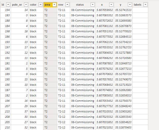
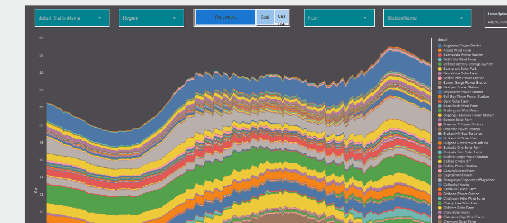
The report Show the Daily Electricity produced in eastern state of Australia, just by Using a slicer, the level of details will change to Region or Technology, or individual Generators
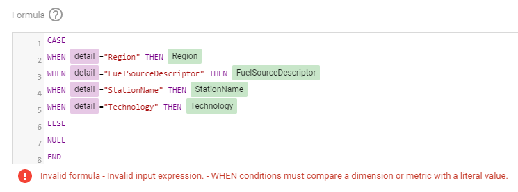
Currently it does not work with parameter in the formula engine,when I tried I got this error ( Nimantha has a solution using Regex which does not require BigQuery, you can see his report here)
Update as 26 August 2020
Riccardo from the dev team suggested a simple workaround,

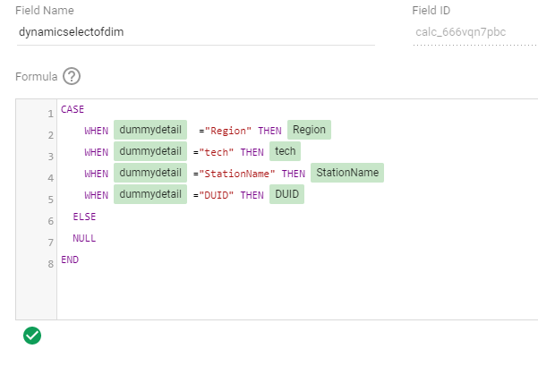
let’s just create a dummy dimension that take the values from the parameter
( I swear, I first tried this before, but it was not working, anyway calculated field in GDS are still a mystery for me)

now you can use it in your calculation
Alternatively you can used a Custom Query from BigQuery, luckily it is accelerated by BI Engine, so it is fast and use the free 1 GB memory provided by Data Studio
SELECT
*,
CASE
WHEN @detail="Region" THEN Region
WHEN @detail="FuelSourceDescriptor" THEN FuelSourceDescriptor
WHEN @detail="StationName" THEN StationName
WHEN @detail="Technology" THEN Technology
ELSE
NULL
END
AS Level_detail
FROM
datastudio.today_view_MT
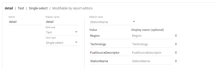
then you added the values to the parameter, notice, you can’t have a list of values from a data source, you have to manually type the values.
now the column “Level_detail” will dynamically switch to column “Technology”, “Region” etc based on the selected value in the parameter Detail
now you add the Parameter “detail” to a filter control, notice Parameter are color code Pink, a nice visual clue !!
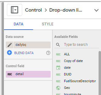
now you use your dynamic column in a visual

and here is the final results
Personally I think it is a game changer for Data Studio, specially when you combine it with the Power of BI Engine, interesting time ahead