NASA Apollo Cost Tracker

Quick how to guide on building my NASA cost tracker.

To follow up a recent video showcasing the NASA Apollo Costs, I wanted to illustrate how easy it is to use PowerBI to generate quick program of works dashboard. If you have several projects following a pipeline of work, some features here might spur some discussions or thoughts on what is possible.

The Data

I have sourced data from a google drive folder

NASA COSTS

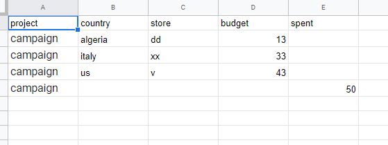
However, like most data you find, the format is not suited to analytics. So a little manipulation was in order. Firstly, I had to create a WBS structure.  Typically, information we find is buried under headers, however for databases, we need to turn group headings into a column data field.

We can see I have inserted a 3 layer WBS structure, plus a company name field. This will allow me the flexibility to add subsequent data to this file from perhaps multiple companies, not just NASA. Again, when you build flexible data structures, the way you can use the structure is much more powerful

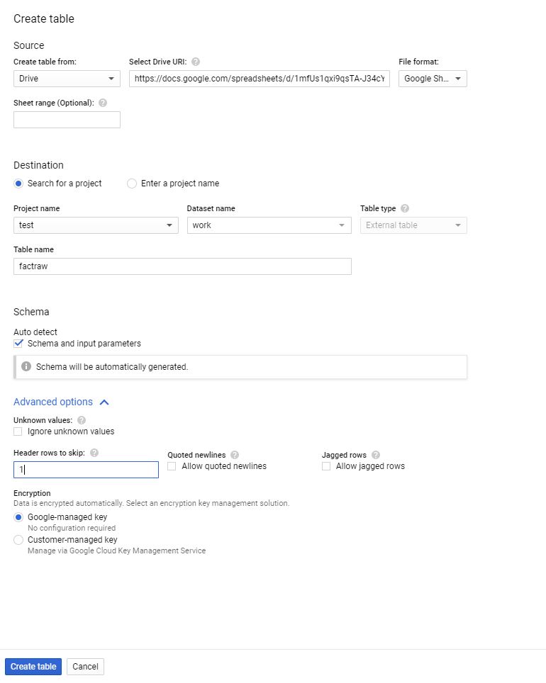
I know that I also want more contextual information displayed on the dashboard beyond simple data. Specifically, I want a description blurb to be viewable on a tool tip, along with a picture. Additionally, I want to display the leading contractor as well. Therefore, I added a few columns to the excel file. When you import the data into PowerBI, the URL needs to be set as a special format of “Image URL”. Took for some time to find that setting: its under “data category” on the column tools tab.

At some point, I will hopefully build out this dataset to include subsequent NASA budgets, and also publish this data through an API that everyone can access. However, there are limitation to what I can do and what I want to do typically far outstrips my abilities.

The Dashboard

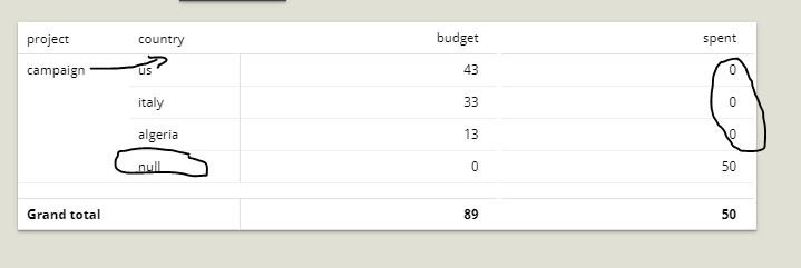
Importing the data is quite straight forward, we do need our usual “unpivot” trick to convert the year information (which is contained inside columns) into row based data. However once that is done, lets look the various parts of the dashboard.

Before I jump into the various aspects of the dashboard, what really gives a dashboard a little polish is the use of a background image. Here is my go to ground image. Just a little playing around with Paint can produce something very valuable to your end product.

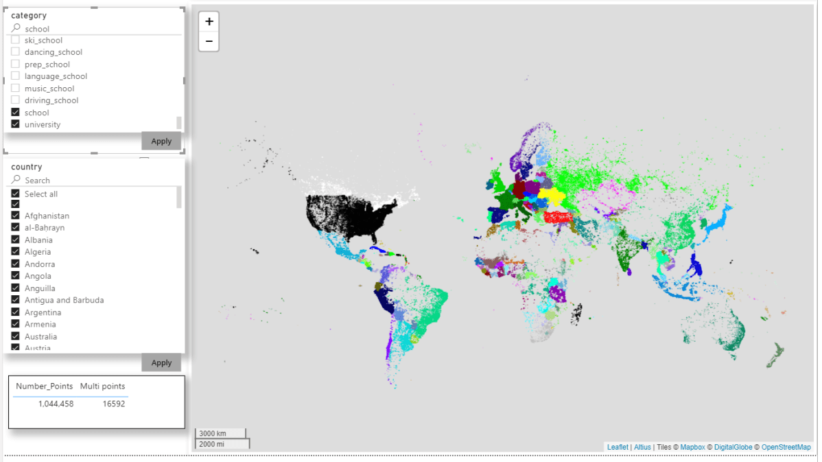
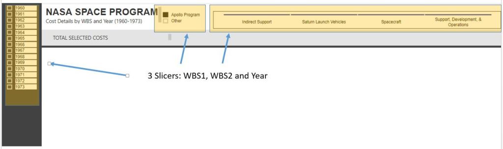
The dashboard utilizes 3 slicers. Each has a slightly different formatting. I definitely recommend playing around with the formatting of your slicers

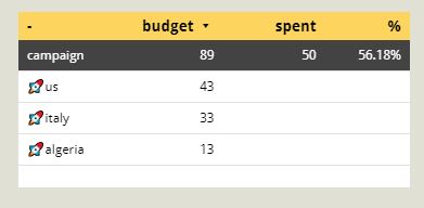
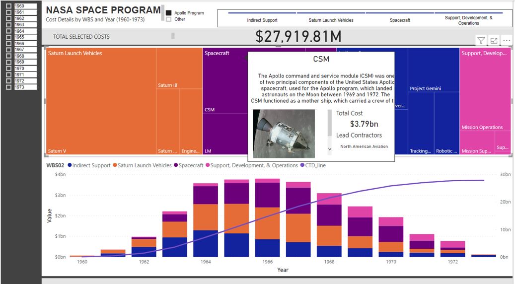
The TREEMAP is where I have put a little extra bit of attention

What pops out here is the tooltip. I have created a separate page just for this tooltip. I am by no means an expert in designing tooltip, but know the power of inserting extra dimensions of data that again allows your dashboard to pop. This specific tooltip includes the blurb, an image URL and the main contractors. This information would be too dense for the overall dashboard and perhaps not dense enough for its own dash, therefore a tooltip is a perfect medium between.

The final element of the dashboard is the line graph and histogram. I still find creating line graphs difficult and in this case I had to add a measure to my data. I think there is a much easier way to achieve rolling sum data, but in my case, the below measure works easy enough for me.

CTD_line = CALCULATE(SUM(NASA_Budgets[Value]),filter(ALLSELECTED(NASA_Budgets),NASA_Budgets[Year]<=MAX(NASA_Budgets[Year])))

And with that, we have our completed dashboard

Extensions

There is a lot I can do with this framework now. We have a cost file that is quite generic and a dashboard that is also generic. We can in theory use this to outline any type of project pipeline. Although this dashboard is looking in the past, we can also have a rolling wave where we can see past spend on specific projects and what our future pipeline of work looks like. I love seeing project pipelines and following my NASA theme for the moment, here is a great view of what the NASA project pipeline looked like in 1973

Rendering 1.2 Million points in PowerBI using Icon Map

TL;DR, the report is here , pbix here , download Icon Map here

I blog about it really before here, but in a colorful discussion on twitter after they closed this bug report, (Max rows in PowerBI is 30 K), I recalled a bug report about R ggplot, when the authors suggested to use multi points instead of individual points to speed the plotting of the map !!! all I had to do is to check if icon map support it and it did !!!.

WKT format for point is POINT (x,y), all you need to do is to concatenate multiple rows of point in MULTIPOINT format MULTIPOINT ((x y),(x1 y1), etc).

now we need to deal with three thing:

1-The maximum row numbers returned to a visual is 30K.

2-The maximum length of a column in PowerQuery is 32766

3-The Maximum length of DAX function is 2.1 Million

so a calculated column is a no go, I am using this DAX measure to concatenate the text from (x y) to a Multipoint format, again using Chris blog, I got this measure

WKT = var concat =CONCATENATEX(values(openstreetmap[point]),openstreetmap[point],",") var wkt ="MULTIPOINT ("&concat&")"return if (concat =BLANK(),BLANK(),wkt)

using this table that contains all the items tagged as amenity in Openstreet Map, the table contain 17 Million records, got it from BigQuery dataset

remember you don’t want to group all points in 1 row for two reason.

1- Concatenax Max is 2.1 Million

2-it is better still to group by common attribute, at you can color code for example by country or category or both if you want, in this case, I added a third factor in MULTIPOINTS, just a number that change very 30k rows to make sure I will not end up with a multipoints > 2.1 million, Initially It was 100K, but I notice icon map become extremely slow

now in icon Map, you need to assign three fields.

Category : multipoints

Icon URL/WKT/SVG: the measure wkt, this extremely clever and flexible, as it is a measure, that will render using the filter context of category, you may want to be creative and implement drill using different level of details, as the geometry is calculated on the fly.

Circle/line/WKT/Geojson Outline Color : a color in hex format, in my case, coded by country, ( at work for a different use case, I use a measure instead to show change of status per time)

because, the data set is relative big, I use this option in PowerBI

Just to be clear, this only proof of concept, rendering a big dataset will be slow and will eat all your memory, and probably you will get errors in shared workspace, or if you are in a premium workspace, probably you will end up in a trouble, but it is cool, personnaly, I use it to render a 58K points and it is very smoth.

anyway here is the result filtering the tag place of worship 1.1 Million, I tried parking which is 3.2 Million but my laptop crashed !!!, I know it is subjective, but that looks very beautiful for me.

here tag : School and University color by Country

edit : got a nice feedback from Reddit user data_Crucher, just to improve the performance I materialized the results using a calculated table, the drawback is you increase the size of the model, but I guess it is worth it, and I changed the decimal precision for the lat and long to 4 digits just to reduce the size, the pbix is around 600 MB.

again for production scenarios, I think around 100K points should be doable.

How to build Compact layout Pivot Table in Google Data Studio

TL,DR : the report is here. and I appreciate a vote on this bug report

First, don’t be excited, it is a silly workaround, and introduce it is own problem, but if you are like me and need to deliver a nice-looking pivot table in Google Data Studio, it may be worth the hassle.

The Problem.

Show the spent and budget by Campaign and country, the spent is at the country level, the budget at the country level, here is a sample data set.

The Solution, First try

Probably you are saying, it is too easy, why you are writing a blog about it, GDS support pivot Table !!, let’s see the result

We have three Problems already (1 bug, 1 limitation and 1 by design)

Bug:            you can return not return a null in the metric spent

By design:  GDS does not understand hierarchy, country null is all good.

Limitation: The Famous Excel compact View is not supported

Here is the deal, contrary to what you may read in the internet, Pivot table is the most used viz in reporting ( ok, maybe second after table) and users will want their pivot table to look exactly like their beloved Excel, my own experience, if you show a user a map for example and he ask for a feature which is not possible, you can say, I can’t do it and people will tolerate that, but their Excel looking Pivot table, zero tolerance, if you can’t reproduce it, they will either think :

  1. Your BI is not good
  2. You don’t know the tool

The Solution, SQL!!.

Write a SQL that return a column that show the campaign and country in the same field, using union

Assuming your data is on google sheet.

  1. Link Google Sheet to an External table in BigQuery

2-Write the Query

Connect to that table using a custom Query

SELECT project,sum(budget) as budget,sum(spent) as spent FROM `test-187010.work.factraw`

group by 1

union all

SELECT Concat(“\U0001f680”,country), budget, spent FROM `test-187010.work.factraw` where country IS NOT NULL

3-BI engine does not support External table.

Every time you open the report, GDS studio will issue a new query which cost 10 mb minimum !!!, even if the data is 1 kb ( it is a big data thing after all),  to avoid that we extract the data

4-Profit 🙂

 We use conditional formatting to highlight the row campaign.

needless to say !!!! you should not use it unless you have to, cross filtering will be a mess , Hopefully GDS will improve pivot table formatting in the near future.

Is Google Data Studio Ready for Complex Business Reports ?

 I love Google data Studio, I am using it for this project nemtracker.github.io and it is perfect for this use case.


For other Dashboard at Work, I am using PowerBI, for no reason, I tried a new experiment, can GDS be used instead, it is an academic exercise only.
the use case is a typical Business Reports, a lot of different small datasets with different granularity , something like budget vs items sold etc.


I am just recording the pain points in GDS , the good thing, most of them are under development, and some of them overlap, for example if we have Parameters controls, probably, there will be less need for blending ( which is very limited at the moment).


it is not a critique, GDS has some killer features, I particular like custom visuals as there are no limit the number of data plotted which is a pain in other Software.


the assumption is all the data-sources is already loaded and cleaned and ready to be analysed in BigQuery.


TL,DR : the pain points are at the Calculation level , Obviously if all you data is at the same granularity, then everything is easy
my conclusion, nearly there !!!, but will revise when Parameter controls are supported.

Instead of Writing a full blog, I thought showing a report is a more practical approach