First impression of Looker from a PowerBI user

Looker was always a bit of mystery for me, as there was no trial version to test, and they have high profile customers, luckily Google recently start providing trial version without asking too much Questions, I registered 2 months ago, and recently got an email with a trial offer.

it is just an impression, I just used it a couple of times in the weekend with no training

You get an URL instance with the name of your company, I used a dummy name.

The user interface is rather streamlined, nothing unusual which a good thing , as expected it is hosted in Google Cloud, but you can’t see anything from the console ( Looker is available in AWS, Azure and GCP)

Looker by default has two modes, development and production, everything you build is linked to Git repository

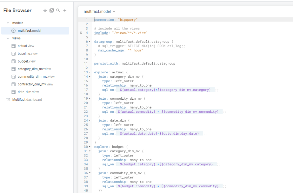
let’s say you want to build a new Dashboard , first thing to do is to create a new LookML Project, setting up GitHub was straightforward, I made the repo public

Probably you are asking where is the data preparation the Likes of PowerQuery or Tableau Dataprep, there is none, Looker connect only to Databases, it assume you have already a Data Warehouse, Looker Provide Just the Semantic Model using LookML code and the Viz, and the API which you can call from any Clients.

There is no Import mode, all connections are live, there is a cache though that save the result caches which you can adjust by Project or you can turn it off by using cache = 0 second.

There are aggregation Table , which you can use to speed up Queries but again you need to store them in the source database.

Looker use an internal Database ( I think MySQL), but is only to store internal Metadata ( users names, SQL Queries etc), all calculation depends on the source system

To my surprise at least for simple Semantic Models, LookML is not too hard, I connected to a dataset in BigQuery and Looker imported the Table Schema, all I had to do is to define relationship between Tables, and add Measures using SQL

funnily enough the most confusing Part; Looker does not use standard technical Terms:

Views means Table

Explore is a semantic Model

Model is a group of Explores and Views

Look is a chart

at any time you can View the Diagram View

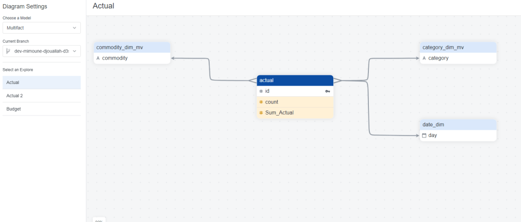
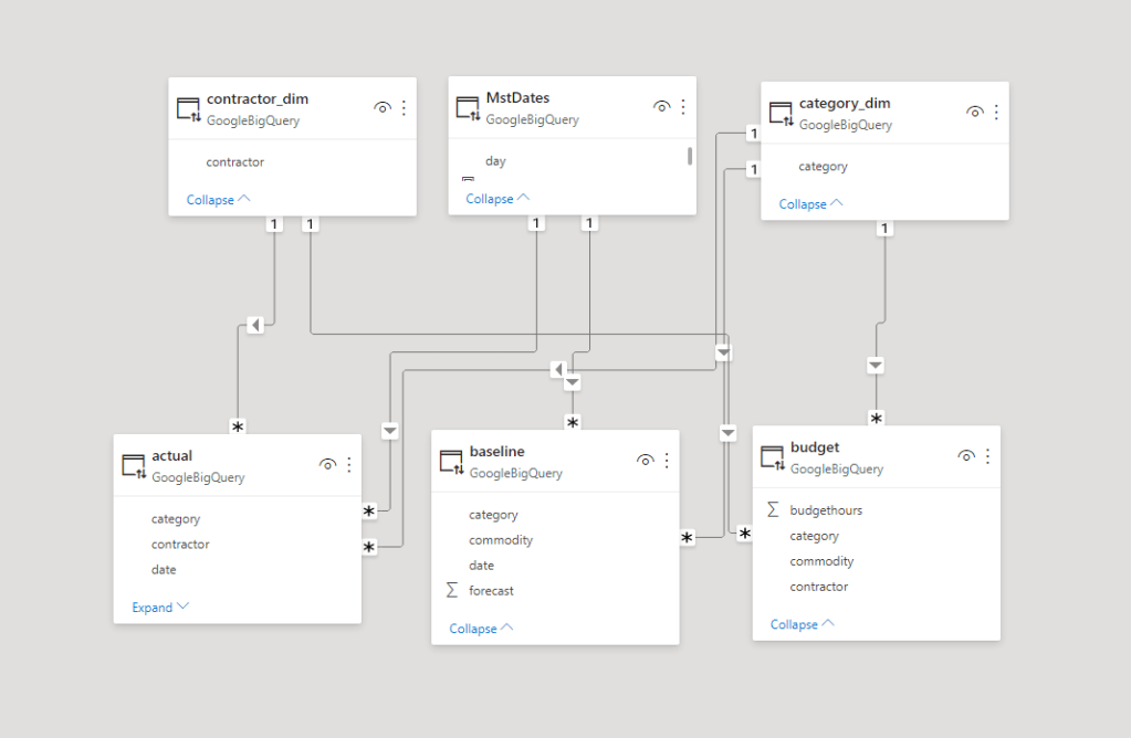
One interesting aspect of Looker Modeling compared to PowerBI, you can have Multiple Models that join the same tables in different ways !!! but at the same time, I could not reproduce a typical Multi Fact Tables easily (Example from PowerBI, I am not saying it is not possible, but I did not know how to do it)

Once the Model is completed you can start exploration using “Explore”, I guess this is the core Concept of Looker , every time you add a metric and dimension, Looker automatically generate the Correct SQL, and because the Model are defined Enterprise wide , the metric definitions and dimensions are consistent regardless of the users.

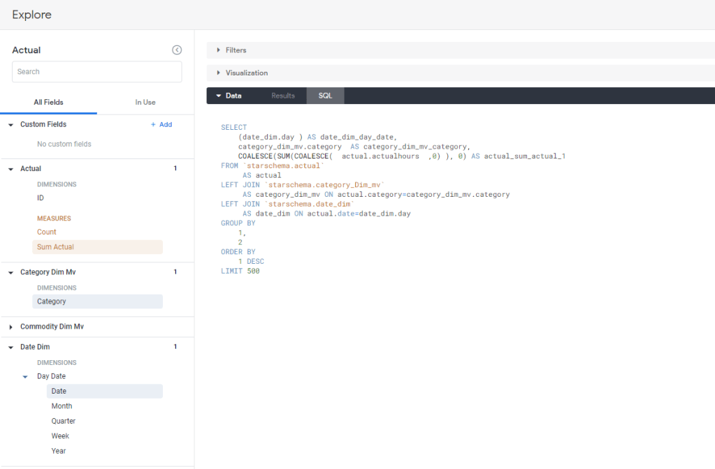
Notice here, the first thing you get is the data in a tabular Form, then you define the Visual, there is a saying that PowerBI is 80 % Data and 20 % Viz, I would say Looker is 99 % Data and 1 % Viz :), OK I am a bit exaggerating but don’t expect a Tableau Level Customization

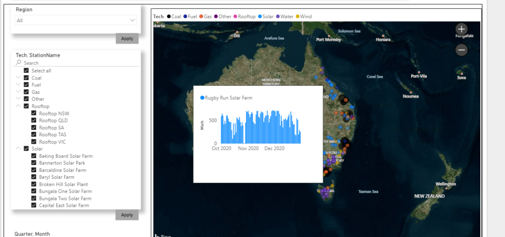
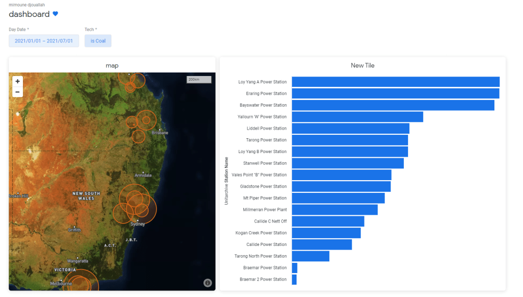
When you are happy with your explore you can save it as a Look which is basically an individual Chart which you can pin to a Dashboard like this one

Another very nice functionality is Roles, in PowerBI you can customize what a user can do , build new content, sharing etc, But in Looker it is very granular, you can customize any option , you can even authorize who can and can’t download data !!

Sharing is very trivial, you can share with external users with different email address, even users with gmail and hotmail.

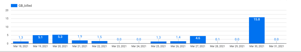
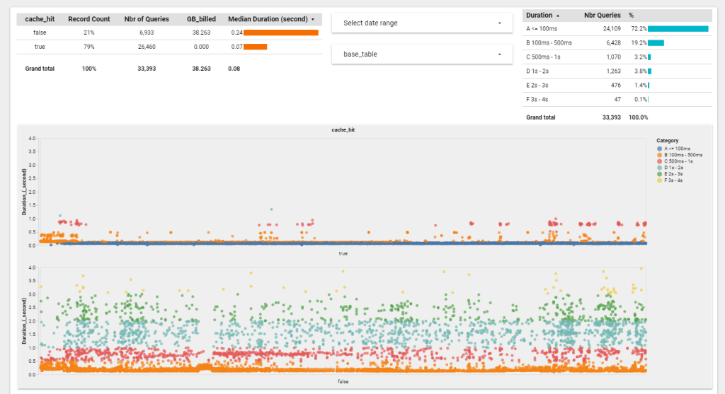
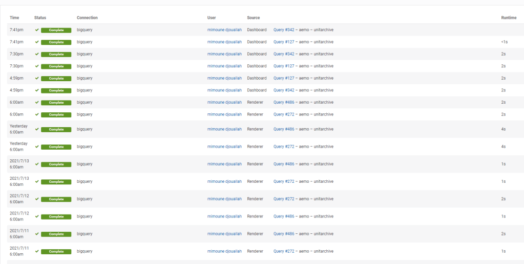
Tracking performance is simple, you can see the history of all SQL Queries and identify any issues

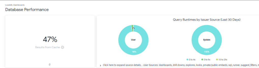
and a nice overall Performance of your Instance

Regarding Performance, I think Looker will perform Better compared to PowerBI in Direct Query mode , simply because there is less moving parts, in PowerBI, the viz generate a DAX Query against the Model which call the engine which call PowerQuery that convert to SQL, Looker Just Generate SQL Queries based on the Data Model that’s all

You can’t really Talk about Looker without talking pricing, here is a screenshot from Google Cloud Pricing

Image

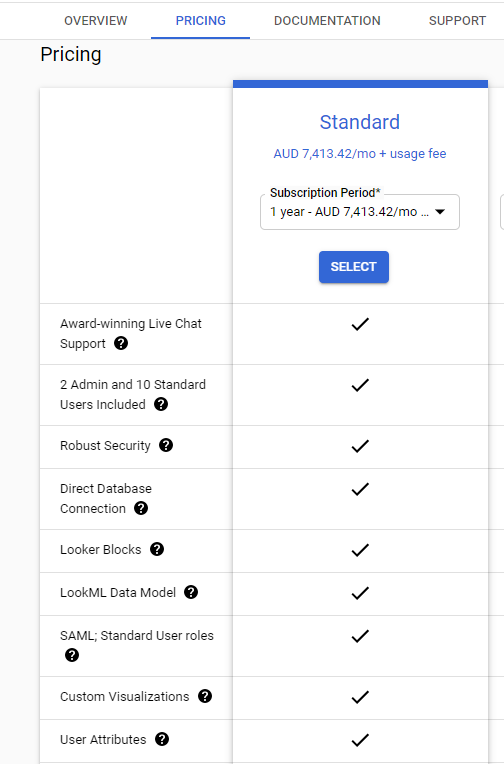
yes, there is no typo, 5000 $/Month get you 12 users and you need to pay 30 $/Month for any extra user !!!

apparently Looker is very popular with High scale embedded scenarios but it require some JavaScript skills which is out of my scope.

Take Away

as Far as I can see the target Market of Looker is Large Enterprises with Mature Data infrastructure and deep pockets, I can see the attraction of code based solutions with version control and centralized Semantic Models, no wonder BI professional with Software engineering background love it.

Apparently in the short term a lot of Data is moving to the cloud and Cloud Data warehouse are getting really Fast and cheap ( See BigQuery BI Engine), the concept of Live connection using a centralized Semantic Model is very attractive and according to some industry commentators it is the next big thing in Business intelligence.

Personally I am not sold, I think every Business users should be able to build his own analysis without waiting on a central BI team( not all reports are equals, some are strategic which require governance other less ), on the bright side LookML is not as hard as I thought at least for simple Models, but with the current Pricing, it is fair to say it is not a threat to PowerBI at least for smaller Installation

edit : got a feedback that a self service user can add custom measures and dimension that did not exist in the original Model , see documentation , but still if you want to use new data, it has to be imported first in the Source Database.

edit : Google shut down my trial instance after three weeks, unfortunately I can’t write any more about Looker, if someone from google is reading this , you’re not helping yourself.

BigQuery GEOGRAPHY Support in Data Studio

Google Data Studio added recently support for BigQuery Geography field, which is a fantastic development and open all kind of new scenarios for creating free to share Maps.

It is straightforward, you just add a geography field and it just render, for example I have this dataset that contains polygons, lines and points

and here is the result

Some Observations

  • It seems the initial focus of the dev team was on polygons which are fully supported
  • You can’t fill color for lines yet
  • Although points support color coding, I could not make them smaller ( The Piles in a Solar Farm are obviously much smaller)

BI Engine to the rescue

Now the confusing part, BI Engine for Data Studio does not accelerate GEOGRAPHY yet , so you will incur BigQuery Cost, but if you connect the new BI Engine SQL interface, the Query will be accelerated, according to the devs, the BI Engine used in Data Studio is to be considered Version 1 , SQL Interface as the next version and they will be merged together eventually. ( This should be in the Documentation)

here is an example of a Query generated by Data Studio, I would say it is very complex SQL Query with analytical functions, UNNEST, you name it, and the New BI Engine support it just fine ( I really like Bytes billed 0 B)

A more interesting use case

I came across this excellent dataset https://openflights.org/data.html, and thought let’s try it with Data Studio, first I imported the two tables airports.dat and routes.dat  then using this SQL Query to generate the routes, which is a line between Source coordinates and Destination Coordinates

WITH
  xxxx AS (
  SELECT
    yy.Name AS source_name,
    yy.City AS source_city,
    yy.Country AS source_country,
    zz.Name AS destination_name,
    zz.City AS destination_city,
    zz.Country AS destination_country,
    DestinationairportID,
    SourceairportID,
    ST_MAKELINE(st_geogpoint(yy.Longitude,
        yy.Latitude),
      st_geogpoint(zz.Longitude,
        zz.Latitude)) AS route
  FROM
    `testing-bi-engine.test.airportroute` xx
  LEFT JOIN
    `testing-bi-engine.test.airport` yy
  ON
    SourceairportID= AirportID
  LEFT JOIN
    `testing-bi-engine.test.airport` zz
  ON
    DestinationairportID = zz.AirportID),
  ttt AS (
  SELECT
    source_name,
    source_city,
    source_country,
    destination_name,
    destination_city,
    destination_country,
    DestinationairportID,
    SourceairportID,
    ST_ASTEXT(route) AS route_wkt
  FROM
    xxxx
  GROUP BY
    1,
    2,
    3,
    4,
    5,
    6,
    6,
    7,
    8,
    9)
SELECT
  *,
  ST_GEOGFROMTEXT(route_wkt) AS route,
  ROW_NUMBER() OVER() AS id
FROM
  ttt

I save the Query in a table, then plotted using Data Studio

and here is the Result, which i share it in Reddit 🙂

I think it is fair to say, people love maps, and a lot of users appreciate that you can download the data straight from Data Studio , you can play with the report here

Really Excellent Works by Data Studio Team.

PowerBI – Resource Profiles from P6

One of the biggest critiques/limitations in using P6 data is the lack of time phased resource assignment data. The only effective way to pull time phased resource assignment data into PowerBI (or even excel ) is to copy-paste from P6 into Excel. This is what I have recommended in the past and still what I would recommend for anyone moving forward. However, that does not mean that PowerBI can’t produce time phased data using a start date, end date, and profile. What follows is a simply guide on how I have tackled the problem (and the limitations I have run into)

One of the biggest critiques/limitations in using P6 data is the lack of time phased resource assignment data. The only effective way to pull time phased resource assignment data into PowerBI (or even excel ) is to copy-paste from P6 into Excel. This is what I have recommended in the past and still what I would recommend for anyone moving forward. However, that does not mean that PowerBI can’t produce time phased data using a start date, end date, and profile. What follows is a simply guide on how I have tackled the problem (and the limitations I have run into)

Note: In all likelihood this problem has already been solved my many people in many different ways. I do not want to suggest this is “the way” to solve this. More so, I want to simply raise awareness of at least my approach and welcome comments and feedback on how to really solve the problem

Part 1 The Problem

P6 data does not contain time phased distributions. Instead, the backend (and inside XER) data only contains information about the activity, the resource, and the profile applied. So, our problem is to try to extract these data elements and generate a time phased distribution of the resource according to the profile and activity start and end dates.

Typical Activity Level Data
Here we have our Resource Details (including our “curv_id)
Resource Profile Data

I’ve taken a few liberties with the data above to try to focus on the:

Key Problem: how to allocate the resources assigned to an activity according to a resource profile?

I’ve seen this done in excel a lot although, i’ve never been comfortable with the excel solutions. Typically we count the weeks and distribute the hours equally to all the weeks. I know more complex files exist that allow for spreads using profiles. So to add to the problem isn’t nessessarily to simply spread per the profile, but to perform the operation inside PowerBI (or perhaps more to the point, inside Power Query).

At this point, I’d again love to call upon anyone who has a nice solution to include links about how you tackled this as what follows is just my initial stab at this.

Part 2: Getting the data into PowerBI

Firstly, although the data above is from a P6 XER file, I wanted to make this a bit more general. Therefore, I have created a toy model approach. Thus, here is what my source data looks like

Resource Profile Data:

Excel Profiles

We can run this through PowerQuery and convert it to a usable table. Note in the above I have created a PeriodCum field. This will be used to calculate an end date for each of the 10 periods required.

tbl_profiles

Activity and Resource Data:

In this example, I am combining the Activity and Resource data into just 1 table. Obviously if you were doing this formally, you would need to build a scheme to link the Resource Assignment data into the Activity level data

Excel Data

And running the above through Power Query we end up with something as seen below. Note I have added a calculation for the duration (in cal day) and have converted the date formats to numbers. This make the subsequent steps a little easier

Note: a critical hard step (for me at least) came duration this stage. Because we are breaking the duration into 10 periods and will ultimately be allocating a qnty per day to each each, if we have a fraction of a day (example a duration of 15 days), my method bombed. This caused an overlap of qnty allocation on the day of the overlap. As such, I have rounded the duration to the closest 10s.

tbl_activities

Part 3: Time Phasing (where the magic happens)

The first step of generating the time phasing is to now split the activities into the 10 periods per the resource allocation. We do this by first merging tbl_activies with tbl_profiles using the ProfileDesc field. After expanding the result, we will end up with 10 records for each activity (corresponding to each of the 10 periods).

We will now want to calculate a start and finish date unique for each of the 10 periods. In the profile table is a PeriodCum field that we can use to multiply by the duration and then add that to the start date to get a finish for each period. The result table will now look something like this. Note, at this step, its good to now use the profile allocation for each period and multiple that by the hours_total field. This will give us a hours per each period. The last step will be the divide that by the period duration to calculate what will now be an hours per day for that period.

Lastly, we now want to perform 1 additional expansion to get the DAYS for each period. Here is the code I have used. This is a nice little bit of code that can generate a sequential list from a start to an end (we are using days, but its works for any beginning to end sequence)

= Table.AddColumn(#”Changed Type2″, “Custom”, each { Number.From([PeriodStart])..Number.From([PeriodFinish]) })

resulting resource allocation table with profiles applied

In our resulting table (see above), we can clearly see that the hours per day adjusts for each period based on the profile.

Part 4: Putting It All Together

We have our activity data, we have our time phased resource data, the last step is to generate a DIM_Date table that can be used to bin the days to either weeks or months (or quarters or years or any custom grouping defined inside the DIM_Date table)

I don’t want to get to into the DIM_Date table, effectively all we need is each day assigned to a Month-Yr for the purpose of generating a nice little graph below, which is ultimately what we are after.

Conclusion

Again, I do not recommend using this approach. Instead I am more interested in how others have decided to approach this. Personally, as I noted at the beginning, my recommendation is to use a copy-paste from the P6 Resource Assignment tab. Although, this time phasing approach can be used for other (non P6) applications. But alas, I believe there are much smarter ways to achieve the spread using the DIM_Date table and perhaps custom functions. In my research for my method, I ideally wanted a “working day” spread as opposed to the calendar day spread. There are some awesome custom functions that can provide an integer for the number of working days between 2 dates. However, even when taking that approach, I ran into additional complications in getting everything to work.

So, really keen for feedback!

thanks

First Look at BigQuery BI Engine with PowerBI

Google made BigQuery BI engine available in a public preview , you need to enroll first here, for the last two years it was available only for Google Data Studio, and I had use it extensively for this Project, so I was really curious how it will work with PowerBI.

I don’t think I know enough to even try to reproduce a benchmark, Instead I am interested in only one Question, how much value I can get using the lowest tier of BI Engine and can PowerBI works smooth enough t make Direct Query a realistic option.

BigQuery team was nice enough for the preview period to have 100 GB reservation free of charge, just to keep it realistic, I kept reservation to 1 GB with a cost of $30 per month, I built a couple of reports in PowerBI and tried to observe how BI engine behave and observe the Query statistic , The report is located here, The Data is using Direct Query Mode, the Query statistics update every 1 hour.

How BI Engine Works

it is extremely easy to setup just select how much memory you want to reserve by Project, and that’s all, you pay by GB reserved per hour.

Keep in mind the Project used for reservation can Query any other projects as long as it is in the same region, in PowerBI, you can define which project you use for the Query

After you wait a couple of minutes for BI engine to start, this is more or less how it works

1-Query received by BigQuery, based on columns used in the Query, BI engine will load only those columns and partition into the Memory, the First Query will be always slower as it has to scan the data from BigQuery Storage and compress it in memory in my case usually between 1-2 second

2-Second Query arrive, the data is already in Memory, very Fast 100 ms to 500 ms

3- Same Query arrive as 2, BigQuery will just hit the cache, that’s the sweet spot, less than 100 ms

4- A new Query arrive that target different table, that’s the interesting part, BI Engine based on the size of the scanned column, and the available reservation, either evict the old table from memory or decide that there is not enough Reservation then it will fall back to the default BI Engine, where you pay how much data is scanned

5- A Query arrive that contains feature not supported by BI Engine , it will fall back to the default engine

6- Data appended to the Base table or Table changed, BI Engine will invalidate the cache , it will load the delta to memory or load everything again if the table was truncated

Obviously it is much more complex behind the scene, But I find it fascinating that BI engine in a fraction of a second decide what’s the best way to serve the Query ( cache, Memory or Storage)

Personally I am very interested in Case 4, obviously if I reserve a Memory I want to minimize scanned storage to the lowest possible, here is the result for the last 10 days, I think that’s a great result, my ” Big Table is 6 GB, 50 Million rows” other tables are smaller , the dev team said they are working on improving even more how BI Engine algorithm deals with smaller tables, so far happy with that. ( it is fixed now, the memory consumption is extremely low now )

I appreciate other users with flat rate pricing would not care that much about file scanned , for user with usage based pricing, it is a very important factor

Query Performance

Again the results is based on my usage, the only way to know is to try it yourself, nearly 72 % of Queries render in less than 100 ms, I think it is fair to say, we are into a different kind of data warehouse architecture

PowerBI Performance

The Query Performance is only a portion of the whole story, you need to add network latency and PowerBI overhead ( DAX calculation, Viz rendering etc), my data is in Tokyo Region and PowerBI Service is located in Melbourne, a bit of distance I would say and using Publish to web add an extra latency.

The good thing, using Direct Query on a 51 Million Fact table with 5 dimensions is an achievement in itself, I feel I can use that in a Production, at the same time, using other report, it seems I am hitting a bug in the ODBC driver, and the performance is not good.

but to be totally Honest, it seems PowerBI driver for BigQuery is far from being optimized, it seems they are using SIMBA ODBC , other BI tools are using the native API and it is substantially faster, but I have reason to believe the PowerBI team will invest more in better Integration ( PowerBI parameter in SQL Query is coming for example)

I Think it is extremely interesting new development, specially if you have Big Fact tables or data that change very frequently, Direct Query mode have a lot of advantages, it is very simple to setup, the data is always fresh and there is no data movement. and BI Engine is fast, extremely Fast, and Cheap !!!, I am using a state of the art data warehouse for $30 per month !!!!, now it is up to The PowerBI Team to take advantage of that.