Integrated EPCM Management – Engineering Progress

How is an engineering deliverable list a bit of a misnomer? Find out of a web page with editable fields can streamline the tracking of progress on list items.

I am a firm believer in the use of a standard project website portal from which the project team at large can quickly access key data and metrics about the project. This is not meant to be confused with a project dashboard, or PowerBI visualization. This is simple html file linked to a database with key flat-file information. Using smart JavaScript code, it is also possible to EDIT some of the key information.

With everything, before we even begin, we want to focus on what core digital strategies we are trying to tackle. Again, the project website is just a tactical approach, underlying it are the more relevant strategic goals we want to operate under.

Digital Strategy – Make Information easy to access

Digital Strategy – Agile Construction Management

Digital Strategy – Allow people to EDIT key data

The features discussed in this blog can be seen showcased in the following video. This is not a pipe dream. This is a functional application.

The video can be viewed in a separate window at https://www.youtube.com/watch?v=0XNA9xJS2yY

The Data

The key data sources involved with engineering progress will be:

  • Engineering Deliverable List
  • Manhours per WBS

Your engineering deliverable list is a bit of a misnomer. A lot of engineering and design tasks are not specifically related to a “deliverable.” In my view of the world, while you will have specific deliverables and need to track them, your progress list should also include everything else you are doing too – up to a point where perhaps the level of detail is too small.

For analysis, productivity factors for engineering are critical. As such, this post would not be complete without a discussion and visibility into hours and productivity factors.

The Menu

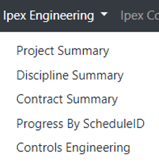
Our menu follows many of the key functions of project controls. However this specific post will dive into the ENGINEERING section only.

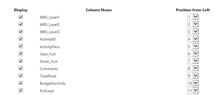
If we expand our menu, we see various views into our data: by project, discipline, contracts, schedule IDs and a unique view for controls engineering

Detail Views / EDIT MODE

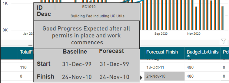
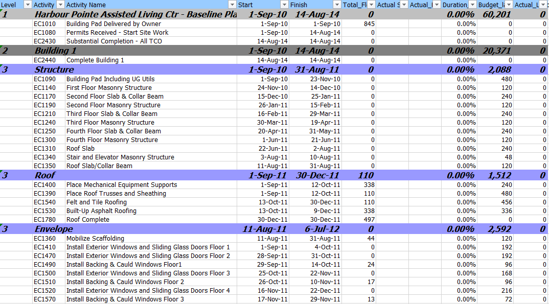
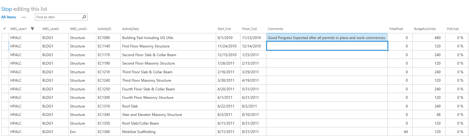
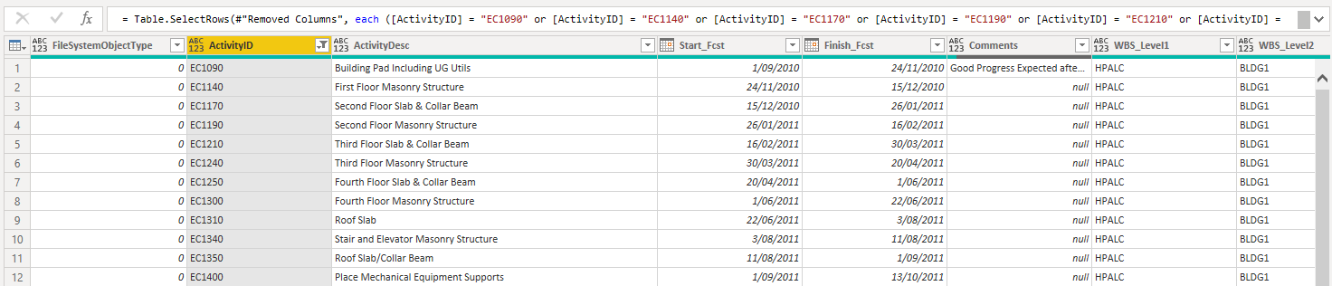
Perhaps before we look at our summary and drill downs, the main control screen we would use on a day to day basis would be the Deliverables by WBS and Discipline

In the below screen, we can see all out progress items, our budget hours, progress% as well as the mapping to P6 ID (as all progress items should be mapped to into your schedule)

This view into deliverables by itself is not specifically unique. Where the magic happens is when we enter EDIT MODE.

Inside our EDIT MODE, we can directly update the progress %, and update our mapping to schedule ID. These features in my mind are your killer features that distinguish this from any other app. The shear ease in updating items in this way is a breath of fresh air, not to mention the live feedback and visibility throughout your team.

JIRA

Each combination of WBS and Discipline can be mapped to a JIRA task. Obviously we know our WBS can be considered an EPIC. The power in using a tool such as JIRA is that we can now track more detailed L4/5 tasks using JIRA Subtasks. These are completely flexible to allow the user to manage their own tasks.

Additionally, the ability to embed commentary and status is a brilliant way to distribute and communicate key status and blockers if any.


Summary Pages

Now that we have seen how we will actually interact with a project website, we can now showcase the summary level reporting. Specifics of how you report can often times be better captured using an analytics platform like PowerBI; however, more often then not, simple summaries and metrics are what drive our business.

In the summary by project, we can easily see key metrics per project. Each project would have a link to allow us to drill into the details for each project

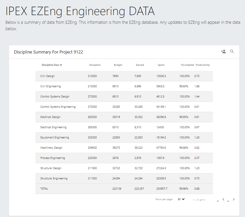
In the above, we are now looking at the individual functional delivery areas (disciplines) for our project. Again we can see key budgets, spent hours, progress and productivity measures too. By clicking each discipline, we further dive into our project by now looking into the detailed WBS elements for that Discipline

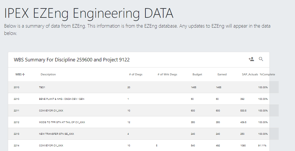
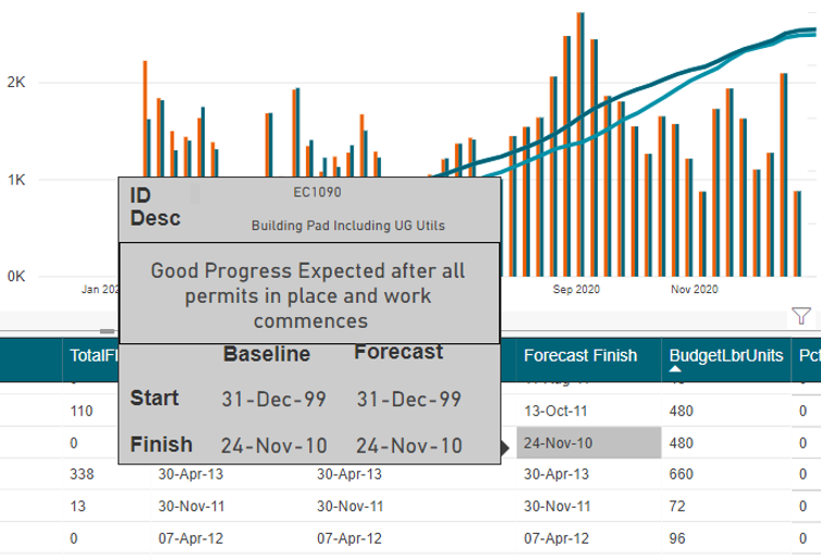
It is in this view that we can see detailed metrics per WBS/Discipline pair.

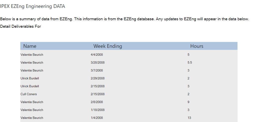
Understanding our Spent Hours from time sheets is a critical management function. As such, the SAP actuals here is a link that takes us to a screen where we can view the detailed weekly time sheet data to see who (and when) has book to this element.

Conclusion

In summary we started with some key strategic thinking and built out a tool that ticks a lot of boxes in the EPCM construction world.

More often then not, I am confronted with technology that “shows me” but doesn’t allow me to interact, edit, or collaborate. Everyone wants to solve the “one source of truth” however, information changes and is updated by people. That is the missing link in a lot of our data analytics. Look into the work processes that generate information in the first place. Look at what people need to better capture their raw information into a data format and platform that others can now use.

This approach to put management of engineering items to plain sight, with ease of access is just one approach. There are 100s of ways to approach this, but if you stick to core strategic ideals, you can’t go wrong.

PowerBI Progress & Schedule Dashboard – By Darrin Kinney

I have recently been developing a series of videos that highlight the key features utilized in a progress and schedule dashboard. The videos showcase the capabilities of PowerBI dashboards in the Project Controls space. I have not seen dashboards effectively used in this way and want to share the valuable knowledge.

I have recently been developing a series of videos that highlight the key features utilized in a progress and schedule dashboard. The videos showcase the capabilities of PowerBI dashboards in the Project Controls space. I have not seen dashboards effectively used in this way and want to share the valuable knowledge.

This series is not meant to be a step by step guide. There are subtleties about this demo that may cause difficulties in the production environment. I would simply recommend you share this with your development team and discuss the pros and cons of your approach. Oftentimes, a more straight forward approach is more valuable when compared to endless development polishing an inferior product.

Part 1: The Showcase

This video gives an insight into the key capabilities of the dashboard. Having the ability to seamlessly review schedule activities, and how these contribute to the overall progress and forecast, is invaluable.

The ability to quickly dive into your schedule, without having to deal with the confines and limitations of your actual scheduling tool are also key features.

Part 2: The Excel Feeder Sheets

This highlights a simple Excel feeder sheet. Too often the time phased data that our schedules produce are not easily accessible in a digital format. I have built an excel file around a typical structure that project controls deals with. This structure will lend itself nicely to the steps that follow in converting the into a database format.

Part 3: PowerBI PowerQuery

Here we import the data from the Excel feeder sheets into the PowerBI platform. The use of PowerQuery is so embedded with the way PowerBI works. The steps you need to follow here are the similar to the steps you would need to follow in inserting the progress and schedule data into any formal data structure. The way we think about data is sometimes not compatible with the format that databases need. This is specifically around the need to “unpivot” time phased data.

Part 4:  PowerBI Measures and Dax

With all the data now structured and available to PowerBI, we need to now dive into the use of DAX to create Measures. A perfect example in the use of measures is in the generation of progress curves.

What might seem line a straight forward approach to drawing simple progress curves, is in fact (within the realms of PowerBI) not that simple. However, if you follow a logic approach and know what calculations are needed, the world is your oyster.

Part 5: Integration of JIRA and Agile Methods

In the (as of now) final installment of this series, I showcase a way in which we can integrate our PowerBI dashboard with a JIRA project. This approach is completely different from what you might expect. I don’t want to put a PowerBI dashboard ontop of my JIRA task list. I want to put a JIRA task list on top of my schedule.

The purpose of the dashboard is to extract the SCHEDULE data from the scheduling tool. When variations to prior forecasts occur, or where further detail is needed, we are often constrained because pictures, running commentary and discussion about each activity is not something that resides in our schedule. However, we can use JIRA to easily capture those elements and use our PowerBI dashboard and a linking tool to integrate everything together.

The Future: ???

There are still a lot of features and extensions that I have yet to formally discuss. The next steps are likely going to be a showcase of a SQL Server backend for this data. There is a lot of information that is missed in the way this dashboard imports data (specifically past budgets). Therefore visibility into changes is restricted.

Another interesting feature is the use of saw tooth graphs when budget changes occur. I have a clear vision for how this is possible, and in a professional capacity have implemented it. To achieve this, while you won’t achieve a discontinuous graph, it will calculate your % based on a variable budget. For this, you need to setup another tab on the excel feeder which instead of tracking the earned per week per activity, it will instead track the BUDGET for each activity at each cutoff. With this data element now in your data, you just change the denominator calculation.

In general, the way in which dashboards and data are embedded into our work processes, is a field ripe for growth. It is also an endeavor that can greatly increase the visibility into project controls data and can also bring teams together using integrated tools like JIRA. As such, the future is bright and where we should always have half an eye looking.

Analyzing GIS data using BigQuery and PowerBI

TLDR, world data here , pbix file (Publish to web has a limit of 1 GB, only points are used)

Australia Report with polygons , pbix file

Australia report Using Datastudio Google Map

Edit : 14 April 2020, Updated the report to load all the tags amenity in the world, I am using this formula to dynamically calculate the distance between two points

Due to the COVID19 pandemic Google has made some public dataset free to query, one of them is openstreetmap, I thought it is an excellent opportunity to play with BigQuery GIS functions.

Using the existing documentation, I come up with this Query which return all the geometries in a radius of 100 Km from an arbitrary point ( for some reason I choose Microsoft office building in Brisbane as a reference) and with a tag =amenity

WITH
params AS (
SELECT
ST_GeogPoint(153.020749,
-27.467539) AS center,
100000 AS maxdist_m )
SELECT
ar.key,
ar.value,
feature_type,
osm_id,
osm_way_id,
geometry,
ST_CENTROID(geometry) AS center_location,
ST_Distance(ST_CENTROID(geometry),
params.center)/1000 AS distance
FROM
bigquery-public-data.geo_openstreetmap.planet_features,
params,
UNNEST(all_tags) AS ar
WHERE
('amenity') IN (
SELECT
(key)
FROM
UNNEST(all_tags))
AND ST_DWithin(ST_CENTROID(geometry),
params.center,
params.maxdist_m)

the query return

WARNING

the query processed 245 GB in 16 seconds !!!, and it did cost 0 $ at least till 14 Sept 2020, after that it will incur cost ( 1 TB/5 $)

you can explore the result using the built in Geoviz, but you can’t share the data.

PowerBI does not support custom queries when connecting to Bigquery , I had to save the query results in a view, then the connection to PowerBI is straightforward.

the query results is returned as a Key, Value

using PowerQuery pivot, it is trivial to denormalize the table ( I could not find how to do that in SQL), anyway the results looks much easier to analyze.

by the way just be careful , PowerBI support a maximum of  32766 characters , but there is an easy workaround, split the column by 32766 and then concatenate in a calculated column, yes it will increase the memory size, but it works.

and here is the final results using the beta version of icon Map, for example filtering all the data less than 4 Km, if you want print quality map you can always use R visual, see example here

the custom visual is still in beta, polygons and multipolygons render perfectly, point works but with a visual discrepancy, and I don’t think linestring is supported at all.

Icon map is a very versatile visual, I hope the author will release an official update and fix the rendering bugs and add an option for color per category.

Bigquery GIS is very powerful and easy to use, the documentation is excellent, I wished only they release a smaller public GIS dataset to play with.

SharePoint / PowerBI / Primavera P6 Integration – By Darrin Kinney

Which mix of applications will improve your construction progress reports? Understand simple steps, like adding comments to SharePoint and quickly publishing Primavera construction data through Excel, Access, and PowerBI.

I have dreamed about the ability to easily integrate many of my favorite applications. A few technological roadblocks had prevented me from pursuing this, but I am finally in a position to showcase what I view to be a quite seamless integration chain and management process.

Our key objective is to

  1. View our schedule activities
  2. Allow our area specific team to provide commentary on each activity (if we view the activity deviating from our plan or perhaps need to include notes about key interfaces)
  3. Allow our project wide team view our comments
  4. Provide a tool to present schedule and progress aspects of our area

Note that I still view JIRA as providing a tool that immediately makes this post redundant.  Although, in lieu of everyone jumping on JIRA, let’s dive right into an interesting use case of common applications.

Primavera

Primavera exported to Excel

For this example, I am using dummy schedule data. The ideas here are quite universal and can be used with any schedule. Care should be take to ensure proper filtering to avoid ever displaying too many activities.

The key objective here is to be able to export our activities to Excel and then upload the data into a SharePoint list. Tools, such as XER reader, provide the ability to quickly move activities into Excel.

SharePoint

Here, a lot of interesting hacks and strategy come into play.

Digital Strategy – Enter Data Once

SharePoint is a perfect tool for editing data in one location, and to source it in many different ways without having to reenter it.

The first thing we need to do is create a list.

so02_sharepointlistsetup

You can insert a few more columns to pull in Plan Dates, or prior updated dates. However, we are only looking at a comments functionality with this list. We can live with a very stripped down data set (and leave PowerBI to capture everything at a later point).

SP03_sharepointList

The above view is what you would see in the edit view on your SharePoint website. This functionality is fast and allows a team to provide a much more concise internal list of comments specific to each activity (or perhaps only key interface activities).

Where the above doesn’t work? It doesn’t work in situations where we might have a chain of comments. SharePoint allows effectively free text fields. We can enter multiple lines of data for each comment and include dates inside the comment for when the comment was made. There are more sophisticated data models that would allow for multiple comments to be actioned on each activity. However, this example is a lightweight solution — using easily available, off-the-shelf technology. From this point, we dive into your standard PowerBI template.

An URL with predefined filter criteria applied to the SharePoint list is simple. However, we need to use this with caution, because we may end up with 1000s of activities in SharePoint and it will be hard to update this in the future.

Microsoft Access

It is possible to directly edit a SharePoint list using MS Access. In this example, we get constant updates from our contractors on dates. Keep in mind, the SharePoint list is not the management tool for the dates or progress (however — looking at the above, it can be!).

To allow for the list to be bulk updated with new dates and progress figures, we can utilize a query in MS Access. I am a firm believer in the ability for MS Access to facilitate moving data between different systems.

PowerBI

In this example, I will be using an existing template I have previously discussed (follow this link to the Construction Progress Reporting post).

Construction02

Where reports in PowerBI fall over, is that users have a difficult time actually being engaged as managers of the data. We do not have an easy ability to provide context or comments to specific data elements.

Here, we can immediately see that we can interface this dashboard with our SharePoint list. In our PowerBI queries, we can link to the SharePoint list.

SP04_sharepointPBI

As our schedule data is unique per ScheduleID, and our SharePoint list is unique per ScheduleID, we can link these 2 tables together and pull the comments into our table.

SP05

The resulting comment can the efficiently placed on a custom tooltip.

Extensions

As with any comment, it is important to include an indication of criticality. In the above picture, we don’t have an indication if a comment exists, and if a comment does exist we do now know if its important. Therefore, in our SharePoint list, we can use an extension to insert a traffic light in the cell. Then on the PowerBI visual, a traffic light is displayed using a small, colored circle. This would allow for quickly glancing at all the activities and being able to quickly drill into a critical comment.

This is different from looking at Total Float or Variations. Typically on-site, various activities have issues for various reasons that may not have anything to do with float or variances. These may be risk-related issues we are trying to prevent, or perhaps gets others to understand. This approach to comments is exactly what can lend value to a project.