Today was playing with a report in PowerBI and I got this idea of exporting data to BigQuery from PowerQuery, let me tell you something, it is very easy and it works rather well, PowerQuery is an amazing technology ( and it is free).
in PowerBI,you can export from R or Python visuals but there are a limitation of 150K rows, but if you use PowerQuery, there is no limitation ( I tried with a table of 23 Millions records and it works)
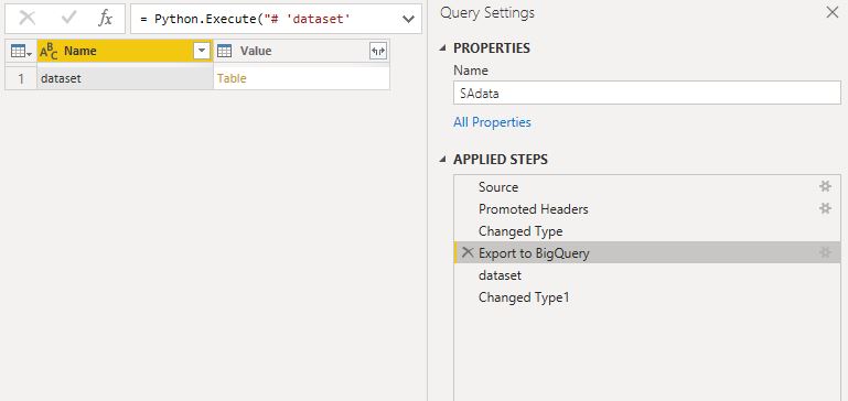
interesting after the step in Python we get a table, simply expand it
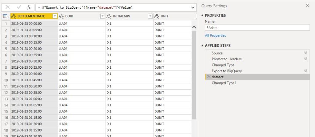
here is the total rows of the table in PowerBI
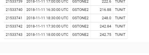
the results in BigQuery
ok, PowerQuery flow can execute many times, it is a black magic knowledge that’s only a handful of people knows, but in this cases, it does not matter, the BigQuery job truncate the tables every time, so there is no risk of data duplication.
probably you may ask why do that if there are a lot of data preparation tools that natively support BigQuery, based on my own experience, most of my data sources are Excel files and PowerQuery is just very powerful and versatile specially if you deal with “dirty” format.
Update August 2020 : SQL Parameter are better supported now, please go tho this updated blog
in the last 12 months, Google Data Studio has added many new interesting new features, specially the integration with BigQuery BI engine, and custom SQL Queries.
Obviously, I am a huge PowerBI fan, and I think it is the best thing that happen to analytics since Excel, but if you want to share a secure report without requiring a license for every user, Data Studio is becoming a valid option.
I have already blogged about building a near real time dashboard using Bigquery and Data Studio , but in this quick blog, I will try to show case that using SQL one can create a more complex business logic reports.
I am using a typical dataset we have in our industry, a lot of facts tables, with different granularity, the facts tables don’t all update at the same time, planned values changes only when there is a program revision, actual changes every day.
Instead of writing the steps here, please view the report that include the how to and the results.
The approach is pretty simple, all modern BI software works more or less the same way( at least PowerBI & Qlik, Tableau is coming soon), you load data to different tables then you model the data by creating relationships between the tables, then you create measures, when you click on a filter for example, or when you add dimension to a chart, the software generate a SQL query to the data source based on the existing relationship defined in the data model, it is really amazing , even without knowing any SQL coding you can do very complicated analysis.
Data Studio is no different to other tools, the Data Modeling is called Blending, it link all the tables together using left join, which is a big limitation as if some values exist in one table and not in others, you will miss data.
The idea is let’s bypass the modeling layer and write some SQL code, and to make it dynamic let’s use parameters, it is not an ideal solution for an average Business users ( we don’t particularly like code) but it is a workaround, till Data Studio improve it’s offering.
TLDR, the report is https://nemtracker.github.io/, please note, my experience with BigQuery and Google stack is rather limited, this is just my own perspective as a business user .
Edit : 20 Sept 2019, Data Studio use now BI engine by default for connecting to BigQuery, now the report contains the historical data too.
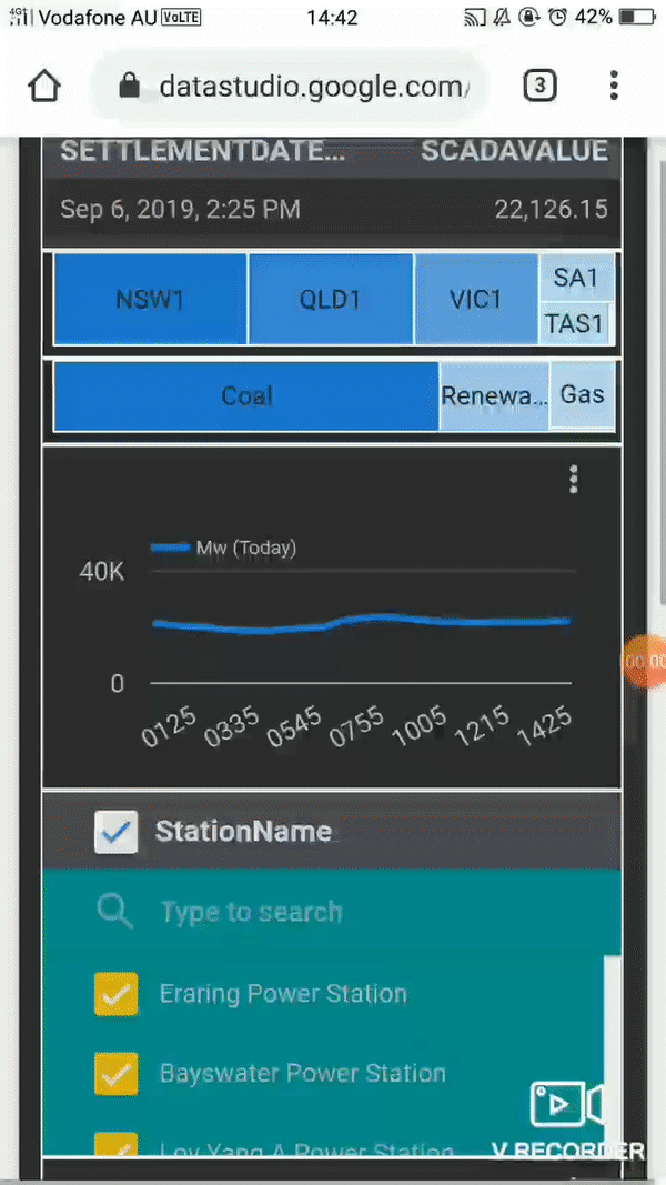
I built already a dashboard that track AEMO Data using PowerBI, and it is nearly perfect except , the maximum update per day is 8 time, which is quite ok ( direct Query is not an option as it is not supported when you publish to web, actually it is support but rather slow) , but for some reason, I thought how hard would it be to build a dashboard that show always the latest Data.
Edit : 23 Sept 2019, actually now, my go to solution for near real time reporting is Google Data Studio, once you get used to real time time, you can’t go back.
The requirements are
Very minimum cost, it is just a hobby
Near Real time (the data is published every 5
minutes)
Export to csv
Free to share.
Ideally not too much technical, I don’t want
something to build from scratch.
I got some advices from a friend who works in this kind of scenario and it seems the best option is to build a web app with a database like Postgresql, with a front end in the likes of apache superset or Rstudio Shiny and host it in a cheap VM by digitalocean , which I may eventually do, but I thought let’s give BigQuery a try, the free tier is very generous, 1 TB of free Queries per month is more than enough, and Data Studio is totally free and by default use live connection.
Unlike PowerBI which is a whole self service BI solution in one package, Google offering is split to three separate streams, ETL, the data warehouse (Biguery) and the reporting tool (Data Studio), the pricing is pay per usage
For the ETL, Dataprep would be the natural choice for me,( the service is provided by Trifacta), but to my surprise, apparently you can’t import data from an URL, I think I was a bit unfair to Trifacta, the data has to be in google storage first, which is fine, but the lack of support for zip is hard to understand, at least in the type of business I work for, everyone is using zip
I tried to use Data fusion, but it involve spinning a new spark cluster !!!! , and their price is around 3000 $ per month !!!!!
I think I will stick with Python for the moment.
The first thing you do after creating a new project in BigQuery is to setup cost control.
The minimum I could get for BigQeury is 0.5 TB per day
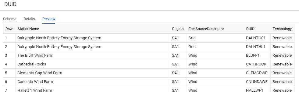
The source files are located here, very simple csv file, compressed by zip, I care only about three fields
SETTLEMENT DATE : timestamp
DUID : Generator ID , ( power station, solar, wind farm etc)
SCADAVALUE : Electricity produced in Mw
Add a table with partition per day and clustered
by the field DUID
Write a python script that load data to Bigquery,you can have a look at the code used here, hopefully I will blog about it separately
Schedule the script to run every 5 minutes: I am huge fan of azure WebJob, to be honest I tried to use Google function but you can’t write anything in the local folder by default, it seems the container has to be stateless but I just find it easy when I can write temporary data in the local folder (I have a limited understanding of Google function, that was my first impression anyway) , now, I am using google functions and cloud Scheduler, Google functions provide a /tmp that you can write to it, it will use some memory resources.
I added a dimension table that show a full Description for the generator id, region etc, I have the coordinates too, but strangely, Data Studio map visual does not support tiles!!!
Create a view that join the two tables and
remove any duplicate, and filter out the rows where there is no production
(SCADAVALUE =0), if there is no full Description yet for the generator id, use
the id instead
Notice here, although it is a view, the filter per
partition still works, and there is a minimum of 10 MB per table regardless of
the memory scanned, for billing BigQuery used the uncompressed size !!
One very good thing though, the queries results are cached for 1 day, if you do the same query again, it is free!
Create the Data Studio report : I will create two connections :
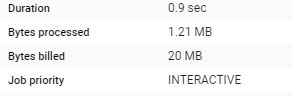
live connection: pull only today data, every query cost 20 MB, as it is using only one date partition, (2 Tables), the speed is satisfactory, make sure to disactivate the cache
But to confuse everyone there two types of caches, see
documentation here,
the implication is sometimes you get different updated depending if your
selection hit the cache or not, as the editor of the report, it is not an issue,
I can manually click refresh, but for the viewer, to be honest, I am not even
sure how it works, sometimes, when I test it with incognito mode, I get the
latest data sometimes not.
Import connection : it is called extract, it load the data to Data Studio in-memory database (it uses BI engine created by one of the original authors of multidimensional) , just be careful as the maximum that can be imported is 100 MB (non compressed), which is rather very small (ok it is free so I can’t complain really), once I was very confused why the data did not match, it turn out Data Studio truncate the import without warning, anyway to optimise this 100 MB, I extract a summary of the data and removed the time dimension and filtered only to the last 14 days, and I schedule the extract to run every day at 12:30 AM, notice today data is not included.
Note : Because both datasets use the same data source,
cross filtering works by default, if using two different sources (let’s say,
csv and google search, you need some awkward workaround to make it works)
Voila the live report, 😊 a nice feature shown here (sorry for the gif quality) is the export to Sheet
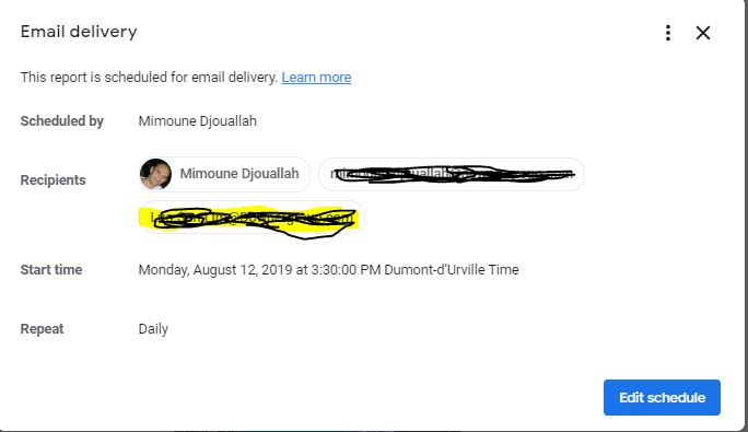
Schedule email delivery
although the report
is very simple, I must admit, I find it very satisfying, there is some little pleasure
in watching real time data, some missing features, I would love to have
An option to disactivate all the caches or bring back the option to let the viewer manually refresh the report.
An option to trigger email delivery based on alert, (for example when a measure reaches a maximum value), or at least schedule email delivery multiple time per day.
Make data Studio web site mobile friendly, it is hard to select the report from the list of available reports.
Google Data Studio support for maps is nearly non existent, that’s a showstopper for a lot of business scenarios
Kelpler.gl is a Geospatial data analysis
by Uber !!!, in this short blog we show
how to build a map with a time attribute and then showing a time playback slider,
it is very and straightforward process, all you need is to format the data as a
list.
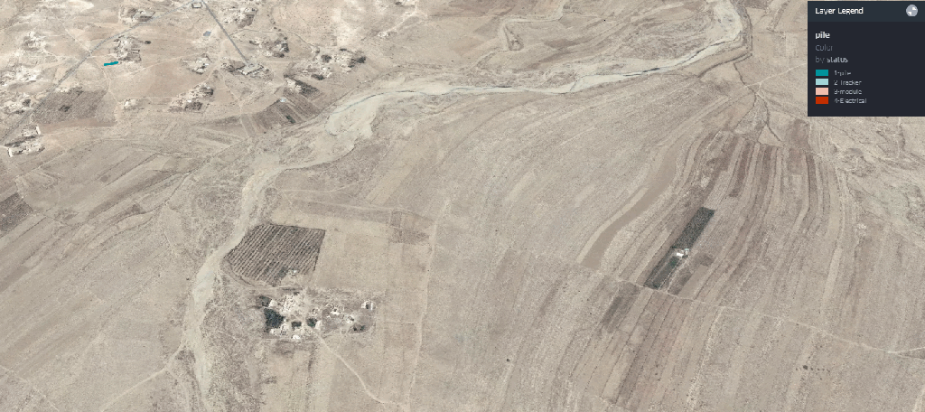
This data was randomized, as an example I show the main step to build a solar farm, piling, tracker, module then Electrical works, but obviously you can try it with road , pipeline projects, any project really that have geographic data
Please note the data is rendered using your local computer, so it is totally safe
The map is here,
keep reading if you want to understand how it was built
I attached a sample dataset here;
the field are self-explanatory.
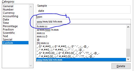
Just be careful with Excel for some reason, when you open
the csv file, it changes the date format, make sure the format is like this
And because in a medium sized solar farm, the total pile
will be around 50,000 Piles, if you want just to show 4 main stages, the total
number of rows will be 50,000 * 4 = 200,000 row, PowerBI will not support that
( Tableau shine in this scenario),
The documentation is very clear, please read it to experiment with your own data
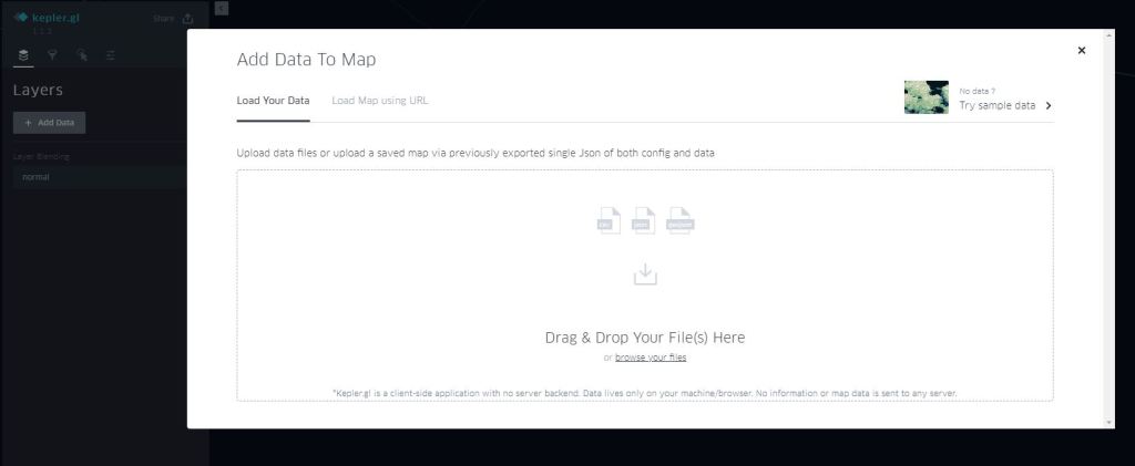
Add data
If your dataset has this fields names
X_lat, X_lng, Kepler.gl will automatically recognised it as a point layer
2-Define the legend
We select colour based on the field status ( select the palette
of colour)
3- Select time field
The filed should be recognized as time otherwise, it will
not work.
4- Add satellite as new map Style
For some reason, it is not there by default, but it is
trivial to add
mapbox://styles/mapbox/satellite-streets-v9
5-And voila
You can play with the slider, either moving the end date
or a window, up to you
6-Now you have multiple options for sharing
You need to have a mapbox
account, it is virtual free to medium usage !!!
For this example, I will share it using Dropbox, but you can export to HTML and securely share it either per email or hosted in sharepoint
This is one of the best piece of software
that I had the privilege to use, nothing to install, free , simple and straight
to the point !!