in Dec 2020, PowerBI introduced a fundamental change to the architecture of the Product, now when you connect to an existing model you can enhanced it by adding your own data.
Personally I find this functionality extremely useful, for example, I had access to an Enterprise Data Model that contains Oracle Primavera Data, but it was not very useful alone, that data make sense for my use case only when I combined it with other sources, now it is possible.
To make this functionality possible the Product team add the option to connect to an Existing PowerBI Dataset using DirectQuery, it is not SQL but DAX instead, I think you should read this first, if you haven’t already.
In this blog, I am experimenting with a new scenario just by curiosity, not sure if useful at all, but fun !!!! In PowerBI by default when you refresh a dataset, all the tables will refresh, the only way to control that is using XMLA endpoint, which involve some coding and require a premium license (PPU works too).
The idea is simple, let’s say you have a model with 4 tables, and only 1 Table needs to be refreshed frequently.
– Create a new Model that contain only 1 Table, setup schedule refresh to how often you want to see the data updated
– Delete that Table from the existing model, and connect to it from the new Model using DirectQuery
The Table that refresh frequently can be even a Realtime dataset
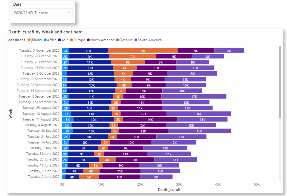
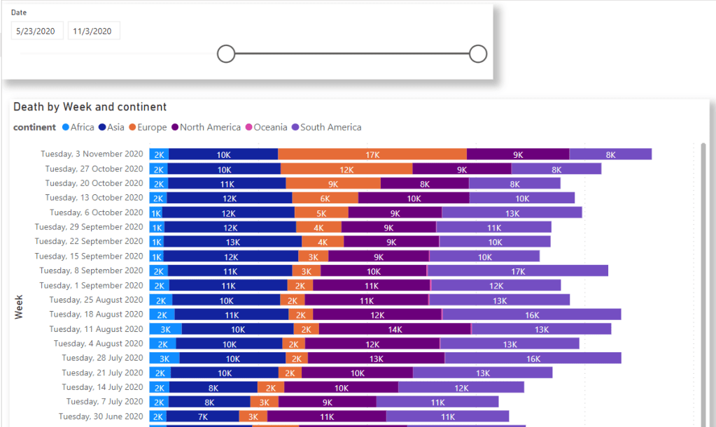
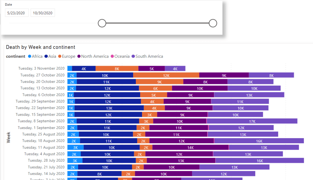
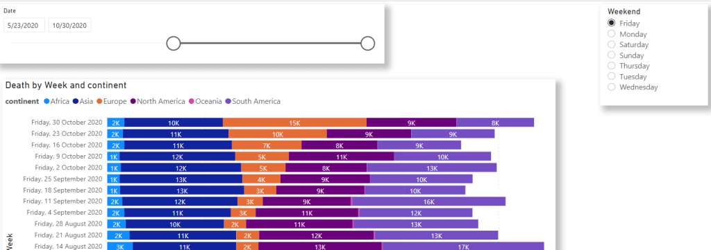
Testing
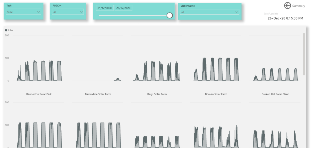
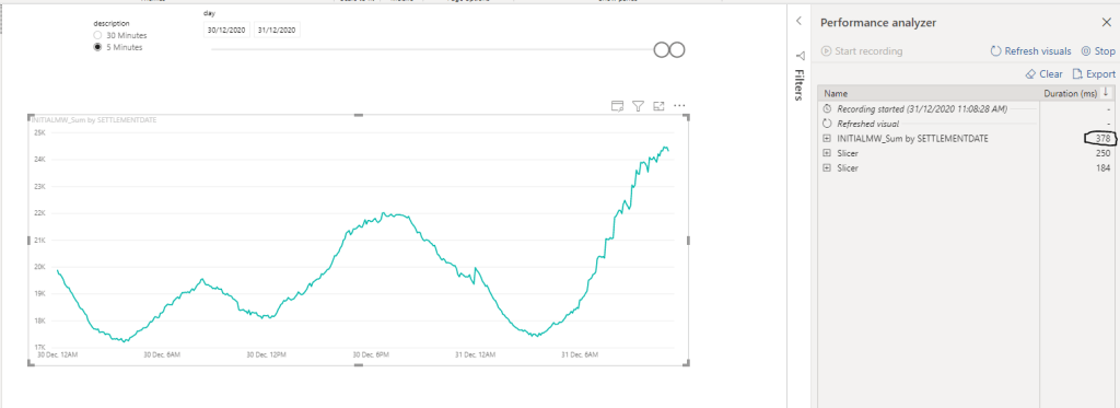
Again, don’t read too much into it, it just to give you an indication, The Data is Power Generation every 5 minutes, it make sense only to update the data for the current Day, all previous data does not change, The visual will show the data for today and yesterday.
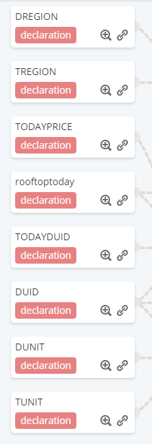
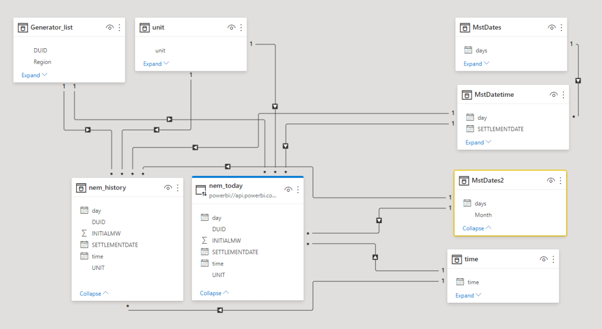
1- All Tables are imported
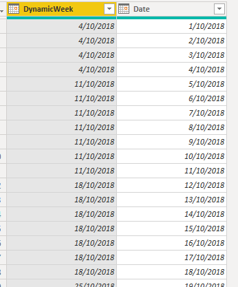
notice Settlementdate is a datetime field, the data is imported using incremental refresh.
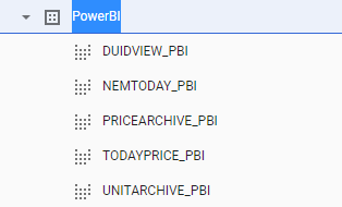
and here is the Model

here is the result, 378 ms
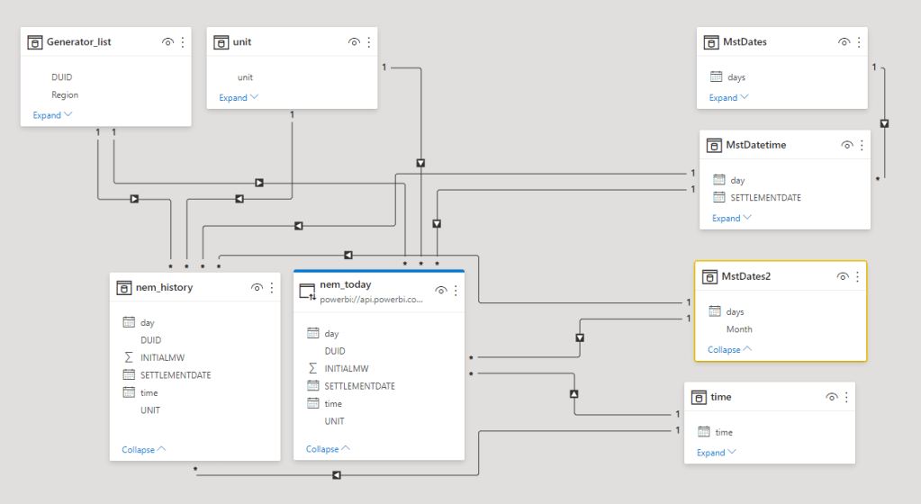
2-History Imported, Today Data DirectQuery
when you do DirectQuery mode, the performance will depend on the modelling used, here the measure Mw will sum the values from the History Table and Today Table.
if we use settlementdate as an X axis, the results will return in 80 Seconds

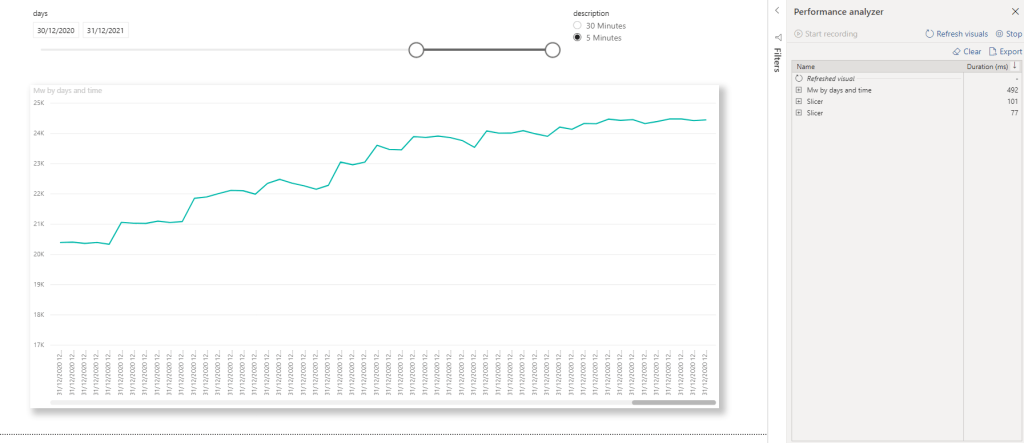
Now using two Dimension Date and time instead of Settlementdate, the Performance is nearly the same as import 492 ms
I can’t find a way to make date and time as a continuous axis in the Visual
I noticed if you use the DirectQuery Table without using dimensions from other models, the performance is extremely fast.
Take Away
I am not going to pretend I am an expert in DAX optimization, and Probably I am doing one or two things wrong, and as always it depends on a lot of factors 🙂 but as a rule of thumb:
DirectQuery on Dataset does not like Dimension with High cardinality
Import Model will be always more performant and tolerant to bad modelling
Data Modelling is very important, now it become even more critical
PowerBI Import mode is so fast and Powerful that even bad written DAX and poor Data Modelling will Just works, DirectQuery Mode on PowerBI Dataset will open all kind of new scenarios that was not possible before, but you have to be more careful about your modelling.