Flat table modeling in PowerBI can generated some very heated arguments, every time someone suggest that that it may be useful for a particular use case, the reaction is nearly universal, flat table are bad, I think it may be useful in some very specific scenarios.
let’s say you have a nice wide fact table generated by dbt and hosted in a fast Cloud DWH, all dimensions are pre joined, , to be very clear you will not need to join it with another fact, it is a simple analysis of 1 fact table at a very specific grain
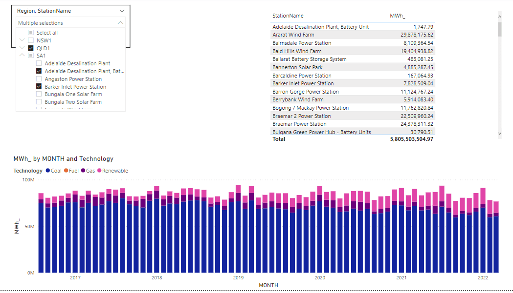
I will use Power generation in the Australian market for the last 5 years as an example.
Import Mode
When using Import Mode, PowerBI import the data to the internal Database Vertipaq, it is just a columnar database, with some very specific behavior, because the whole table is loaded into memory, less columns, means less memory requirement, which is faster, and because it does uses index joins between Fact and dimensions when you define relationships, counterintuitively, the cost of doing join is less expensive than loading a whole column in the base table.
In Import Mode, it is a no-brainer, Star Schema is nearly always the right choice.
Direct Query Mode
In Direct Query Mode, the whole way of thinking change, PowerBI is just sending SQL Queries to the source system and get back results, you try to optimize to the source system, and contrary to popular beliefs Star Schema is not always the most performant ( it is rather the exception), see this excellent blog for more details , basically pre join will often give you better performance.
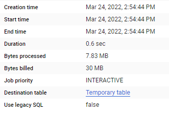
let’s test it with with one fact table ( The Table is 80 millions with a materialized view to aggregate data)
And the glorious Model in PowerBI, yes, just 1 Table
and let’s build some visuals
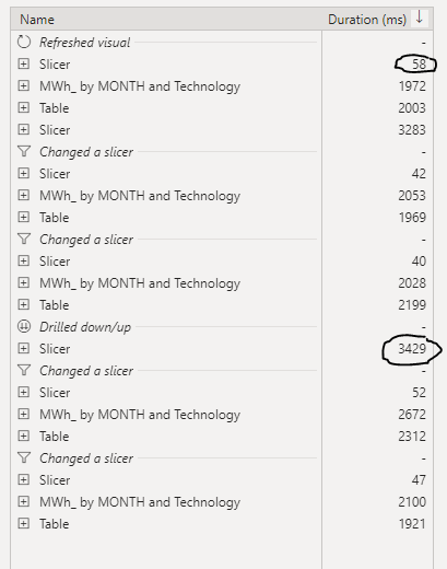
Now let’s check the Data Source performance
Slow Slicer
The Slicer is rather slow, probably you will say, of course scanning a whole 80 million columns is not very smart, actually that’s not the Problem.
for example when I extend the State NSW, PowerBI will generate two SQL Queries
the first one to get the station Name and took 481 ms
And the second Query to get the regions, 361 ms
PowerBI Formula Language will take some time to stitch the results together ( 1023 ms, that’s seems very slow to me ?)
in this case it is only 5 states, not a big deal, the Query results will be cached eventually after the report users expand all the options.
Is 3 second ? a good enough experience for an end user, I don’t think so, slicers have to be instantaneous, Visual can take up to 5 second, I don’t mind personally , but as a user I have a higher expectation for the slicers responsiveness, I will still use Dual Mode with a star schema
Take Away
If your Database can give you a sub second response time for the slicer selection and you have a very limited and clear analysis to do and you have to do it in Direct Query Mode, then flat wide table is just fine as long as you are happy with the SQL Generated.
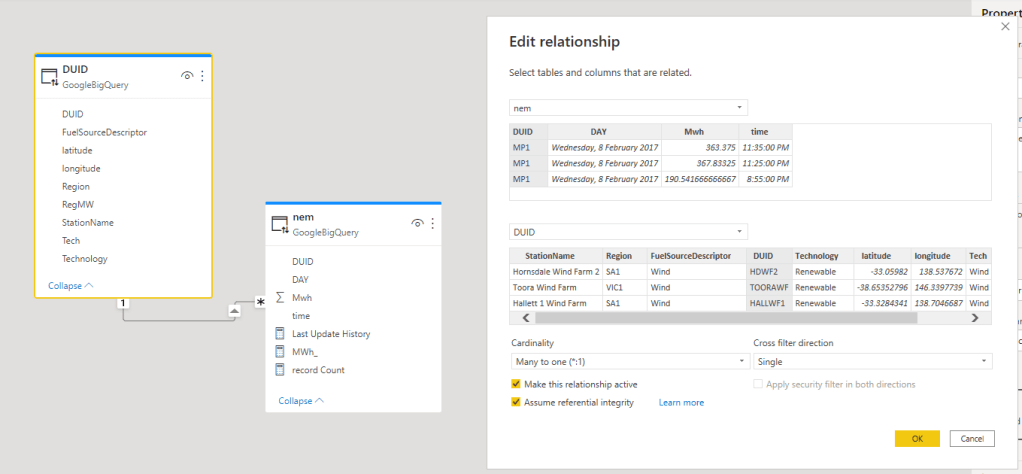
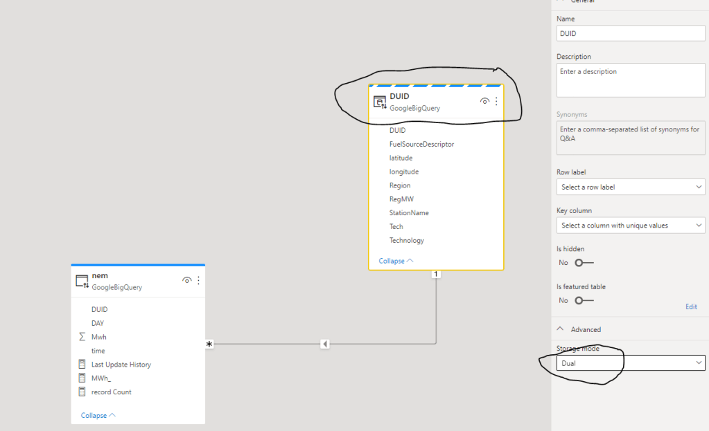
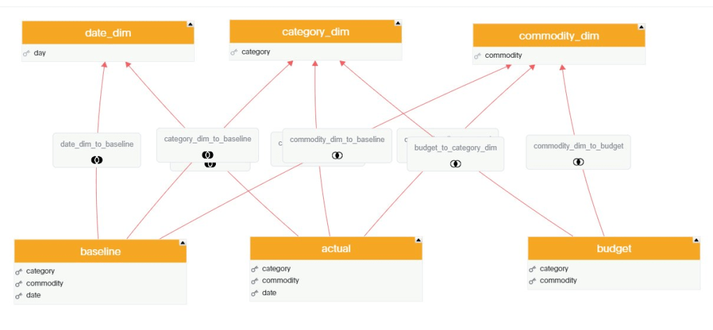
In a previous blog, I showed that dual Mode is really a very good pattern when building PowerBI Model that uses Direct Query, but it in order to work, both Tables needs to be using the same Data Source, you can’t physically join a table from a SQL Server with another Table from Excel, But still PowerBI Engine manage to do that using a clever trick, to explain how it works, I build two Models one using Dual Mode and Another using Composite Model and then we compare the behavior.
The Diagram give already an indication that the two dimension Tables are imported to the Local cache and that the relationship is a bit different than a “Normal” Relationship, I think the official term is weak relationship.
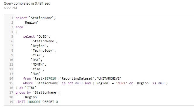
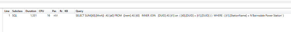
To Understand how this special Join Works, let’s try a simple Query, show me the total Mwh of coal Production
And here is the SQL Query generated by PowerBI Engine, at first sight it seems very weird !!!!
select `DUID`,
`C1`
from
(
select `DUID`,
sum(`Mwh`) as `C1`
from
(
select `DUID`,
`DAY`,
`time`,
`Mwh`
from `test-187010`.`ReportingDataset`.`UNITARCHIVE`
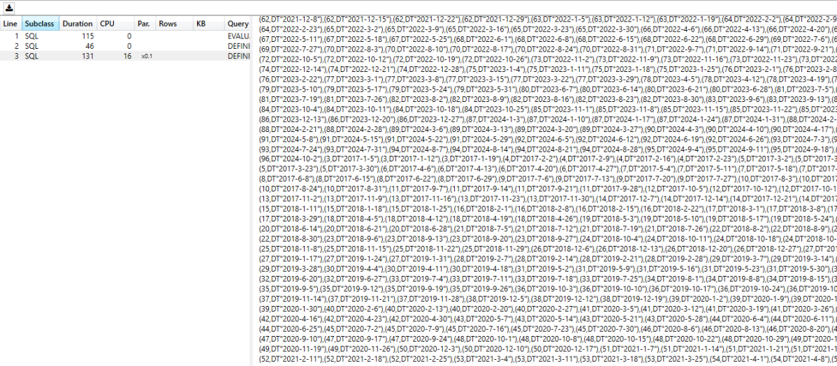
where `DUID` in ('APPIN', 'BRAEMAR2', 'BRAEMAR5', 'BW02', 'OAKY2', 'TARONG#1', 'LD03', 'MP1', 'BW01', 'MORANBAH', 'LYA3', 'MP2', 'KPP_1', 'TAHMOOR1', 'TARONG#3', 'LYA2', 'CPP_3', 'BW04', 'TNPS1', 'TARONG#4', 'LYA1', 'BW03', 'OAKYCREK', 'GROSV1', 'TARONG#2', 'LYA4', 'CPP_4', 'GROSV2', 'VP6', 'CALL_B_1', 'WILGAPK', 'GSTONE5', 'VP5', 'LOYYB2', 'CALL_B_2', 'WILGB01', 'GSTONE3', 'STAN-1', 'LOYYB1', 'CALL_A_4', 'DAANDINE', 'GSTONE6', 'YWPS1', 'ER01', 'GERMCRK', 'GSTONE2', 'STAN-2', 'YWPS2', 'ER03', 'MBAHNTH', 'STAN-3', 'YWPS3', 'TERALBA', 'GSTONE4', 'STAN-4', 'YWPS4', 'ER02', 'GSTONE1', 'LD02', 'ER04', 'TOWER', 'BRAEMAR3', 'LD01', 'BRAEMAR6', 'MPP_1', 'GLENNCRK', 'BRAEMAR1', 'LD04', 'BRAEMAR7', 'MPP_2')
) as `ITBL`
group by `DUID`
) as `ITBL`
where not `C1` is null
LIMIT 1000001 OFFSET 0
The Fact table in Direct Query mode contained only DUID, which is the code for the station name ( Coal Power plant, Solar Farm, Winds etc), the remote Source here is BigQuery, which have no idea what Coal means, as it is not a field defined in the table.
PowerBI Engine is smart enough to know which DUID belong to Coal as it is defined in the Dimension Table, get those items and injects them as a filter in the SQL Query, send the Query to the source system and get back the results
to be honest I did like this approach very much as usage based Database that I used Synapse Serverless and BigQuery, you pay a minimum of 10 MB by table, if you can avoid joins and pass everything as filters you save a bit of money.
Does it scale Though
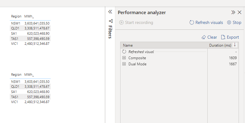
to test it, I built two exact same visual, one using composite and the other Dual
So Far, so good, nearly same performance ( it is hard to believe it is 80 millions rows, and the region is Tokyo )
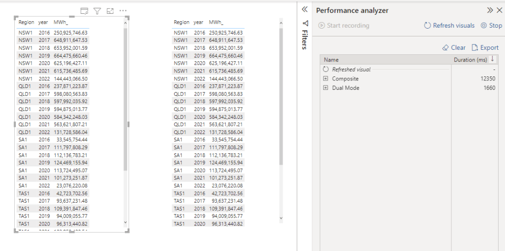
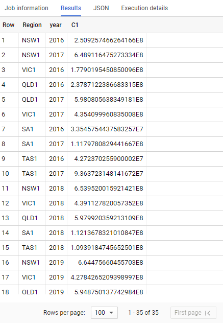
Now let’s add a date dimension, show me, Mwh per state per year
that’s not Good, 12 second is definitely not interactive, my first gut feeling, BigQuery slow down because of all those filters value, let’s check
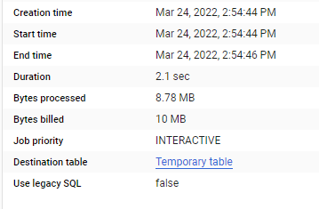
And Now Dual Mode, which make the joins at the source, that’s why I am billed for 30 MB ( Synapse Serverless do the same)
Data Transfer is the bottleneck
ok doing the join is faster, but still it does not explain the big difference observed in PowerBI. now let’s check the result set returned by every Query
Dual Mode
35 rows, the same level of granularity as the visual
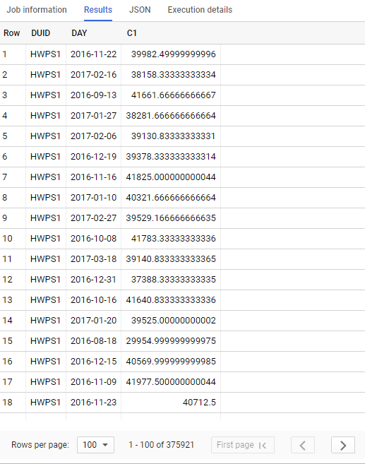
Composite Model
375K rows returned, yes, it is correct, PowerBI in composite mode don’t know anything about Year and Region, it has to get everything by DUID and Day level then group everything locally using the special join.
Downloading 370K will be slow and not very efficient for everything involved here, yes I know, you can add dimension year and region to the fact table, in that case we may just use flat table and call it a day. (I am joking you still need a dimension specially f you want to join another Fact)
so is Composite Model Bad ? absolutely not, but there is no free lunch, if you use it with dimensions that generate a small number of row it is fine, otherwise it can be slow, DWH are fast but data transfer is always a problem
How about Direct Query for PowerBI Dataset
it works the same way, two remote PowerBI Dataset are absolutely isolated from one another, PowerBI just see them as a separate Server !!!, and the join works by passing filter values around, Vertipaq is very fast though and all the datasets are located in the same space, I suspect it is less of a problem, But if you are not carefully enough with dimension with high cardinality, it may slow down the experience.
This is an example of a composite Model between two very small tables from two PowerBI Dataset, the DAX Query is passing day filter around, it is still fast, but the more you add, the slower it get.
We don’t use Composite Model at works as currently it needs a build permission for every user, and I did find sometimes rebuilding a model from scratch is much more practical than trying to decipher someone else disconnected table measure shenanigan, I think we currently use it only for special model to show a summary of all KPI from all existing Models grouped at a very high level.
The perfect use case for composite Model is if you have a Mature Enterprise Model and you need only to add a special dimension, like a different hierarchy then it is just perfect, anything else you need to be rather careful , you may end up with spaghetti Models all over the place.
What if ?
But I have to admit, the concept is very tempting and make you wonder, what if somehow we can just join between two arbitrary dataset using a real join, Vertipaq engineers are clever and they can figure it out, what if PowerBI service somehow accept a DAX Query and loaded not the whole Models but just the columns used for the Query , maybe even only the partition needed for the Query, what if in PowerBI service you will have different dataset just for storing data by department, and a lot of lightweight Logical Model in Direct Query mode.
Total separation of Storage, Compute and Semantic Model all using the same tables, can we just imagine how Vertipaq will look like in 2030 ?
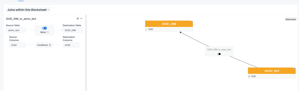
Sometime to understand and appreciate how PowerBI Engine works is by comparing it to other product, when I was playing with thoughtspot, I noticed if you want to show items from a dimension that don’t have any value in the fact Table; you simply Model the relationship as a right join ( or full outer join to get values without a dimension item)
The Semantic Model is a very simple Star Schema with 1 Fact and 1 Dimension.
And here is the Query generated
SELECT
  `ta_1`.`StationName` AS `ca_1`,
  IFNULL(sum(`ta_2`.`Mwh`), 0) AS `ca_2`
FROM `testing-bi-engine`.`starschema`.`aemo_fact` AS `ta_2`
  RIGHT OUTER JOIN `testing-bi-engine`.`starschema`.`DUID_DIM` AS `ta_1`
    ON `ta_2`.`DUID` = `ta_1`.`DUID`
GROUP BY `ca_1`
LIMIT 1000
The Only reason, I noticed the right join, the Query was not accelerated by BigQuery BI Engine which is weird as the same Model in PowerBI was working fine !!! ( Btw, right join with small table should Work, I think it is a bug in BigQuery BI Engine, BI engine added support for right and full outer join)
Now I checked the same Model in PowerBI, using both Fact and Dimension as Direct Query
I am using only one visual using a Station Name from the dimension table and measure (Mwh) from the Fact Table
As expected because I am using “assume referential integrity” , the SQL Query generated will be an inner Join, one SQL Query is enough to get the data required.
select `StationName`,
    `C1`
from
(
    select `StationName`,
        sum(`Mwh`) as `C1`
    from
    (
        select `OTBL`.`Mwh`,
            `ITBL`.`StationName`
        from `test-187010`.`ReportingDataset`.`UNITARCHIVE` as `OTBL`
        inner join `test-187010`.`ReportingDataset`.`DUID_DIM` as `ITBL` on (`OTBL`.`DUID` = `ITBL`.`DUID`)
    ) as `ITBL`
    group by `StationName`
) as `ITBL`
where not `C1` is null
LIMIT 1000001 OFFSET 0
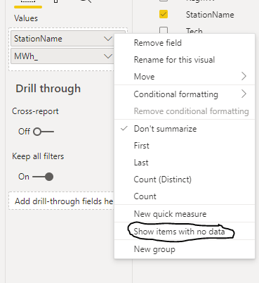
Show Items with no data
Now let’s add this option, Show items with no data ( Station Name that have null value in the Fact)
To get the required Data, you would expect a right join ? or maybe a left join from dimension to fact, I am glad that PowerBI Engine is not using either options, as Both are not optimized for BigQuery BI Engine, as a matter of Fact PowerBI Engine use only left join and inner join.
BI Engine is designed for a Big Fact table and smaller Dimension Tables ( 5 Millions as of this writing) my understanding it is a good practice for performance to have the small table at the left join side( this apply to other distributed Query Engine too like Synapse), anyway the Queries generated by PowerBI are fully accelerated and that’s a great news.
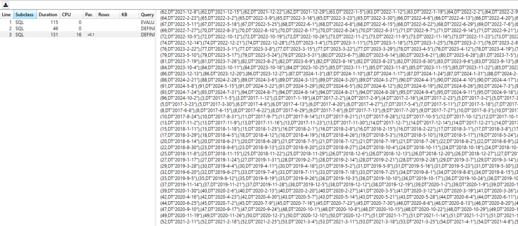
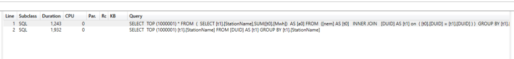
Using DAX Studio, I can see that PowerBI has generated two SQL Queries
one inner join to get the measures by dimension from the fact, and another Query to get all the items from the dimension Table, Then The Formula Engine join the results.
Ok why Should I care about Dual Mode ?
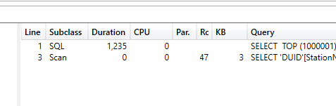
The answer is simply performance, let’s change the dimension Table to dual Mode
Now Let’s run the report again and see the Query generated using DAX Studio, yes it is still 2 Queries, but now the second Query is hitting the local cache (notice the word scan ) and the duration is basically 0 ms, so we saved nearly 2 seconds
It is all about the Slicer
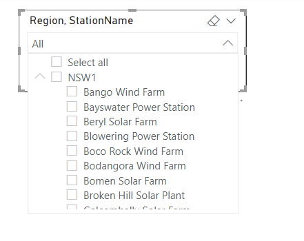
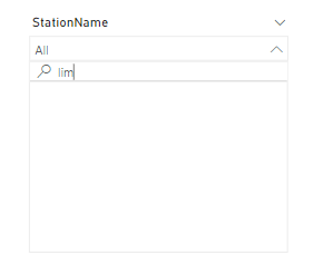
Now let’s add a slicer to the the report, Both tables in Direct Query Mode
First issue , it is case sensitive, if you search “lim” you get nothing
The Second Problem, every search and selection trigger a new Query , Based on my own experience, a user can wait for a report a couple of second to get results, but if the slicer is not instantaneous, they will thinks something is not working
When I change the Dimension to Dual Mode, the search is instantaneous and not case sensitive, and the report will send only 1 query to get the results back
What’s the catch !!!
Dual Mode means the Table has to be refreshed to get the latest Data, if your dimension table change very frequently ( like a couple of second ), then you will get the same limitation of data import, but I think usually this is not the case, in the previous example the dimension change once a couple of months.
Take Away
If you have a Direct Query scenario, dual Mode for dimension Table is a very simple and efficient optimization and require literally one click.
Both PowerBI and the source Database have a concurrency limits (in Direct Query Mode) and the best optimization is not to generate the SQL Query in the first place, it may be not a big deal for one user, but for a hundred of users, it start to make a substantial difference, and obviously dual Mode assume a star Schema as a Data Model.
Another aspect which I think is not stressed enough in the discussion about DWH Modelling, The BI tools does Matter, Modeling is not done in vacuum, the reporting tables for PowerBI are not necessarily the same for Other BI tools.
I have a bit of an obsession with Modeling language, I am referring to semantic model language like PowerBI tabular Model , Looker LookML and the new alpha release of dbt metrics and Google Malloy
For some reason, TML the modeling language of thoughtspot is not getting enough attention, although IMO, it is one of the most mature offering right now in the so called “Modern” Data Stack.
This is not a review, I spend some time in the weekend playing with the free trial, (no credit card required , and you don’t need to talk to a sales department) and I thought it is worth sharing some notes.
For Any test, I always start with the same Model, 3 facts tables with different granularity and a couple of common dimensions, because this is the kind of Model I use at Work with PowerBI.
My Data is loaded into BigQuery, connecting to the database in Live Mode and selecting the Tables was very straightforward, adding the relationship between Tables was very easy too, using a simple GUI.
Here we go, a Multi facts ( AKA Galaxy Schema ) is supported out of the box, in other BI tool Like Tableau for example, you can have only 1 Base Table, here like PowerBI it is not an issue.
Although I build the Model using GUI, the code is written behind the scene, you can build it by hand or edit it, or simply import it.
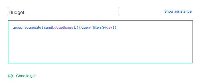
Complex Measures
in this Model the table Budget don’t have a date dimension ( 1 Km of Electric cable is the same independent of time), to model that, I need to tell TML that the measure budget should ignore the date dimension
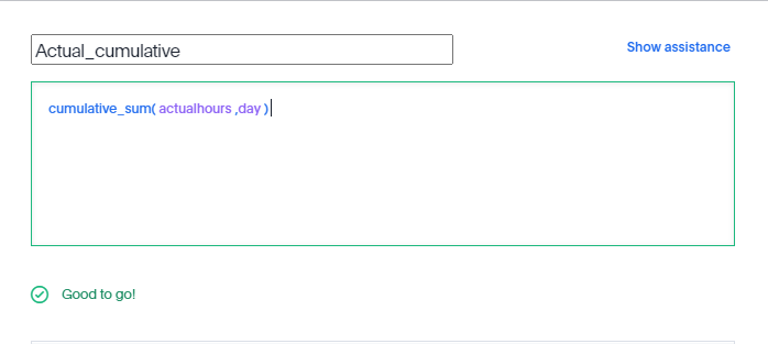
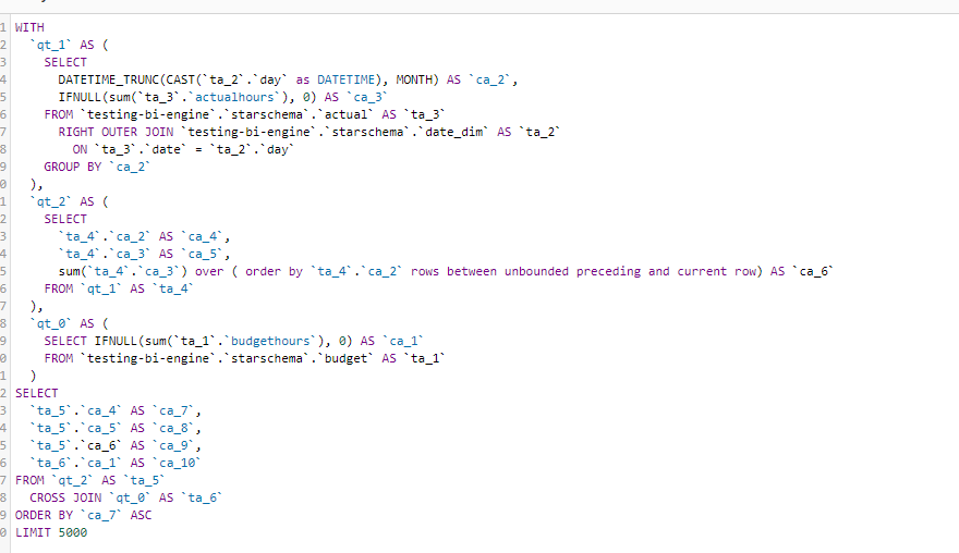
As far as I can tell and based on the SQL Generated by Thoughtspot , there no Post processing for the calculation, Like PowerBI Formula Engine and Looker Merge results, all the calculations are done at the Source Database level, there is even a very nice visual Query Planner
You can see how sum cumulative was translated to SQL sum () over (order by)
Take Away
There is a lot of discussion nowadays about the need for a pure logical metric layer, where all the calculations are done by the DWH, unfortunately most of the proposals are either immature or sometimes are just magical thinking, TML is a damn solid language and a Query generator, and the guys building it knows what they are talking about.
I think if thoughtspot somehow decide to release TML as an open source Project with the Query generator it will change the current market dynamic, The Cloud Data Warehouse are getting really Fast and they deserve a decent Semantic Layer.