Specifically in the world of project controls, I have found the strategic approaches to digital strategy to perhaps be a bit lacking. This was the key impetus for me to put together the presentation last year. For me, digital strategy is not about implementing PRISM or EcoSYS. It isn’t even about upskilling your staff. There are more holistic views that can enable users to operate smarter. Obviously, this goes hand and hand with systems and education. They key is that nothing exists in isolation. You need a fully comprehensive approach that touches everyone on your projects.
The genesis of the ideas were several posts on LinkedIn and a Blog Post on Digital Strategy
I have posted each of these separately, but nice to have them all together in once concise post that I can reference in the future. There is a similar post on Agile in Construction
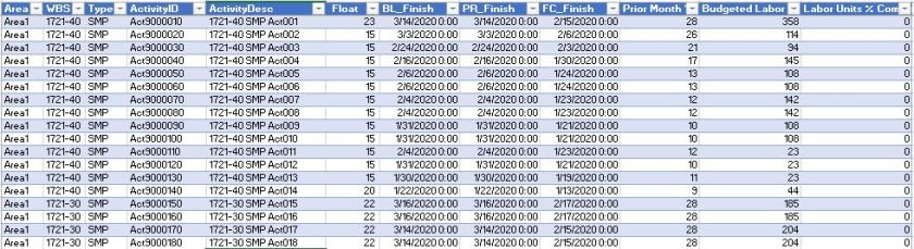
Digital Strategy – Dealing with Excel Hell
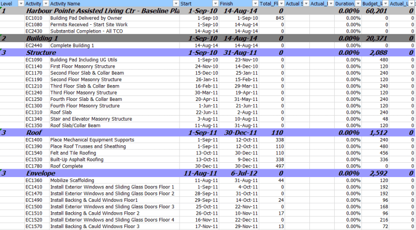
Excel Hell is where we all live and the area of our business that has seldom been touched by digital strategies. Perhaps times we start to think what we can do about it and move to the next step
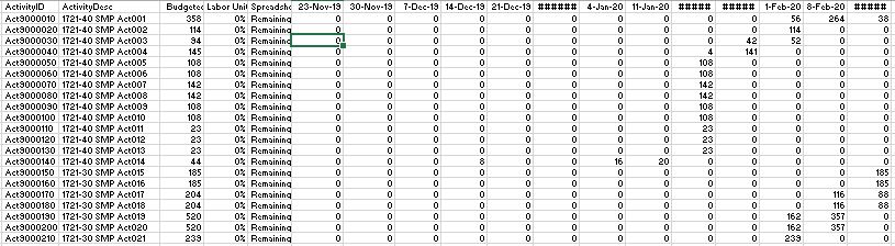
Digital Strategy – Enter Data Once
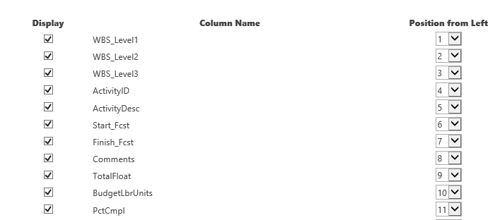
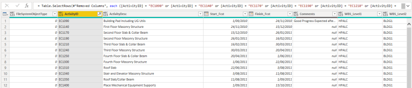
The next step is Entering Data Once. This term is tossed around a lot, but the way we view and deal with this is a dogs breakfast. I don’t necessarily understand all the possible solutions, but perhaps the framing of the problem and discussions about what we can do about will stimulate some discussions.
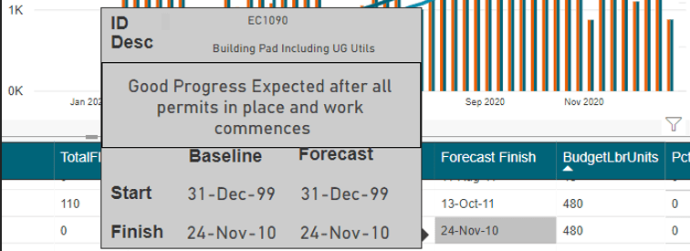
Once we have data stored digitally, we can move onto the next step: Be Visual
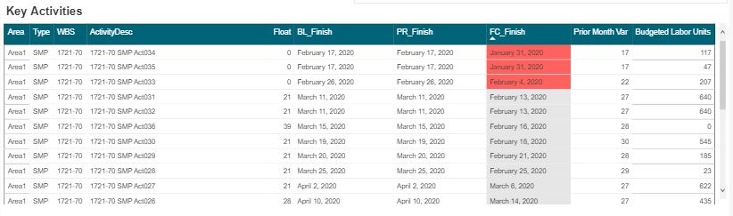
Something as simple as a daily report – can be insanely valuable when translated into a digital environment. Enter information once and allow the entire project access to it. Digital forms – using tools such as OpenText allows for your creativity to be the limiting factor in entering data once and using it everywhere. Tools such as NINTEX can also so easily be tailored to fit unique custom needs in your existing sharepoint platforms.
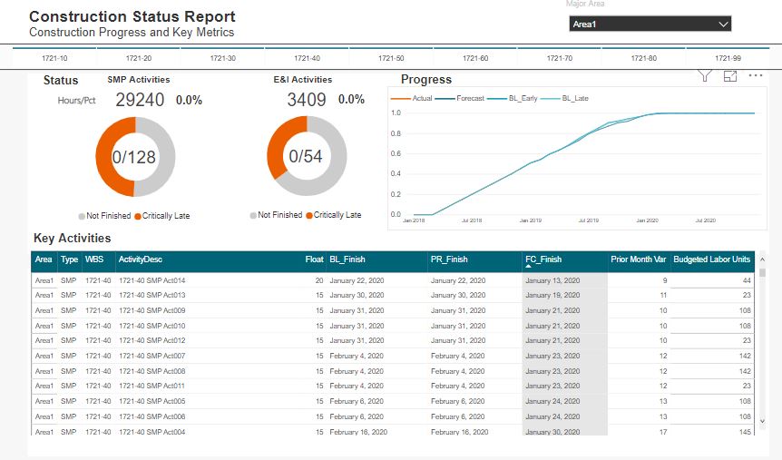
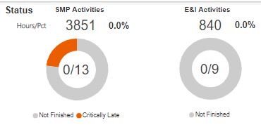
Digital Strategy – Be Visual
The future is all about digital dashboards. If you are not in this space now, you will be in the future. Now that we have our key data stored in a digital format, we can start to move our reporting into the 21st century: BE VISUAL!
Whats in the Future?
I think the sophistication of many of the commercial software packages can in some regards leave my beliefs redundant. Companies like Sablono, Procure and JIRA not to mention a myriad of other providers are implementing many of the concepts I try to follow related to digital strategy. While some of the tools are known in the construction world, I urge people to push the concepts of MASHUP. If you can use something from another field in a creative way inside construction – that is where innovation and disruption come from.
Gaining awareness of what is out there, gaining clear understanding of the current capabilities of your staff and in general, being at the forefront of our technological world is what the future will bring
Thus, perhaps the most important strategy I can recommend
Digital Strategy – Follow all the latest Trends and know all the software capabilities
This is perhaps at the core of my beliefs. Unless you at the forefront, vision alone is not sufficient.
Digital Strategy – IT by itself does not solve your problems – its how you use IT