
When we look at our project management world, we have to assume that each project will have its own website. These project websites can be leveraged for so much more, specifically displaying progress information. It is my hope that over a few posts, I will outline some key techniques, not just from a data point of view, but more from a communication and management point of view. My world and view is not just about diving into data and code, but more about actually using our new friends to drive an entire new management approach. We will never succeed with the coming digital transformation of our business, without leaders that have a vision on how we will use and inspire our team to use technology.
A lot of focus on the project management world is on PowerBI. Its important to understand that plain old vanilla websites using the latest web technologies can also provide stunning and relevant information to suit the needs of projects. Projects will need to utilize a range or tools and approaches to manage their jobs. This is just a flavor of using D3 which in some instances can be easier to embed into webpages.

So, what do we need
- Progress Data
- A visual
- Linking data to the visual (using an API)
Progress Data
We normally think of progress as being a %. That doesn’t always need to be the case. In construction projects, QUANTITIES are often a better representation for where a specific element of scope is at. At a good friend always told me “know the quantities, know the job!”. Thus this example will deal with quantities.
For this example, I am using some hypothetical job which is tracking Fabrication Tons per shipment. We will have 4 shipments, each with varying amounts of tonnage. We could in theory toggle the view to show # of modules fabricated; however, here I have just used total tonnes (I don’t really care what modules they are fabricating, just total for the shipment).
Thus our progress data will comprise 3 key metrics
- “Total Shipment Tonnage”
- “Plan Tonnage per Shipment”
- “Actual Tons Fabricated per Shipment”
Our Visual
We will be using a “Bullet Chart”

The bullet chart in this example has a few elements (each element will need to be represented in the underlying data we pass into it).
Title: As you can guess, this is just the title
Subtitle: A smaller sub heading that is displayed
Ranges: These divide the bar into 3 pieces each with sizes according to values
Measures: This describes the “progress bar” as we would know it. The visual allows 2 metrics of progress. The fabrication, this bar could represent tonnes cut, and another bar for tonnes fabricated”. For our example we will use the same value for both to just display 1 progress bar
Markers: This is a horizontal marker that is displayed on the bar. In our world, this market is typically the “plan” data point, and we will use it as such. The visual only allows 1 marker.
Linking Data to the Visual
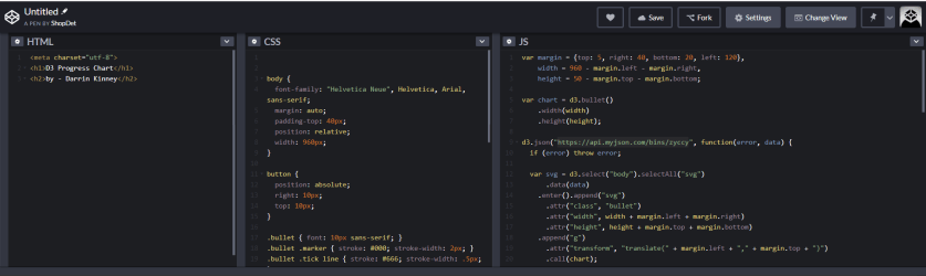
To drive the visual, we will need an API to serve the data in the required format. The data can be passed as JSON data well (that is what the API does anyway). This example I have used a great tool called myjson.com.
I do not have the proper digital team and database group or server to actually drive this with a full backend. But, I can easily emulate what a database backend can provide. Here is what our JSON data needs to look like to drive the visual
{"title":"Group 1","subtitle":"1,756 Tons (1,708 issued)","ranges":[1756,1756,2500],"measures":[1708,1708],"markers":[1756]}
The full sample dataset for this visual can be seen at the below.
https://api.myjson.com/bins/zyccy
CODEPEN – Bringing It All Together
Codepen is an amazing tool to live test out web pages. Again as I mentioned, I do not have a back-end platform to build from, nor do I have a web team. If you have one, they can run circles around me, but the fundamental ideas are the same
Strategy – you don’t need to be the pro – but you need to know enough to effectively drive your team
I have found too many managers are not hands on enough with the development team, or properly embedded within the projects to really pull user needs – and obviously champion the use of technology. Our projects are run by our lead cost and lead planners. Unless you are in those chairs pushing technology, you will fail.
Strategy – you need insanely close alignment with your lead cost and planner with a common vision to develop and push new ways of working.
You can directly link to the codepen code vai
To drive this visual, all we need to do is embed the API link
d3.json("https://api.myjson.com/bins/zyccy", function(error, data) {
if (error) throw error;
We will also need links to the required Javascript, specifically:
Conclusion
Nearly all project controls data can be viewed in this way. Other, radial charts or graphs are better it really just depends on what you want. Obviously, this chart could have been built using Excel. From Excel, we can build out tables and other graphs, an then use those to copy-paste into word files for monthly reports. But that isn’t our strategy
Strategy – get everything on the web
When you start building a team, that can grasp how easy it is to build visual like this using web technologies (or PowerBI), you gain the flexibility and ability to expand. Get your underlying data into a format that can be queries to drive a visual such as this, and your results are endless.

Really enjoyed your post Darrin,
do you have a link to the codepen dem0? Would love to see this example in action.
LikeLike
Again, totally simple stuff. However, this would only be a small part of a much bigger (and likely complex) puzzle
LikeLike