First Look at Dynamic M Query parameter using SQL Server

Edit 26 May 22 Please vote to have table function available in Datamart

With PowerBI February 2022 release , finally we can use M Dynamic parameter with SQL Server in Direct Query Mode, I was really excited, I had a couple of patterns where I used M Parameter with BigQuery to do calculation on the fly that iare not supported natively in PowerBI, for example Geospatial calculation.

My first example was dynamic changing of dimension, it just works as it is relatively simple, see example here, very excited it works.

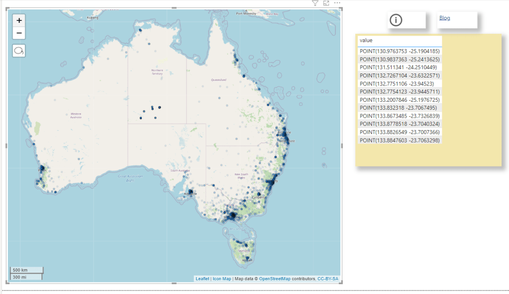
Then I tried to port this example from BigQuery, basically you select some points in a map, and you get back the polygon and the area, The calculation has to be done on the fly, pre calculating the results is not practical, generating all possible calculation is just too much.

The first step of getting the points selected as a nice list was very easy, see code here

let
TagsList =  if Type.Is(Value.Type(tag_selection), List.Type) then 

     Text.Combine({"'" , Text.Combine(tag_selection, ",") , "'"})

    else

Text.Combine({"'" , tag_selection , "'"}),


finalQuery= "select 1 as poly, value from string_split("& TagsList&",',') ",  

      
Source = Sql.Database("XXXXXXXX", "DB", [Query=finalQuery])

in
    Source

I selected some points in Icon Map and dynamic M parameter get populated, I was really excited, The hard part is done and all I need is to write some T-SQL

T-SQL Rabbit hole

I am no SQL expert by any means, by some weird coincidence, my first Database was BigQuery, (I used MS Access long time ago ), so this is the first time I tried to use T-SQL in a non trivial way ( at work I use T-SQL to retrieve data, maybe doing some joins and stuff in that nature but no GIS for sure).

The Good thing is , the amount of resources available on SQL Server is phenomenal, I got some indication on Stack overflow, but something weird happen.

I start writing T-SQL code in SSMS and it works fine, when I copy it to PowerBI, it generate errors, I was really angry and can’t understand what’s going on, I thought it is something weird about PowerBI.

I know that PowerBI, embed any custom SQL inside a Subquery, that’s very standard, actually Tableau does the same as well as Google Data Studio.

Turn out, SQL Server don’t support CTE inside a subquery

Chris has blogged about it here, that was very kind of him, basically his points is just write a view in a database, it is better to have the logic upstream anyway, which totally make sense, except it is not a realistic solution, Business users don’t just get write access to the database, actually they are very lucky to get even read access.

Update : we now have Datamart which will change everything.

Track BI Engine using information Schema

BigQuery team recently released a fantastic new functionality, when using BI engine, all the statistics are saved in the INFORMATION_SCHEMA.

When using BI Engine one major pain was it was not very clear why sometimes the Query is not accelerated, yes you can see the the result in the console, but it not very sustainable when you run a lot of queries.

Here is a query I use to tack the workload in a particular region

SELECT
  job_id,
  (case when bi_engine_statistics.bi_engine_mode is null then "BigQuery" else bi_engine_statistics.bi_engine_mode end) as Engine_Mode ,
  user_email,
  xx.project_id,
  query,
  creation_time,
  start_time,
  cache_hit,
  TIMESTAMP_DIFF(end_time,start_time,MILLISECOND)/1000 AS duration,
  SUM(total_bytes_processed/1000000000) AS GB,
  SUM(total_bytes_billed/1000000000) AS GB_billed,
  STRING_AGG(t.message) AS reason
FROM
  `region-asia-northeast1`.INFORMATION_SCHEMA.JOBS_BY_PROJECT xx
LEFT JOIN
  UNNEST(bi_engine_statistics.bi_engine_reasons) AS t
WHERE
  creation_time >= '2022-01-01'
GROUP BY
  1,
  2,
  3,
  4,
  5,
  6,
  7,
  8,
  9

And to make the results easy to explore, I load the query results in Google Data Studio.

For example, I aggregate the reason why the Query was not accelerated by BI Engine

Based on the results, you can decide for a some mitigation, The Obvious one is to increase the reservation, or if you hit some current limitation of BI Engine change the Data Model.

In this particular case I am using TPC-H Data Model as an example, although it is very useful for benchmark, it is not really optimized for a BI Workload, joins are expensive.

Star Schema for the Win

As of this writing ( it may change anytime though), BI Engine support a Star Schema with up to 5 unpartitioned dimension tables.

You can denormalize the tables supplier and customer by merging nation and region, and orders and lineitem to get rid of join to a partitioned table.

Alternatively if the data don’t change much, you can go rogue and Build a giant flat table.

Or use Nested Data Model, although I did find it very complex to understand just conceptually, and there are no easy to use front end tool to take advantage of it.

Usually Data Modeling can be bring some strong arguments, Star vs Flat vs Snowflake, I think it does not really matter, what is important in the Case of BigQuery, any interactive Workload has to be accelerated by BI Engine, the extra boost in speed and specially the cost is very hard to ignore, so Model any Schema you want as long as BI Engine support it.

I am keeping the stats in the public report

Poor man’s snapshot using PowerBI Dataflow

It is a quick Hack and maybe useful, let’s say you want to keep a snapshot of a previous data, for example you have a dimension table and you want to see how the data has changed between multiple load.

This Scenario was famously hard to do in PowerBI, because when you load a table a into PowerBI Database, by default it will overwrite the existing data, there is an option for incremental refresh, but it assume your data change daily or at least regularly.

The canonical solution for this scenario nowadays is to attach a workspace to an Azure Storage, unfortunately, it is very problematic for a couple of of reasons

– Business users don’t usually have access to Azure Resources.

– As of today, a PowerBI admin need to opt for that Option, which apply for all Workspace Admins, it would have being easier if that option can be granted to only some Workspace Admins.

XMLA End Point

The Idea is very simple.

  • Getting already Loaded Data from a PowerBI using XMLA Endpoint ( See this blog for how to use it).
  • Load the new data using a Dataflow.
  • In the Same Dataflow you can append only the new Data, or any operation you want ( like merging new Data), it is very flexible, it can use any attribute not only Date
  • Just make sure there is a lag between Dataflow refresh and PowerBI Dataset refresh

Dataflow Should be Better

The Obvious Question ? because Dataflow keep snapshots of recent loads, why we need the extra step of attaching an Azure Storage, why not exposing this data using some extra option in the UI.

I think after all this years, it is time for Dataflow to tackle more use cases, can we have an option to append Data instead of overwrite ? or why not an easy to use upsert.

PowerBI made Data Modeling nearly trivial, Hopefully Dataflow can make Enterprise ETL available for everyone.

PowerBI Custom Chart Ranges

My go to progress dashboard calculates a lot of progress % metrics and graphs. However for larger projects, its often difficult to zoom into the graph. This is exactly why slicers exist

Slicers are not my specialty, actually, PowerBI is not my specialty. So it was with a little frustration in trying to add a slicer to a page to find the slicer altering all my data.

Set The Stage

My go to progress dashboard calculates a lot of progress % metrics and graphs. However for larger projects, its often difficult to zoom into the graph. This is exactly why slicers exist. I am sure there are other nice graph tools that allow for custom date ranges, but again, this is so not my specialty.

What didn’t work

I simply added a slicer on my “weekending” field. However, in doing so, all my measures are now calculating based on the filtered date range. This is likely an issue with my measures, but alas, I wanted something to just adjust the graph axis and not effect anything else

Below we can see that my measure are calculating a progress set from 0-100%. Thus when the date ranges were adjusted, the entire dashboard is now just wrong. My budgets and %’s are also not correct on the cards (which are also based on all the slicers).

The Solution – Create a Duplicate DIM_Date Table

The problem was caused because the slicer was based on the live master dimension table that was linked to my data. Just like I want my graph to adjust based on the adjusted the WBS dimension tables, if I insert a slicer linked in anyway to my FACT table, I am in a world of hurt

Thus, just create a duplicate DIM_Date table. Here I created a new table: DIM_Date_GraphRangeSlicer

I insert a formula into the chart X-Axis range to select the min and max dates from this new GraphRange table. I then setup a slicer that filters the range for this new table, not the master DIM_Date.

With these new ranges, linked to the dummy date range, I can now much better refine just the X-Axis display of the graph without impacting any of the measures used to calculate the % progress.

The Result

Putting it all together, we can now customize the X-Axis range without altering the measures or cards that are calculating key metrics off the full (or filtered based on the WBS slicers) data.