A typical situation in the construction industry the progress data is sourced from multiple system with different format, generally we get two type of reports.
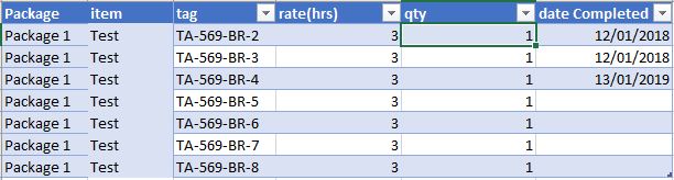
Time stamp items
My preferred one, the data is tracked at a very low level (cable, spool, pre-commissioning and commissioning tracking), and you get a date when the item is completed something like this
This format is very convenient as you need to maintain only 1 file, the history is recorded in the data itself unfortunately, this kind of report is not always available for multiple reasons, the main one is, in some kind of work to finish one item it will take longer period of time, for example completing 1 drawing will take 3 weeks, no manager will wait 3 weeks to claim a progress.
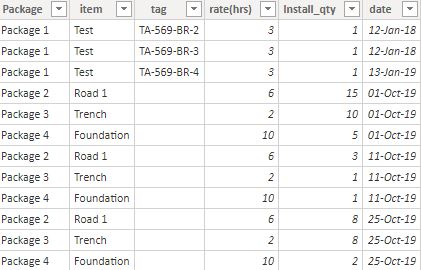
Cumulative Progress
This format reports the cumulative progress at a time period (daily, weekly, or whenever there is a progress) something like this
This is format is very common, it is very easy to update by the supervisor, and works with any level of details
the challenge of this format is
To get the historical data you need to keep all the previous files.
As it is cumulative data, calculating the progress per time period is a bit harder, and getting something like year to date is very awkward.
we need to normalize those files to be in the same format, one approach I use with PowerQuery is
Load the cumulative files.
Calculate the reverse total cumulative using self-join
Filter only the values where there is a progress
Append to the time stamp file.
Now we have a normalize Actual Table, where quantity per period, year to date and all date calculations are very easy to calculate.
I know it is tempting to just load data and start making visual and do some complex DAX calculation, but it is not sustainable and it will make your life miserable, a simple data model will make further development much easier.
This post is an extension to that which instead of looking at engineering model development, instead looks at construction development. I don’t want to delve too much into the details about exactly how this was built (again see the post above).
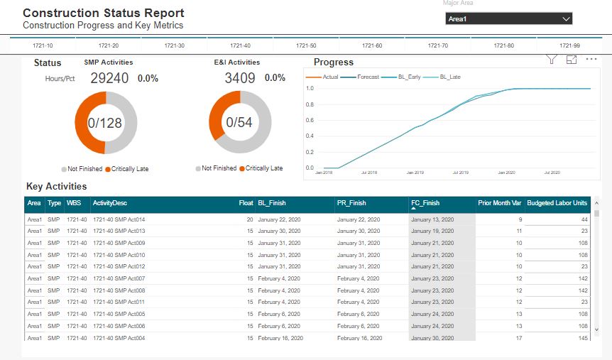
Some big differences is that I have used a resource assignment view. in addition to the date metrics This allows for resources histogram and progress curves to be quickly sorted down to an activity level. This approach also follows a prior post Resource Analysis Dashboard .
The data
The underlying data is very similar to our engineering progress example. We can use a flat file export direct from P6 with a standard set of columns. As I have mentioned before, you can achieve this in a SQL query as part of a larger data model, although with everything, a delicate balance is needed (balancing database formalism and easy excel solution)
We will also have the resource assignment data
The WBS Slicer and Area Selection
This design element doesn’t work for project with too many WBS elements. For this example, each major area only has about 10 WBS elements, therefore I could pull this off with no drama. I really prefer this selection as opposed to drop downs where it is often difficult to quickly make selection.
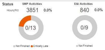
The Pie and Metrics
Here we follow much of the look and feel I used with the engineering progress; however instead of just using activity count metrics, I have also inserted hour and percent complete metrics. There is nothing fancy about these.
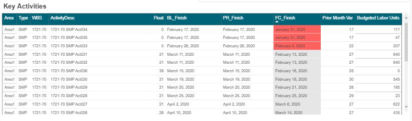
The Data Table
I’ll sound like a broken record again, when you have a good design with one aspect of a project, you can likely take that and run with it for many other areas. In a following post I will detail this systems engineering aspect to nearly everything we touch.
Obviously the key inclusion into the table is the budget units and %’s. I still prefer these tables views vs the GANTT views. Having clear visibility into the last month dates, the prior month dates, and variances is the purpose of this view.
The Future
Again, the extension of this are endless. At this stage, we are starting to see how pre filtered views provide more focused dashboard as compared to a one size fits all. Sitting in an EPCM world, most of the detailed activities and schedules are managed by our contractors. Thus, this construction view is more suited to using an export from a contractor Level 4 schedule.
At some point, we will need to begin to discuss an overarching design where a user can navigate to our various dashboard in a logic way.
I have been asked to produce a simple construction report, we need to show the last 4 weeks of actual progress data and 6 weeks of forecast and to make thing a little bit complex the average installation since the start of the project, nothing special three measures, average to date, install per week and forecast per week
Obviously, it is trivial to be done in Excel using named sets,
if you don’t know what’s named set and cube formula is, you are missing the
most powerful reporting paradigm in Excel, a good introduction is here,
and there are plenty of resources here.
Unfortunately named set is not supported yet in PowerBI, you
can vote here,
Just for demonstration purpose, if you try to add those three
measures to a matrix visual, PowerBI just repeat them for every time period, obviously
that’s not good at all, the actual
installation make sense only in the past and the forecast has to be in the future,
there is no option to hide a measure if there is no value in a column and even
if it was possible we need to show the average installation independently of
the time period, anyway this the report when you add the three measures
and because I already learned a new trick on how to dynamically add measures to a matrix visual in PowerBI, I was tempted to try and see if it works in this scenario.
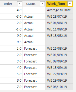
So, let’s see how it can be done using the disconnected table
Create a disconnected table with two columns
Order and status
Add a calculated column,
As the cut-off date change at least three times a week, the week number change accordingly, we can’t simply hard code the dates, instead let’s add a new calculated column, which will just lookup the week date from a master calendar table based on the order, when the order is -4 it will return “average to date”, I added a dummy 0.5 order just to add an empty space between actual and forecast ( cosmetic is important)
Who doesn’t love the glossy Level 1 reports our project produce. But really, when you look into these beauties, really understand the difficulty that goes into them. What follows is first a description of what a typical Level 1 report is, and how we can structure our excel based data to be a bit smarter.
This is by no means a fully comprehensive guide on this subject. It is instead just a primer to get us thinking about how we feed data into our reports.
Who doesn’t love the glossy Level 1 reports our mega construction projects produce. But really, when you look into these beauties, do you really understand the difficulty that goes into them. What follows is first a description of what a typical Level 1 report is, and how we can structure our excel based data to be a bit smarter (which is the real message to this article).
Interspersed with hopefully be a few key strategy points which can guide your work.
I’ll then showcase how you can take what will now be structured data and upload into a powerBI visual (although the process to capture the data into any database and drive any visualization tool would be the same)
Strategy – Don’t be afraid to use excel (not everything needs to be automated)
Key Elements of a Level 1 Report
Cost and Progress
Here we are presented with:
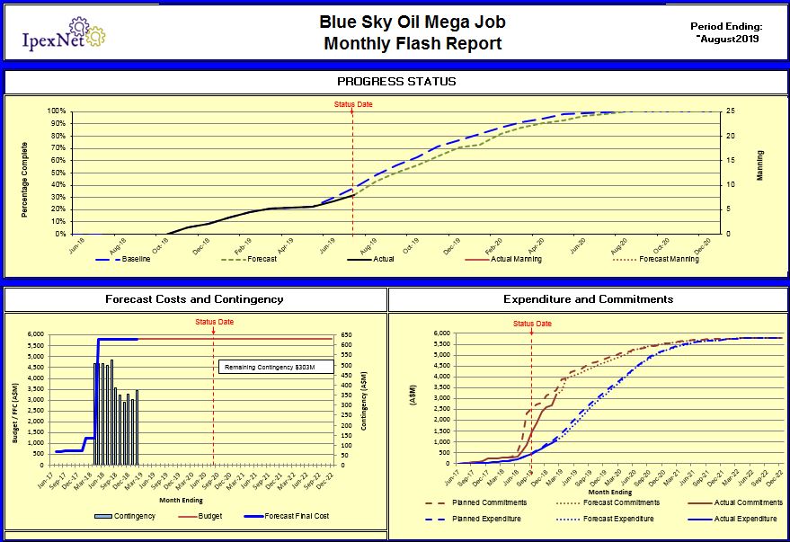
Overall progress curve
Financial Status
Cost & Commitment curves
Some may argue what to lead with – for me its always %. No bigger value highlights where your are more than what % are we. Not displayed on the image above is a data series reflecting how many people are have and comparison against planned. People achieve progress. Its impossible to talk progress without talking how many people we have. The graphs provide enough enough context to allow for discussions about productivity without having to muddy the waters
The cost sections should include visibility into what our final forecast costs will be (and comparison against baseline). Underneath that key metric are a few sub items such as how much contingency we have, a few cost curves associated with spend profiles and commitment profiles.
Schedule and Narrative
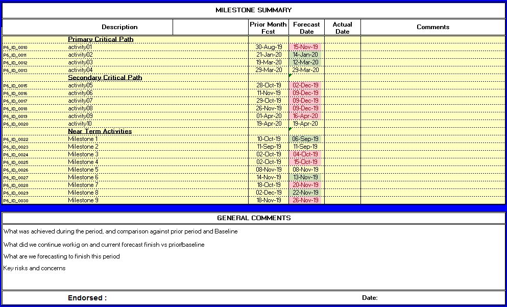
Yes, my secondary critical path finishes after the first – gotta love random data!
The schedule aspects of a Level 1 report are always tricky. Do we need to only display the final project milestone? For me, on major projects no single DATE has any meaning. Thus even on a Level 1, I still prefer to include 10-15 dates that represent some key aspect of the project. All dates should be compared against what we said last month to highlight current month variances, and dates should be compared against our project baseline (or whatever current approved version thereof).
The narrative section of a Level 1 can nearly always be updated by simply reading the progress, cost and schedule tables. Just put words to the graphs. Key adders here are insights into RISKs. What may come in the future that will alter what we are saying today!
Safety
As always, safety metrics are also usually front and center. For me, this has always been a difficult aspect of our jobs. A political correctness that is forced into our reporting. Don’t get me wrong, safety is the most important aspect of a project. So, including a safety table somewhere on the Level 1 is always done. For this article, I want to instead focus on the key project control elements and data integration.
Level 1 Data Structures
So, we all know what a Level 1 report looks like, and I would fathom we can all mostly agree these are the elements included and can be rolled out as a standard for any major construction contractor. Most of our reports likely already report this information in some manner or another. The entire point of this article is that we should really focus on entering the data in a smart data centric way so that if you want to automate anything down the line, you have the foundations to do so.
At this stage, I don’t want to talk about the source data used to generate your summaries. We can leave that for a later discussion.
Key Data Domains
Progress
Cost
Schedule
Narrative
We are aiming towards consistency here and want to actually represent all the data required for our key Level 1 chart to be housed in a database. Therefore we need to have structure.
Strategy – Do not focus on systems, focus on DATA
A critical strategic element in my approach is that I do not care what systems you use. Our reporting is not a function of our systems (at least in this step 1 phase). We instead need a structure from which we can extract data and as easily as possible, move that data into a template or format in which we can drive our level 1.
If you go down the path to seamlessly integrate source systems with a Level 1, you unwittingly constrain yourself.
Progress Data
Typically our (time phased) progress data will be sourced from Primavera. There are other systems where the progress data may live, but again, that isn’t the focus of this article – I don’t care where it lives and neither will any seasoned project controls manager. We just need to know it exists and has a common structure
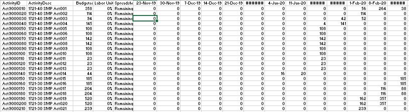
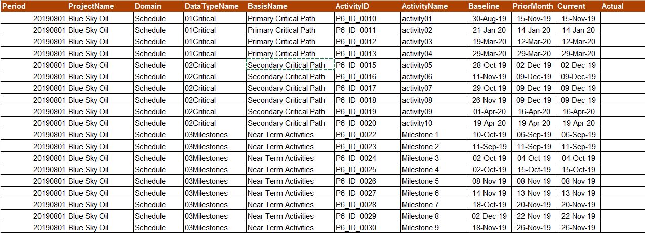
Here, a few key notes, use a consistent data format. The above structure is how all your progress data should be housed, not just Level 1. All time phased data, all the way down to Level 5 detail items should be managed in a data structure, not a fancy formatted excel file. Trust me, updating a table such as the above will serve you in the long run. Even if your data is fully managed inside a system such as P6 or PRISM or ECOSYS or COBRA, you should be able to at least extract Level 1 into the format defined above.
Cost Data
You guessed, we can capture our Level 1 cost data in exactly the same format
In the graphs we are building, there are only 11 specific datasets. Only 4 of these require update on a period basis. So again, we really boil this down to something simple.
Strategy – Do not over complicate anything in your Level 1 layer
The implementation of the specific data model I have outlined above fits the strategic approach to keep your level 1 simple. Any project can implement this data model for Level 1 with without any integration into source systems. Level 1 can be updated by the project controls team doing a few copy-pastes into excel to capture project wide data. Again, I would assume your teams already do this, but perhaps end up copying this data into various other corporate systems as well.
Schedule Data
Again, we are keeping a simple approach and only capture the required information.
Here, we are forced into a different structure. So whereas the cost and progress data can fit the same data model (as seen above), we will need a different template for schedule dates. We will typically be using Primavera, as such this model fits P6, but the idea is universal.
I do not believe this information can ever be fully automated from our scheduling systems. These paths will continually be adjusted. The planning lead will always refine what activities are being tracked to be displayed on the Level 1. Behind the scenes, there are tricks upon tricks to pull the dates, however, again, we are talking about the data layer here, not necessarily HOW you get the data into this format.
It is entirely possible to have the assignments encoded into P6 activity codes. Therefore, it would be possible to integrate your Level 1 data directly into either the source P6 database, or an XER export. In my experience, any automation that is attempted in this arena (for Level 1 data), is futile. We are only talking 10-15 key activities. Let you lead planner sort out how they get the data into this format. Again, our strategy is to not over complicate this. If the data is provided to a digital team in the format about, you are for all intents done.
The model above only captures the finish dates. If added visuals with simplified GANTT charts are needed in your Level 1 (and will be discussed in my next Level 2 article), you would have to edit the above.
The nice value of the above structure is that we have effectively created an interface, an integration layer, between what will be P6 data and our dashboard. The list of what activities can easily be edited by way of a sharepoint list. Then, in your data model, you can link on scheduleID to pull the relevent date data (I suspect many do this).
Narrative
Too often, narrative comments are shuffled between parties via email, entered into several documents, edited, customized, etc. The project controls team is always struggling sourcing commentary from various sources, and in my experience, we end up entering in something ourselves.
Level 1 data structures have to fit into these complications. In this realm, sharepoint offers a canned solution by way of sharepoint lists.
Strategy – If Technology already exists, use it
Strategy – Technology can be used in innovative ways – use a mashup mindset to use existing technology in a new way
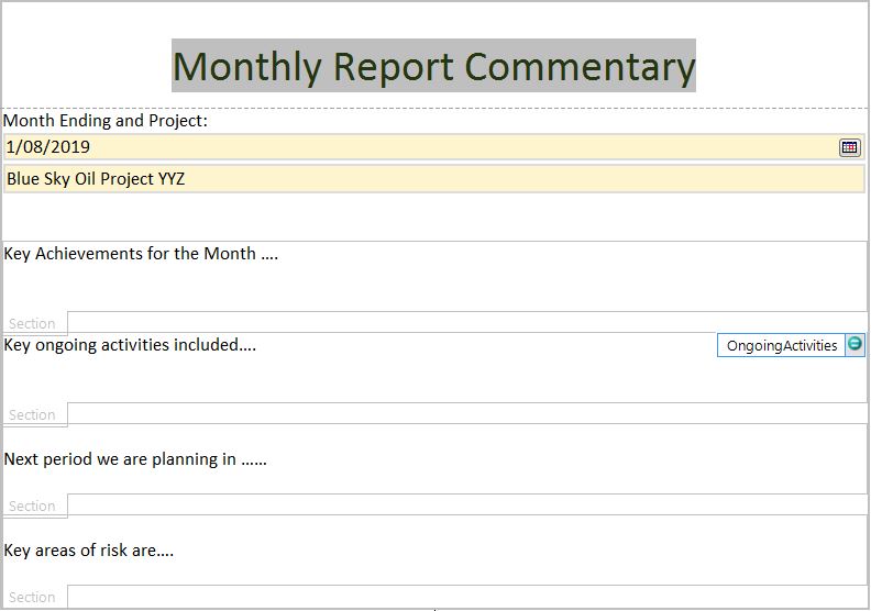
I find that sharepoint lists offer unparalleled capabilities for commentary. However, for lists to be really functional, they need to be embedded into FORMS or some routines that provide export functionality
In this example, I have mocked up a simple INFOPATH form that could represent our sharepoint fields. The sky is the limit when it comes to existing technology that can automate the capture of this type of commentary.
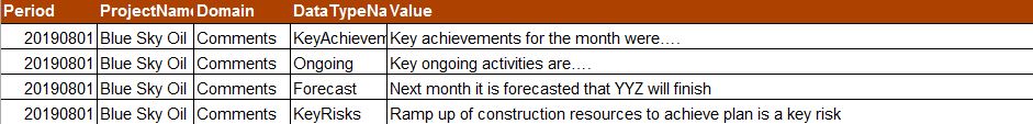
The value adder here is that instead of allowing unstructured comments (via email or manually marking up a word , excel or power point file), we have structured comments that are housed in a database and that database can be updated in a distributed manner using WEB based technologies.
The above would be a web based form which will be updated by the associated responsible parties. However, we can’t quite import a form into our data model. When the above form is filled out, the data will be stored in a data model (which we will have to design first before we can even build the form above). Thus, what we are looking for is something akin to the below
The above is just a table in an excel file, but again, when we house data in this format, it can naturally flow into a database. That is what we need to focus on. Even in our excel reporting world, if you can capture commentary in this tabular data centric way, you can still link to it from your main dashboard tabs to be “smarter” in how information is managed.
Strategy – Focus on the DATA! (I can’t say this enough)
Everything we do can be captured in a data model. Every report we design should be able to pull direct data out of a data structure. Thus, before we add anything to reports, first consider the entire flow of data required.
Putting it all together
At no point in time in the above have I had to rely on a source system. However, I have been able to take a typical Level 1 report and extract everything from it. I have taken this data and outlined a data model (in simple form) that can drive not just 1 project, but an entire corporate endeavor in this space.
As with everything, nothing novel here. Many companies already have systems that capture some of this information. This is more just a thought experiment for those that perhaps do not have a clear data model that supports level 1 reporting. It also highlights the discussion topics of “what are the manual steps” – because there will be manual steps in getting the data into the right format.
For me, everything above has to be manual at some point up or down the food chain. Your projects and portfolios need to have the discussions about where this type of Level 1 data is housed. If all projects already have this data in consistent databases, all you need to do is query that source. Everything discussed here is system independent. You can easily generate these data tables by way of query a source system directly (if you can), but I have not limited or require that approach
Strategy – Whatever you do, allow for flexibility
A Dashboard?
Even though my data model is entirely excel based, the data structure is very powerful. I can, in quite automated steps, import and convert these datesets into a more database model and thus gain value from dashboards that wouldn’t be custom for your project, but could drive an entire portfolio (and when you see how this scales to Level 2 data and beyond, the worlds your oyster).
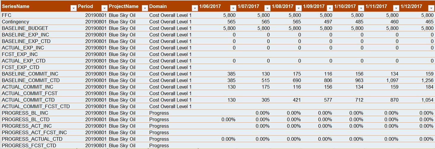
If you actually want to proceed with a dashboard, and if you have your data as outlined above, here is what you can do with it. In fact, I would recommend that your source tab in excel that is driving your dashboard looks like the below.
Raw data captured
The above data isn’t “immediately” friendly for digital reporting. A few transformations are required. The key steps involved are (the below was done as just an example using PowerQuery)
Unpivot the Timephase date columns
Pivot the the “SeriesName” column to create a unique “Column” for each dataset (this is need to create unique lines on our dashboard graphs)
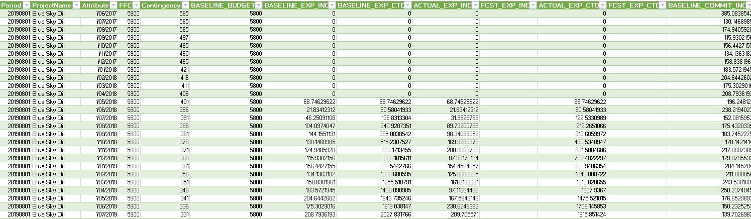
At this stage, we have a nicely formatted table and we can now import into PowerBI. The intent here is not to showcase a beautiful Level 1 dashboard in PowerBI. My intent is more to showcase the data structures need to drive a dashboard. With the above data, we get pull each data series into graphs, tables, cards, KPI metrics, etc.
Our model has tagged each record with a “As-Of” date. Thus you can utilize this structure to have your dashboard display ALL prior months by way of a slider or select. Given more advanced skills, you can also pull out metrics about current incremental values vs what we said last month. Although, I feel those metrics are best served in Level 2 report where more detail is available.
Apologies for the look and feel below, I just pulled in the data to showcase that indeed you can drive a dashboard with what is effectively just a few lines of data that every project already has. We can bring together cost, schedule, progress, and commentary quite easily and in a very data friendly way.
CONCLUSION
For me, there is no substitute for an excel based dashboard. The value in this for me is ensuring that when I produce a Level 1 Dashboard (in Excel), I should give consideration to ensuring my data is structured appropriately. This gives us a fighting change to perhaps go down the path of creating a more digital world. It also allows for perhaps more flexibility in dealing with Level 2 data to maybe have some real automation of rolling up of data.
Whats Next?
Level 2 obviously. I hope to showcase how the same ideas and concepts here can also help you structure your raw excel based Level 2 data to perhaps be better utilized in a more digital world


 At this stage, we have a nicely formatted table and we can now import into PowerBI. The intent here is not to showcase a beautiful Level 1 dashboard in PowerBI. My intent is more to showcase the data structures need to drive a dashboard. With the above data, we get pull each data series into graphs, tables, cards, KPI metrics, etc.
