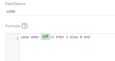
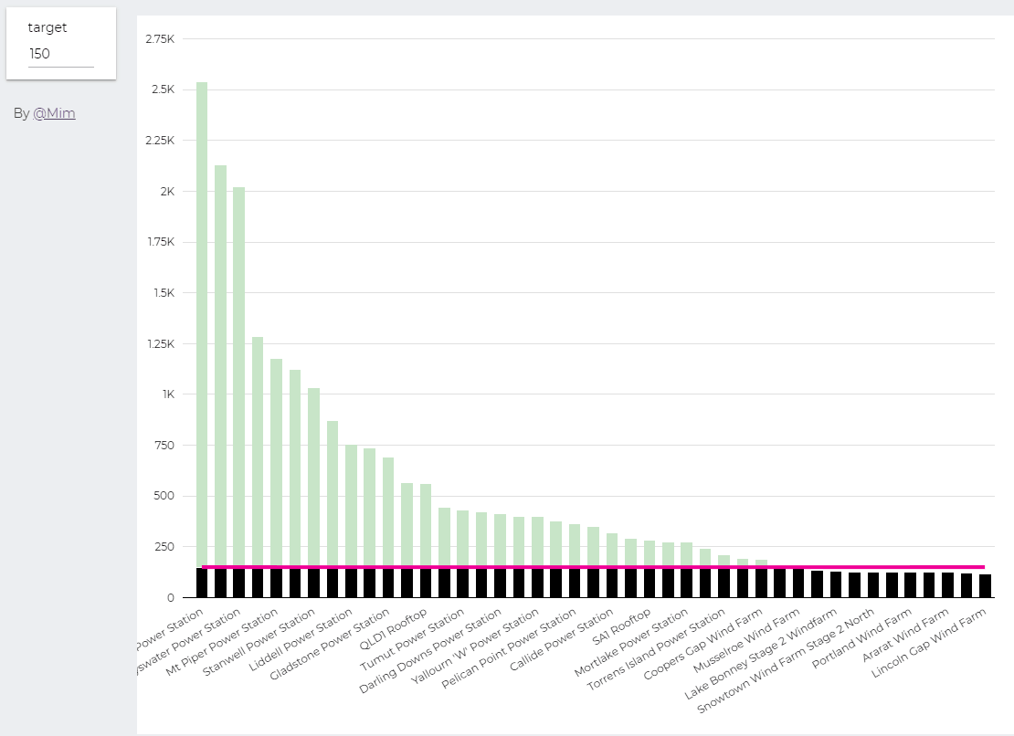
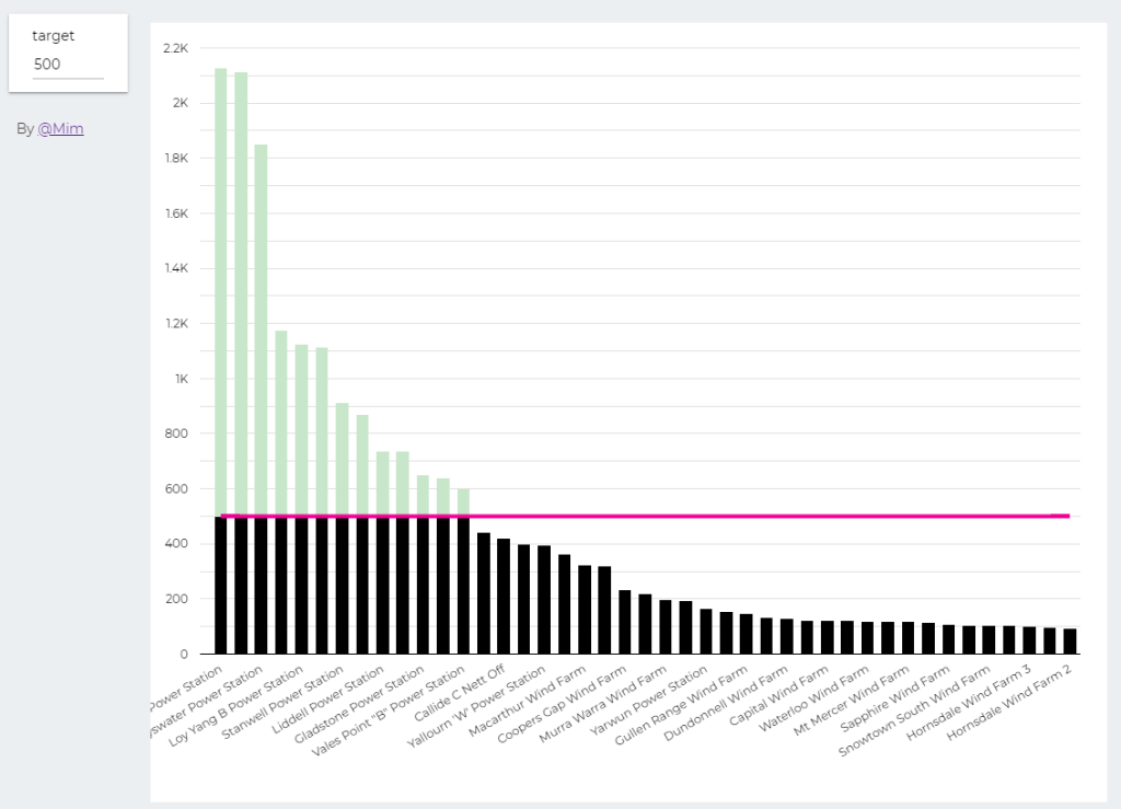
trying to reproduce a visual I saw before, Probably in a tableau forum, it is quite simple but give a very nice visual clue, the idea is the user input a target and the color will change based if it is higher or lower than the Target
Probably you can do it using Parameter in Google Data Studio, but using BigQuery was much easier. ( solution using only GDS , courtesy of Nimantha )
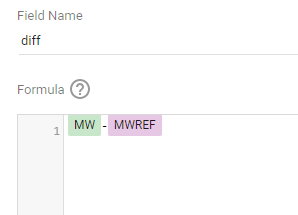
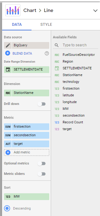
I built this Query, which generate two values, Firstsection of the bar and the secondsection
SELECT
*,
CASE
WHEN MW < @target THEN MW
ELSE
@target
END
AS firstsection,
CASE
WHEN MW < @target THEN null
ELSE
MW -@target
END
AS secondsection
FROM
datastudio.table
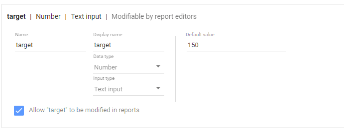
define parameter “Target” , currently BigQuery parameter does not accept range, instead you have to type a number
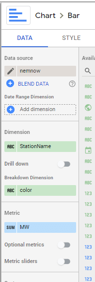
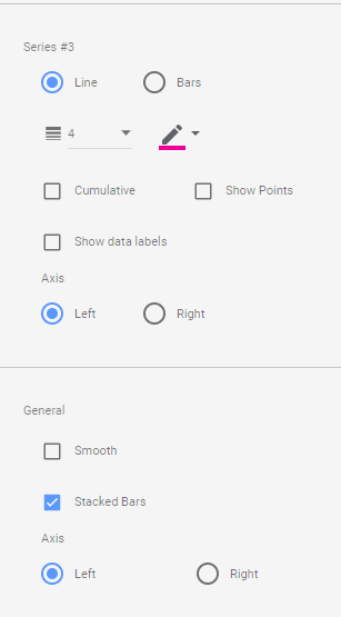
then Create Stacked Combo Chart
Make sure first section and second section are bars and target is a line and make sure bars are stacked
when you change the parameter values, the bars value change
At Last Google Data Studio added the option to let the user change the value of parameter, which will make some new scenarios possible, I will try to show some new cases where either it was extremely painful to do, or simply not possible.
In this report, I added some cases where I think it is useful, for this Blog, I will start with a very common scenario
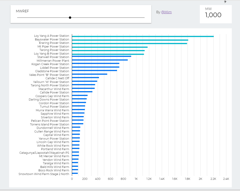
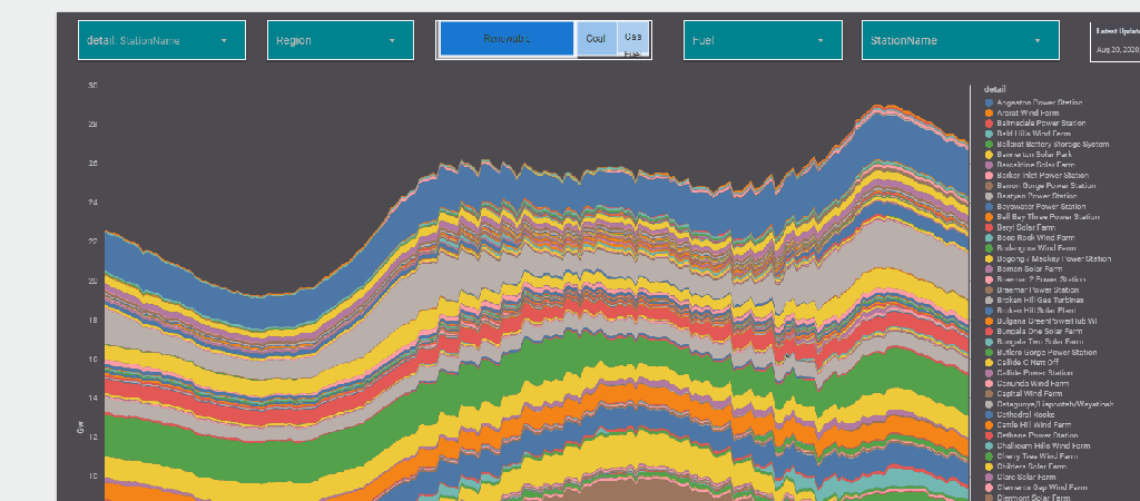
The report Show the Daily Electricity produced in eastern state of Australia, just by Using a slicer, the level of details will change to Region or Technology, or individual Generators
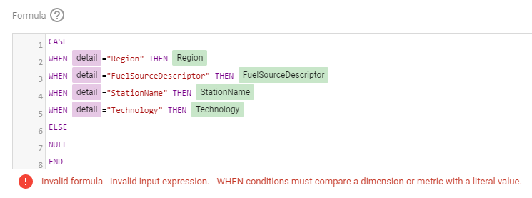
Currently it does not work with parameter in the formula engine,when I tried I got this error ( Nimantha has a solution using Regex which does not require BigQuery, you can see his report here)
Update as 26 August 2020
Riccardo from the dev team suggested a simple workaround,
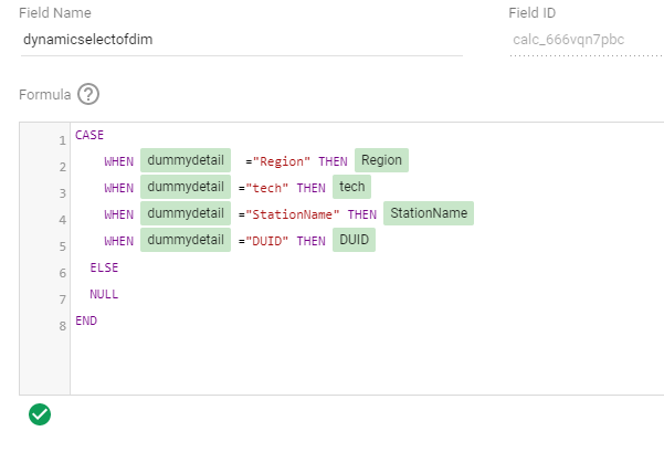
let’s just create a dummy dimension that take the values from the parameter
( I swear, I first tried this before, but it was not working, anyway calculated field in GDS are still a mystery for me)
now you can use it in your calculation
Alternatively you can used a Custom Query from BigQuery, luckily it is accelerated by BI Engine, so it is fast and use the free 1 GB memory provided by Data Studio
SELECT
*,
CASE
WHEN @detail="Region" THEN Region
WHEN @detail="FuelSourceDescriptor" THEN FuelSourceDescriptor
WHEN @detail="StationName" THEN StationName
WHEN @detail="Technology" THEN Technology
ELSE
NULL
END
AS Level_detail
FROM
datastudio.today_view_MT
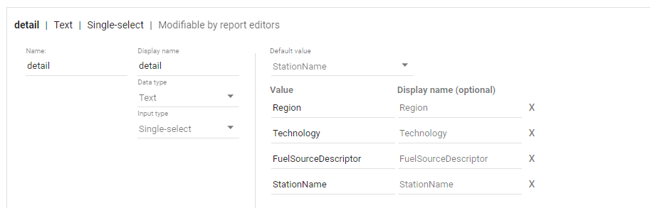
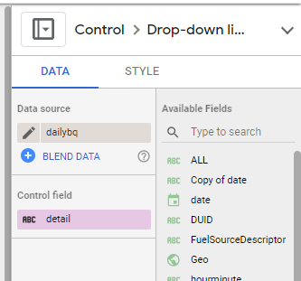
then you added the values to the parameter, notice, you can’t have a list of values from a data source, you have to manually type the values.
now the column “Level_detail” will dynamically switch to column “Technology”, “Region” etc based on the selected value in the parameter Detail
now you add the Parameter “detail” to a filter control, notice Parameter are color code Pink, a nice visual clue !!
now you use your dynamic column in a visual
and here is the final results
Personally I think it is a game changer for Data Studio, specially when you combine it with the Power of BI Engine, interesting time ahead
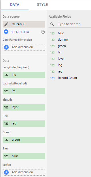
TL;DR : a sample dataset with x,y,z,red,green,blue and a custom Viz in Google Data Studio Using Deck.GL point Cloud, see example here
I added a new dataset , so you can test it yourself, you can either load it using BigQuery or use the load file connector in Data studio.
section explain how we got the data, if you are only interested in testing the visual go to section 2.
1-How to get the Data
for some reason it it is extremely painful to get a dataset with x,y,z,r,g,b
luckily a couple of days ago, I was in twitter and saw this tweet by Michael Sumner
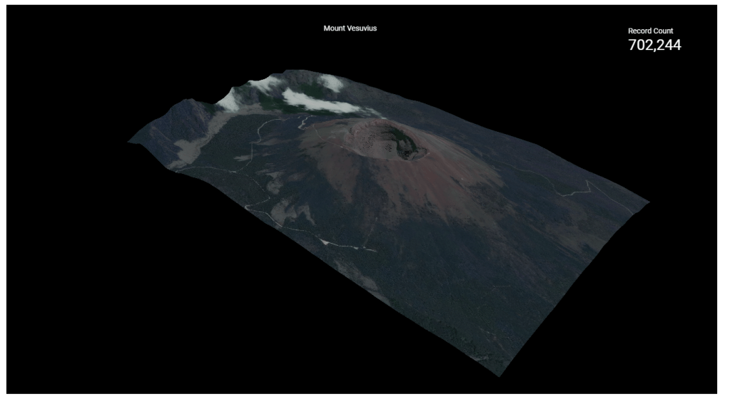
it turn out extracting coordinated and elevation is extremely easy using R, all you need is the center location and the dimension of the area you are interested in, and R ceramic will extract x,y,z automatically in a nice dataframe, then I took that data and uploaded it to BigQuery using the package bigrquery then plot using a custom Viz I built using Deck.gl ( see the linked report)
or you can just copy the report and use your own data
all fields are required except tooltips, by default it will show coordinates
I used Mount Tahat as an example, it is a highest Moutain in the south of Algeria, extremely beautiful area
Data Studio limit the number of rows passed to a custom visual to 1 Million, here I made sure it is less than 750K as it is the maximum that can be downloaded from the visual