TL;DR : a sample dataset with x,y,z,red,green,blue and a custom Viz in Google Data Studio Using Deck.GL point Cloud, see example here
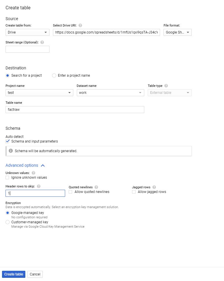
I added a new dataset , so you can test it yourself, you can either load it using BigQuery or use the load file connector in Data studio.
section explain how we got the data, if you are only interested in testing the visual go to section 2.
1-How to get the Data
for some reason it it is extremely painful to get a dataset with x,y,z,r,g,b
luckily a couple of days ago, I was in twitter and saw this tweet by Michael Sumner

it turn out extracting coordinated and elevation is extremely easy using R, all you need is the center location and the dimension of the area you are interested in, and R ceramic will extract x,y,z automatically in a nice dataframe, then I took that data and uploaded it to BigQuery using the package bigrquery then plot using a custom Viz I built using Deck.gl ( see the linked report)
here is a script I used
library(raster)
library(ceramic)
library(bigrquery)
bq_auth("XXXXXXXX.json")
Sys.setenv(MAPBOX_API_KEY = "DDDDDDDDDDDDDDDDDDDDDDDDDDDDDDDDDDDD")
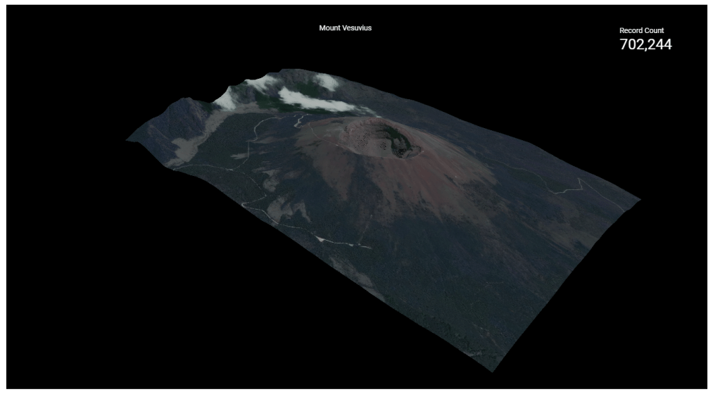
cc <- ceramic::cc_location(cbind(14.428778,40.822973), buffer = c(2000, 2000), zoom = 15)
el <- ceramic::cc_elevation(cc)
el1 <- resample(el, cc, method = "bilinear")
df1 <- as.data.frame(cc,xy=TRUE)
df2 <- as.data.frame(el1,xy=TRUE)
df <- merge(x = df1, y = df2, by = c("x", "y"), all.x = TRUE)
df <-transform(df, lng=x/100000,lat=y/100000,red=layer.1,blue=layer.2,green=layer.3)
df <- df[c("lng", "lat","layer","red","blue","green")]
job <- insert_upload_job("PROJECT_ID",
"GIS",
"VOLCANO",
df,
create_disposition = "CREATE_IF_NEEDED",
write_disposition = "WRITE_TRUNCATE")
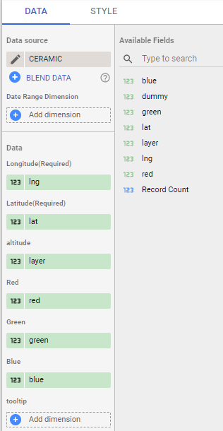
wait_for(job)2-Plot the Data using Point Cloud Viz
the Custom Viz address is

or you can just copy the report and use your own data
all fields are required except tooltips, by default it will show coordinates
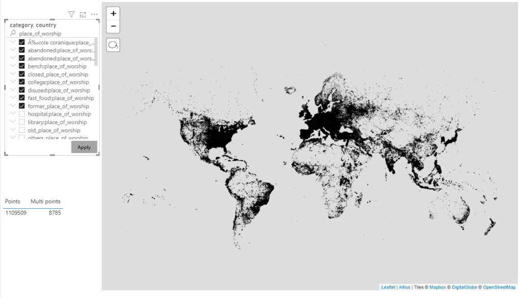
I used Mount Tahat as an example, it is a highest Moutain in the south of Algeria, extremely beautiful area
Data Studio limit the number of rows passed to a custom visual to 1 Million, here I made sure it is less than 750K as it is the maximum that can be downloaded from the visual

3-The end Results

Mount Uluru in Australia

Volcano Vesuvius in Italy