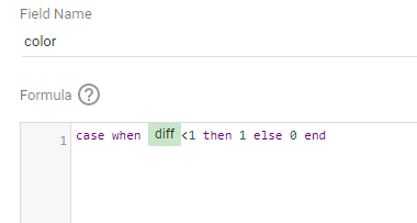
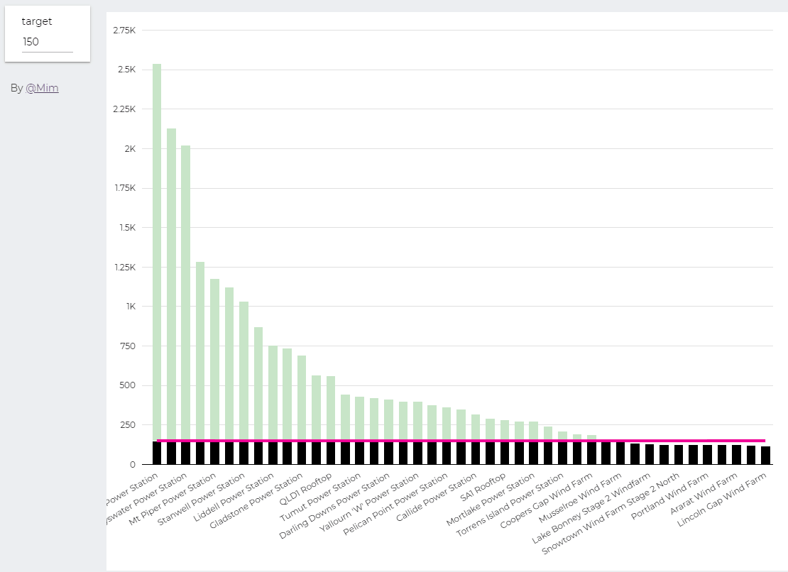
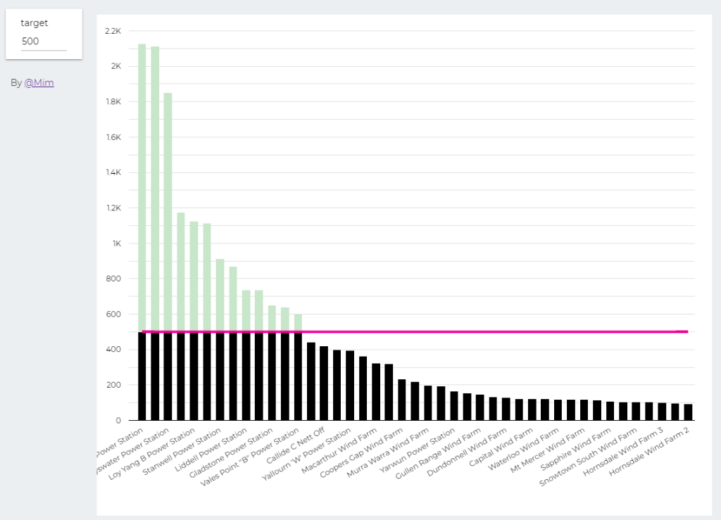
trying to reproduce a visual I saw before, Probably in a tableau forum, it is quite simple but give a very nice visual clue, the idea is the user input a target and the color will change based if it is higher or lower than the Target
Probably you can do it using Parameter in Google Data Studio, but using BigQuery was much easier. ( solution using only GDS , courtesy of Nimantha )
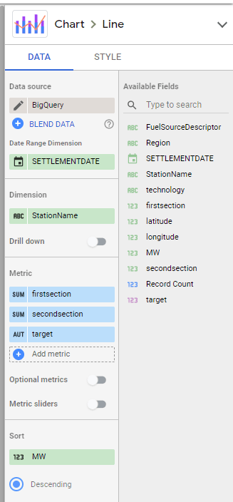
I built this Query, which generate two values, Firstsection of the bar and the secondsection
SELECT
*,
CASE
WHEN MW < @target THEN MW
ELSE
@target
END
AS firstsection,
CASE
WHEN MW < @target THEN null
ELSE
MW -@target
END
AS secondsection
FROM
datastudio.table
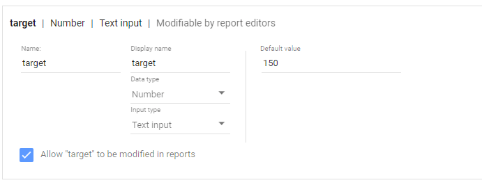
define parameter “Target” , currently BigQuery parameter does not accept range, instead you have to type a number
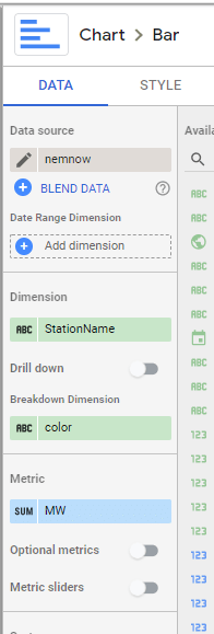
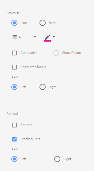
then Create Stacked Combo Chart
Make sure first section and second section are bars and target is a line and make sure bars are stacked
when you change the parameter values, the bars value change
At Last Google Data Studio added the option to let the user change the value of parameter, which will make some new scenarios possible, I will try to show some new cases where either it was extremely painful to do, or simply not possible.
In this report, I added some cases where I think it is useful, for this Blog, I will start with a very common scenario
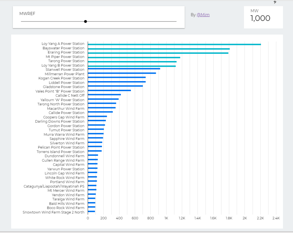
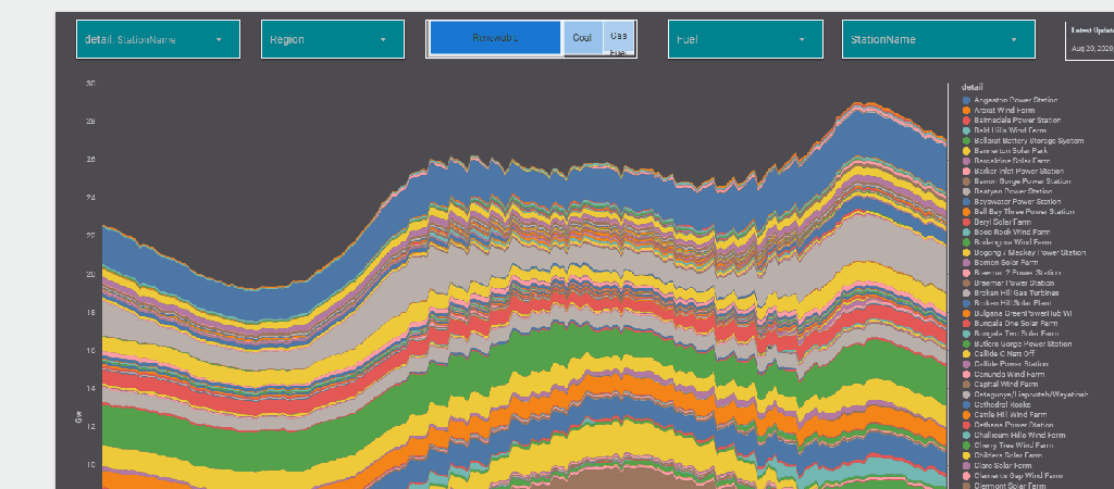
The report Show the Daily Electricity produced in eastern state of Australia, just by Using a slicer, the level of details will change to Region or Technology, or individual Generators
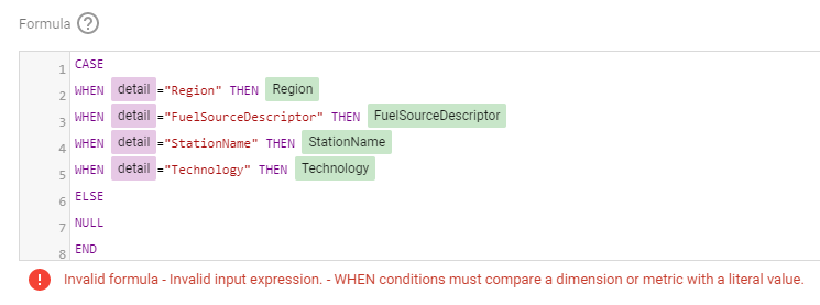
Currently it does not work with parameter in the formula engine,when I tried I got this error ( Nimantha has a solution using Regex which does not require BigQuery, you can see his report here)
Update as 26 August 2020
Riccardo from the dev team suggested a simple workaround,
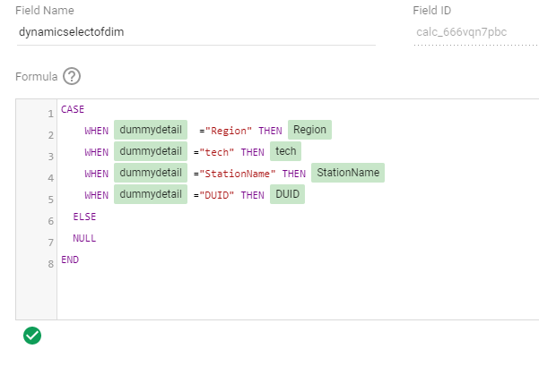
let’s just create a dummy dimension that take the values from the parameter
( I swear, I first tried this before, but it was not working, anyway calculated field in GDS are still a mystery for me)
now you can use it in your calculation
Alternatively you can used a Custom Query from BigQuery, luckily it is accelerated by BI Engine, so it is fast and use the free 1 GB memory provided by Data Studio
SELECT
*,
CASE
WHEN @detail="Region" THEN Region
WHEN @detail="FuelSourceDescriptor" THEN FuelSourceDescriptor
WHEN @detail="StationName" THEN StationName
WHEN @detail="Technology" THEN Technology
ELSE
NULL
END
AS Level_detail
FROM
datastudio.today_view_MT
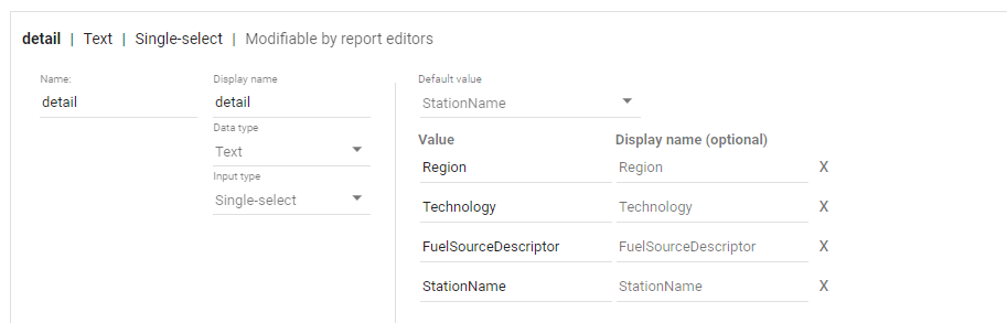
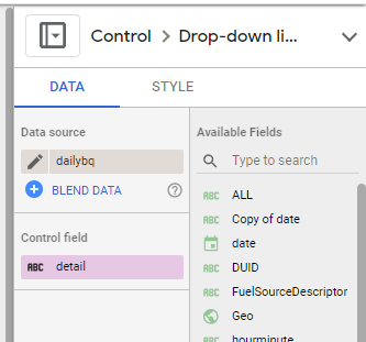
then you added the values to the parameter, notice, you can’t have a list of values from a data source, you have to manually type the values.
now the column “Level_detail” will dynamically switch to column “Technology”, “Region” etc based on the selected value in the parameter Detail
now you add the Parameter “detail” to a filter control, notice Parameter are color code Pink, a nice visual clue !!
now you use your dynamic column in a visual
and here is the final results
Personally I think it is a game changer for Data Studio, specially when you combine it with the Power of BI Engine, interesting time ahead
Edit : 16 Nov 2022, a new approach is to use DAX REST API, it does not require Premium license and works with any front end tool even on Linux, see example here ( source code in the Link)
Streamlit is a new framework to build data web app using only python, you don’t need any knowledge of javascript/HTML.
Connecting to a PowerBI using Python is well documented , see those excellent tutorials here by David Eldersveld
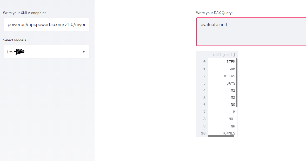
using this code, I managed to build a small app that using an existing XMLA end point, first it will extract the existing models and then you can run arbitrary DAX queries.
please note as of August 2020, XMLA end point is a PowerBI premium only feature
the main connection string and how to export to a df was copied from this Answer in Stackoverflow
import adodbapi as ado
import numpy as np
import pandas as pd
import streamlit as st

def get_df(data):
    ar = np.array(data.ado_results) # turn ado results into a numpy array
    df = pd.DataFrame(ar).transpose() # create a dataframe from the array
    df.columns = data.columnNames.keys() # set column names
    return df
source=st.sidebar.text_input('Write your XMLA endpoint')
if source:
    with ado.connect("Provider=MSOLAP.8; Data Source="+source) as con:
        with con.cursor() as cur:
         cur.execute('select * from $SYSTEM.DBSCHEMA_CATALOGS')
         data = cur.fetchall()
         catalogue = get_df(data)
         catalogue_Select= st.sidebar.selectbox('Select Models', catalogue['catalog_name'])
dax=st.text_area('Write your DAX Query:')
if dax:
    with ado.connect("Provider=MSOLAP.8; Data Source="+source+" ;Initial catalog="+catalogue_Select) as con:
        with con.cursor() as cur:
         cur.execute(dax)
         data = cur.fetchall()
         df = get_df(data)
         st.write (df)
and here is the result
Unfortunately adodbapi required Windows , which make deploying the app a bit harder, yo can try Azure Web app which has a windows runtime, I wish it was as easy as Heroku !!!
The good new Microsoft added recently the support for .Net Core, so hopefully I will Update the blog with a cross platform solution
to run the app on your laptop, just type
streamlit run app.py
it is a proof of concept but I see a lot of use cases, an obvious one is to build web app for visualization not supported by PowerBI like massive dataset maps, or 3 D viz.