
A key quality of project controls management, is the communication of major milestones. Every lead will have several spreadsheets with all our milestones listed on rows, and columns for the various interpretations (baseline, contract date, prior forecast, current forecast, contractor forecast, etc). So when we talk about dates, the difficulty is that everyone will have a different date in their mind.
We need a mechanism to see and filter for, well, everything. We need insight to ALL the dates. Then, during discussion related to the contractor forecasts, we can quickly filter to show just contractor dates. To add to that, when the questions turn to
“How do the contractor forecasts compare against our forecast?”
– this can be achieved via a simple selection.
To often I get criticized for “being a data guy.” I can not stress that as we move into future, unless your management team has a clear picture for how the data is structured and the sources of various data, you will run into communication problems.
This isn’t a planning discussion; this isn’t even a data discussion — this is a management and communication discussion. Do you have a way to quickly communicate during a meeting
“How do the contractor forecasts compare against our forecast”?
Or what about, “Can you add how that compares to our site supers forecast?”
To clearly communicate project controls you need to manage your data. Thus in my view, the best management will be the “data guy.” Once you know your source for dates, now, you need to communicate them.
1. Organize your Data
Each period (daily, weekly, fortnightly, monthly, etc.) you will collect date information. (Footnote – this isn’t an integration discussion. It is possible to get creative about linking P6 schedule IDs between various schedules – but that isn’t the point here. However, you collect your date information will work.)
For this example, lets only look at 2 Major Milestones: “MS1 Area 1 Access to SMP Contractor”, “MS2 Area 2 Access to SMP Contractor”. For each of our milestones we will have access to many different dates
- Contractor Baseline
- Contractor Approved Forecast (approved delays)
- Contractor Forecast (from their weekly schedule updates)
- Owner Baseline
- Owner Target
- Owner Forecast
- Site Forecast (this is the site supers best guess)
The list above is only a subset of a multitude of dates. I haven’t even delved into the risk point of view where perhaps the PD only wants to see an effective P10 date as a target to really press the team, but that dates doesn’t officially exist anywhere.
A weakness in our Excel files that are built to track this information is variance reporting (last period vs this period). This is great practice, but ultimately masks what may be longer term trends that can be better understood when we look at ALL the data for ALL the periods.
We will have a spreadsheet that looks like the below

These types of files are quite common for project managers. Everyone keeps these as basically cheat sheets during discussions so that all the various information can be accessed. A key note here – these types of Excel files are vital and required for this to work. This is not an integration topic or even a system based approach to build a system to manage all the various dates. (– although that type of platform would be valuable, future post topic?)
Note, the typical files we use, do not contain as “Report Date” key. The files will likely insert columns to reflect the dates from various data dates: Ex: Last Month, Current Month, etc. From a data management viewpoint, that is not best practice. Instead we need to collate all the information as of 1 date. Each period, our report date will change.
2. Manage your data
We can easily import our data file into PowerBI or into any database; however, some key transformation will be needed. Each of the columns reflect a specific data series. This information needs to be un-pivoted. Another required transformation (for PowerBI) will be that the date fields after un-pivot will need to be copied, and the copy will need to be converted into a “number” field.
This example is meant to manage the data for a select few activities and gather dates from various other sources. However, there are various extensions to this. If instead we wanted to view only our contractors schedule (or perhaps our owners team schedule), then we do not need different sources – we have just 1 source. We can, instead, create a PATH. For a specific WBS, we may want to extract s specific path of lets say 5-10 activities leading to practical completion. This can be achieved by building a table which maps a PATH to the various activities. You can have multiple paths and manage the paths exactly the same way as the next few steps

For this example – we are keeping it quite simple. Thus, my query looks like this

We now have our data in a format from which we can build upon. With everything, good project management is good data management. When we build a database that houses this type of information, it is good practice to go to everyone who uses this information and ensure they query from our master data source. Its perfectly OK for people to use their Excel files – but its another issue to ensure they all get their data from the same place.
3. Build the Visual
Our visual is going to be a simple line graph. We will generate a data series for each date series (attribute in our query after the un-pivot transformation). Note this is completely generic. We can load in data from any source into this format and generate a similar type image.
Load in the below data fields into you graph setting
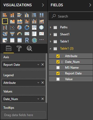
One trick here is that PowerBI can not utilize dates for a vertical axis (yet). Thus, we have to use the number figure we generated. It is possible to manually adjust the axis settings to display a custom date range (using integer values you can use Excel to get these).
Another minor hack I have used is that I have inserted a background image with custom horizontal lines and have used text boxes to distinguish my Y-Axis (showing the data not the numbers). It takes a little calibration, however once setup, it just works.
Here is out final visual. We can see on the graph every data series associated with the 1 milestone. This is where the real power lies. I have used dummy data, where all the dates are the same for each reporting period. In reality, that isn’t the case. The whole point is to view the changes of all the dates over time.

Again, this is just a pilot. A showcase of the capabilities using PowerBI, and pushing good data management. It is easy building reports in Excel. Its harder extracting a clear data model that can house the underlying information and building a more automated and flexible tool to communicate the data.
