Load Raster tiles to PowerBI Data Model using R

In a previous blog, I showed how to use PowerBI to generate high quality print maps, with a caveat that the R script does not work in the Service unless all the packages are supported (the desktop use your local R install, so no limitation here)

I am a huge fan of ceramic, for me it shows the best of R philosophy, it does one thing and do it very well, you give it coordinated and it will give you back raster tiles.

I spent some time trying to figure out a workaround to make it works in the service and I found this trick.

  • Generate raster using ceramic outside PowerBI ( using Rstudio for example).
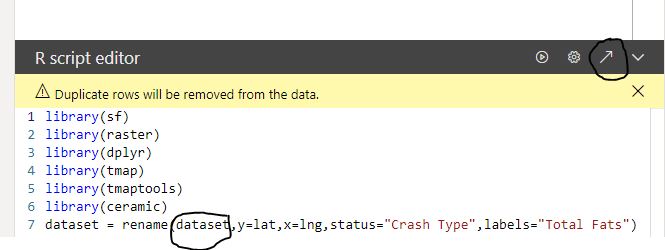
  • Save the raster object using saveRDS but using the option ASCII = TRUE, so it is a text file, notice you need to write version = 2, otherwise it will not work in the service.
  • Load the file into PowerBI using PowerQuery
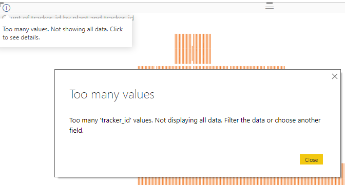
  • The maximum data you can pass to R visual is 150K rows, which is not enough for my use case.
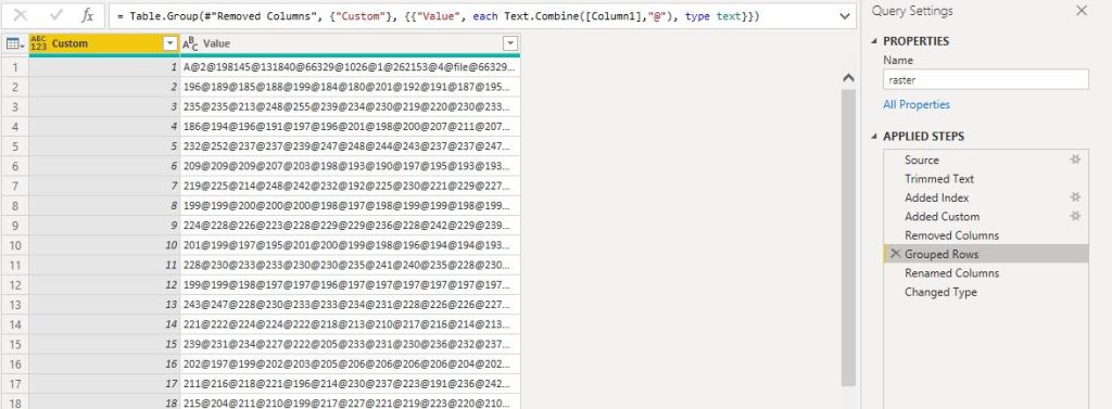
  • The trick is to group the data using concatenation, the limit is the number of rows not the number of columns :), please note the maximum number of length of a text value is 32766 
  • Merge the table for the raster with the table of data (coordinates, attribute etc), unfortunately, you can pass only one dataframe to R script, I changed to append so the visual can be sliced
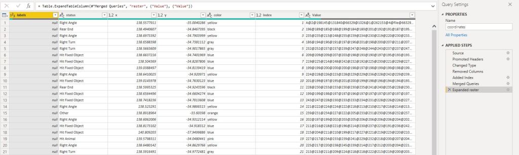
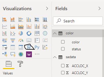
  • Now you have a dataframe with the coordinates and a raster data which you pass to R Visual script
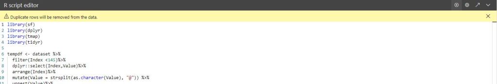
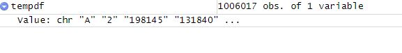
  • Unest the raster data into a dataframe, notice the dataframe holding the raster data is 1 Million rows
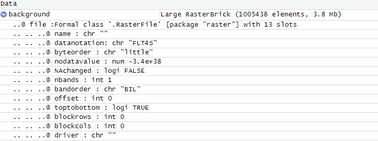
  • Save the dataframe to a “raster.rds”
  • Load the “raster.rds” and it is R Magic the raster is alive
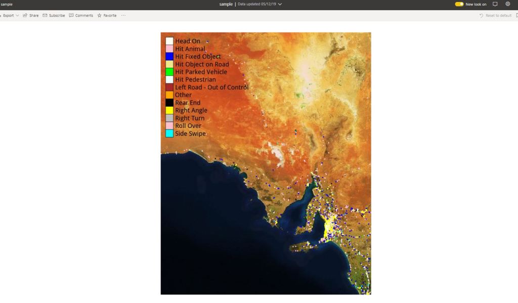
  • Plot the map ( it is on the PowerBI service not the Desktop)

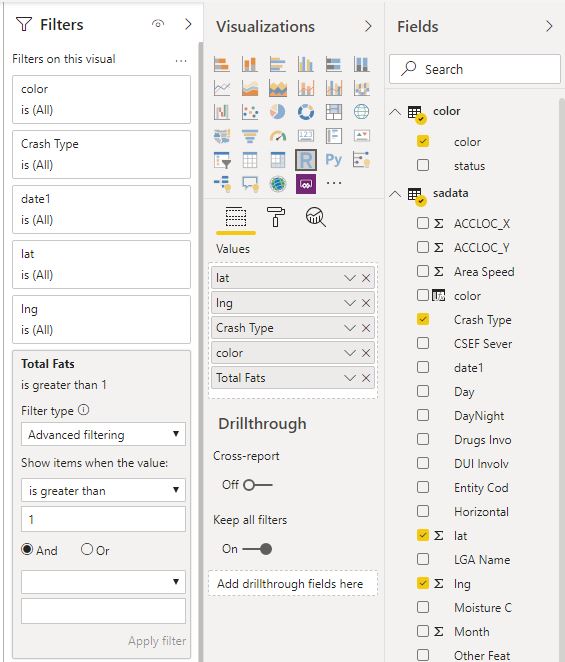
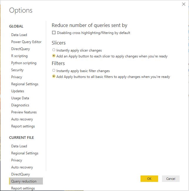
you can filter the status and hide the tiles if you want, as it is slow to render in the service, please use query reduction option in the filter

This workflow does works with any R object, not only Raster but any binary data can be passed to PowerBI data model.

All the codes are saved here.

I think the main take away is you can circumvent PowerBI limitation of 150,000 rows when you pass data to R or Python, but there is a trick, the resource available in the PowerBI Pro instanced are limited and not documentation, so your mileage may vary , but it is worth the try

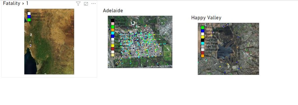
now, you may ask, why bother with this tedious, slow visual, the answer is very easy, in some cases you want to control the exact look of a map, and R give you just that, you can show multiple layers, text, it support more than 30 K point in a map, it is worth the pain

edit : I just noticed that PowerBI cache the visual output , if you do the exact selection again, the visual show instantly !!!

PowerBI, generate multiple Print quality Maps using R

In this blog, I will present a workflow, I have been using for the last 2 years with a rather a good feedback.

Obviously, I like interactive Dashboard, I want everyone to login to the PowerBI service and start doing their own analysis, but to my dismay, not everyone is interested in doing that, a lot of users want only a report that they can print. A took me a while to understand that that there is nothing wrong with that, and in a lot of use cases, a printed report is the best medium to convey information.

in my case, we do a lot of maps, and users want print quality maps, and because the data change daily, you need automation.

In previous blog, I wrote how to integrate PowerQuery with R, in the current blog, I will show how to generate multiple pdf with a customized map, by using R custom visual.

The PowerBI team has done a fantastic job, all you have to do is add the R script visual, add the fields you need, which automatically create a dataframe and write your code, and with one click, you can edit your code in RStudio!!!

Rstudio Integration works by creating a temporary csv file that hold the dataframe data

I personally prefer RStudio, but you can use any IDE

There are two caveats though

  1. The dataframe has a maximum of 150k rows.
  2. When you work in the desktop, it will use your R installation, all packages are supported, but when you publish to the service only the packages in this list are supported (ceramic is not supported, I think packages that downloaded external data are not supported), I found a workaround

Let’s generate some maps.

I am using the excellent package tmap for the mapping, you can customize any aspects of the map, layout, Text Size, legend, titles, it is really an amazing product and show the power of R, for tiles I am using ceramic .

you need a Mapbox token (their free tier is very generous), I will use South Australia car crash data as an example.

  • Fatalities >1

No code just adds a filter in the visual

The code

library(sf)

library(raster)

library(dplyr)

library(tmap)

library(tmaptools)

library(ceramic)

dataset = rename(dataset,y=lat,x=lng,status="Crash Type",labels="Total Fats")

dataset$color <- as.character(dataset$color)

dataset$labels <- as.character(dataset$labels)

map <- st_as_sf(dataset, coords = c("x", "y"), crs = 4326)

Sys.setenv(MAPBOX_API_KEY =”get your own key")

background <- cc_location(map)

dataset[dataset==""] <- NA

new_DF<-filter(dataset, !is.na(labels))

map1 <- st_as_sf(new_DF, coords = c("x", "y"), crs = 4326)

chartlegend <- unique(dataset[c("status", "color")])

m2 <- tm_shape(background)+

  tm_rgb() +

tm_shape(map) +

tm_symbols(col = "color", size = 0.04,shape=19)+

  tm_shape(map1) +

 tm_text(text="labels",col="white")+

  tm_add_legend(type='fill',labels=chartlegend$status, col=chartlegend$color)

  tmap_save(m2, "C:/Users/mimoune.djouallah/pdf/happyValey.pdf",width=3508, height=4961)

  m2

  • Copy the same custom visuals and just change the filters

Here we go

 Best part the pdf files

Now you can share those files per email or save it in a shared folder. the map show only dots, but you can load polygon if you need to, see this blog for further details

 You can download the pbix here, you need R to be installed, and your own Mapbox token.

Construction Map time playback using Kepler.gl

Kelpler.gl is a Geospatial data analysis by Uber !!!,  in this short blog we show how to build a map with a time attribute and then showing a time playback slider, it is very and straightforward process, all you need is to format the data as a list.

This data was randomized, as an example I show the main step to build a solar farm, piling, tracker, module then Electrical works, but obviously you can try it with road , pipeline projects, any project really that have geographic data

Please note the data is rendered using your local computer, so it is totally safe

The map is here, keep reading if you want to understand how it was built

I attached a sample dataset here; the field are self-explanatory.

Just be careful with Excel for some reason, when you open the csv file, it changes the date format, make sure the format is like this

And because in a medium sized solar farm, the total pile will be around 50,000 Piles, if you want just to show 4 main stages, the total number of rows will be 50,000 * 4 = 200,000 row, PowerBI will not support that ( Tableau shine in this scenario),

 The documentation is very clear, please read it to experiment with your own data

  1. Add data

If your dataset has this fields names X_lat, X_lng, Kepler.gl will automatically recognised it as a point layer

2-Define the legend

We select colour based on the field status ( select the palette of colour)

3- Select time field

The filed should be recognized as time otherwise, it will not work.

4- Add satellite as new map Style

For some reason, it is not there by default, but it is trivial to add

mapbox://styles/mapbox/satellite-streets-v9

5-And voila

You can play with the slider, either moving the end date or a window, up to you

6-Now you have multiple options for sharing

You need to have a mapbox account, it is virtual free to medium usage !!!

For this example, I will share it using Dropbox, but you can export to HTML and securely share it either per email or hosted in sharepoint

             This is one of the best piece of software that I had the privilege to use, nothing to install, free , simple and straight to the point !!

Load polygons geometry into PowerBI data model

Starting a new project that involve plotting a relatively big map ( 3000 polygons), it should be straightforward, as I have done it before, but a limitation in my prefered PowerBI custom visuals had an interesting result.

1-  synoptic panel: in my view it is the best visual to show custom map, ( floor plan, general layout etc), unfortunately not this time, my new map has 3000 polygons, when I tried to plot some attributes, I get the equivalent of Windows screen of death for PowerBI, too many values !!!

1

That’s bad, I filled a bug report, the author was kind enough to reply that it will be fixed in a next release, (something to do with incremental loading) fine let’s try other options

2- Shape map : (it did not even render the polygons correctly, and to be honest the visual did not receive any update since the first time I use it, 2 years ago)

3- Mapbox: showstopper, to load your own shape file and keep it private, you need a business plan.

I am stuck, I can’t plot a 3000 polygons map in PowerBI, let’s try Rstats.

4-Leaflet: is very versatile mapping engine, right now I use it in other projects (outside of PowerBI) and it plot 60K points and nearly 500 polygons in sub 2 seconds, but there is a problem, Leaflet output is HTML which is not supported under PowerBI, I never manage to make decent screenshot, something to do with the zoom.

5-ggplot2 + SF : quick google and got this code

library(sf)

library(tidyverse)

map_shp <- read_sf(‘C:/Users/mimoune.djouallah/test.geojson’) map =dataset %>%

left_join(map_shp, ., by = c(‘id’ = ‘id’)) %>%

ggplot() +

geom_sf(aes(fill = type),lwd = 0)

map

2

Great, I have my map now ( this is only a portion, I can show the whole layout as it is proprietary), there is only a little problem, code take 25 seconds to render, it is very annoying, especially as in PowerBI you touch anything, and all the visuals render again.

my first thought maybe the join between PowerBI dataset ( dataframe) and the geojson is slow !!! the beauty of R integration in PowerBI is: you click on R icon, a new window open with an empty dataset, then you add the columns you want to analyse, yes that simple no ETL, no messing with data, you have to the mighty data model.

Loading Geometry data into PowerBI data model ?


After reading the SF documentation, I learned all I need is a dataframe  with a column that store geometry data, too easy just use QGIS , save as csv and make sure to select geometry, WKT

Capture

Now I loaded the csv file to the data model and join it with the attribute

3

Now here is the new code, notice, we don’t load any external file, all data is from the data model

library(sf)

library(tidyverse)

map_file= st_as_sf(dataset, wkt = “geometry”)

map = ggplot(map_file) +

geom_sf(aes(fill = type),lwd = 0)

map

basically, you need just to tell SF which column represent the geometry , unfortunately it is still slow maybe now it is 24 seconds

Another round of googling and I find the issue ggplot2 is very slow to render, no problem, this is R after all, there are a least a couple dozen of packages that do the same thing 🙂

6-Pure SF

 Turn out SF is not only to manage Geometric dataframe but it can plot too,( who would thought that)

library(sf)

map = plot(st_as_sf(dataset, wkt =geometry”)[“type”])

map

 render in less than 2 seconds, happy dance  


Bonus point, Cross-filing geometry

 My purpose to load geometry was just to speed ggplot2, but hold on, the geometry is in the data model, not only the attribute change ( install quantities, category etc), I can even filter polygons on the fly !!!, this is quite amazing, I can load all the layers and filter out any shape as I want.

4