Dynamic Geospatial Clustering using BigQuery GIS

I was reading this blog post and thought of a new use case, using OpenstreetMap Data and generate polygons based on the user Selection

First to reduce cost, we will select only all a subset of OpenstreetMap Data, you can use this post as a reference

my base table is OPENSTREETMAPAUSTRALIAPOINTS , which contains 614,111 rows

The idea is to provide some tag selection ( School, cafe etc) and let BigQuery generate a new polygons on the fly, the key function in this SQL script is ST_CLUSTERDBSCAN

WITH
  z AS (
  SELECT
    *
  FROM
    `test-187010.GIS.OPENSTREETMAPAUSTRALIAPOINTS`
  WHERE
    value IN UNNEST(@tags_selection)),
  points AS (
  SELECT
    st_geogpoint(x,
      y) AS geo_point,
    value AS type
  FROM
    z ),
  points_clustered AS (
  SELECT
    geo_point,
    type,
    st_clusterdbscan(geo_point,
      200,
      @ct) OVER() AS cluster_num
  FROM
    points),
  selection AS (
  SELECT
    cluster_num AS spot,
    COUNT(DISTINCT(type))
  FROM
    points_clustered
  WHERE
    cluster_num IS NOT NULL
  GROUP BY
    1
  HAVING
    COUNT(DISTINCT(type))>=@ct
  ORDER BY
    cluster_num)
SELECT
  spot AS Cluster,
  st_convexhull(st_union_agg(geo_point)) as geo_point,
  "Cluster" as type
FROM
  selection
LEFT JOIN
  points_clustered
ON
  selection.spot=points_clustered.cluster_num
  group by 1
union all
SELECT
  spot AS Cluster,
  geo_point ,
type
FROM
  selection
LEFT JOIN
  points_clustered
ON
  selection.spot=points_clustered.cluster_num

Technically you can hardcode the values for Tags, but the whole point is to have a dynamic selection

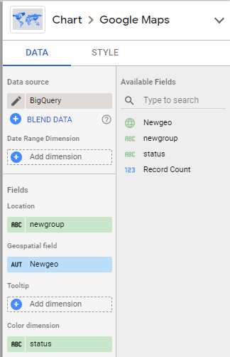
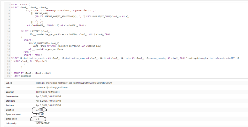
I am using Data Studio and because the Query is not accelerated by BI Engine , and in order to reduce the cost, I made only 6 Tags available for user selection and hard code the distance between two points to 200 m.

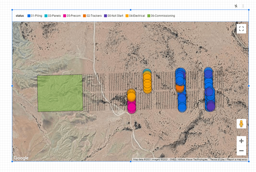
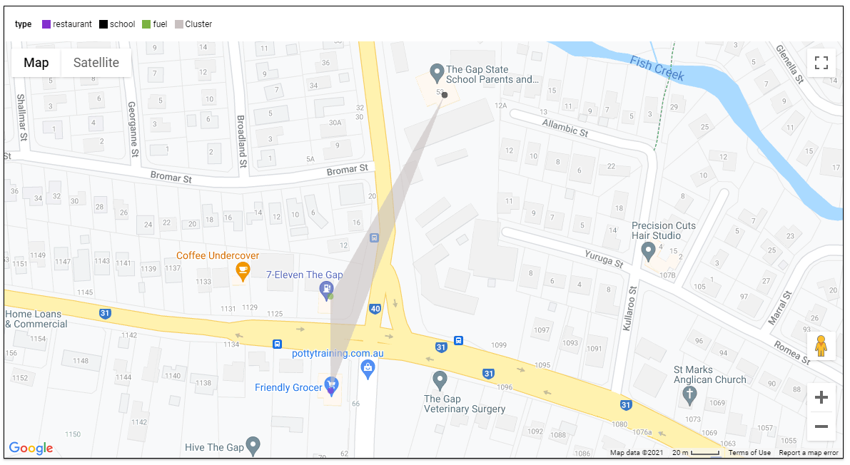
Here is an example when selecting the tags (restaurant, school and fuel), I get 136 cluster

here when I zoom on 1 location, the result are pretty accurate

I think it is a good use case for parameters, GIS calculation are extremely heavy and sometimes all you need from a BI tool is to send Parameter values to a Database and get back the result.

you can play with the report here

edit : August 2021, The Same report using PowerBI

BigQuery GEOGRAPHY Support in Data Studio

Google Data Studio added recently support for BigQuery Geography field, which is a fantastic development and open all kind of new scenarios for creating free to share Maps.

It is straightforward, you just add a geography field and it just render, for example I have this dataset that contains polygons, lines and points

and here is the result

Some Observations

  • It seems the initial focus of the dev team was on polygons which are fully supported
  • You can’t fill color for lines yet
  • Although points support color coding, I could not make them smaller ( The Piles in a Solar Farm are obviously much smaller)

BI Engine to the rescue

Now the confusing part, BI Engine for Data Studio does not accelerate GEOGRAPHY yet , so you will incur BigQuery Cost, but if you connect the new BI Engine SQL interface, the Query will be accelerated, according to the devs, the BI Engine used in Data Studio is to be considered Version 1 , SQL Interface as the next version and they will be merged together eventually. ( This should be in the Documentation)

here is an example of a Query generated by Data Studio, I would say it is very complex SQL Query with analytical functions, UNNEST, you name it, and the New BI Engine support it just fine ( I really like Bytes billed 0 B)

A more interesting use case

I came across this excellent dataset https://openflights.org/data.html, and thought let’s try it with Data Studio, first I imported the two tables airports.dat and routes.dat  then using this SQL Query to generate the routes, which is a line between Source coordinates and Destination Coordinates

WITH
  xxxx AS (
  SELECT
    yy.Name AS source_name,
    yy.City AS source_city,
    yy.Country AS source_country,
    zz.Name AS destination_name,
    zz.City AS destination_city,
    zz.Country AS destination_country,
    DestinationairportID,
    SourceairportID,
    ST_MAKELINE(st_geogpoint(yy.Longitude,
        yy.Latitude),
      st_geogpoint(zz.Longitude,
        zz.Latitude)) AS route
  FROM
    `testing-bi-engine.test.airportroute` xx
  LEFT JOIN
    `testing-bi-engine.test.airport` yy
  ON
    SourceairportID= AirportID
  LEFT JOIN
    `testing-bi-engine.test.airport` zz
  ON
    DestinationairportID = zz.AirportID),
  ttt AS (
  SELECT
    source_name,
    source_city,
    source_country,
    destination_name,
    destination_city,
    destination_country,
    DestinationairportID,
    SourceairportID,
    ST_ASTEXT(route) AS route_wkt
  FROM
    xxxx
  GROUP BY
    1,
    2,
    3,
    4,
    5,
    6,
    6,
    7,
    8,
    9)
SELECT
  *,
  ST_GEOGFROMTEXT(route_wkt) AS route,
  ROW_NUMBER() OVER() AS id
FROM
  ttt

I save the Query in a table, then plotted using Data Studio

and here is the Result, which i share it in Reddit 🙂

I think it is fair to say, people love maps, and a lot of users appreciate that you can download the data straight from Data Studio , you can play with the report here

Really Excellent Works by Data Studio Team.

Drill Down to another page in Google Data Studio, the easy way

I have blogged already how to drill down to another page using Parameter, today, I find another approach, it is extremely easy, and a bit embarrassed why I have not thought about before !!!

I will be using administrative division of Algeria as an example, see the report here, please notice the pattern is not only for maps, personally I use drill down to another page extensively with finance reports, for example drilling down by Project, vendor, user etc

1- Create a map at the region Level

2- Add a new empty tab

3- Make the Map at the report level

4-make sure apply filter is on

5- in the second tab , hide the map either using send to back or add a big rectangle

6- add a new map at the city level

7- add a new button to navigate between page 1 and 2

basically when you create a report level map, the selection from page 1 get synchronized to page 2 , then the hidden map in page 2 will filter the map at the city level.

How to plot Digital Elevation Model in Data Studio.

TL;DR : a sample dataset with x,y,z,red,green,blue and a custom Viz in Google Data Studio Using Deck.GL point Cloud, see example here

I added a new dataset , so you can test it yourself, you can either load it using BigQuery or use the load file connector in Data studio.

section explain how we got the data, if you are only interested in testing the visual go to section 2.

1-How to get the Data

for some reason it it is extremely painful to get a dataset with x,y,z,r,g,b

luckily a couple of days ago, I was in twitter and saw this tweet by Michael Sumner

it turn out extracting coordinated and elevation is extremely easy using R, all you need is the center location and the dimension of the area you are interested in, and R ceramic will extract x,y,z automatically in a nice dataframe, then I took that data and uploaded it to BigQuery using the package bigrquery then plot using a custom Viz I built using Deck.gl ( see the linked report)

here is a script I used

library(raster)
library(ceramic)
library(bigrquery)
bq_auth("XXXXXXXX.json")
Sys.setenv(MAPBOX_API_KEY = "DDDDDDDDDDDDDDDDDDDDDDDDDDDDDDDDDDDD")
cc <- ceramic::cc_location(cbind(14.428778,40.822973), buffer = c(2000, 2000), zoom = 15)
el <- ceramic::cc_elevation(cc)
el1 <- resample(el, cc, method = "bilinear")

df1 <- as.data.frame(cc,xy=TRUE)
df2 <- as.data.frame(el1,xy=TRUE)
df <- merge(x = df1, y = df2, by = c("x", "y"), all.x = TRUE)

df <-transform(df, lng=x/100000,lat=y/100000,red=layer.1,blue=layer.2,green=layer.3)
df <- df[c("lng", "lat","layer","red","blue","green")]
job <-  insert_upload_job("PROJECT_ID",
                "GIS",
                "VOLCANO",
                df,
                create_disposition = "CREATE_IF_NEEDED",
                write_disposition = "WRITE_TRUNCATE")
wait_for(job)

2-Plot the Data using Point Cloud Viz

the Custom Viz address is

or you can just copy the report and use your own data

all fields are required except tooltips, by default it will show coordinates

I used Mount Tahat as an example, it is a highest Moutain in the south of Algeria, extremely beautiful area

Data Studio limit the number of rows passed to a custom visual to 1 Million, here I made sure it is less than 750K as it is the maximum that can be downloaded from the visual

3-The end Results

Mount Uluru in Australia

Volcano Vesuvius in Italy