TL;DR, you can incremental refresh PowerBI using Parquet files stored in an Azure Storage without using any Database in the middle, you can download sample pbix here
I am using this blog post by Gilbert Quevauvilliers which is based on a technique from Rafael Mendonça, Please read it first
Maybe read this, it is using Synapse Serverless , but has a section where you can Partition your data using Python to Parquet
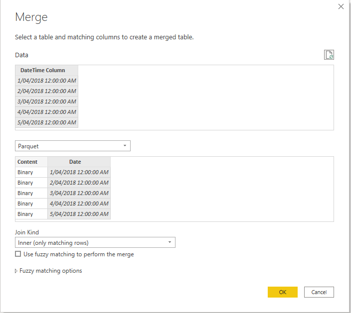
1-Add a new Table, Parquet
make sure it is not loaded, here is the M code
let
     Source = AzureStorage.DataLake("https://xxxxxx.core.windows.net/parquet"),
     #"Removed Other Columns" = Table.SelectColumns(Source,{"Content", "Folder Path"}),
     #"Inserted Text Between Delimiters" = Table.AddColumn(#"Removed Other Columns", "Text Between Delimiters", each Text.BetweenDelimiters([Folder Path], "D", "/", 1, 0), type text),
     #"Renamed Columns" = Table.RenameColumns(#"Inserted Text Between Delimiters",{{"Text Between Delimiters", "Date"}}),
     #"Changed Type" = Table.TransformColumnTypes(#"Renamed Columns",{{"Date", type datetime}}),
     #"Removed Columns" = Table.RemoveColumns(#"Changed Type",{"Folder Path"})
 in
     #"Removed Columns"
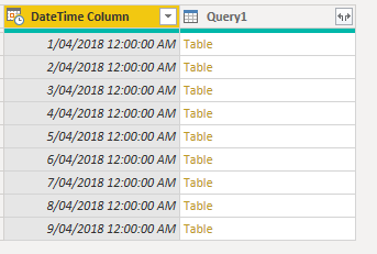
here is the result
3-Merge using Inner Join
to read the parquet file content we use this function , notice we used inner join in the previous step to avoid reading null Content, which generate errors when you refresh in the service
Parquet.Document([Content])
and here is the final table
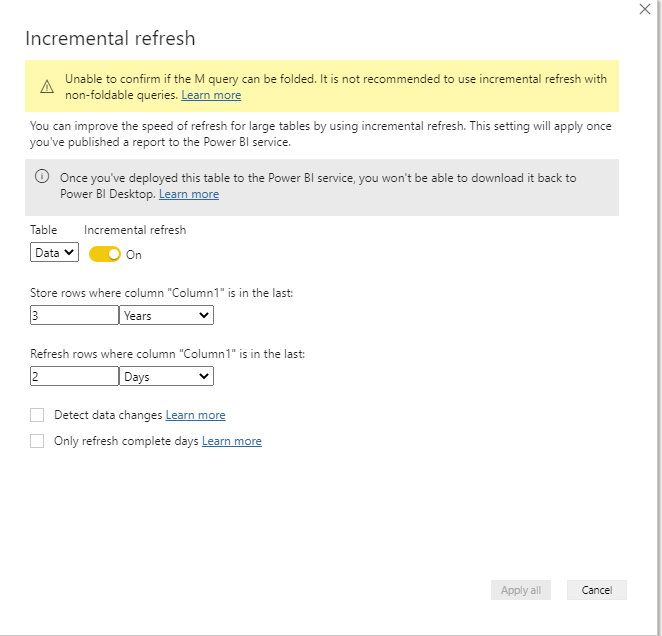
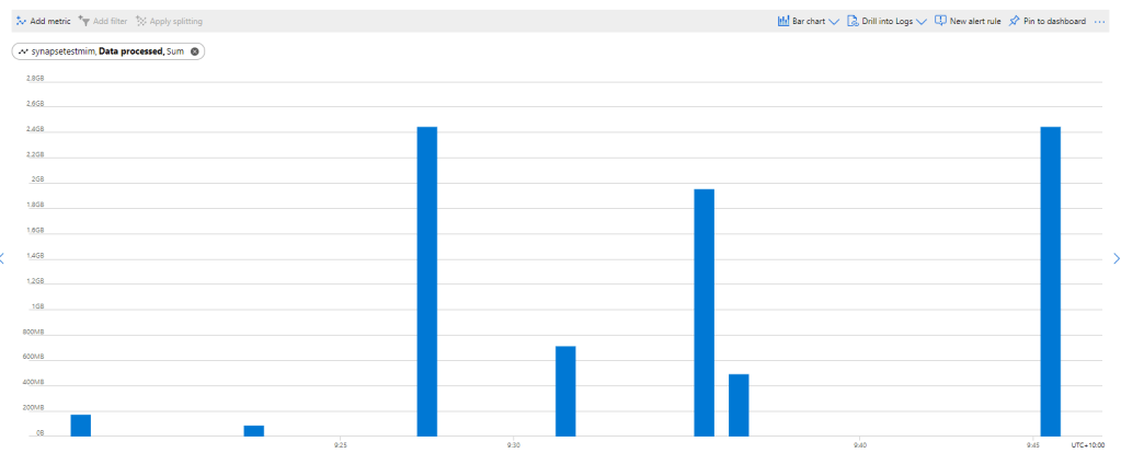
we configure incremental refresh to refresh the Last 2 days
4- Testing in PowerBI Service
as you can see the second refresh is way faster then the First one
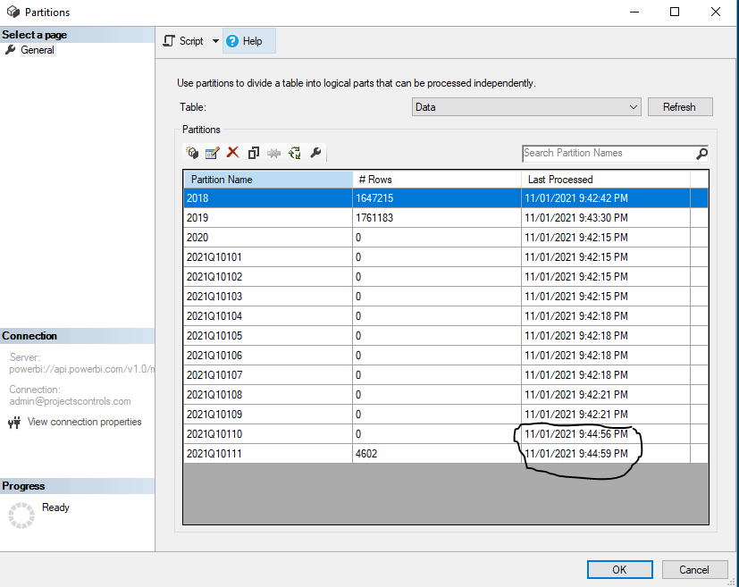
here is the partition Table
now let’s check the transaction history from Azure storage, I refreshed again just to be sure
The second refresh read substantially less data as only two files are read
I Think with PowerBI desktop supporting Parquet, we will see more exciting scenarios, I can’t wait for Dataflow to support export to Parquet !!!!
if you are still reading, I appreciate a vote on this idea, Having an option in Dataflow to export to a dynamic file name
Recently I come across a new use case, where I thought Azure Synapse serverless may make sense, if you never heard about it before, here is a very good introduction
TLDR; Interesting new Tool !!!!, will definitely have another serious look when they support cache for the same Queries
Basically a new file arrive daily in an azure storage and needs to be processed and later consumed in PowerBI
The setup is rather easy, here is an example of the user interface, this is not a step by step tutorial, but just my first impression.
I will use AEMO (Australian electricity market Operator) data as an example, the raw data is located here
Load Raw Data
First I load the csv file as it is, I define the columns to be loaded from 1 to 44 , make sure you load only 1 file to experiment then when you are ready you change this line
Then it will load all files, notice when you use filename(), it will add a column with the files name, very handy
USE [test];
GO

DROP VIEW IF EXISTS aemo;
GO

CREATE VIEW aemo AS
SELECT
result.filename() AS [filename],
     *
FROM
    OPENROWSET(
        BULK 'https://xxxxxxxx.dfs.core.windows.net/tempdata/PUBLIC_DAILY_201804010000_20180402040501.CSV',
        FORMAT = 'CSV',
        PARSER_VERSION='2.0'
    )
    with (
c1   varchar(255),
c2   varchar(255),
c3   varchar(255),
c4   varchar(255),
c5   varchar(255),
c6   varchar(255),
c7   varchar(255),
c8   varchar(255),
c9   varchar(255),
c10   varchar(255),
c11   varchar(255),
c13   varchar(255),
c14   varchar(255),
c15   varchar(255),
c16   varchar(255),
c17   varchar(255),
c18   varchar(255),
c19   varchar(255),
c20   varchar(255),
c21   varchar(255),
c22   varchar(255),
c23   varchar(255),
c24   varchar(255),
c25   varchar(255),
c26   varchar(255),
c27   varchar(255),
c29   varchar(255),
c30   varchar(255),
c31   varchar(255),
c32   varchar(255),
c33   varchar(255),
c34   varchar(255),
c35   varchar(255),
c36   varchar(255),
c37   varchar(255),
c38   varchar(255),
c39   varchar(255),
c40   varchar(255),
c41   varchar(255),
c42   varchar(255),
c43   varchar(255),
c44   varchar(255)
     )
 AS result
The previous Query create a view that read the raw data
Create a View for a Clean Data
As you can imagine , Raw data by itself is not very useful, we will create another view that reference the raw data view and extract a nice table ( in this case the Power generation every 30 minutes)
USE [test];
GO

DROP VIEW IF EXISTS TUNIT;
GO

CREATE VIEW TUNIT AS
select [_].[filename] as [filename],
   convert(Datetime,[_].[c5],120) as [SETTLEMENTDATE],
    [_].[c7] as [DUID],
   cast( [_].[c8] as DECIMAL(18, 4)) as [INITIALMW]
from [dbo].[aemo] as [_]
where (([_].[c2] = 'TUNIT' and [_].[c2] is not null) and ([_].[c4] = '1' and [_].[c4] is not null)) and ([_].[c1] = 'D' and [_].[c1] is not null)
Connecting PowerBI
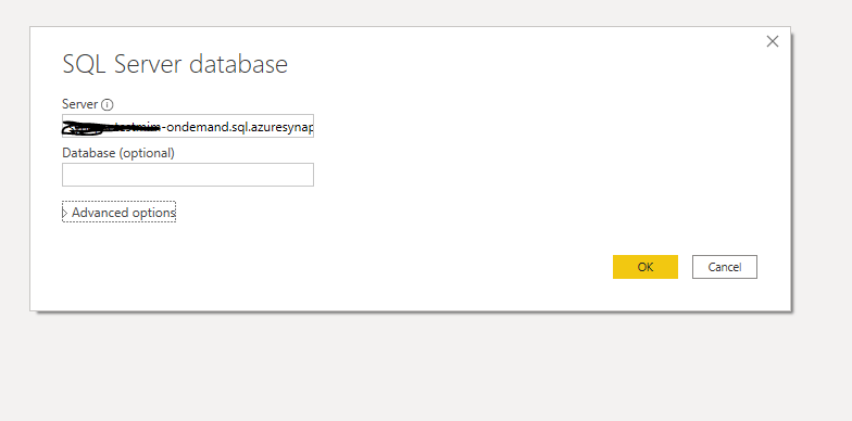
Connecting to azure synapse is extremely easy, PowerBI just see it as a normal SQL server.
here is the M script
let
Source = Sql.Databases("xxxxxxxxxxx-ondemand.sql.azuresynapse.net"),
test = Source{[Name="test"]}[Data],
dbo_GL_Clean = test{[Schema="dbo",Item="TUNIT"]}[Data]
in
dbo_GL_Clean
And the SQL Query generated by PowerQuery ( which Fold)
select [$Table].[filename] as [filename],
[$Table].[SETTLEMENTDATE] as [SETTLEMENTDATE],
[$Table].[DUID] as [DUID],
[$Table].[INITIALMW] as [INITIALMW]
from [dbo].[TUNIT] as [$Table]
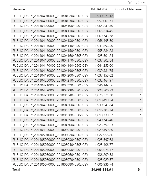
Click refresh and perfect, here is 31 files loaded
Everything went rather smooth, nothing to set up and I have now an Enterprise Grade Data warehouse in Azure, how cool is that !!!
How Much it cost ?
Azure Synapse serverless pricing model is based on how much data is processed
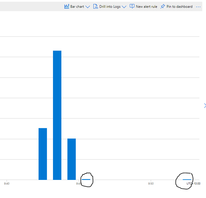
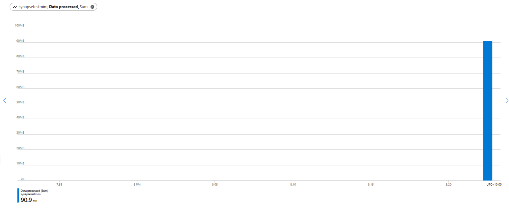
First let’s try with only 1 file ,running Query from the Synapse Workspace, the file is 85 MB, good so far, data processed is 90 MB, file size + some meta Data
now let’s see using the Queries generated by PowerBI, in theory my files size are 300 MB, I will be paying only for 300 MB, let’s have a look at the Metrics
My first reaction was, there must be a bug , 2.4 GB !!!, I refreshed again and it is the same number !!!
A look at the PowerQuery diagnostic and a clear picture emerges, PowerBI SQL Connectors is famous for being “Chatty”, in this case you would expect PowerQuery to send only 1 Query but in reality it will send multiple Queries , at least 1 of them to check the top 1000 rows to define the fields type.
Keep in mind Azure Synapse Serverless has no cache ( they are working on it), so if you run the same query multiple times even with the same data, it will “scan” the files multiple times, and as there is no data statistic a select 1000 rows will read all files even without order by.
Obviously, I was using import mode, as you can imagine using it with directQuery will generate substantially more queries.
Just to be sure I tried to do refresh on the service.
The same, it is still 2.4 GB, I think it is fair to say, there is no way to control how many time PowerQuery send a SQL Query to Synapse.
Edit 17 October 2020 :
I got a feedback that probably my PowerBI desktop was open when I run the test in the service, turn out it is true, I tried again with The desktop closed and it worked as expected, one refresh generate 1 query
Notice even if the CSV file was compressed, it will not make a difference, Azure synapse bill uncompressed data.
Parquet file would made a difference as only columns used would be charged, but I did not want to used another tool in this example.
Take Away
It is an interesting Technology, the integration with Azure cloud storage is straightforward, the setup is easy,you can do transformation using only SQL, Pay only what you use and Microsoft is investing a lot of resources on it.
But the lack of cache is a show stopper !!
I will definitely check it again when they add the cache and cost control, after all it is still in Preview 🙂
Edit : 28 November 2020, there is an easy way without using parameter
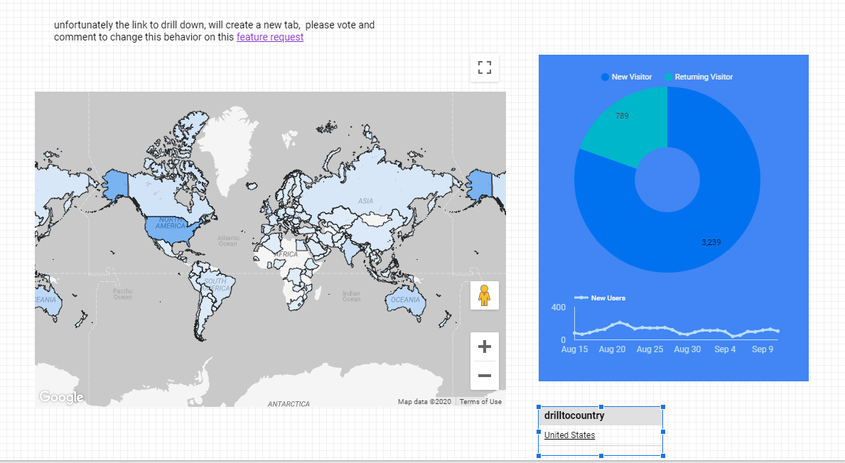
Drill down to another page is a well known technique in BI software, you have a main page with aggregate data, and you can select one category then drill down to another page with more details and keeping the filter selection.
Data Studio does not support this functionality natively but we can simulated using parameter URL
in this example, we will drill down from Country to cities
1- Create a country parameter
2- add a new Page
the first report will show data at the country level, like this
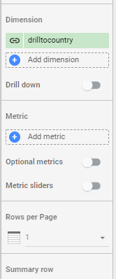
make sure interaction is one
3- Go to Resource, Manage Report URL Parameter
4- Allow to be modified in report URL
tick the option on, you can edit the parameter to remove ds1.drillcountry to drillcountry
5- Build the URL
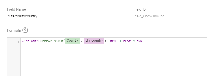
that’s the main part of the post, create a new calculated field using this forumula
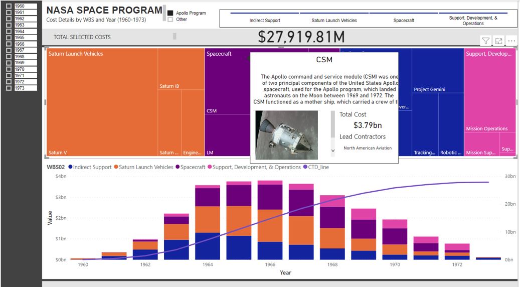
Quick how to guide on building my NASA cost tracker.
To follow up a recent video showcasing the NASA Apollo Costs, I wanted to illustrate how easy it is to use PowerBI to generate quick program of works dashboard. If you have several projects following a pipeline of work, some features here might spur some discussions or thoughts on what is possible.
However, like most data you find, the format is not suited to analytics. So a little manipulation was in order. Firstly, I had to create a WBS structure. Typically, information we find is buried under headers, however for databases, we need to turn group headings into a column data field.
We can see I have inserted a 3 layer WBS structure, plus a company name field. This will allow me the flexibility to add subsequent data to this file from perhaps multiple companies, not just NASA. Again, when you build flexible data structures, the way you can use the structure is much more powerful
I know that I also want more contextual information displayed on the dashboard beyond simple data. Specifically, I want a description blurb to be viewable on a tool tip, along with a picture. Additionally, I want to display the leading contractor as well. Therefore, I added a few columns to the excel file. When you import the data into PowerBI, the URL needs to be set as a special format of “Image URL”. Took for some time to find that setting: its under “data category” on the column tools tab.
At some point, I will hopefully build out this dataset to include subsequent NASA budgets, and also publish this data through an API that everyone can access. However, there are limitation to what I can do and what I want to do typically far outstrips my abilities.
The Dashboard
Importing the data is quite straight forward, we do need our usual “unpivot” trick to convert the year information (which is contained inside columns) into row based data. However once that is done, lets look the various parts of the dashboard.
Before I jump into the various aspects of the dashboard, what really gives a dashboard a little polish is the use of a background image. Here is my go to ground image. Just a little playing around with Paint can produce something very valuable to your end product.
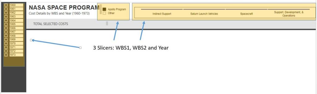
The dashboard utilizes 3 slicers. Each has a slightly different formatting. I definitely recommend playing around with the formatting of your slicers
The TREEMAP is where I have put a little extra bit of attention
What pops out here is the tooltip. I have created a separate page just for this tooltip. I am by no means an expert in designing tooltip, but know the power of inserting extra dimensions of data that again allows your dashboard to pop. This specific tooltip includes the blurb, an image URL and the main contractors. This information would be too dense for the overall dashboard and perhaps not dense enough for its own dash, therefore a tooltip is a perfect medium between.
The final element of the dashboard is the line graph and histogram. I still find creating line graphs difficult and in this case I had to add a measure to my data. I think there is a much easier way to achieve rolling sum data, but in my case, the below measure works easy enough for me.
There is a lot I can do with this framework now. We have a cost file that is quite generic and a dashboard that is also generic. We can in theory use this to outline any type of project pipeline. Although this dashboard is looking in the past, we can also have a rolling wave where we can see past spend on specific projects and what our future pipeline of work looks like. I love seeing project pipelines and following my NASA theme for the moment, here is a great view of what the NASA project pipeline looked like in 1973