I spend a lot of time thinking about project controls, it is my love and passion. Specifically in the planning world, P6 is weapon we are tasked with us. While I firmly believe the way in which P6 is used on projects needs to be expanded (extended) with the use of Agile (JIRA), nothing tops the user base and acceptance P6 has in our business.
P6 is fundamentally, just a CPM platform. We have activities and we have relationships (and constraints). It would seem simple to use at first; however, in practice, it is anything but simple and the way we build schedules is not helping matters.
What has specifically changed over the past 15-20 years is the DATA SOURCE from which we derive our data. 20years ago, we would run progress reports from P6 (we still do, but have complicated matters). Today there is much better visibility into deliverables on a project. What follows are some example from a construction project; however I feel as if the issue is more visible in the engineering and study side of things. Additionally, what has changed is the global adoption of EPR tools (Enterprise Progress Tools – aka Ecosys).
And that is the problem – we now have 2 or 3 sources of data that everyone looks at – and everyone thinks are integrated. Everyone has clear visibility into document progress by way of our document control tools, everyone has clear visibility into our EPR reports, and everyone struggles to understand what is in the schedule and why it is different. EPR is forcing document progress to drive overall reporting, but P6 does not track documents. We do not build schedules from a bottoms up document world. We (should) build schedules based on overall workflows. I will demonstrate this in many examples that follow and what we have been forced to do inside P6 to try to solve this conundrum, and exactly why our solutions all fail because we have fundamentally deviated from the CPM roots that used to make schedules valuable.
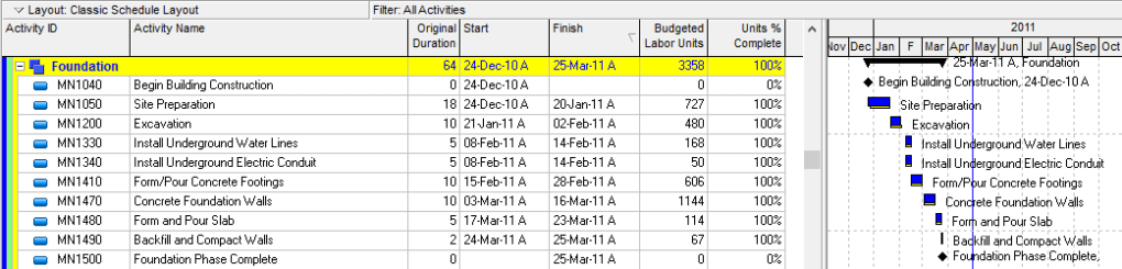
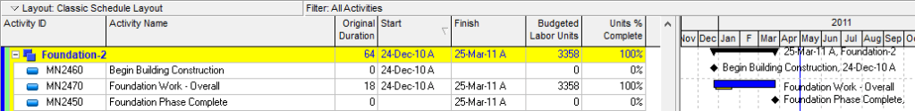
This is what a schedule is meant to look like
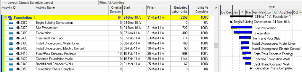
In reality, below is what the schedule would look like today. Extended durations on everything, broken relationships, out of sequence work and worse than anything – NO CRITICAL PATH! This is not a good example – however I am confident you have dealt with a schedule like this and know this isn’t just an isolated issue anymore.
What is driving this insanity is the method (the data source) for where our progress comes from. The concept of what “site prep” meant in the original schedule was not the full site prep scope, but only the key site prep work required to commence the excavation.
What changed is the method and data source for where the progress is coming for our activities. Because we are not progressing the schedule, and instead are progressing an excel file to load into our EPR systems – to most likely drive a progress payment – the way data then flows into the schedule becomes meaningless.
There are many that would counter that we are simply running our progress system wrong, and that indeed the site prep should have been 100% earlier. And, likely true. In the above I am just being silly, but we have all seen this and we all know the issue.
So what is the solution?
The solution is to understand that when progress is measured outside the schedule and at a level that is at a finer level of detail than the schedule – the schedule becomes meaningless at certain levels. You therefore need to build schedules AT A HIGHER LEVEL.
Instead of tracking the work at a lower level, for the schedule to bring back meaning, we need to only represent the high level workflows and leave the details in our progress system.

The project should retain clear visibility to the detail and the detailed % complete; however, the detail items should not flow into the schedule because they can not be scheduled in a proper CPM way.
Again what is driving this is the method of progress no longer aligning with the methods of schedule. I understand this is severely controversial but when you start looking at your schedules these days and see countless in progress parallel activities that are simply being driven by interfaces with EPR systems to mirror a % – and not a proper schedule workflow – something is broken in our business. We would like to think our progress are all nice CPM logically driven schedules, and obviously I am not suggesting all our schedules are broken. However, the more I see issues such as this popping up in our As Builts Schedules, the more I want our industry to understand we are simply building crap schedules that are not agile enough to capture the intricate data now available in our other systems.
This article is only meant to better illustrate the problem – the why CPM is broken. Solutions (using CPM) are available. In the above I have actually suggested one solution, but several different models that can retain alignment with detailed progress items and retain a workflow CPM model are possible. Hopefully I will dive into those in subsequent discussions.