Model Header/Details Schema using Nested Data in BigQuery

I was watching a Video by Alberto regarding the best way to model Header/Details Schema and how Star Schema is always the best option at least in PowerBI , even if you have never used PowerBI I think it is a great video to watch.

An interesting information I learned from the Video, although PowerBI columnar database is extremely fast in joins, still when the join column has a massive number of distinct values, performance will degrade, in his case, one of the fact has 1.4 B rows and 94 million distinct values on the join !!!, the solution was basically to flatten the two fact Tables.

ok, what this has to do with BigQuery !! for some reason, an idea occurred to me, this scenario will be a perfect scenario for Nested Data, but as I never used nested data before, in this blog, I am just messing around and see how it goes !!!

The Dataset

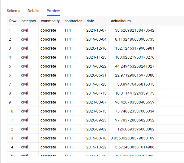
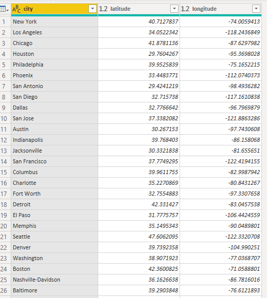
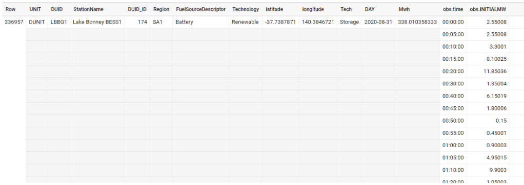
As usual, I will use the Australia electricity market as an example, it has 72 Million records with a size of 10 GB uncompressed, here is a sample f the Data, the dataset is public using this adreess

“test-187010.ReportingDataset.UNITARCHIVE”

As you can see the same attribute is repeated for every 5 minutes, what change is the date and the production in Mw

let’s see how it looks as a nested format

in a pure denormalized form they are two tables in reality, the dimension which contains the generator attribute and the production every 5 minutes

How to Nest data in BigQuery

I literally copied from this blog by Lak, just go and read it, I will just show the SQL Query here

drop table if exists XXXXX.nested.UNITARCHIVE_nested;
CREATE OR REPLACE TABLE
  XXXXX.nested.UNITARCHIVE_nested
PARTITION BY
 RANGE_BUCKET(DUID_ID, GENERATE_ARRAY(1,4000, 1))
CLUSTER BY StationName,DAY
AS
SELECT
  UNIT,
  tt.DUID,
  StationName,
  DUID_ID,
  Region,
  FuelSourceDescriptor,
  Technology,
  latitude,
  longitude,
  Tech,
  DAY,
  cast(SUM(mwh) as numeric) AS Mwh,
  ARRAY_AGG(STRUCT( time,
      INITIALMW)
  ORDER BY
    time ASC) AS obs
FROM
  test-187010.ReportingDataset.UNITARCHIVE tt
  left join (select DUID,row_number() over() as DUID_ID
  
FROM
  test-187010.ReportingDataset.UNITARCHIVE
  group by 1 ) as xx
  on tt.DUID=XX.duid
WHERE
  unit="DUNIT"
GROUP BY
  1,
  2,
  3,
  4,
  5,
  6,
  7,
  8,
  9,
  10,
  11

Compare Performance

For the same level of details, the size went from 10.1 GB to 1.13 GB !!! the cost of storage is rather insignificant, but if you use Query on demand, you pay by size scanned, the less the better.

Let’s check the total sum of Mwh , the same Query went from 1.1 GB to 5.1 MB !!! that nearly 100 X Cheaper ( in BigQuery you pay a minimum of 10 MB)

let’s check the 5 top days by production, same went from 1.6 GB to 7.7 MB that’s 160 X Cheaper , and faster too from 0.9 Second to 0.6 Second, it is funny both return subsecond results and it is not cached 🙂

What’s the catch !!!

There is a catch though, when you Query inside the Nested Data, the performance is nearly the same, went from 1.6 GB to 1.1 GB still it is a saving of 0.5 GB, but what surprised me, unnesting is a bit faster than reading from flat data, I was expecting the opposite

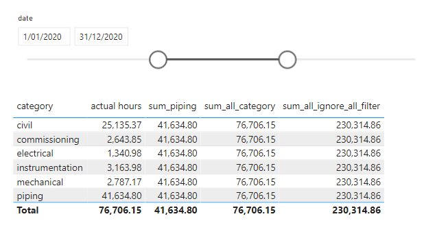
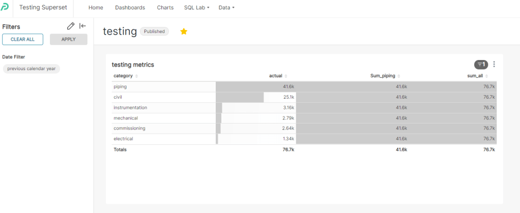
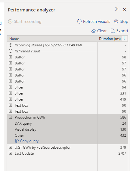
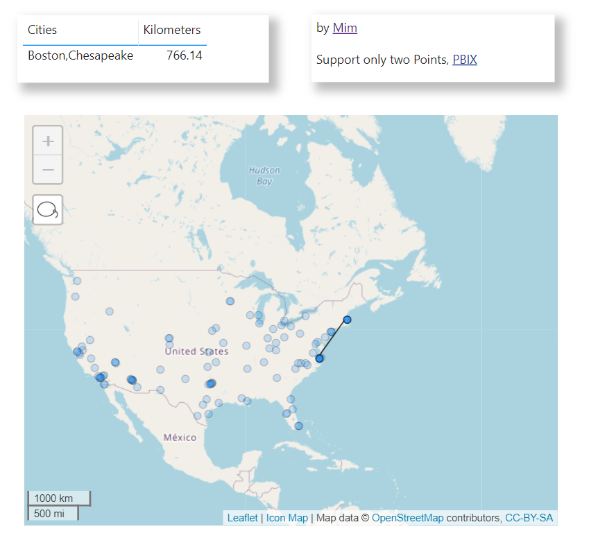
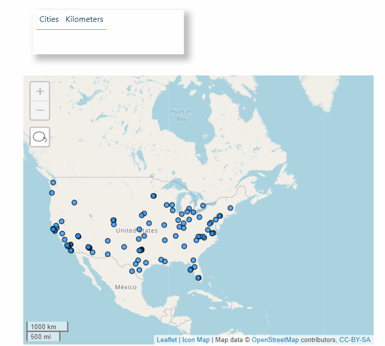
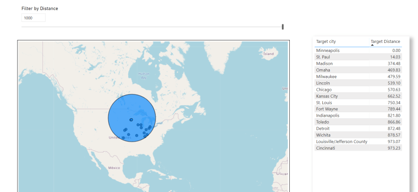
Visualise the Results in your Favorite BI Tools

I am using PowerBI to show the final results, using Direct Query Mode, the Dimensions are Imported to improve the slicer performance, Obviously it works with any BI tools that support SQL.

Looker has a nice support for nested data, unfortunately there is no free version to test it.

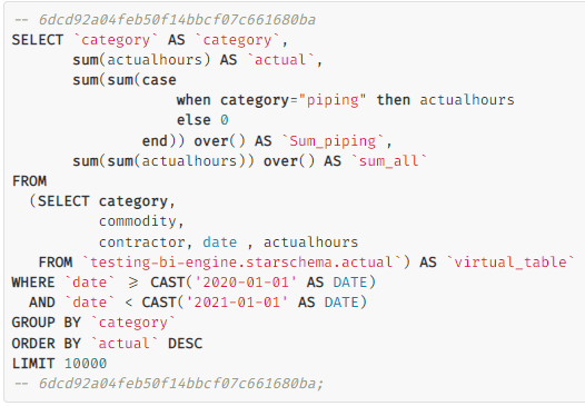
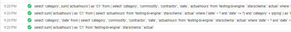
As of this Writing BI Engine does not support Unnest Data,Hopefully they fix the issue very soon., Nice, it is supported under BI Engine SQL Interface !!!!

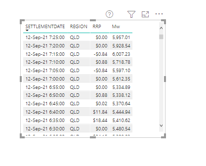
And a sample report using nested data (5 minute Dimension)

Take Away

let’s say you have a Header and details tables, there are some options

  • Join at run time in the BI tools, can be slow for high cardinality joins
  • Merge the two Fact at the ETL Stage, very fast but potentially generate multiple grains and you need to using distinct count to remove duplicates
  • Nested Data seems to be very elegant solution, no joins and you keep the granularity and it is cheaper to Query

“Modern” BI tools are missing something like PowerBI Composable SQL Generator

If you are on twitter or LinkedIn, Probably you heard already about the emergence of the “Modern” Data Stack and the triumph of the Cloud Data warehouse , this is all good, I use BigQuery BI Engine and I am amazed at what can be done with a little Bit of SQL.

Before I used to have an obsession with semantic model, I always thought you can’t have a decent analytical workflow without a proper multi fact semantic Model or what’s called now “Metric Store” , but I started changing my mind, flat wide table with multi grains are definitely ugly but they work , and storage is cheap, the point is ; there is a workaround it is not a showstopper, I think the issue is Further downstream.

To explain my point I will use PowerBI , and compare it to Apache Superset as an example, but the same can be said about other “Modern” tools too.

Analysis of Simple Table

we will try to analyse only one table using Direct Query mode, the Table is loaded in an external Database, so no ETL , no OLAP, no data movement.

Then I created this simple Report

The main metric is Actual Hours, which is basically sum (Actual Hours) grouped by category, to my surprise, it was trivial to reproduce the first three metrics easily using Apache Superset

The SQL was not too complex

SQL Aggregate can not simply ignore filters

The Problem started with the Metric “sum_all_ignore_all_filter”, which basically sum the total hours and ignore any filters or grouping, In PowerBI, we use this syntax to get this behavior

sum_all_ignore_all_filter = CALCULATE(sum(actual[actualhours]),REMOVEFILTERS())

now let’s see the Query generated by Superset

As far as I know there is no way in SQL to add an aggregation and tell SQL to ignore the where clause , I presume you can create another Query and do a join, but I don’t think Superset permit this in the Metric definition, another solution is to use Parameters to pass the filter values, but then you will lose cross filter functionality.

Now you may wonder how PowerBI solved this Problem, how it is possible by just writing a generic Metric, it will always works regardless of filters or which dimension is used in group by ?

I know it is pretentious statement, but in my View this is the Ethos of the Product, this the killer feature of PowerBI

The idea is very simple, PowerBI DAX Engine will just send multiple SQL statement and assemble the results , the implementation is very complex involving two engines ( formula and Storage Engine), complex Query plan, and even a patent which I think it is worth reading , but obviously this is all hidden from the user.

here is a look at how the PowerBI process the report

And the Actual SQL Queries generated

Take Away

Obviously this is only my own understanding from an analyst point of View, but as far as I can see , all I can read is SQL is better than proprietary DSL, but no one explain how to handle very complex calculation that ignore filters and level of details using SQL and keeping the flexibility of Metrics, where they are just supposed to work.

The Previous example was just simple use case with one table, now imagine a complex model with multiple tables and Non additive Metrics.

I am not suggesting PowerBI is the only software that can do that, all what I am saying “Modern” consumption layer tools need to have more sophisticated SQL Generators.

Share Data from a PowerBI Dataset using Dataflow

Using PowerBI Dataflow to share data between departments is increasingly getting more popular, with the rise of managed self service offering, it is not unusual to find a non centralised Data warehouse but rather every department managing it is own data, I don’t know enough to say anything useful on which model works better in the long term.

this blog is about one use case I encountered recently, and thought it maybe worth sharing and to be very clear it is always good practise to share the data from the upstream Data source , but in this case, there was a non trivial business logic applied inside PowerBI dataset.

Usually we have two options.

  • A user can just create a new thin report assuming he has build permission
  • With Direct Query on composite model, a user can mix between live connection to a dataset and import different sources.

Both approach are fine, but in this case, the data consumer from another departement is just interested in 1 table (a couple of dimension and some measures) and because there is a non trivial logic in the Model, we can’t get the data from the source system, and it is rather important not to provide Build permission.

In my humble opinion sometimes giving access to a whole Data model with a lot of tables, relationship etc does seems an overkill and potentially confusing , instead I am suggesting an easier approach, sharing a dataflow that run a DAX Query against the model, and return exactly the agreed schema,basically a flat table which will not change even if the structure of Model change.

it is very straightforward and works with both Pro and premium ( Premium works better with large models, the timeout duration is more generous, and anyway PPU is very cheap)

Build a visual that show the required data

I will use a random dataset as an example, let’s say the data consumer wants this data updated daily ( real life example is substantially more complex)

click on performance analyzer , refresh visual then copy the Query

Clean the Query in DAX Studio

Paste the Query in DAX studio, don’t get intimidated by the apparent complexity , The main Query start by VAR __DS0Core

Now in a simplified format

// DAX Query

  EVALUATE 

    SUMMARIZECOLUMNS(
      'MstDate'[SETTLEMENTDATE],
      'REGION'[REGION],
      TREATAS({"QLD"}, 'REGION'[REGION]),
      TREATAS({"5 Minutes"}, 'unit'[description]),
      "average_Price", '00-Measures'[average_Price],
      "INITIALMW_Sum", '00-Measures'[INITIALMW_Sum]
    )

Alternatively you can build The Query straight in DAX Studio using the Query Builder

Connect to PowerBI service endpoint using PowerBI Desktop

you can read the documentation here, basically you connect to SQL Server Analysis Services which is the Engine of PowerBI,

Note : I am using my personal tenant.

Copy PowerQuery code to Dataflow

Dataflow don’t have a connector to Analysis Services at least in the UI, but coping the Query just works ( notice the double Quotes in QLD)

let
    Query1 = AnalysisServices.Database("powerbi://api.powerbi.com/v1.0/myorg/aemo_data", "aemo_data",
     [Query=
    "
    // DAX Query

  EVALUATE 

    SUMMARIZECOLUMNS(
      'MstDate'[SETTLEMENTDATE],
      'REGION'[REGION],
      TREATAS({""QLD""}, 'REGION'[REGION]),
      TREATAS({""5 Minutes""}, 'unit'[description]),
      ""average_Price"", '00-Measures'[average_Price],
      ""INITIALMW_Sum"", '00-Measures'[INITIALMW_Sum]
    )
    "
    ,Implementation="2.0"])
in
    Query1

I am not suggesting it is a good practise, in an ideal world everything is in a nice Cloud DWH with business logic and all, and the BI tool is just a front end to run aggregation and show nice charts, but real life is not perfect and it is useful to have the option when you need it.

Edit : The original title of this blog was using Dataflow as Poor Man’s Data mesh, but I had to be realistic as of this writing Dataflow can only be consumed by a PowerBI Client, not even Excel is supported and I know about Azure Storage, but with the current paranoia about security, it is extremely hard to have that option on for a lot of companies , Hopefully Dataflow product team open up a little bit for other Client too.

Filtering by Dynamic Distance in PowerBI

TL:DR , the blog show some tricks using DAX and Icon Map, pattern like dynamic filtering by distance and showing a Buffer when selecting a point, The Publish to web report and pbix are here

before you get too excited Currently to make it works you have to block the Zoom Functionality.

The Formula for calculating distance in PowerBI is very well known I think it was first mentioned here , I had used it already for building this report a couple of years ago.

what changed is Icon Map, with the 3.0 release basically nearly everything can be customized which make some new scenario Possible.

you need only 1 table with coordinates

Draw a Line Between Two Points and show Distance

1- You Build first an Icon map just using point

2-Create the second Layer by creating a new Map Visual

This Map will show the line based on the Point selected

we need first a dummy table with one row

Build a measure that capture the selection

linestring = var Geo="LINESTRING("&CONCATENATEX(reference,[longitude]&" "&[latitude],",")&")"
return
if(ISFILTERED(reference[city]),Geo,BLANK())

add the Line String Measure here

and Voila now you have two Map, The Point Selected in the first Map will be shown as a line in the second Map, CONCATENATEX does not respect the Order of Selection, so currently it is useful only for two Points ( M parameter respect the selection but that will be another Blog)

3- Merge the Two Map together

I guess this is the trick of the Blog, if you want this behavior

Stack the two layers on top of each other; Make the Point layer background transparent, Remove Background, Lock the Map, keep both layer having the same Dimension , Layer Layout and zoom Value

You have to remove the Zoom otherwise the two layers will not be synchronized, Technically speaking we need only 1 Map, but unfortunately DAX table can not filter itself, feel free to vote on this idea and complain on Linkedin and Twitter 🙂

Select a Buffer Selection

When you Select a Point, the Map will draw a Circle and filter only the Point inside the Circle, it is a very Powerful GIS pattern.

The Same approach, but now we create three Layers

The Selection Layer we use this option ( the point not selected will be hidden, I love Icon map )

The Circle Layer

we use this Option

to get the Radius of the Circle we use this Measure

diam_M = if(ISFILTERED(reference[city]),SELECTEDVALUE(Dis_Parameter[Dis])*1000)

The Parameter is used to control the Size and the measure Works only when a point is selected

The Calculation Layer is where we show the Point filtered , we will use a bit of DAX, we create a new disconnected Table , make sure there is no relationship between the two Tables

to reduce data duplication we need only ID from the first table, I am using a measure to get the coordinates ( Probably LookupValue is no the most performant Option)

Target_Lat = LOOKUPVALUE(reference[latitude],reference[city],min(Target[Target City]))
Target_Lng = LOOKUPVALUE(reference[longitude],reference[city],min(Target[Target City]))

The Measure to calculate the Distance is

Target Distance = 
-- see https://radacad.com/dynamic-distances-in-power-bi
var Lat1 = min(reference[latitude])
var Lng1 = min(reference[longitude])

var Lat2 = [Target_Lat]
var Lng2 = [Target_Lng]
---- Algorithm here -----
var P = DIVIDE( PI(), 180 )
var A = 0.5 - COS((Lat2-Lat1) * p)/2 + 
    COS(Lat1 * p) * COS(lat2 * P) * (1-COS((Lng2- Lng1) * p))/2
var final = 12742 * ASIN((SQRT(A)))
return if(ISFILTERED(reference[city]),final)

And then another Measure to filter the Result

Filter_by_Distance = if(ISFILTERED(reference[city]),if([Target Distance]<=SELECTEDVALUE(Dis_Parameter[Dis]),1,BLANK()),BLANK()) 

Then add the measure filter to the Viz

Icon Map is a fantastic Tool, and there are plenty of possibilities, hopefully the author keep adding more options and customisation