I always tried to learn R, but I never succeed, I did not like it, after enjoying the GUI of PowerQuery, using R was like a self-inflicted torture. But obviously I was wrong as usual, R is not only for data cleaning.
in a PowerBI usergroup , I heard someone talking about R, and I made a mistake of telling him what R can do that PowerBI can not do ?, all I can say is I wish if I did not ask him this question, anyway, in defending R, he said something about generating HTML file and boom, that’s exactly what I was looking for, a file that anyone can read and it has interactivity and it works offline.
my problem is, I build very nice interactive map visualization, but for large distribution, I just print it to pdf, which obviously fail the purpose, not everyone has access to PowerBI service, and for external parties ( client, subcontractor), you can’t reasonably expect them to subscribe to PowerBI service just to see a map :), using Excel 2016 was an option but unfortunately some functionalities are still missing (can’t show a label) and honestly the integration of 3D map with Excel looks like it was a second thought by the developers.
The good news is, R has an excellent integration of PowerBI, so instead of recreating the wheel, just use R for the stuff that can not be done natively in PowerBI.
I hope to publish multiple blogs to document my workflow.
In my real case scenario which I can not publish for obvious reason, we need to view the status (Completed, or not) of nearly 50,000 Piles, show all the piles will clutter the view, instead, I found by accident that a library called Leaflet (the Engine used by MapBox), has the ability of showing layer only when you zoom.
I will use a dummy data, (literally a foundation on a mountain in a New Zealand as an example),
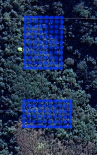
the data source is an excel file with the pile location and topojson file to show the foundations location all generated using the Excellent QGIS.
the R code is
library(readxl)

library(leaflet)

library(htmlwidgets)

#read Excel Data

data <- read_excel("pile.xlsx", col_types = c("text","text", "numeric", "numeric"))

#read json

map_data <- geojsonio::geojson_read("foundation.json",what = "sp")

######################################

map <-leaflet(map_data) %>%

addTiles(urlTemplate = "https://mts1.google.com/vt/lyrs=s&hl=en&src=app&x={x}&y={y}&z={z}&s=G", attribution = 'Google') %>%

addPolygons()%>%

addCircleMarkers(lng = data$x, lat = data$y,radius = 3)

map

saveWidget(map,file="foundation.html",selfcontained=TRUE,title = "foundation")
the result is a self contained html, at the moment, it is show only 2 foundations and some piles, in the next blog post, we will add zoom, and how to filter layers, and show labels and stuff.
the result is here, and the source data is located in this github repository.


