Primavera P6 calculated a lot of rich metrics for a
schedule, we all know the basics, Start Date and Finish date, but there are all
kinds of other values ( Cost, Labor hours, not Labor , Float Duration etc)
The challenge is, different people want to see different
measures, and once you publish your
reports, the viewer can not change the visual, Microsoft is working on this feature,
but it will take another couple of months to be released.
The trick was suggested by Kasper
de Jonge and in a random chat with @DingbatData@_Ivan_Bond , they use it
already to solve similar issues, actually it is very easy
Anyway the
purpose to reproduce something like this from Primavera
Create a new table that contains all the measures
Instead of copy and past all the measures, I just used DAX studio
connected to my PowerBI desktop to generate a list of all the measures, read this
link
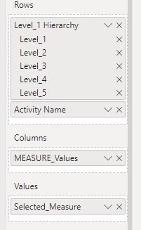
The Category is to just to make it easy to select which measure to select, the index is to keep the same sort in the slicer, I don’t want to show actual Finish before Actual Start.
2- Create a Master Measure that check if the value is selected.
Using Switch and SelectedValue give the result, I had only to add some condition
to format the results of Date to be show as date not Number, you can vote on
this idea
Here is a snapshot for the first 4 measures ( currently I have 29 in the
models)
3- Add the column Masure_Value to the column in the Matrix and Seletced_value in the values Area.
4-Voila
5-Bonus
I am using bookmarks to toggle the select Columns Button, I think it is
freaking cool, hopefully in the short
term PowerBI add more features so we can build not only dashboard but real application
interface.
in the first blog post of this series, we showed how to connect to Primavera SQL server, in this blog we build our first report, we use only the three tables TASK, PROJECT, and PROJWBS
I will not show the details of every steps, you need to have a basic understanding of PowerQuery and DAX, but i will highlights some aspects of Primavera Database schema that you should be aware of.
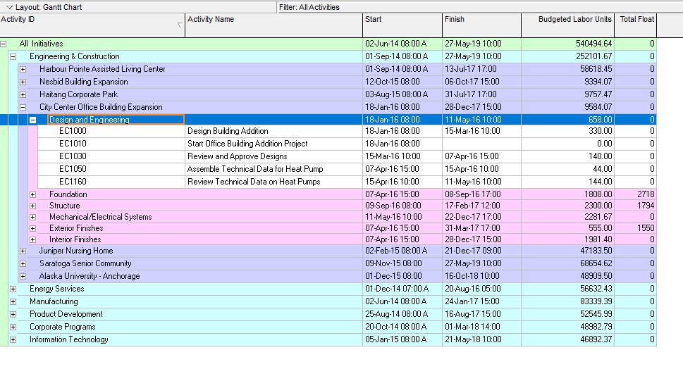
Reproduce Project View
this view show all the projects grouped by WBS and show measures, start date, finish date and budget labor units
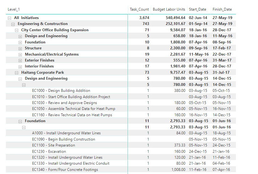
and here is the equivalent report in PowerBI
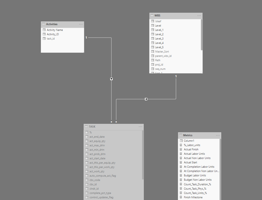
PROJWBS
the table PROJWBS store the EPS/WBS data for all projects, it is represented the database as a parent, child ID, which can’t be used directly by PowerBI, first we need to flatten the data to multiple levels so we can show it in a matrix visual, so basically moved from this format
to this format
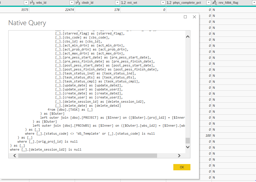
you have multiple options either using SQL , DAX or PowerQuery, for Powerquery here is an excellent resource by the Imke Feldmann , for our example I am using DAX , the canonical reference is by Marco Russo
just make sure when you import a table from SQL server to have this filter [delete_session_id] = null , because Primavera don’t directly delete data, but instead have something called soft delete, ie; the items is not shown in the client but it is still in the database and will be deleted later, anyway for PROJWBS remove all the template WBS, (I think they are used by the EPPM web client)
TASK
task is straightforward it save all the tasks of the project, same filter [delete_session_id] = null
PROJECT
we use project table only to filter the baseline out, in Primavera current project and baseline are saved in the database exactly the same way ( that very powerful paradigm ), but for our report we want to show the activities only for the current project, too easy [orig_proj_id] = null and the best part, we don’t have to write any queries, Powerquery simply generate the SQL for the database ( that’s awesome)
Simple Data Model
the two tables are connected by the field wbs_id, we added another copy of the table TASK as a dimension table for reporting ( just activity id, and activity name), and we have this simple data model, I like to save measures in a separate dummy tables
as you can see, building a data model is relatively easy, the complexity start when you want to add more measures, for example, total float, you need to connect to the table CALENDAR, if you want cost, you need to connect to other tables, and if you want spread it will become a little trickier ( hint it is not saved in the database)
hopefully by now, instead of asking how to connect to Primavera Database, the interesting question become, in which table the data is saved and how to join two separate tables to get the report you want
if you are still reading, I will appreciate if you can vote on this idea, unfortunately you can’t dis-activate table sorting in PowerBI, in this particular report, the sorting is already defined by the WBS, if the user click on the header, the order will change, they can still reset the order using the measure sort, still very annoying
I think one of the most asked question when some talk about
Primavera and PowerBI, is how to connect to the database, ok, the good news is,
the connection itself is easy, the bad news, extracting useful information is a
bit of work.
Just to show how it work, I am using a temporary
installation in my personal laptop, as obviously I don’t have access to my
production database.
I am using a developer edition of SQL Server 2006, and an evaluation copy of EPPM, oracle allow the use the evaluation of most of its software for the first 45 days, you can download a copy from here, you need SSMS too
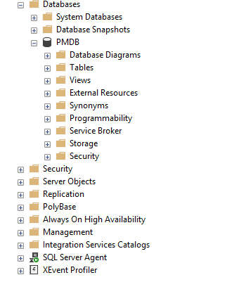
For the purpose of this blog, we will query the “normal” Primvera tables, for the extended schema, which is a groups of tables and views design specifically for reporting, but those extra tables are empty per default and you need to configure publishing service ( will discuss it in a future blog), please note I already blogged about how to connect when using Sqlite in the case of standalone P6 professional
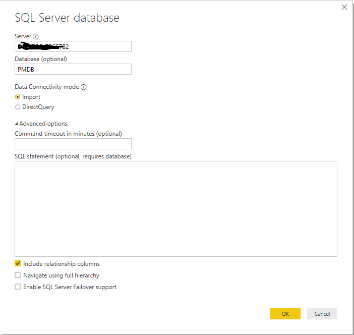
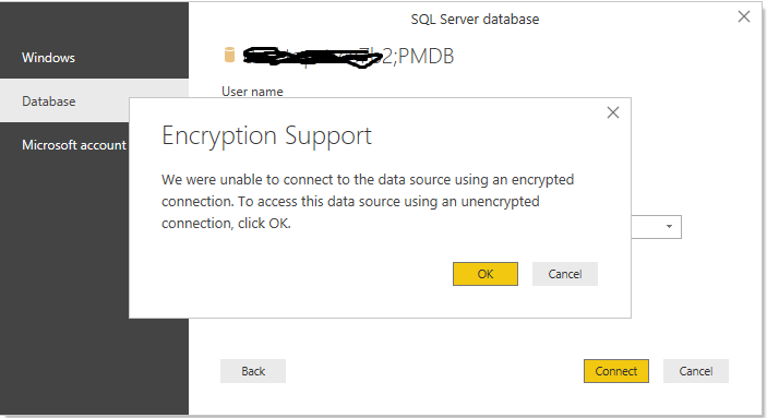
Connect to SQL server using SSMS
When you install Primavera, you get to
define 4 user account
sa : the database admin account (not the admin
for primavera application).
Privuser, pubuser : used to connect Primavera
app to the database
Pxrptuser : user account for reporting
We will
use sa to connect to the database
When you click on connect you get this
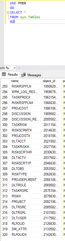
The database itself has 320 tables; you can
check that by running this SQL script
USE PMDB
GO
SELECT *
FROM sys.Tables
GO
Create a read only user
Connecting using the admin account is just very bad
practise, and I don’t want to mess with the existing account, so instead we
will create a read only user account
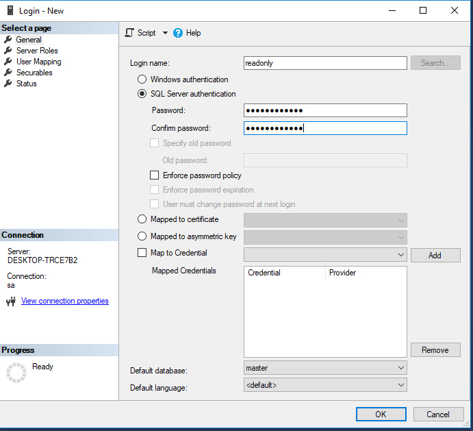
Create a New Login
Create password
Map the user the PMDB
Assign a new role
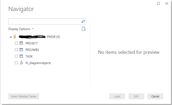
Instead of having access to the 320 tables, we create a new role (read_only) and we just assign the 3 most important table in the database, you can add later more tables, we granted select only, so no read access
Connect PowerBI to SQL using read only user
and Voila our Tables are now visible in PowerBI
so the answer to how to connect to Primavera Database from PowerBI is you need a user name, password and the server name, the challenge is how to extract meaningful reports from those tables ?
what’s next
at this stage, you need to get yourself familiar with Primavera Schema, yes it is 320 tables, but the basic one are three, and usually for my reporting I use around 10, I wrote an introduction to Primavera schema 6 years ago, I hope it is still relevant
When I start that AEMO Dashboard , I had a hard time dealing with PowerBI gateway, it is just setting there, my laptop has to be online whenever I need to schedule a refresh, it just annoyed me, and I could not understand how cloud based data needs on-premises gateway anyway, obviously later I learned that strictly speaking it was not required, there was just undocumented feature to get away of it ( the trick is in the first blog, thanks @Rad_Reza).
but before I was aware of that, I went to some rabbit holes dealing with new tools that are out of my comfort zone, and I think they are worth sharing.
my first thought was instead of accessing the data directly from the website, let’s instead copy the data to a cloud storage then read it from there, I have already a google storage account, it is very generous with a free 5GB storage, my data is not big around 2 GB of zipped csv..
first setback, there is no native connector to Google storage and even if there was ,we have something called egress fees, in a nutshell, cloud storage is really low cost, loading data is free, but getting your data out is not free, unless it is for the same provider and the same region, most of the cloud vendors use the same model, as my data will be processed in PowerBI, the clear choice is azure blob storage
Azure Blob Storage
the setup is very simple I used the following options :
the same region as my PowerBI region ( otherwise your pay the egress fees)
for replication I used LRS
as PowerBI don’t support data lake V2, I used the classical Blob Storage.
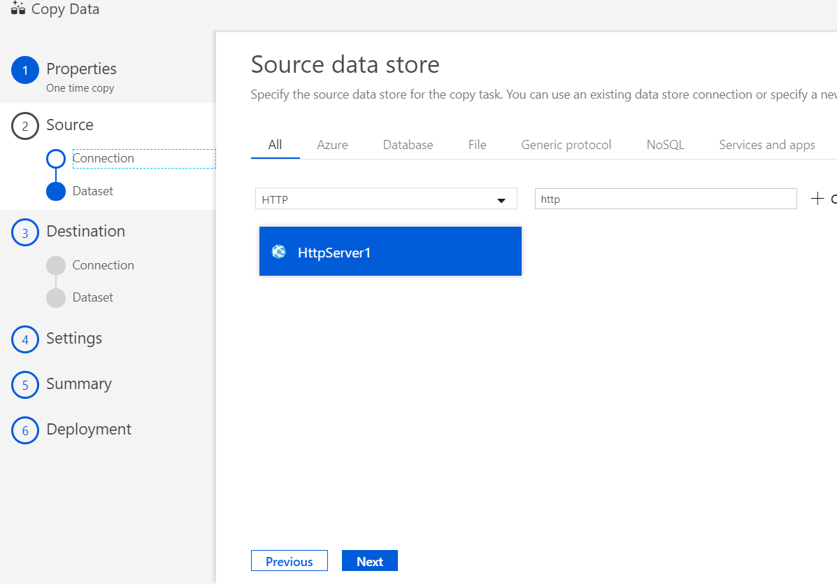
When you want to copy data, the official tool in azure is data factory, I tried to play around with copy activities, it is straightforward, my first attempt did work and it was fast , actually too fast 😊, no zip was transferred but rather an HTML
probably copy data just handle this case just fine, but when you use your own credit card on a cloud tool and you don’t know what you are doing, better stay back and take the time to understand how it works, I deleted the new created resources and went to the second option, Python !!!
PYTHON
Normally I go with R but blob storage has no API for R, I have very limited experience with Python , just using it for the excellent package altair , let’s try something new.
I was very pleasantly surprised, the amount of documentation for Python is just amazing, actually once I asked a question on stackoverflow and got a very succinct answer in less than a minute, no one was judgemental or downvoted my question ( the question was very basic). the only drawback is that sometimes the code works well for python 2, but I am using Python 3 anyway enough talking let’s show some pseudo code.
step 1 : get a list of files name from the web site
url = “web address where the files are saved”
result = urlopen(url).read().decode(‘utf-8’)
pattern = re.compile(r'[\w.]*.zip’)
here is a snapshot of the results, the full list is 60 items.
step 2 : get a list of files name from the blob storage
in the first run, the list is empty as we did not load anything yet, I load a couple of files manually just to test if it is working, the API for blob storage are very simple, you only need to provide your storage account name and key and I love that.
step 3 : get a list of files that exist in web and don’t exist in the storage
the code in Python is very simple, it is simply substraction of two sets, and then you converted to a list using function list ( i get why people like Python)
step 4 : Upload the new files to Azure Blob Storage
the same here, the Azure API are very simple and clear, I had only when issues, when the script upload in a loop, it does not wait until the transfer is completed before jumping to the next file, my workaround was just to use sleep ( sync is supported but not in this scenario where the input is from an url), anyone i got the answer in stackoverflow
ok, so we do have a script that works, now we need to run it on a schedule, once per day at 5 AM, keep in mind the whole purpose of this workflow is not to use on-premise software, I just need to find the service that runs a script on the cloud on a schedule, as I am already on azure, let’s stick in that ecosystem.
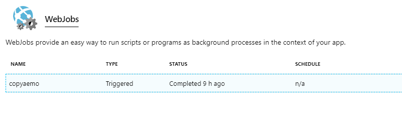
and it is a personal project, I prefer a free solution, my script runs only every 24 hours, for a couple of minutes, a quick google search and i find this little treasure, I will not repeat here the steps, WebJobs is a service that just do that.
note that the package azure-blob-storage is not a base package in Python you need to install first in WebJobs, the schedule functionality is very flexible as it is using CRON, I wish we had something like that in PowerBI Dataflows.
End results
Every day at exactly 5 AM, a new file show up in the azure storage, although I don’t need those files, I am using now another approach to load the files directly in PowerBI, it is important to build a data lake ( yes, I just said that, I am just joke, data lake is folder in the cloud where you save the raw files, nothing more), storage is cheap but most importantly the requirement may change, I may need to report on another dimension and it is crucial to keep the raw unprocessed data.
Take away
Python is awesome
Azure API for python are straightforward
Azure is awesome.
Be careful of Egress fees
CRON is awesome wish it was supported in PowerBI dataflows.
Wish PowerBI dataflows could save a raw file, Powerquery is amazing but it does not copy raw files.