Controls Accounts for Cost – Houston we have a (possible) problem

This article captures 2 issues that are related and perhaps not clearly discussed or understood (not even by me): Level of Detail, and Transactional vs Account based tracking

Many cost tools, for right or wrong, are now almost entirely Control Account based. This leads to some conceptual issues where people have been use to managing data in a more transaction way.

Additionally, when we begin to establish defined control accounts, picking the right level of detail, and how changes are managed between Controls Accounts, requires a lot of creative accounting (thoughtful process mapping through all your systems & Digital Strategy)

The below is just a primer for a potential discussion. This is a post on what it means to pick a correct level of detail and what it really means to how you manage your costs.

Transaction Management

This is my wheelhouse, the way my brain primarily works when dealing with projects. List Management. Everything is a new record.

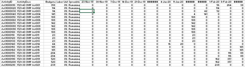
We have contracts with detailed line items, we want to retain our budget line items, each contract line item will have various columns for Committed, Forecasts, Incurred and Paid values. We manage these detail items in this way. Below is a example of how we really manage costs (and progress and deliverable). Excel (sharepoint, or a simple flexible database) provides an ideal solution for users to manage this detail.

C01

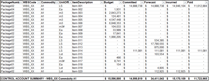
However, the new age of cost tools want us to view projects at a more “control account” level. In the above example, I have created a control account to a WBS and Commodity code level of detail.

In the above example, we have 4 contractors working on this scope in various capacities. Although, its way more subtle then that, we actually only have 1 contract and 3 expected contracts. We have parsed our budget into what we expect to be 4 different contracts. Thus only 1 contract has a commitment, but yet we have a forecast (and budget) for all 4. Each contract will have a full detailed list of detail items that we will manage. We will items for specified growth, perhaps contingency, maybe a few site instructions. A transactional list!

Quantity Growth – new line or modify existing?

Here again is one of the conundrums of how we manage (specifically related to progress measurement. Consider a project with some concrete and steel.

If we have a change in quantity for a foundation, where do we capture the change and what does it look like in our database. Too often, we look at this and manage it using a simple excel file – which can make the process easy. However, this is a very complex issue. If we add a line item and base our progress off committed quantities, we will have to update 2 line items with %’s. However, so many options exist to capture this.

And again, if instead this item is managed at the “control account” level, all we need is the total actual quantity, or simply the overall % for the control account. When you look at the above from a control account level, you capture all the detail, but yet for % management, you can disregard all the %’s to the details and only insert a % to the control account.

Which method is right, which method fits into your cost/progress system, which approach aligned to your specifications?

In the second method above, you loose the ability to calculate a specific % for variations. So again, we have taken just a simple issue, and created a complex nightmare.  Obviously, we all solve these problems day in and day out. The issue here is again just to bring this topic to light and how the new range of cost tools may not be flexible enough to really capture what we do – nor should they! The real answer is as we all do now, some detail is managed inside excel and some abstraction ends up in the system.

Control Account Management

In the above, we have seen the importance of picking the right control account level of detail, but, we perhaps haven’t conceptualized what a controls account is in the first place. For “control account” management, we want to manage “SCOPE”. For this package of scope, we sum up all the detail coded to the same codes.

C02

When we look at scope, it is much easier to compare against our estimate which was built to this level before we had to detail with specified growth, claims, site instruction and even contractor commitment. This is why we want control account management and why so many cost tools are forcing us down this path.

Whats the Problem?

In the above example, the “control account” is meaningless. We can not “manage” anything at the control account level. The control account is only a metric.

Instead we are going to manage our contracts in isolation. Each contract will have its own specifics and likely its own approvals when we modify a forecast or a commitment.

A solution to this conundrum is to split the above into 4 control accounts (or more). However, that creates a nightmare for everyone dealing with the new cost systems where creating cost accounts, loading budgets and costs is not straight forward. Doubly so as we haven’t even begun to discuss at what level we manage our time phased data.

All the new tools also allow us to manage “detail items”. Budget again, as soon as you start to push the level of detail of management into the detail items, you may as well make the detail item its own control account.

The Problem is – Whats the right Level of Detail?

You can run this problem down rabbit holes with how we manage engineering deliverables, how we manage progress items, manhours, quantity management, etc. Here I have just presented the problem related to strictly just a cost control level. But yet the dimensions for each of the items above is multiplied by each of the additional management datasets we also track.

Picking the right level of detail that goes into our cost tools, is more of an artform than it is a science.

My view is that we need easy flexible transactional capabilities from cost systems to ease the excel hell aspects. But yet at the same time, need to understand how the transactional records join up to perhaps a more formal CTR or Control Account level of detail.

PowerBI Incremental refresh using Python or R

In this blog, I will show how to leverage Python (or R) to implement an incremental refresh in PowerBI using PowerQuery and Python, nothing is really new ( I am sure Imke and Maxim has blogged about it before).

in a previous blog, I showed how to use R & Python integration to load data to a Database

This approach make sense only when you do a lot of heavy transformation and your data source change based on time.

As an example, in my previous job, we receive a new excel file every Monday (300K rows), this file gets approved and corrected every Thursday.

the workflow was:

save the files in a folder, do the transformation, which was fine , but after the first year, it was around 52 files, and although technically you need only to do transformation for the last file, and as PowerBI does not support incremental refresh, twice a week we redo everything, after two years, the refresh took nearly 30 Minutes and sometimes we get out of memory errors.

in the big picture,Half an hour was not that bad (we have a desktop just for refresh), the worst was, you refresh the model and once you finish, you get a new revision and you must refresh again.

Now using Python/R script, the idea is every file get transformed only 1 time, regardless of how many times you refresh, just by exporting the results of the transformation of every file as a csv in a staging folder.  

  • The first run is slow, as it will process all the existing files in Source Data, but the subsequent run, will transform only new files.
  • Let’s say File 2 was revised, all you need to do,is to delete File2.csv and it will be transformed again, but only that file.
  • Ok, if you see step 4, the files are reloaded each time, I am not too much worried about that, as the batch loading of csv files from a folder using PowerQuery is relatively fast (yes, a bit slow compared to R), the bottleneck is rather the transformation.

the code for python script is here, as you can see PowerQuery integration is amazing, just add a new step and you get a dataframe, that’s all,

# 'dataset' holds the input data for this script

df_by_filename = dataset.groupby("filename")

for (filename, filename_df) in df_by_filename:

    filename = filename.replace("zip", "csv")

    filename = filename.replace("PUBLIC_DAILY", "UNIT_PUBLIC_DAILY")    filename_df.to_csv("C:/results/"+filename,index=False)

the script split the dataframe by the column filename, and then export each file separately, currently it is saving into a local folder, but you can easily save those files into a cloud storage

to test it, I built a quick workflow using public data, PBIX here,  the source data is zip files in a public website, there is a new zip file daily, it is relatively complex transformation as you need to unzip the file split it, delete some columns etc, the first run is slow, as it is processing all the files (62 files), but the next run, will just process 1 file, you can simulate that just by deleting some csv files in the staging folder, when you refresh again, only the files deleted will be processed again.

I think the main take away is, Python and R integration are amazing tools to implement new possibilities that will not be necessary available in PowerBI, and you don’t need to be a programmer to use those integration, a serious search on stackoverflow will get you started quickly.

Construction Progress Report – PowerBI – by Darrin Kinney

A quick and easy construction progress and schedule dashboard.

I have previously outlined an approach that can be used for Engineering Progress.

This post is an extension to that which instead of looking at engineering model development, instead looks at construction development. I don’t want to delve too much into the details about exactly how this was built (again see the post above).

Some big differences is that I have used a resource assignment view. in addition to the date metrics This allows for resources histogram and progress curves to be quickly sorted down to an activity level. This approach also follows a prior post Resource Analysis Dashboard .

Construction02

The data

Construction01

The underlying data is very similar to our engineering progress example. We can use a flat file export direct from P6 with a standard set of columns. As I have mentioned before, you can achieve this in a SQL query as part of a larger data model, although with everything, a delicate balance is needed (balancing database formalism and easy excel solution)

We will also have the resource assignment data

Construction06data.JPG

The WBS Slicer and Area Selection

Construction03_wbs

This design element doesn’t work for project with too many WBS elements. For this example, each major area only has about 10 WBS elements, therefore I could pull this off with no drama. I really prefer this selection as opposed to drop downs where it is often difficult to quickly make  selection.

The Pie and Metrics

Construction04pies

Here we follow much of the look and feel I used with the engineering progress; however instead of just using activity count metrics, I have also inserted hour and percent complete metrics. There is nothing fancy about these.

The Data Table

Construction05table.JPG

I’ll sound like a broken record again, when you have a good design with one aspect of a project, you can likely take that and run with it for many other areas. In a following post I will detail this systems engineering aspect to nearly everything we touch.

Obviously the key inclusion into the table is the budget units and %’s. I still prefer these tables views vs the GANTT views. Having clear visibility into the last month dates, the prior month dates,  and variances is the purpose of this view.

The Future

Again, the extension of this are endless. At this stage, we are starting to see how pre filtered views provide more focused dashboard as compared to a one size fits all. Sitting in an EPCM world, most of the detailed activities and schedules are managed by our contractors. Thus, this construction view is more suited to using an export from a contractor Level 4 schedule.

At some point, we will need to begin to discuss an overarching design where a user can navigate to our various dashboard in a logic way.

Happy data wrangling!

Engineering Progress Report – PowerBI – by Darrin Kinney

In this article, I will run through all the steps required to produce an elegant Engineering Progress Report.

Eng12

The intent is not to delve into the manner in which the progress or schedule are updated. I have assumed you have a schedule and progress status for each key area. It is quite amazing how easy is to generate this dashboard, and also the extensions available to use this not just for engineering, but for fabrication, material deliveries, major milestones, contractor key activities, etc.

I will outline the format for our 2 key datasets and then follow with the creation of 2 dashboards: An Overall Status Gauge, and the full detail EPR Dashboard

P6 Schedule Data

Below is our data set we want to use. This data set has been specifically tailored to our resulting visual. Thus, instead of linking directly to an XER, importing into a data model, and performing perhaps too much data work, a nice trick is to instead define specific VIEWS inside P6, so that you can easily copy-paste directly into Excel, then import directly into your dashboard. Thus, the below can be quickly generated each schedule update cycle.

Eng_9

A very nice aspect of this data set is the field “TYPE”. It is good practice to tag activities of a specific type (this ties into my belief about using a framework approach to approach controls). Thus, in theory, you can export the entire schedule, and drive many different dashboards by just filtering on different TYPE fields. In this example I have used

  • M090 = 90% Model Review
  • M100 = 100% AFC

Although, consider tagging every concrete pour Activity in your schedule with C010. You can then use that code to drive a similar dashboard for concrete pours: Or you use F100 for Module Fabrication, where we tag the completion activity for each module for use in dashboard. Ultimately you create a catalog of TYPE codes and can go dashboard crazy with how easy this turns out to me.

This data does not have all the fields we will need in our dashboard. Specifically we will want to create a several measures that will allow for a few metrics. We will need to know if an activity is “FINISHED”, “NOT FINISHED”, and “Critically LATE”. Because these fields are dependent on your target audience, its best to leave the generation of these to code (because everyone can code right!). If you wanted to display metrics on “Started”, then your source data would need to include the start date and perhaps the activity status field from P6. Again, its important to understand the relationship between your visual and your data. In this example, I am treating these activities as effectively milestones in which case the concept of “started” doesn’t apply. key conceptual discussions such as this are vital.

Progress Data

The progress data in this example is only overall progress. The intents is to just show an overview for the entire project and quick metrics for model reviews. Ultimately, you would want a “WBS Specific” dashboard that would display more information over the entire lifecycle of that WBS. In that view, you could present the engineering curve and perhaps EVMS metrics.

Strategy – Do not do everything in one place- keep focus

Too often, I see users pushing design features into dashboards, for what appears to just be whimsical value. Dashboards are not meant to answer 100 questions. Its easier to have 100 dashboards each displaying a key metric, as opposed to 1 dashboard displaying 100 metrics. Keep your approach CLEAN and FOCUSED.

Ideally, our progress data will include fields such as Area, WBS. In this example I have pulled data with just 1 data date and only 1 dataseries (Engineering_Overall). Your backend progress data will likely have data from multiple cut off dates and for multiple series.

Our progress data will look like this. The full data set will also contain a series for “Construction_Overall” too. This will be used on our summary page to outline the power in using this approach to progress data.

Eng_02

Linking our Data into PowerBI

In this example, both data files are simply Excel based files with the data converted to table. This allows for the easiest importing (and also allows for quick refresh of data). Housing the data in the excel files can also facilitate a movement to a more digital way of thinking (more on that in another article)

VISUALIZATION 1 – SUMMARY GAUGE

I am a firm believer in Overall Project Flash reports. So, when we think about dashboards we should have a starting point our overall project status. Thus, the elements presented here are only a key subset of metrics and visuals I would expect on a Project Status Report dashboard.

In this example, looking at engineering progress, we want to see what Percent % Complete we are and how that compares against our Planned % Complete.

A Gauge is a good way to provide a quick visual (Bullet charts are other, and really, the skies the limit)

Eng_Gauge

To generate this we need to create 2 measures: Actual % and Planned %. This is where you really need to understand how dashboards work and how databases work. If you feed a computer a data source, it is no innate way of know something as simple as “What is the current %”. Therefore, we need to write some code.

Because of the format of our progress data, we can search for the maximum data date, then find the value of our actual % field on that date. We can follow an identical approach for the Planned %. Depending on your data, you would need to custom build these measures.

Code to generate our measure for Current %

M_Progress_Actual = CALCULATE (
SUM ( data1[Actual] ),
FILTER (
data1,
data1[DataDate] = MAX ( data1[DataDate] ) && data1[Date]=MAX(data1[DataDate]
)
))

Code to generate our measure for Planned % (similarly we could also pull in our Plan late)

M_Progress_Plan = CALCULATE (
SUM ( data1[BL_Early] ),
FILTER (
data1,
data1[DataDate] = MAX ( data1[DataDate] ) && data1[Date]=MAX(data1[DataDate]
)
))

The required fields for the gauge are obviously these 2 measures.

  • Value = M_Progress_Actual
  • Target Value = M_Progress_Plan

We will also need to provide a filter where Series=”Engineering_Overall” (note that this gauge can now be easily reproduced to showcase planned vs actual for all Series inside our data source. Obviously in the image above you can see I created 2 gauges each with a filter for the specific data series. Ultimately if your back end data has multiple data series for progress sliced and diced different ways, all you have to do is adjust your filter and you can display an endless series of graphs. Of, you can fancy with smart slicers too.

VISUALIZATION 2 – Engineering Progress Report

This is perhaps the most easy to read, interactive and intuitive view into engineering I have ever seen. We can immediately filter into what areas are complete, what areas are critical, scroll to see upcoming deliverables and see an overall graph.

Eng12

It might seem we have a lot going on here, but again, this is all driven off 2 quite simple data sources, and for this page, mostly everything here is from 1 schedule driven table.

The Data Table

The Table is just pulling from our Schedule data (although I have inserted a page level filter to only include activities with the TYPE = M100 and M090). Our fields are as

Eng_4

In the above image, you can see I have had to insert a few measures. I don’t want to go into them all. I’ve inserted some conditional formatting into the Actual/Forecast date column. To achieve this, I created a measure Activity_Status_Num

Activity_Status_Num = IF(ISBLANK(Schedule[Float]),1,IF(Schedule[Float]<1,2, 0))

Then, with these values I can select a formatting specific just for that column in the table. This is very nice feature of the tables in PowerBI that can add nice level of polish.

The Donut Charts

Eng_6

A nice feature of the donut chart is the count metric in the middle. It is generated from a nice little bit of code as seen below. We have 2 Donut Charts. One for our 90% activity and another for the 100%. Thus, all we need to do is place a visual level filter on each.

IsFinished = IF(ISBLANK(Schedule[Float]),1,0)
DonutCounts = SUM(Schedule[IsFinished]) &”/”& COUNT(Schedule[ActivityDesc])
In the above, there are 2 measures: “IsFinished” and “DonutCount”. Again if you want anything to display on a dashboard in a digital world, you are going to have to see this type of code

The real power of the Donut Chart is to allow for very quick sorting – after all we want to see the critical late activities right! Just click the red 90% or 100% section.

Eng13


Progress Graph

Eng_7

We have a progress graph too. This is effectively a dumb page level graph. It is not linked to a specific progress series for each WBS. So it will not auto update, and our data model does not link these tables. Although, the graph should add context to the overall page. Deviations from the plan curves, should be viewed by a growing number of critically late packages.

Care needs to be made whenever we look at schedule dates and progress graphs. We do not typically create progress graphs at an activity level (although, you can certainty consider it – I would offer caution against going down that route).

EXTENSIONS

This example has show the power simple data sets can have to improve visibility into our projects. This only showcased a few engineering based activities. However, if you read between the lines, you will understand there is nothing “engineering specific” about what I have done. This approach is completely universal. Given this example also included a progress data set for Construction, obviously, the easiest extension will be to link in a few construction activities in the same way.