Feel free to provide comments directly to my LinkedIn Post that references this article and contact me directly – Darrin Kinney
Some content in this post is perhaps superseded by PowerBI Progress & Schedule Dashboard.
Getting the right structure for what a PowerBI dashboard can do in relationship to construction projects is not a 1 sized fit all approach, so really this post is meant to just focus on some of the data elements, which again have been perhaps better presented in the new link above
Analyzing resources in P6 is a common responsibility of all planners. However, ultimately the data typically stays in the realm of the planner, and never properly given to the specific project managers and project engineers who actually need to execute the work. Thus, there exist a huge opportunity in the digital world to extract data from P6, and present it to the masses. Planners are penultimate professionals in this. We live for this. We take the resource assignment data from P6 and work our magic in excel creating a suite of reports and graphs (s-curves).
However, all the excel work is customized. The ability to quickly drill into the data from the data table or the graph is just too difficult for management. The need to create custom graphs, takes time. Instead, we can create something quite amazing using PowerBI.
Using PowerBI we can create a simply easy to use dashboard that provide nearly unlimited flexibility to display both schedule and resource information to any user on a project. The below is a walk through to create a simple view with a simple schedule. However, I have run this through a schedule with 5,000 activities and multiple resources including both manhour resources and quantity resources. It is situations where you have data overload that PowerBI shines. Get the data out from the planner, and into the hands of the project management group.
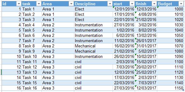
Step 1 – Get resource assignment data
Using the resource assignment tab in P6, remove all the grouping and just display everything. You will want to ensure some key fields are available: Start Data, End Data, Resource Data, Resource ID and Type, Activity Name and ID, plus some WBS and grouping data (ex contract).
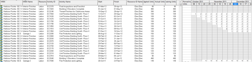
Step 2 – Copy-Paste Resource Assignment Data into Excel
A simply copy-paste from P6 into excel will suffice. It is really that easy. Sometimes the data from P6 may not contain the right descriptions, so this is an opportunity to use some vlookups (or Index(Match()). The data also needs to be presented in a table. Select All and use CNTL-T to convert to a table.

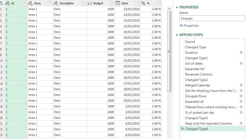
Step 3 – Unpivot Data using Power Query
This step can be done directly inside PowerBI Desktop, or in perhaps a more flexible excel environment. I prefer to do as much data handling in excel to reduce the complications once inside PowerBI; however, many options exist.
Inside Excel (ensure you have power query add in), select the columns with the dates, and click “UnPinvot Columns”. Close and Exit.
After running the unpivot, you will see each data column turned into a row. This is an easier data format for use in databases and a trick universal not just for powerBI, but anytime you might be dealing with databases.

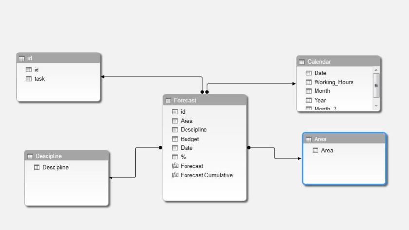
Step 4 – Import Into PowerBI
PowerBI has very quick and easy import routines. This post is not meant to be a specific click by click guide. There are easy import routines you can find to import excel files. Again, as indicated above, just make sure your data is converted into a table. You can directly create a datasource using something similar to the below
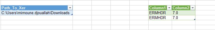
=Excel.Workbook(File.Contents(“C:\Users\Name\Downloads\P6_resource_Assignments_HP.xlsx”), null, true)
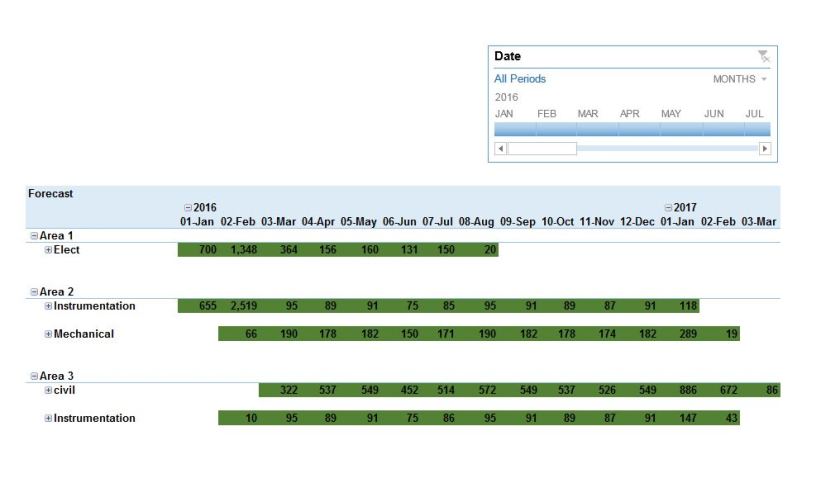
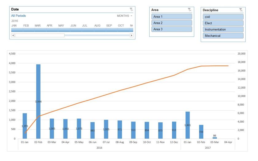
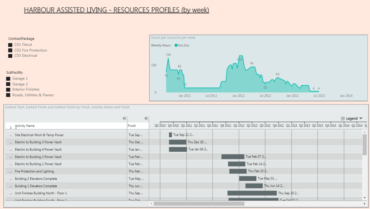
Step 5 – Create your PowerBI Elements : Gantt, Graph, and Slicers
GANTT
The PowerBI file uses a custom visual you can download for free from the marketplace
The parameters you will want to use are roughly as noted below


GRAPH
The PowerBI file use AREA CHART. This is an easy to use built in graph feature of PowerBI. You can use potential extension of line graphs to show a % Complete curve. However, from a base usage, the area chart provides the easiest visual.
A nice trick in the overall dashboard is to align the data range of the GANTT with the GRAPH. I have found some limitations to this exist, but in this example, it worked quite nicely.


SLICER
The real power of this visual is through the use of slicers. Slicers allow for immediate filtering based on a variety of selections. This visuals uses a range of filters for Contract, Facility, SubFacility and ResourceID. Depending on the structure and data you extracted from the P6 resource assignment, your options here are unlimited.


Conclusion
This example just scratches the surface of what is possible. I found the above to be immediately useful to our project team in clearly visualizing the resources required over time. There is some manual effort to keep the source excel updated after changed to P6 – this is not a live linked datasource. There are numerous possible development extension people can use to customize this.
The biggest critique to the dashboard is the lack of visibility into the Baseline dates and plan curves. For this, we can only hope someone builds a more robust custom visual to accommodate this. In the end, happy planning.