Using PowerBI with Azure Synapse Serverless, First Look

Recently I come across a new use case, where I thought Azure Synapse serverless may make sense, if you never heard about it before, here is a very good introduction

TLDR; Interesting new Tool !!!!, will definitely have another serious look when they support cache for the same Queries

Basically a new file arrive daily in an azure storage and needs to be processed and later consumed in PowerBI

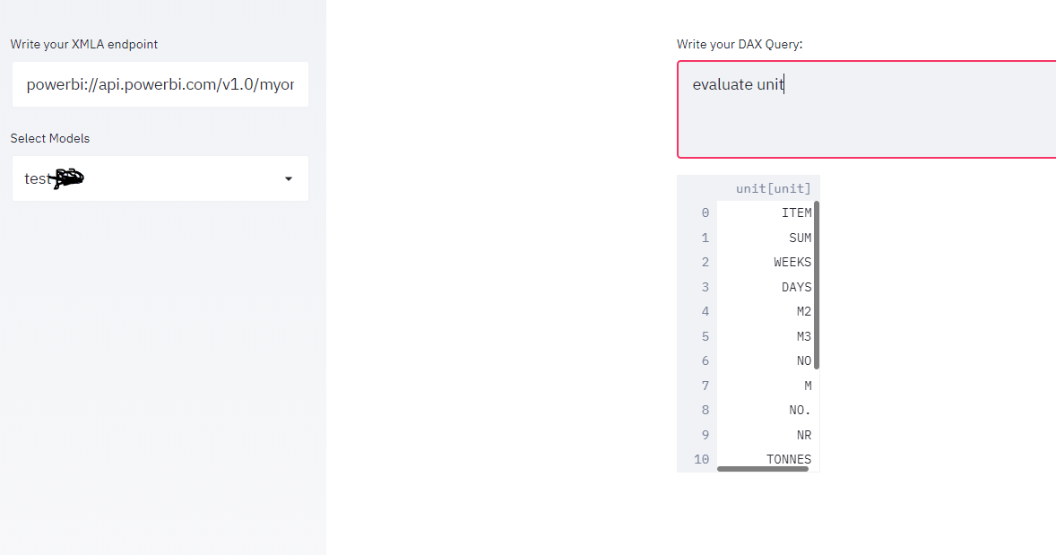
The setup is rather easy, here is an example of the user interface, this is not a step by step tutorial, but just my first impression.

I will use AEMO (Australian electricity market Operator) data as an example, the raw data is located here

Load Raw Data

First I load the csv file as it is, I define the columns to be loaded from 1 to 44 , make sure you load only 1 file to experiment then when you are ready you change this line

'https://xxxxxxxx.dfs.core.windows.net/tempdata/PUBLIC_DAILY_201804010000_20180402040501.CSV',
'https://xxxxxxxx.dfs.core.windows.net/tempdata/PUBLIC_DAILY_*.CSV',

Then it will load all files, notice when you use filename(), it will add a column with the files name, very handy

USE [test];
GO

DROP VIEW IF EXISTS aemo;
GO

CREATE VIEW aemo AS
SELECT
result.filename() AS [filename],
     *
FROM
    OPENROWSET(
        BULK 'https://xxxxxxxx.dfs.core.windows.net/tempdata/PUBLIC_DAILY_201804010000_20180402040501.CSV',
        FORMAT = 'CSV',
        PARSER_VERSION='2.0'
    )
    with (
c1   varchar(255),
c2   varchar(255),
c3   varchar(255),
c4   varchar(255),
c5   varchar(255),
c6   varchar(255),
c7   varchar(255),
c8   varchar(255),
c9   varchar(255),
c10   varchar(255),
c11   varchar(255),
c13   varchar(255),
c14   varchar(255),
c15   varchar(255),
c16   varchar(255),
c17   varchar(255),
c18   varchar(255),
c19   varchar(255),
c20   varchar(255),
c21   varchar(255),
c22   varchar(255),
c23   varchar(255),
c24   varchar(255),
c25   varchar(255),
c26   varchar(255),
c27   varchar(255),
c29   varchar(255),
c30   varchar(255),
c31   varchar(255),
c32   varchar(255),
c33   varchar(255),
c34   varchar(255),
c35   varchar(255),
c36   varchar(255),
c37   varchar(255),
c38   varchar(255),
c39   varchar(255),
c40   varchar(255),
c41   varchar(255),
c42   varchar(255),
c43   varchar(255),
c44   varchar(255)
     )
 AS result

The previous Query create a view that read the raw data

Create a View for a Clean Data

As you can imagine , Raw data by itself is not very useful, we will create another view that reference the raw data view and extract a nice table ( in this case the Power generation every 30 minutes)

USE [test];
GO

DROP VIEW IF EXISTS TUNIT;
GO

CREATE VIEW TUNIT AS
select [_].[filename] as [filename],
   convert(Datetime,[_].[c5],120) as [SETTLEMENTDATE],
    [_].[c7] as [DUID],
   cast( [_].[c8] as DECIMAL(18, 4)) as [INITIALMW]
from [dbo].[aemo] as [_]
where (([_].[c2] = 'TUNIT' and [_].[c2] is not null) and ([_].[c4] = '1' and [_].[c4] is not null)) and ([_].[c1] = 'D' and [_].[c1] is not null)

Connecting PowerBI

Connecting to azure synapse is extremely easy, PowerBI just see it as a normal SQL server.

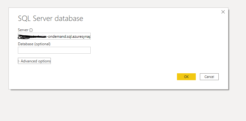
here is the M script

let
Source = Sql.Databases("xxxxxxxxxxx-ondemand.sql.azuresynapse.net"),
test = Source{[Name="test"]}[Data],
dbo_GL_Clean = test{[Schema="dbo",Item="TUNIT"]}[Data]
in
dbo_GL_Clean

And the SQL Query generated by PowerQuery ( which Fold)

select [$Table].[filename] as [filename],
[$Table].[SETTLEMENTDATE] as [SETTLEMENTDATE],
[$Table].[DUID] as [DUID],
[$Table].[INITIALMW] as [INITIALMW]
from [dbo].[TUNIT] as [$Table]

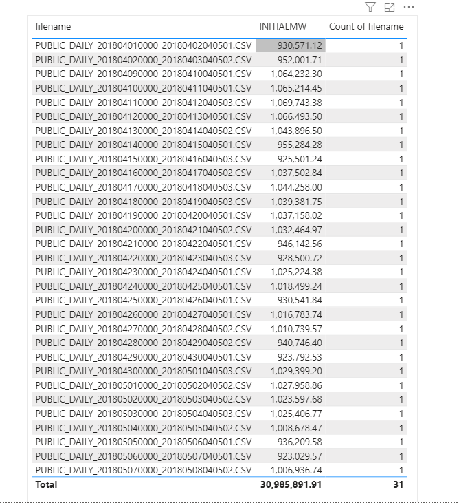
Click refresh and perfect, here is 31 files loaded

Everything went rather smooth, nothing to set up and I have now an Enterprise Grade Data warehouse in Azure, how cool is that !!!

How Much it cost ?

Azure Synapse serverless pricing model is based on how much data is processed

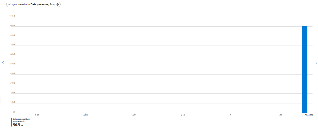
First let’s try with only 1 file ,running Query from the Synapse Workspace, the file is 85 MB, good so far, data processed is 90 MB, file size + some meta Data

now let’s see using the Queries generated by PowerBI, in theory my files size are 300 MB, I will be paying only for 300 MB, let’s have a look at the Metrics

My first reaction was, there must be a bug , 2.4 GB !!!, I refreshed again and it is the same number !!!

A look at the PowerQuery diagnostic and a clear picture emerges, PowerBI SQL Connectors is famous for being “Chatty”, in this case you would expect PowerQuery to send only 1 Query but in reality it will send multiple Queries , at least 1 of them to check the top 1000 rows to define the fields type.

Keep in mind Azure Synapse Serverless has no cache ( they are working on it), so if you run the same query multiple times even with the same data, it will “scan” the files multiple times, and as there is no data statistic a select 1000 rows will read all files even without order by.

Obviously, I was using import mode, as you can imagine using it with directQuery will generate substantially more queries.

Just to be sure I tried to do refresh on the service.

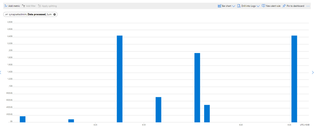
The same, it is still 2.4 GB, I think it is fair to say, there is no way to control how many time PowerQuery send a SQL Query to Synapse.

Edit 17 October 2020 :

I got a feedback that probably my PowerBI desktop was open when I run the test in the service, turn out it is true, I tried again with The desktop closed and it worked as expected, one refresh generate 1 query

Notice even if the CSV file was compressed, it will not make a difference, Azure synapse bill uncompressed data.

Parquet file would made a difference as only columns used would be charged, but I did not want to used another tool in this example.

Take Away

It is an interesting Technology, the integration with Azure cloud storage is straightforward, the setup is easy,you can do transformation using only SQL, Pay only what you use and Microsoft is investing a lot of resources on it.

But the lack of cache is a show stopper !!

I will definitely check it again when they add the cache and cost control, after all it is still in Preview 🙂

Connect Streamlit to PowerBI service using XMLA end point

Edit : 16 Nov 2022, a new approach is to use DAX REST API, it does not require Premium license and works with any front end tool even on Linux, see example here ( source code in the Link)

https://powerbi.streamlit.app/

Streamlit is a new framework to build data web app using only python, you don’t need any knowledge of javascript/HTML.

Connecting to a PowerBI using Python is well documented , see those excellent tutorials here by David Eldersveld

using this code, I managed to build a small app that using an existing XMLA end point, first it will extract the existing models and then you can run arbitrary DAX queries.

please note as of August 2020, XMLA end point is a PowerBI premium only feature

the main connection string and how to export to a df was copied from this Answer in Stackoverflow

import adodbapi as ado
import numpy as np
import pandas as pd
import streamlit as st

def get_df(data):
    ar = np.array(data.ado_results) # turn ado results into a numpy array
    df = pd.DataFrame(ar).transpose() # create a dataframe from the array
    df.columns = data.columnNames.keys() # set column names
    return df
source=st.sidebar.text_input('Write your XMLA endpoint')
if source:
    with ado.connect("Provider=MSOLAP.8; Data Source="+source) as con:
        with con.cursor() as cur:
         cur.execute('select * from $SYSTEM.DBSCHEMA_CATALOGS')
         data = cur.fetchall()
         catalogue = get_df(data)
         catalogue_Select= st.sidebar.selectbox('Select Models', catalogue['catalog_name'])
dax=st.text_area('Write your DAX Query:')
if dax:
    with ado.connect("Provider=MSOLAP.8; Data Source="+source+" ;Initial catalog="+catalogue_Select) as con:
        with con.cursor() as cur:
         cur.execute(dax)
         data = cur.fetchall()
         df = get_df(data) 
         st.write (df)

and here is the result

Unfortunately adodbapi required Windows , which make deploying the app a bit harder, yo can try Azure Web app which has a windows runtime, I wish it was as easy as Heroku !!!

The good new Microsoft added recently the support for .Net Core, so hopefully I will Update the blog with a cross platform solution

to run the app on your laptop, just type

streamlit run app.py

it is a proof of concept but I see a lot of use cases, an obvious one is to build web app for visualization not supported by PowerBI like massive dataset maps, or 3 D viz.

Using the new Convexhull function in BigQuery to reduce Geometry complexity

BigQuery recently introduced two new GIS functions, ST_CONVEXHULL and ST_DUMP

Read the announcement here , when I saw the announcement I already thought about this use case.

The Problem

Although showing map in BI software has improved dramatically in the last couple of years, still unless you use Tableau, there is always a hard limit how much data you can show in a map, even if you can show more, it is better to reduce the volume of data just for performance sake, users are so spoiled those day that they complain when their report does not show up in less than 2 second.

Although the example used here is very specified, I am sure it can be extended to other uses cases.

Let’s say you want to show a lot of points  with one colour coded attribute, in a lot of cases, the end user wants only to see the distribution of the attribute not the individual points, see here  

That’s a lot of points ( my real case is 58 Thousand)

Convexhull to the rescue

Convexhull is very handy the input will be group of points and the output will be a closed polygons, I use it a lot in QGIS, but the killer feature here, because it is SQL and the attribute are dynamic, (in my use case they changed daily), you can write a Query that dynamically generate new geometries, either polygons or linestring or even  keep the original points if they can’t be grouped.

Now the trick is we group by status and existing grouping, for example in this dataset.

  1. Check if in one area all the status is the same using count distinct, if in one area it is the same attribute, it will generate a polygons.
  2. if one area has multiple status and hence multiple colours then fine, we jump to the row level and generate line strings.
  3.  If one line string has multiple colors then we jump to points.

I built this SQL View with the help of  Mikhail Berlyant, the source data is here, replace “xxxxx.SolarFarm ” with your table.

WITH
  source AS (
  SELECT
    *,
    ST_GEOGFROMTEXT(CONCAT( "POINT (",x," ", y,")")) AS POINT,
    COUNT(DISTINCT status) OVER (PARTITION BY ROW) AS multiple_status,
    COUNT(DISTINCT status) OVER (PARTITION BY area) AS multiple_status_area
  FROM
    `xxxxxxx.SolarFarm`),
  tt AS (
  SELECT
    id, pole_nr,color,area, ROW,status, POINT,
    CASE
      WHEN multiple_status_area=1 THEN area
      WHEN multiple_status=1 THEN row
    ELSE
    CAST (id AS string)
  END
    AS newgroup
  FROM
    source),
  ff AS (  SELECT newgroup, ST_ASTEXT(ST_CONVEXHULL(ST_UNION_AGG(POINT))) AS WKT
  FROM
    tt
  GROUP BY
    1),
  xx AS (
  SELECT
    tt.newgroup,
    wkt,
    tt.status
  FROM
    tt
  LEFT JOIN
    ff
  ON
    tt.newgroup = ff.newgroup)
SELECT
  newgroup,
  wkt,
  status
FROM
  xx
GROUP BY
  1,
  2,
  3

and here is the result side by side with the original data from 3528 rows to 283 rows, that’s a big improvement,

as of July 2020, Google Data Studio does not support Geometry, and the total number of points is limited to 10K, you can use other custom Visual but currently tiles are blocked.

if you are using PowerBI to view the data, you need to use the excellent Icon Map as it support WKT geometry

Rendering 1.2 Million points in PowerBI using Icon Map

TL;DR, the report is here , pbix here , download Icon Map here

I blog about it really before here, but in a colorful discussion on twitter after they closed this bug report, (Max rows in PowerBI is 30 K), I recalled a bug report about R ggplot, when the authors suggested to use multi points instead of individual points to speed the plotting of the map !!! all I had to do is to check if icon map support it and it did !!!.

WKT format for point is POINT (x,y), all you need to do is to concatenate multiple rows of point in MULTIPOINT format MULTIPOINT ((x y),(x1 y1), etc).

now we need to deal with three thing:

1-The maximum row numbers returned to a visual is 30K.

2-The maximum length of a column in PowerQuery is 32766

3-The Maximum length of DAX function is 2.1 Million

so a calculated column is a no go, I am using this DAX measure to concatenate the text from (x y) to a Multipoint format, again using Chris blog, I got this measure

WKT = var concat =CONCATENATEX(values(openstreetmap[point]),openstreetmap[point],",") var wkt ="MULTIPOINT ("&concat&")"return if (concat =BLANK(),BLANK(),wkt)

using this table that contains all the items tagged as amenity in Openstreet Map, the table contain 17 Million records, got it from BigQuery dataset

remember you don’t want to group all points in 1 row for two reason.

1- Concatenax Max is 2.1 Million

2-it is better still to group by common attribute, at you can color code for example by country or category or both if you want, in this case, I added a third factor in MULTIPOINTS, just a number that change very 30k rows to make sure I will not end up with a multipoints > 2.1 million, Initially It was 100K, but I notice icon map become extremely slow

now in icon Map, you need to assign three fields.

Category : multipoints

Icon URL/WKT/SVG: the measure wkt, this extremely clever and flexible, as it is a measure, that will render using the filter context of category, you may want to be creative and implement drill using different level of details, as the geometry is calculated on the fly.

Circle/line/WKT/Geojson Outline Color : a color in hex format, in my case, coded by country, ( at work for a different use case, I use a measure instead to show change of status per time)

because, the data set is relative big, I use this option in PowerBI

Just to be clear, this only proof of concept, rendering a big dataset will be slow and will eat all your memory, and probably you will get errors in shared workspace, or if you are in a premium workspace, probably you will end up in a trouble, but it is cool, personnaly, I use it to render a 58K points and it is very smoth.

anyway here is the result filtering the tag place of worship 1.1 Million, I tried parking which is 3.2 Million but my laptop crashed !!!, I know it is subjective, but that looks very beautiful for me.

here tag : School and University color by Country

edit : got a nice feedback from Reddit user data_Crucher, just to improve the performance I materialized the results using a calculated table, the drawback is you increase the size of the model, but I guess it is worth it, and I changed the decimal precision for the lat and long to 4 digits just to reduce the size, the pbix is around 600 MB.

again for production scenarios, I think around 100K points should be doable.