
This is just a code snippet on how to read a delta table using pure Python (no Spark) without attaching a lakehouse.
First in spark notebook you need to install those two package ( this step will be unnecessary with pure Python notebook)
%pip install deltalake
!pip install duckdb
Then get the abfss path of the table, it can be anywhere, even in different workspace.
from deltalake import DeltaTable
import duckdb
access_token = notebookutils.credentials.getToken('storage')
storage_options=     {"bearer_token": access_token, "use_fabric_endpoint": "true"}
TAXI = DeltaTable('abfss://xxx@onelake.dfs.fabric.microsoft.com/NY.Lakehouse/Tables/ny/taxi',storage_options = storage_options).to_pyarrow_dataset()
For this example the table is not small ( 1.3 billion rows) , having filter pushdown is a must for a good user experience, for smaller data it does not matter.
let’s show 5 rows, the limit is pushed to the source, we don’t need to scan 20 GB just to see some rows.
display(duckdb.sql(f''' SELECT * from TAXI limit 5 ''').df())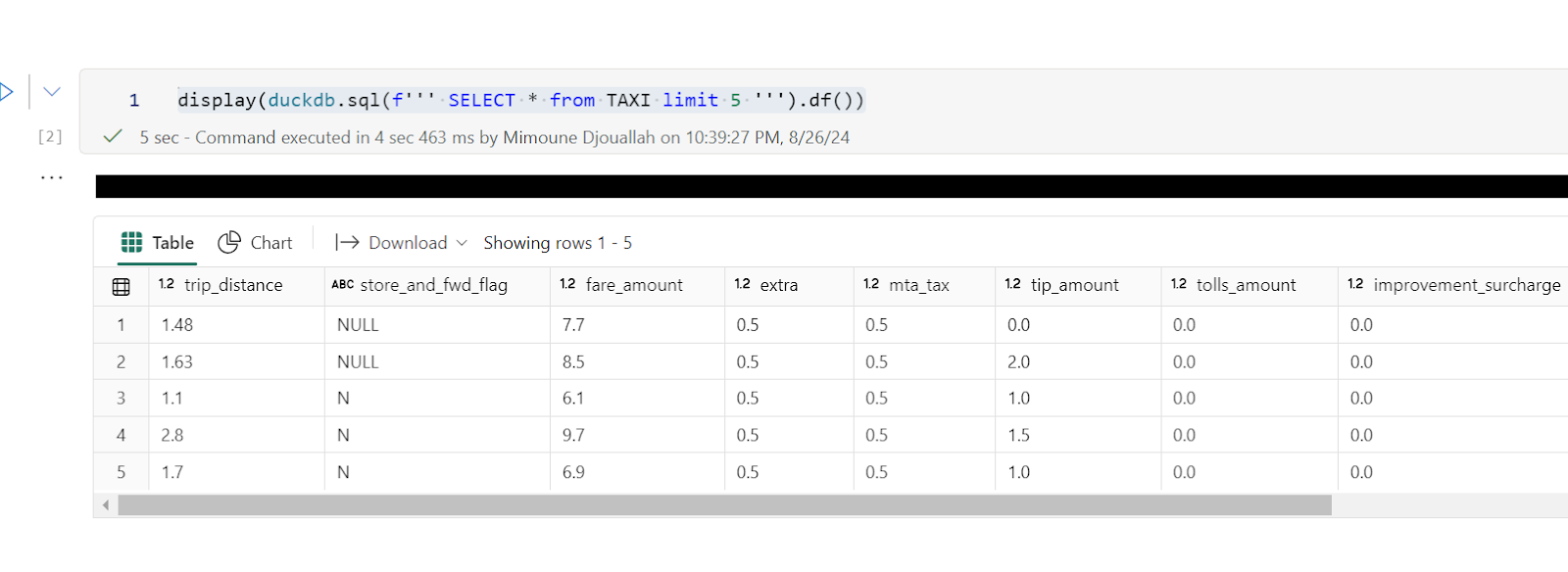
Note : you can use any Engine that understand arrow dataset , personally I prefer duckdb but it is a personal taste
Now let’s filter the data only for this year, again, filter pruning works, what I really like ; although the table is not partitioned somehow the scan is leveraging the stats in the delta table log
data = duckdb.sql(f''' SELECT date ,  ROUND (SUM (fare_amount),0) as TotalFares , ROUND (AVG (fare_amount),0) as AVGFares
             FROM TAXI where year = 2024 GROUP BY ALL ''').df()
display(data)
Not everything is perfect yet 😦
max (column) , count(*) unfortunately does not use the delta log and trigger a whole table scan.
let’s show some interactive chart
I have the aggregated data already, using the excellent library Altair, I can easily plot an interactive chart
import altair as alt
brush = alt.selection_interval()
details = alt.Chart(data).mark_bar().encode(alt.X('date:T'),  alt.Y('TotalFares:Q'), tooltip=[alt.Tooltip('date:T',format='%Y-%m-%d %H'),'TotalFares:Q']
).properties( width=1400,  height=400 ).add_params( brush)

summary = alt.Chart(data).mark_square().encode( alt.X('date:T'), alt.Y('AVGFares:Q'), tooltip=['AVGFares:Q'] ).properties(  width=1400,  height=400).transform_filter( brush)
details & summary
honestly, I did not know how much covid had impacted the Taxi industry 😦
You can use Other Engines too
as I said it is not specific to duckdb, for example using Polars
import polars as pl
access_token = notebookutils.credentials.getToken('storage')
storage_options=     {"bearer_token": access_token, "use_fabric_endpoint": "true"}
scada = pl.scan_delta('abfss://xxx@onelake.dfs.fabric.microsoft.com/NY.Lakehouse/Tables/ny/taxi', storage_options=storage_options)
x = scada.limit(10).collect()
and Daft
import daft
from daft.io import IOConfig, AzureConfig
io_config = IOConfig(azure=AzureConfig(storage_account="onelake",endpoint_url="https://onelake.blob.fabric.microsoft.com",bearer_token=access_token))
df = daft.read_deltalake('abfss://xxx@onelake.dfs.fabric.microsoft.com/NY.Lakehouse/Tables/ny/taxi', io_config=io_config)
df