Download the template for Excel here.
Edit 22-august-2018 : updated for PowerBI & Excel, you can select either precom or com, or any combination ( Phase, SP etc), the DAX measure was done by Owen Auger
Edit 14-may-2018 : PowerBI now support more complex conditional formatting, the post is updated with PowerBI templates.
PowerBI report here
PBIX here
Skyline charts are very popular in the precommissioning and commissioning phase, as in one page, you can see the remaining subsystems to be done, and how much ITRS to be completed, here is an example.

Excel does not support this chart natively, even power bi,( you can vote for this idea) , some people manually draw this chart in Excel, which is really time consuming or using complex vlookup formula, in this blog post i will share with you a template i built using powerquery and powerpivot, as you would expect that chart is generated with a simple refresh.
what data source you need
for convenience, the data source are included in the same file, i used a dummy data for obvious reason.
Export from your completion system :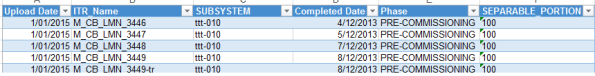
Export from your Planning Software :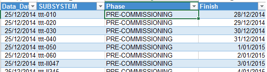
A Master Table for Dates: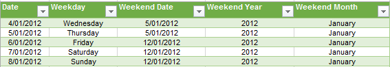
a master table is included as you needed to aggregate the date, there is no point in showing a skyline per day, here i am using week, but you can change the formula to be per month.
refresh
go to Powerquery, show pane, and refresh

some consideration
- Although I personally use P6, any Planning software is fine, basically we need only 1 forecast date by subsystem per phase, if the subsystem is spread in multiple PCWBS, then use the Maximum date
- P6 here is used only for the forecast date, the actual data ( ITR and completion date) are from the completion system , in some cases, i overwrite P6 forecast date if it is earlier then the completion subsystem cut off date, if P6 does not provide a date for a particular subsystem, I use the latest date from the equivalent system.
in the slicer Phase, select either Precom or Commissioning, if you select both, th skyline will not work properly.

Hi this is what I have been looking for, but I can not make it work.
I tried a couple of colleagues to use it, with no luck.
It seems there are some hidden input there.
Hope you can help me
LikeLike
can you tell me what error you get, I presume you have Excel 2013 and PowerQuery Installed
LikeLike
Excel 2016. (expression error) the column Finish of the table was not found.
DM me for further details
LikeLike
I can confirm. It’s not working either on excel 2016. can you please che the file again and post it? I really need it! thanks.
LikeLike
What’s the error message
LikeLike
It is great to see more specialty planning tools on the Power BI platform. I have one question – how would you recommend modifying the RANKX formula to allow for filtering? For example, if I add a slicer that filters the Forecast table by SEPARABLE_PORTION “200”, the correct subsystems are visible, but they do not collapse to the bottom of the chart. I have tried several variations to get the subsystems to re-rank after a selection like that, but so far I haven’t been successful.
LikeLiked by 1 person
Hi Aaron
I added a filter for SP, and updated the pbix file, as you will notice, the formula works if you select only one SP, otherwise the rankk will not be correct.
LikeLike
Aaron, you can use any slicer now, no need to modify any formula
LikeLike
update the Excel file
LikeLike
Hi, I tried downloading this file, but it says it’s no longer available, I would love to have a look at this.
LikeLike
I just checked, all the files are there
LikeLike
Hi, I have a bit different scenario. I need to see the skyline chart as a total without selecting Precom or Commissioning e.g. collapse to the bottom of the chart. At the same time, it should be possible to use a slicer that filters Precom – Commissioning.
LikeLiked by 1 person
Hen
sorry for the late reply, your scenario is doable, but I have to rewrite the calculation, I could not figure out a generic way to filter regardless of the number of dimension the end user want, PowerBI is a great modelling software, but there is a lot of works to be done for graphics
LikeLike
you can now, at least for PowerBI,
LikeLike
This is great news. I will check it out next week and give you a Feedback. Thank you:)
LikeLike
Min
Your work is excellent.
One question. Is it possible to group the Subsytem by color per week, eg. Starting with “not yet started, Started, 20-50% etc. I have more than 200 items weekly and would be great to see items sorted by colors.
Regards
Hen
LikeLiked by 1 person
that make sense, I will have a look, not sure if I can do it, though
LikeLike
Hey Mim, were you ever able to sort the subsystems by colour?
LikeLike
Thank you:)
Hen
LikeLike
Good morning
I would like know a bit more about the sklyline excel tool.
what is the separation portion field ?
thank you
LikeLike
it is just another form of wbs used by completion people, basically, every subsystem belong to one sp, consider it as wbs level 1
LikeLike
Hi Min:
I got a error message which reads: ” Excel couldn’t refresh the table ‘MST_subsystem’ from connection ‘Query – MST_subsystem’ > Column SUBSYSTEM in Table ‘MST_subsystem’ contains a duplicate’0710100′ and this is not allowed for columns on the one side of many-to-one relationship or columns that are used as the primary key of a table.”
Could you please help me?
Thanks in advance
LikeLike
send me the file to my email, feel free to change the data and will have a look,
LikeLike
Hi Mim:
what is your email address?
LikeLike
mimoune.djouallah at yahoo dot com
LikeLike
In addition, the current file shows a weekend day every thursday, How could I move the weekend day to friday and the counted subsystem per week includes the listed on the weekend day as well.
LikeLike
go to the tab mstdates, and the column weekend date, it is just a formula that give you the weekend based on you choice, just change the value to suit you
LikeLike
Thank you so much, I had realized about the formulas to change the weekend day.
LikeLike
Hi, would you mind sharing the PBIX file again? Coz the link isnt working anymore. Thanks a bunch
LikeLike
I just try it, it works just fine
LikeLike
Hi, your blog is a great help. How do you hide the RNK column?
LikeLike
I suspect you mean in Excel, I just changed the formatting to be white, so it is not visible
LikeLike
Thanks for your reply. Apologise for the vague question. I mean the RNK column is showing in the Matrix table. How did you hide it?
LikeLike
How did you show the conditional legend in the Skyline? Thanks
LikeLike
Sorry, just realized it is an inserted image. 🙂
LikeLike
Do you have some sort of procedure that how did you develop the skyline? Just for more understanding
LikeLike
Excellent work. I am completely new to Power Bi but have an interest in Skyline charts and think I now just about see see how you have achieved this in both Excel and Power BI. Very good
LikeLike
Nice tool. Just wondering, how the progress color are made in the skyline graph?
LikeLike
Hi Mim thank you so much for the skyline PBIX, it worked great for me. My one question is how did you anchor the values to the bottom of the visual? When I recreate, my values are anchored to the top meaning there is blank space between the date row headers at the bottom of the chart, and the bottom of the matrix container itself. Hope I explained myself well.
LikeLike
Hi could please help me to understand how to generate skyline
LikeLike
Im trying to recreate this now and im having th hardest time i was able to download a pbix skyline owen edit 1
LikeLike
Hi,
I’m having trouble downloading the files from the link.
Anyone know where can i get the files
LikeLike